Smashbox
One spring at Smashbox: Pride, Mother’s Day, holiday packaging and Richard Bernstein.
Lean into our bold pigmented product category to tell a strong color story.
From the Smashbox Pride 2020 brief, Colorful Characters: celebrating LGBTQIA+ communities, color and creativity.
From March to June 2020 I was a freelance creative director for Smashbox, the Los Angeles makeup brand, planning its weekly social themes through the first months of lockdown. In that time I made the Pride 2020 creative, the Mother’s Day social, four directions for the Holiday 2021 kits and the packaging art that went forward, and a Holiday 2021 direction with the Estate of Richard Bernstein. Pride, Mother’s Day and the Holiday kits all ran.
Colorful Characters
In which every color stands for someone.
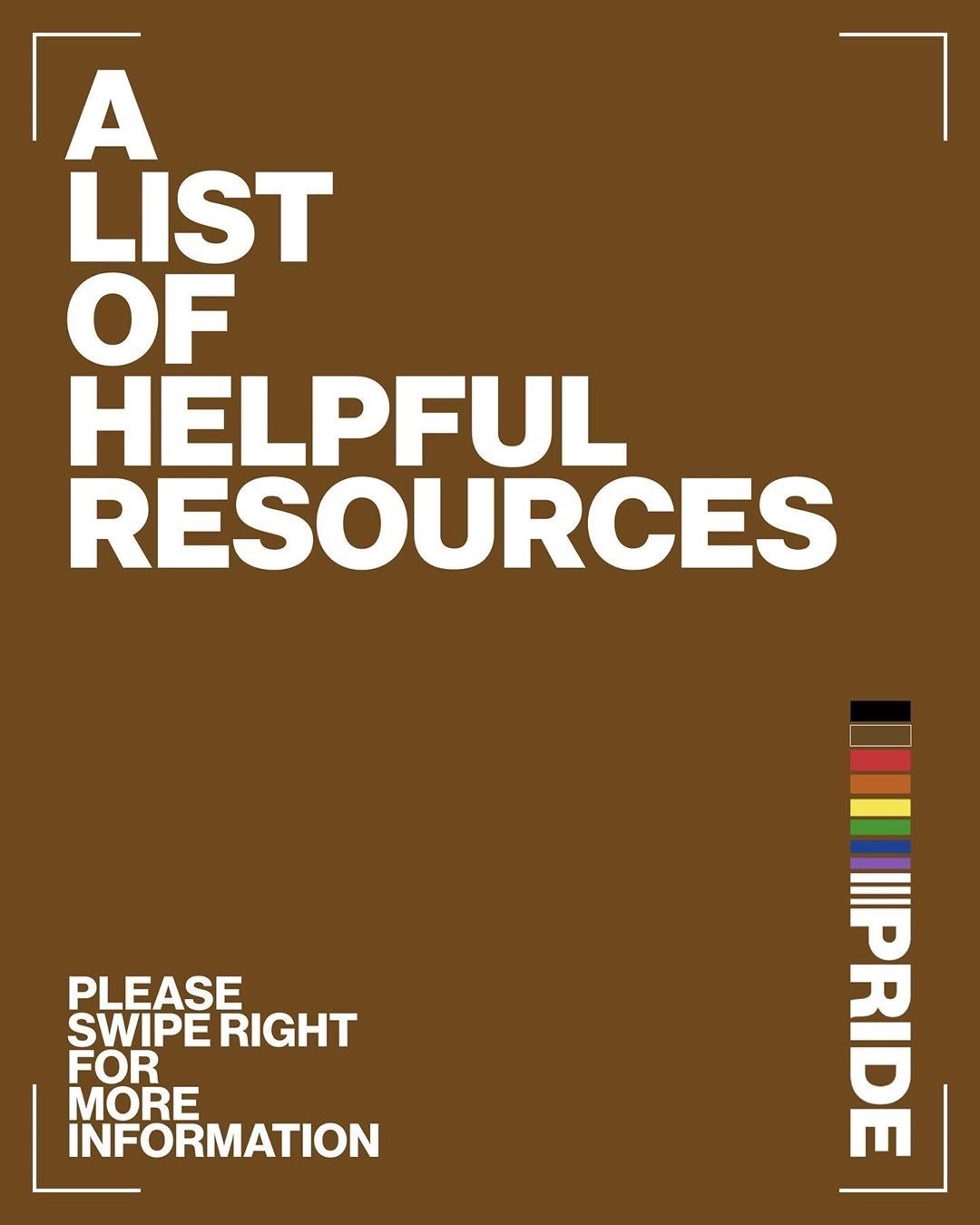
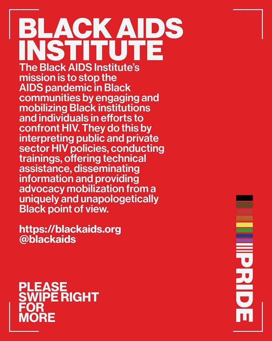
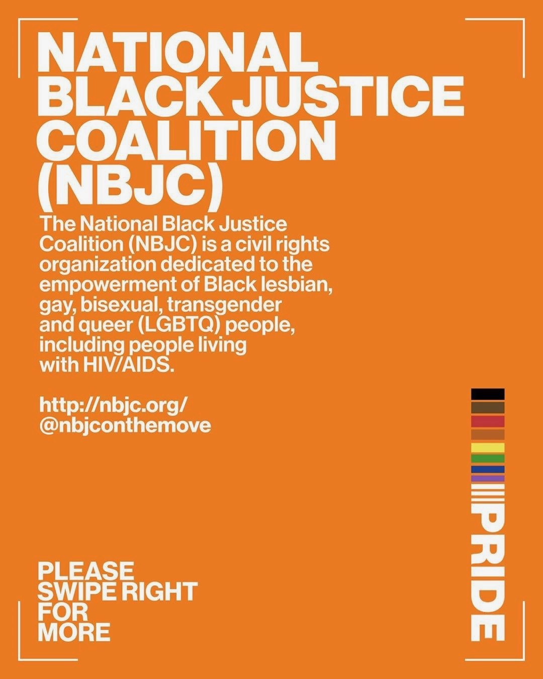
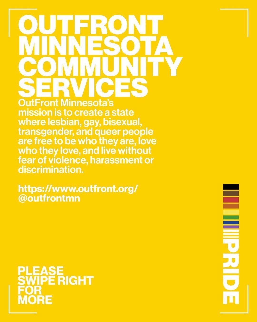
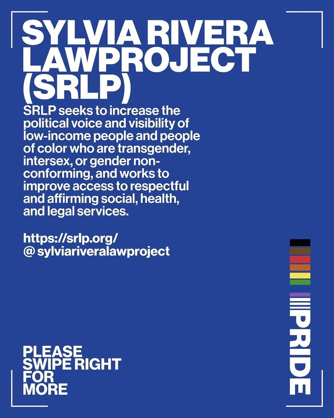
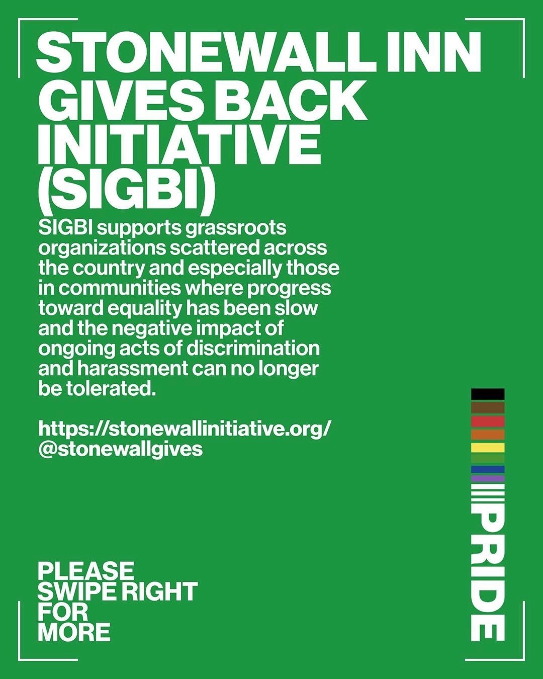
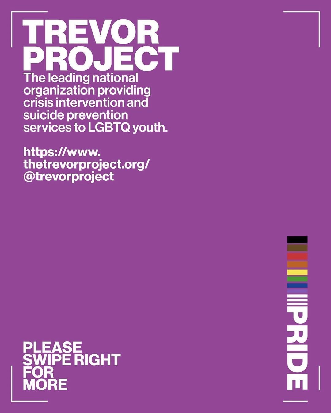
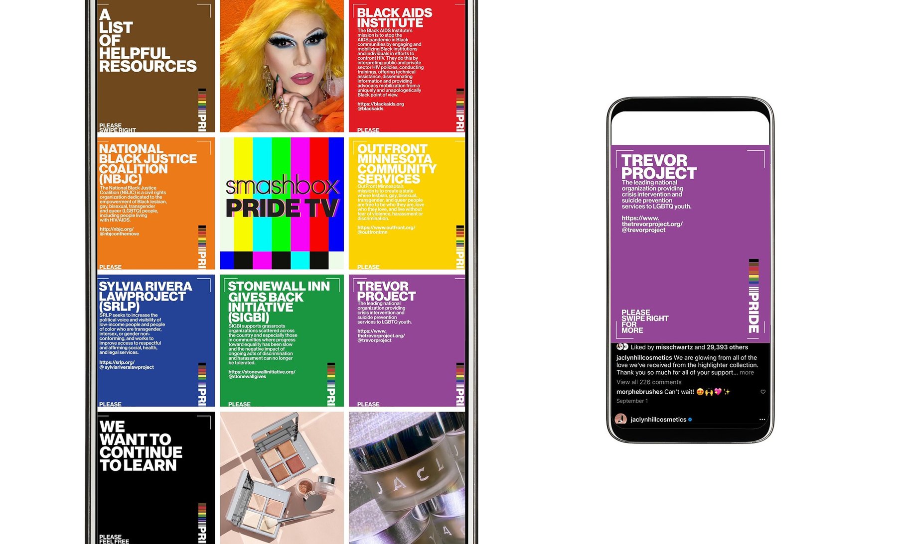
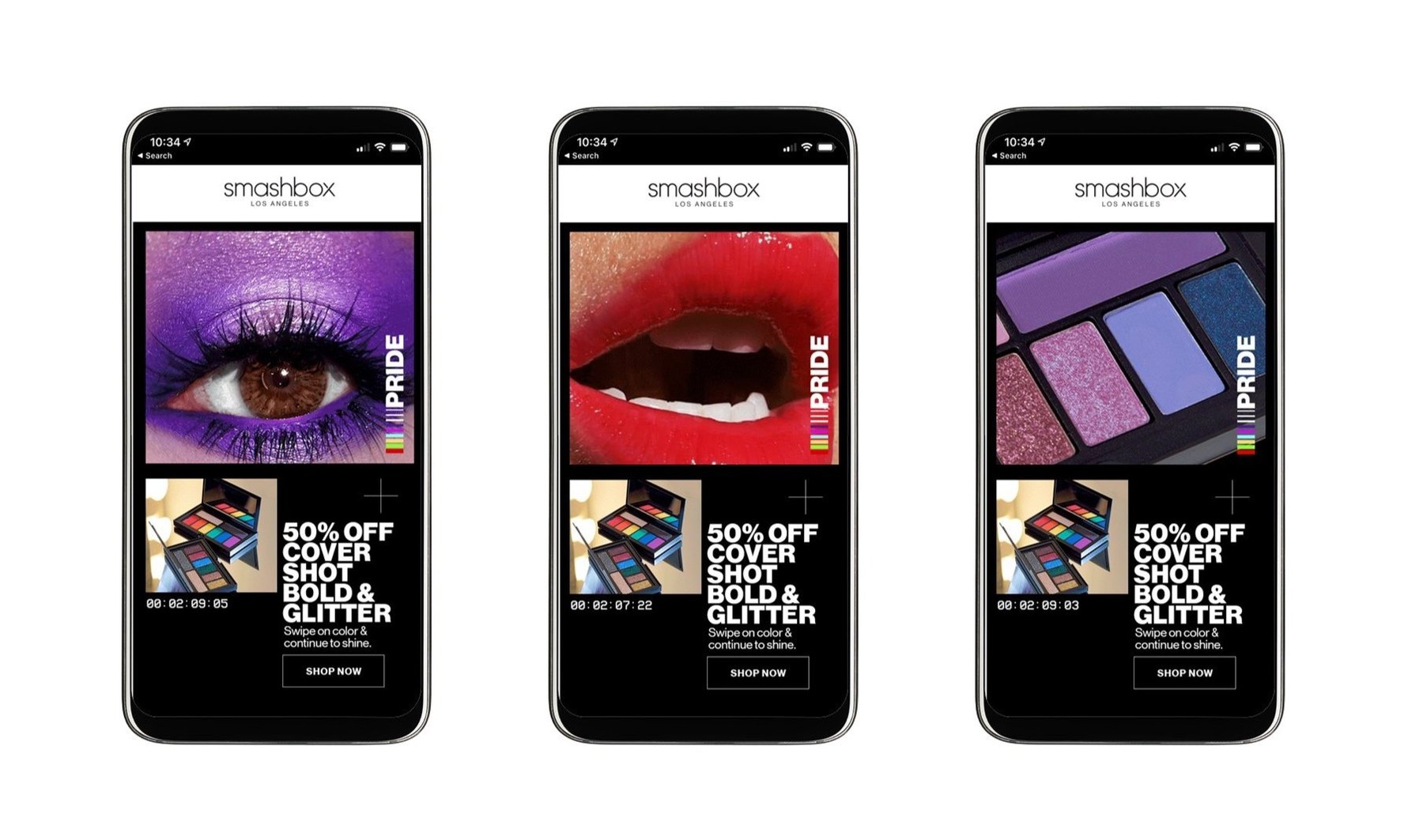
The brief asked for a Pride that celebrated LGBTQIA+ communities through color, with a Pride logo lockup and graphic treatment on the list. I made the Pride logo, the word in heavy capitals behind a run of color bars, and Smashbox Pride TV, the wordmark on TV color bars, with posts that play like tapes on channel one. A carousel handed the feed to the organizations doing the work: the Black AIDS Institute, the National Black Justice Coalition, OutFront Minnesota, the Sylvia Rivera Law Project, the Stonewall Inn Gives Back Initiative and The Trevor Project, each in its own color. The emails carried the same color story.
The coloring book
In which the whole kit gets drawn by hand.
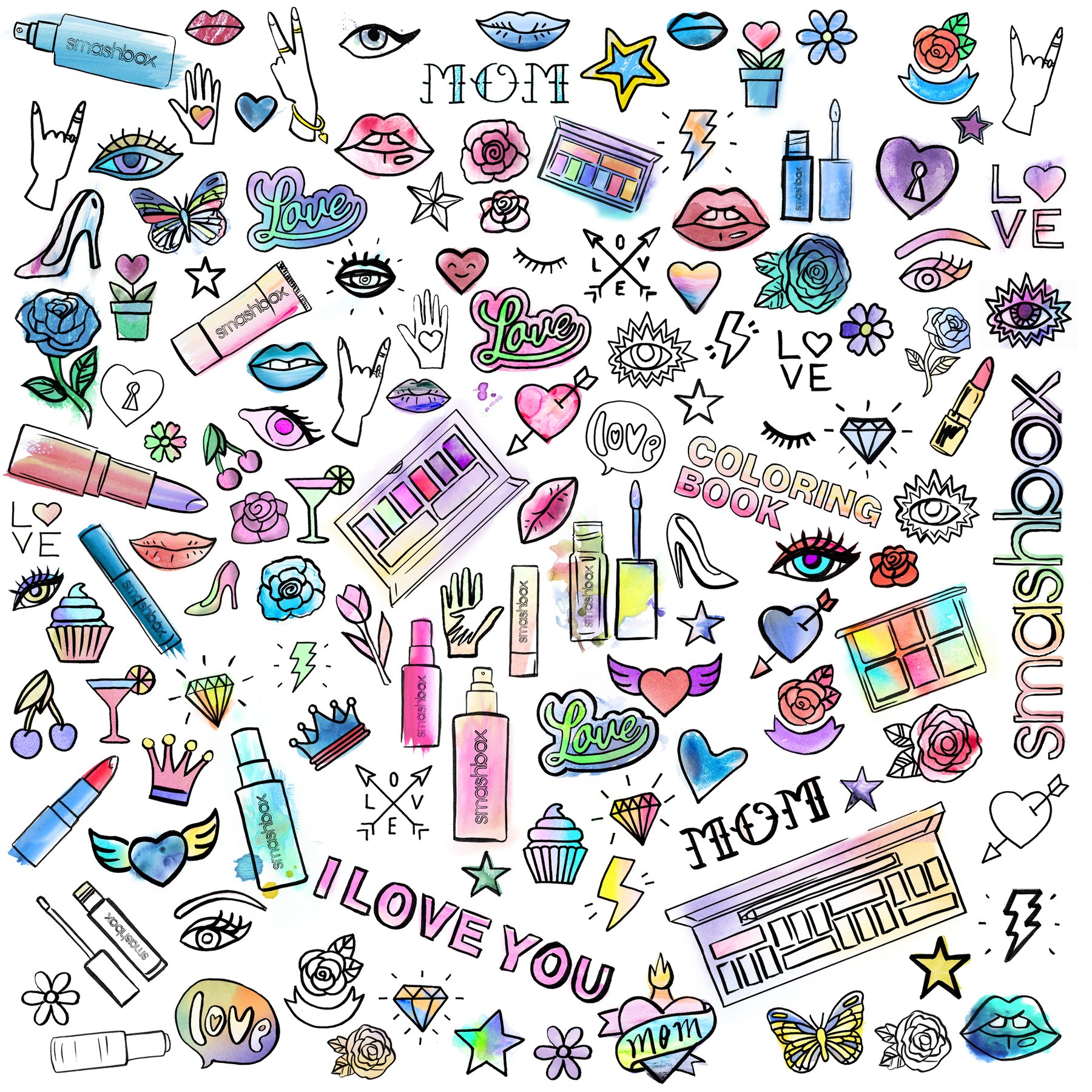
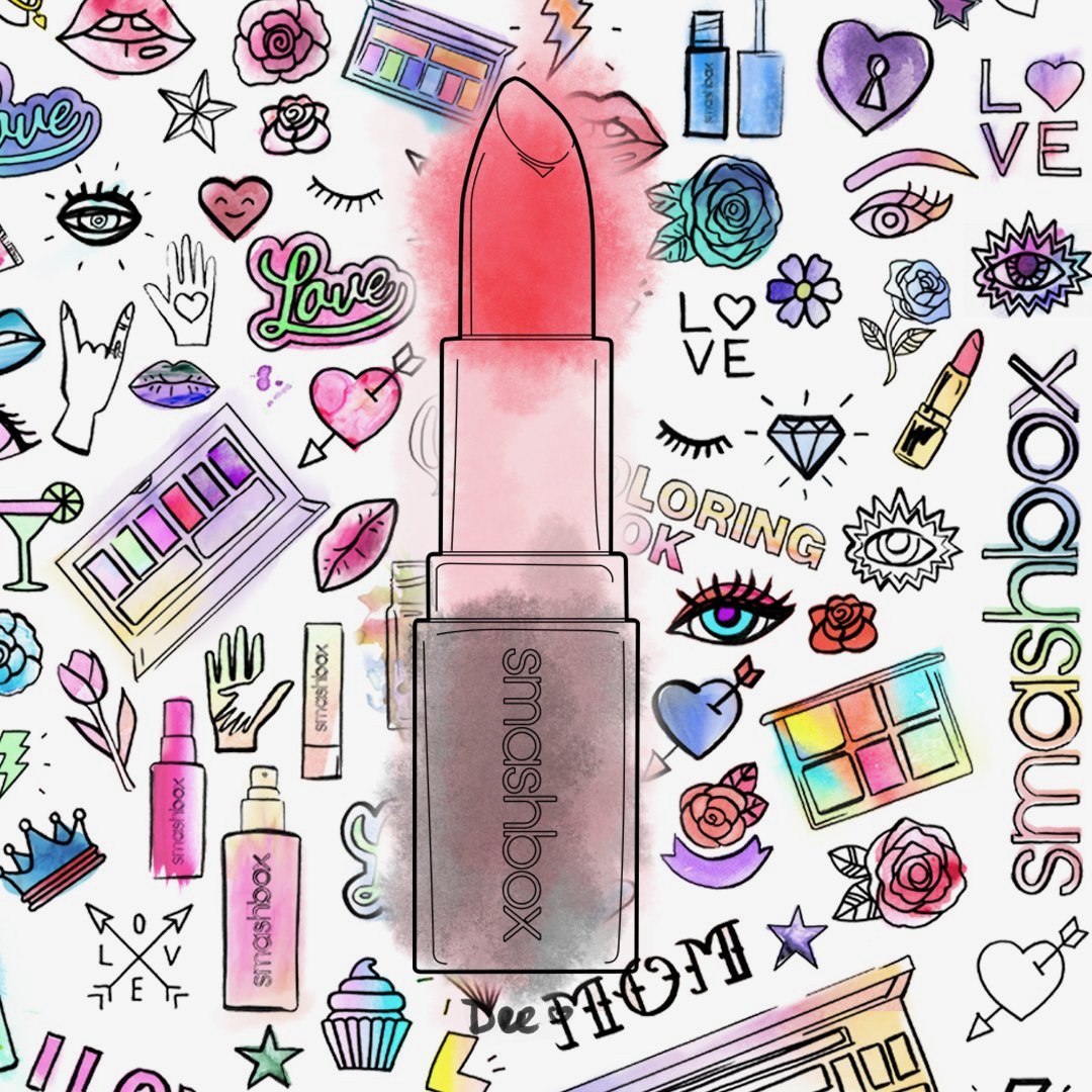
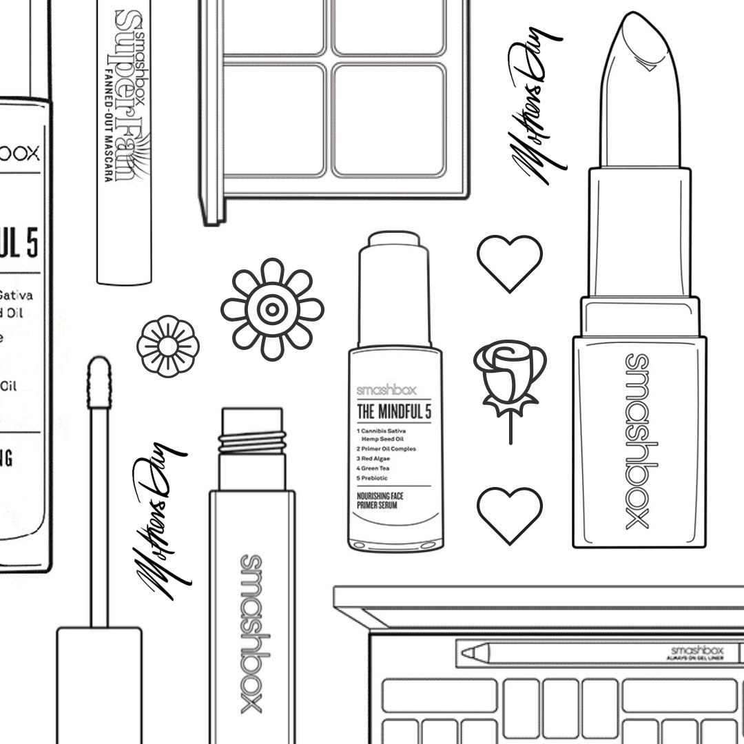
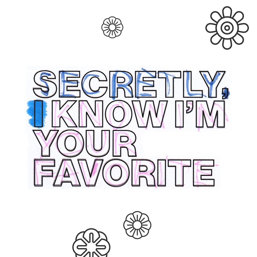
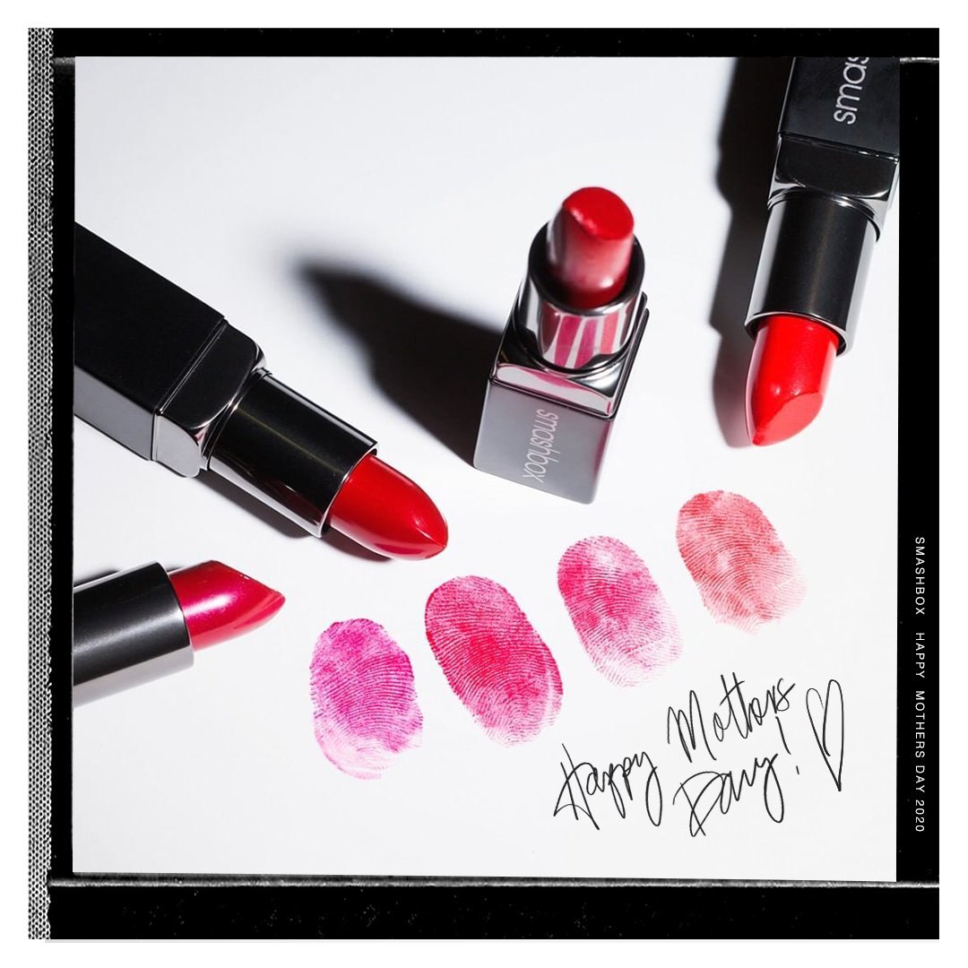
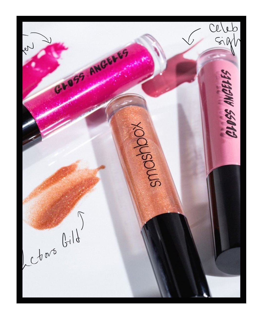
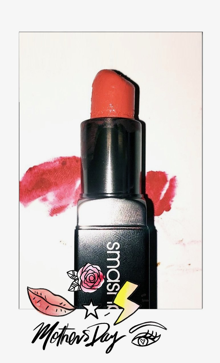
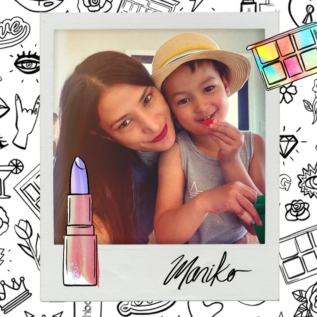
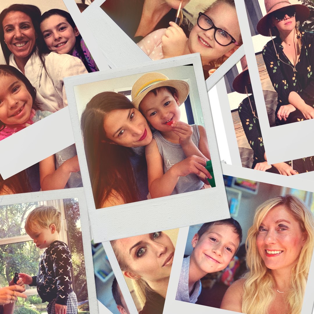
For Mother’s Day I drew a coloring page of everything in a Smashbox kit, from lipsticks and palettes to roses, hearts and MOM tattoos, and posted it in full color and in black and white, ready to color in. I drew the kit again for a loop where each sketch turns into the real product, and colored lipsticks in by hand, each one signed. Around it ran product posts with hand-drawn notes, Be Legend and Gloss Angeles, lip close-ups with doodles that move, type posts like Secretly, I know I’m your favorite, and polaroids of moms and their kids.
Four directions
In which the team gets options, and the collage wins.
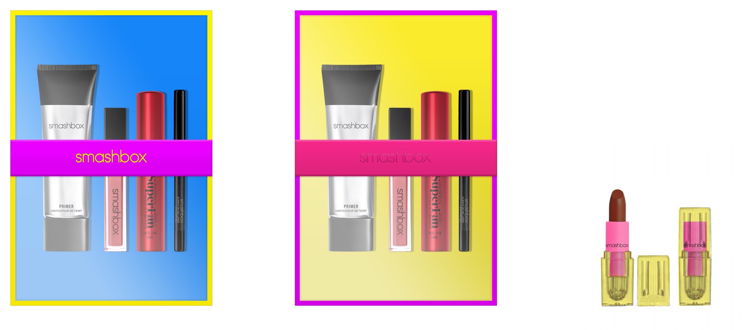
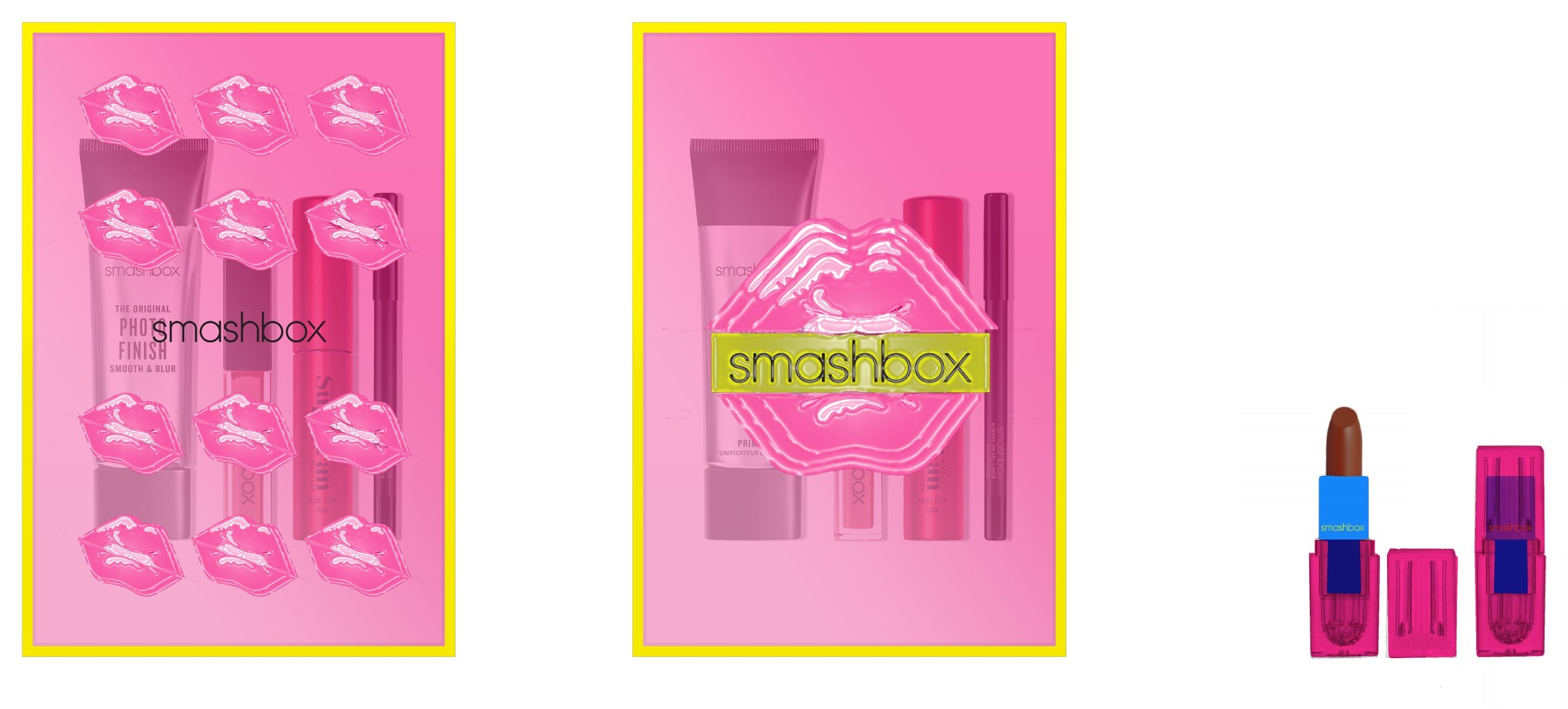
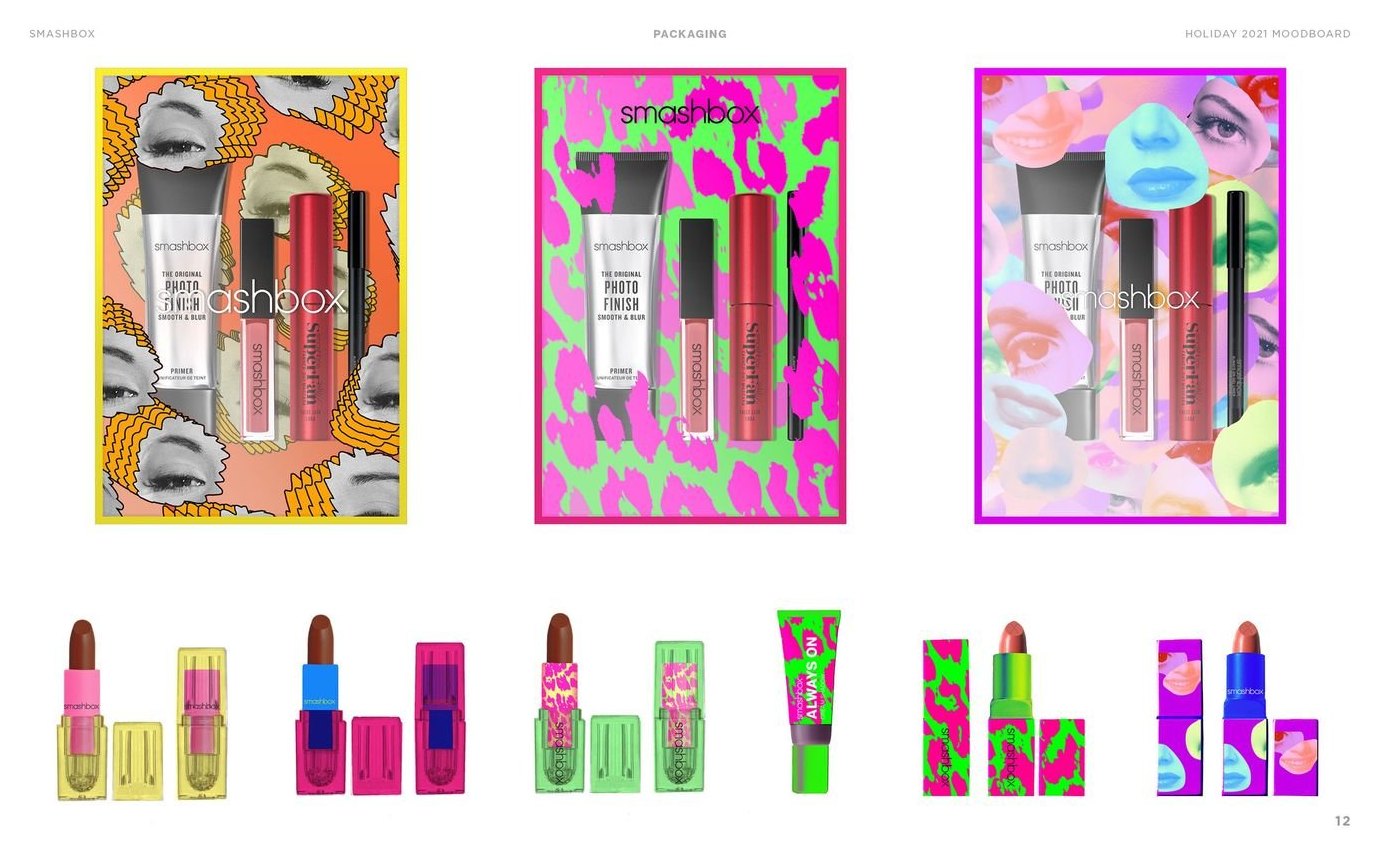
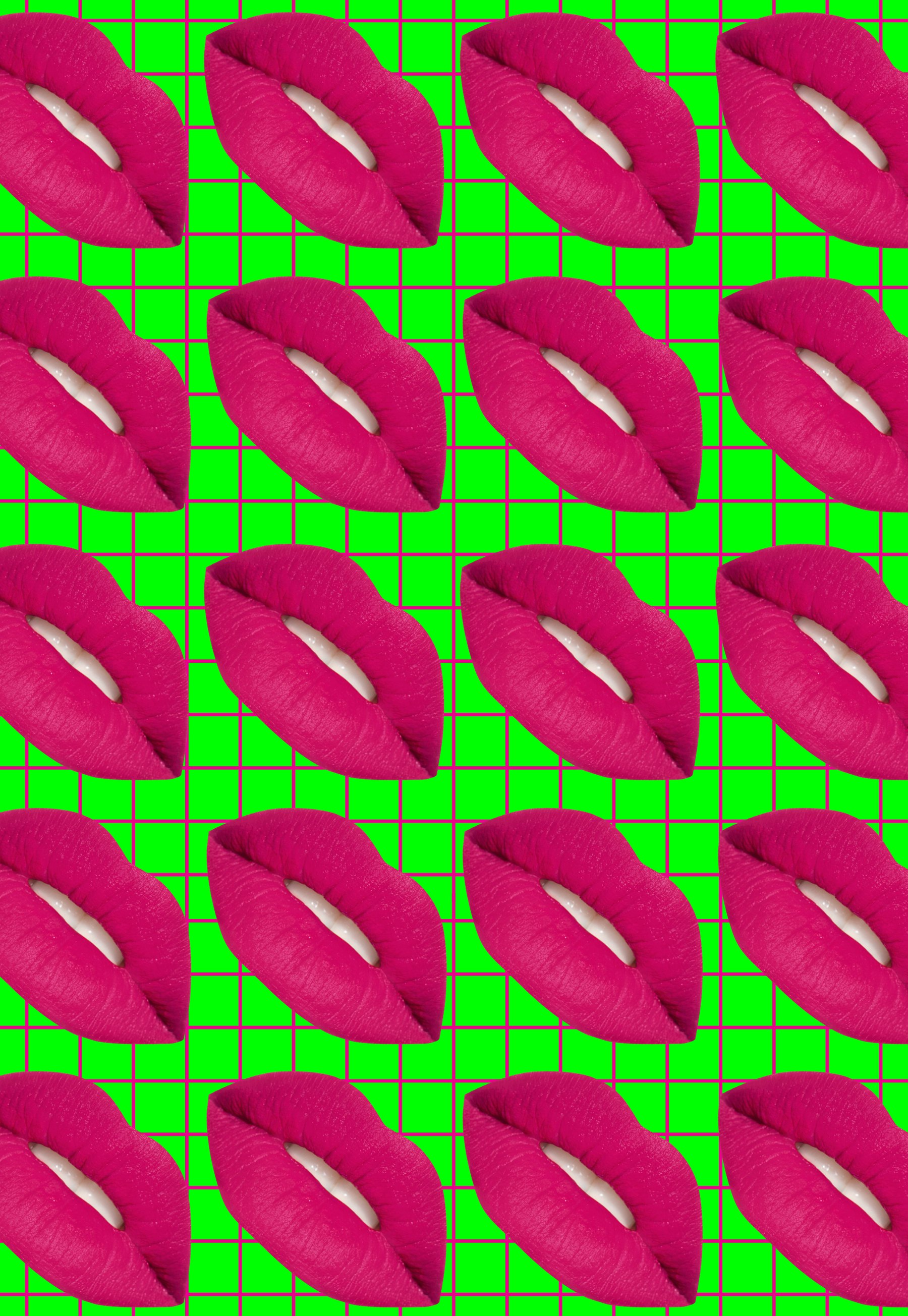
On April 23, 2020 I presented four directions for the Holiday 2021 kits, each with its own mood board, kit boxes and lipstick: Modern Neon, 80’s Collage, 80’s Modern Collage and a collaboration with Richard Bernstein. The collage went forward. Through May and June it became the packaging art: leopard, zebra and jaguar prints in hot pink, acid green and electric blue, torn and layered under the wordmark, and a print of glossy lips on a green grid.
Option 01, Modern Neon
Option 02, 80’s Collage

Option 03, 80’s Modern Collage

Option 04, Smashbox x Richard Bernstein: see Megastar, below
The direction that went forward
Megastar
In which Grace Jones wraps the kit.
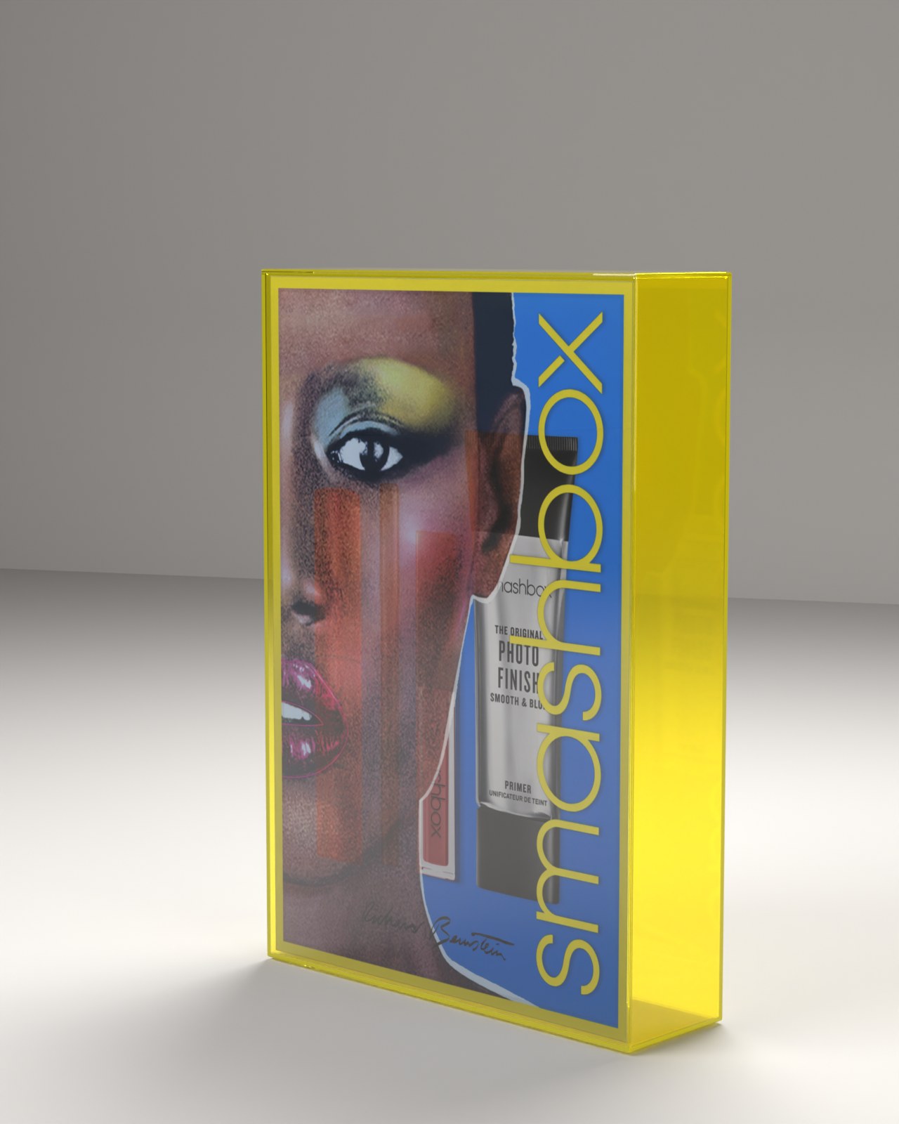
The fourth direction came from the Estate of Richard Bernstein, the artist who painted the covers of Andy Warhol’s Interview from 1972 to 1989. I called it Megastar. Bernstein’s portrait of Grace Jones fills the front of a kit in see-through neon acrylic, with the smashbox wordmark running up the side, his signature along the bottom, as the Estate asked, and lipsticks shaped like capsules after his pill paintings.
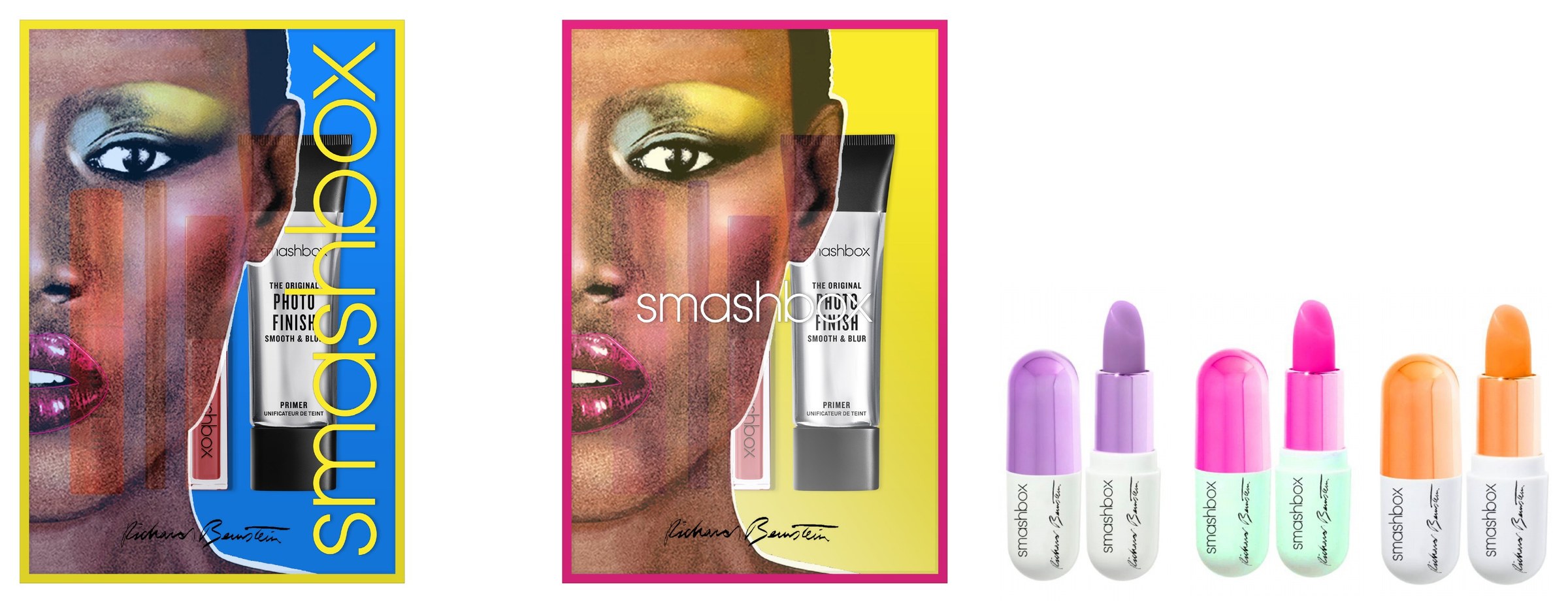
Artwork
Richard Bernstein artwork © The Estate of Richard Bernstein.