Old Navy Brand Programs
Four programs. One family of marks.

“Create unique and meaningful iconography for brand programs, where Old Navy can scale culturally relevant moments under a recognizable customer experience.”
Social first. Built to engage shoppers online and in store.
Working with the Old Navy team, I designed the illustrations, brand marks and graphic systems for four new brand programs. Each one is built around an object people already love, made to move on social, live on the site and turn up in store, so every culturally relevant drop feels like one Old Navy.
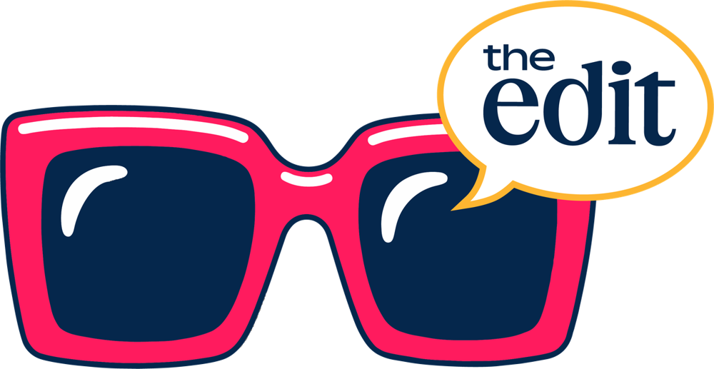
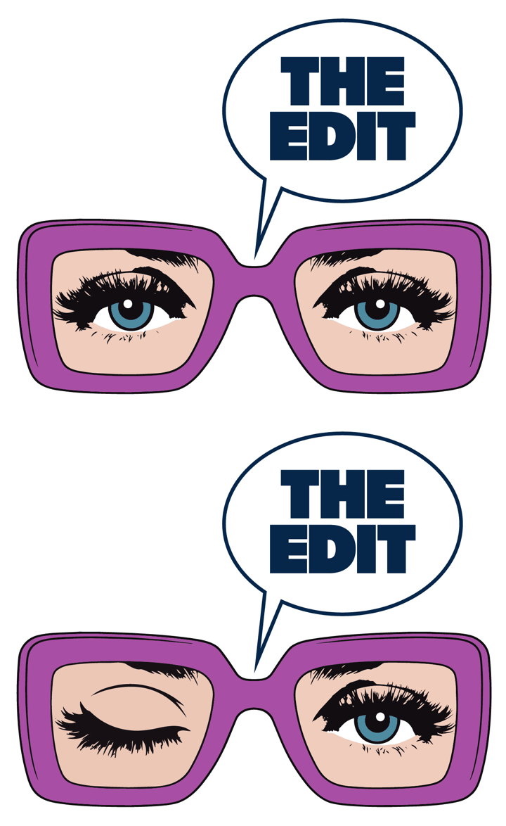
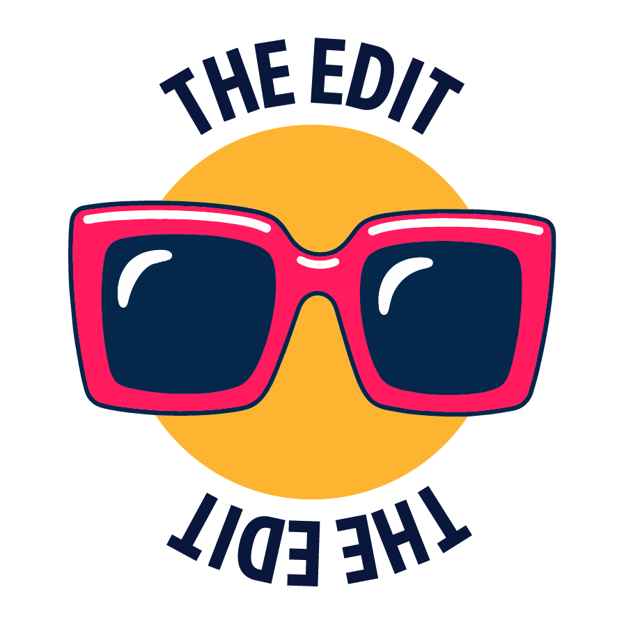
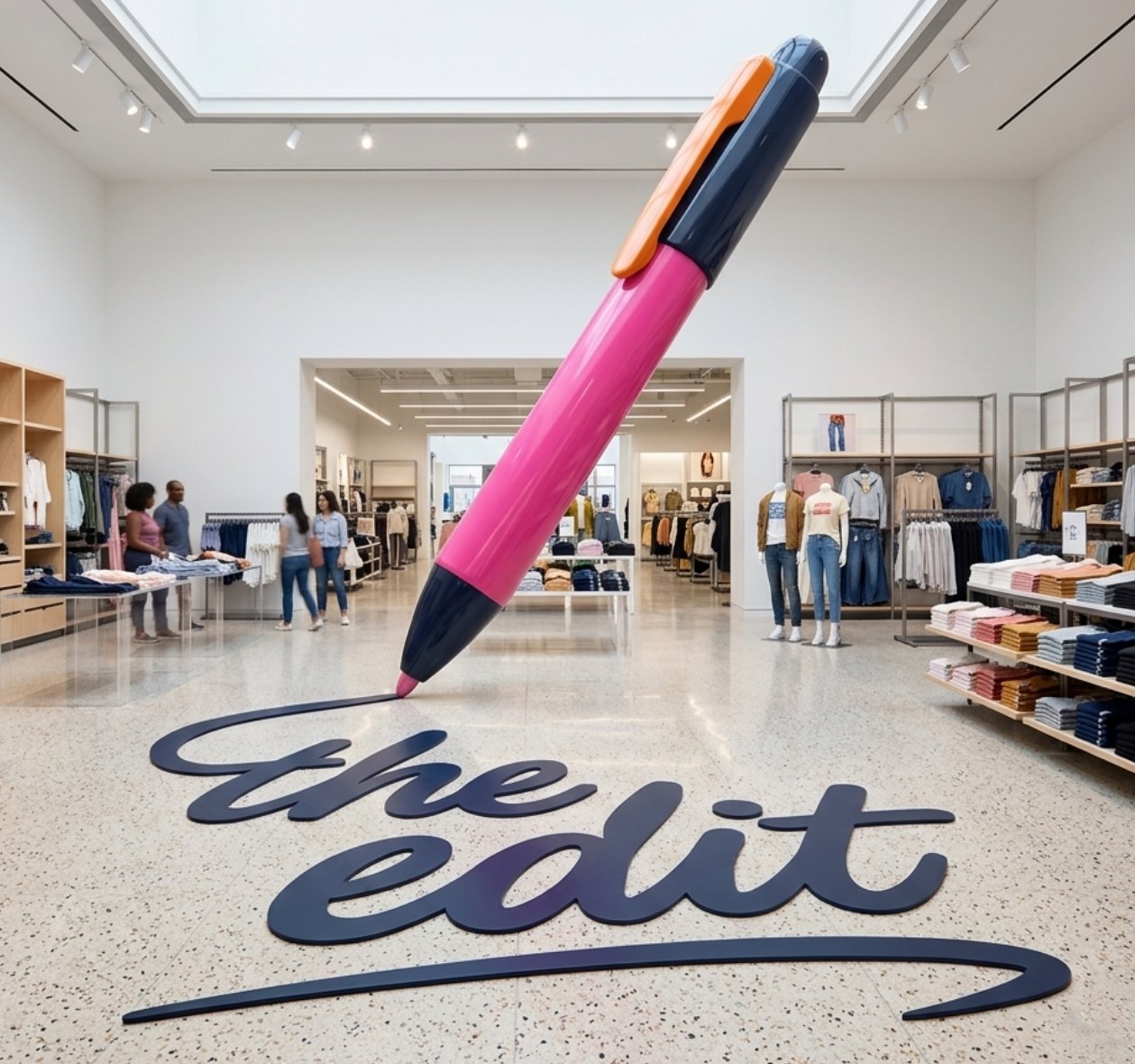
The Edit
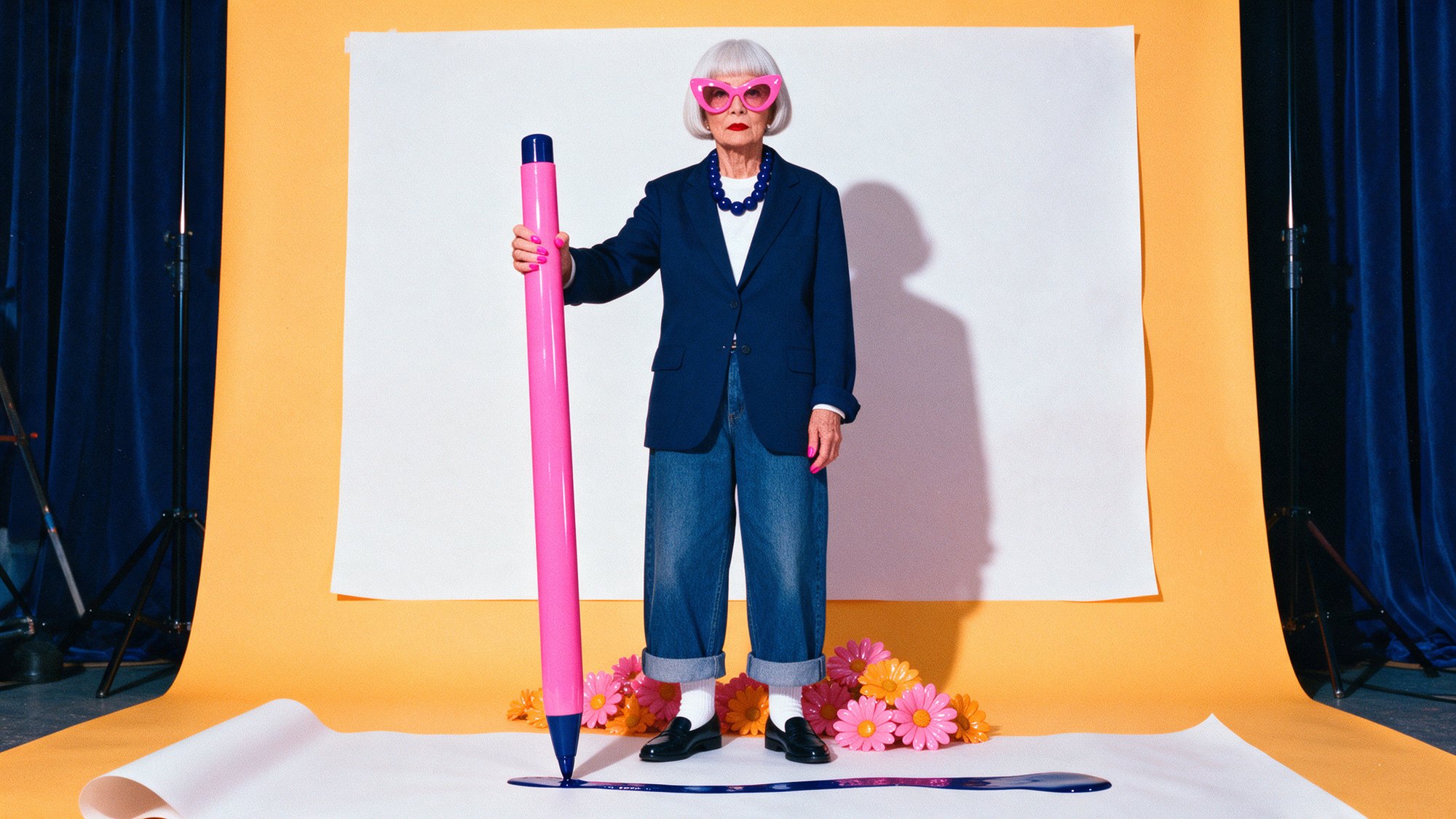
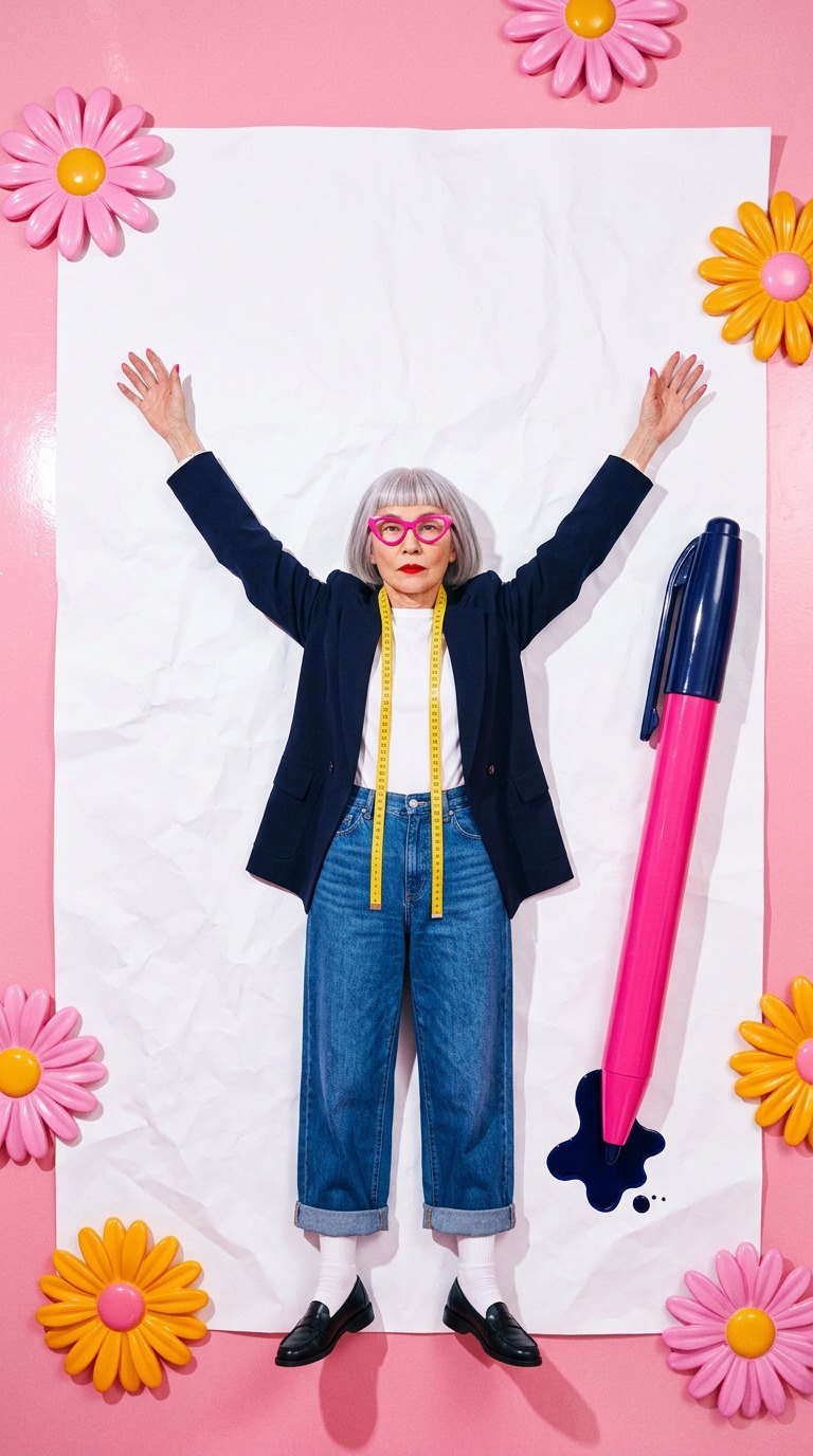
In which a pen signs its own name.

The script mark puts a stylist’s signature on trend-right edits, and a pair of cat-eye frames carries the attitude onto social, where The Edit lives first.
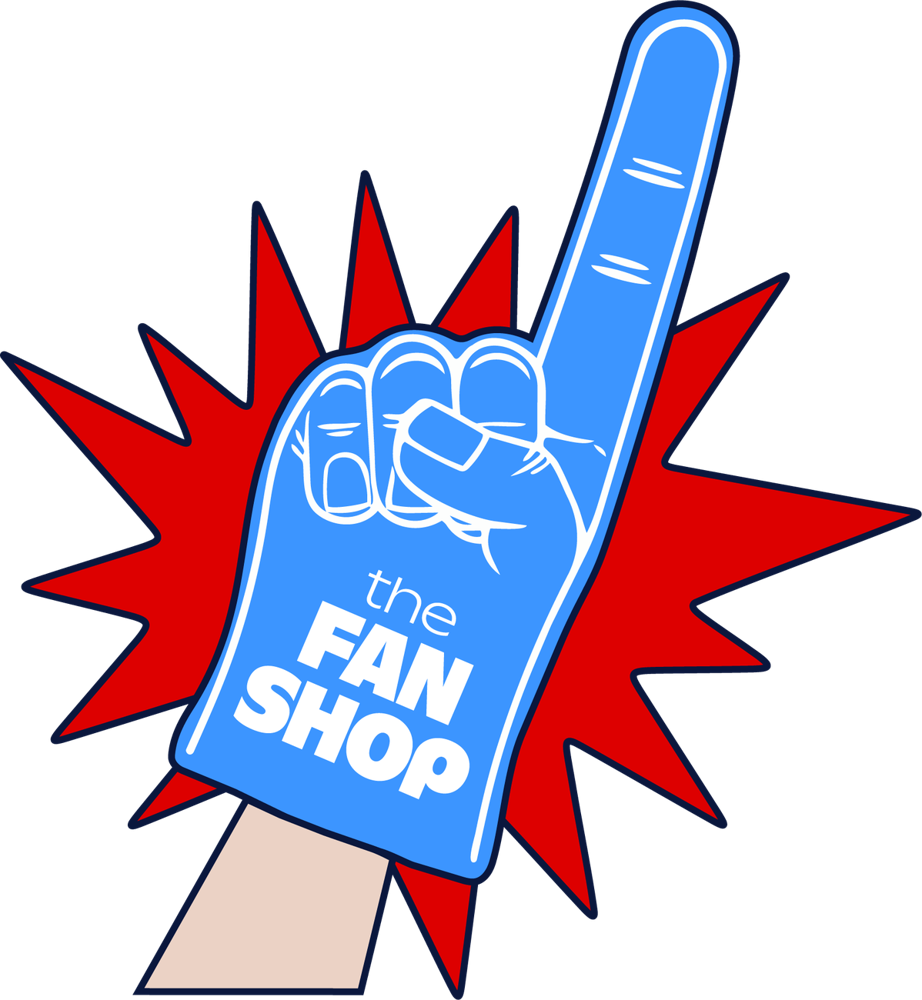
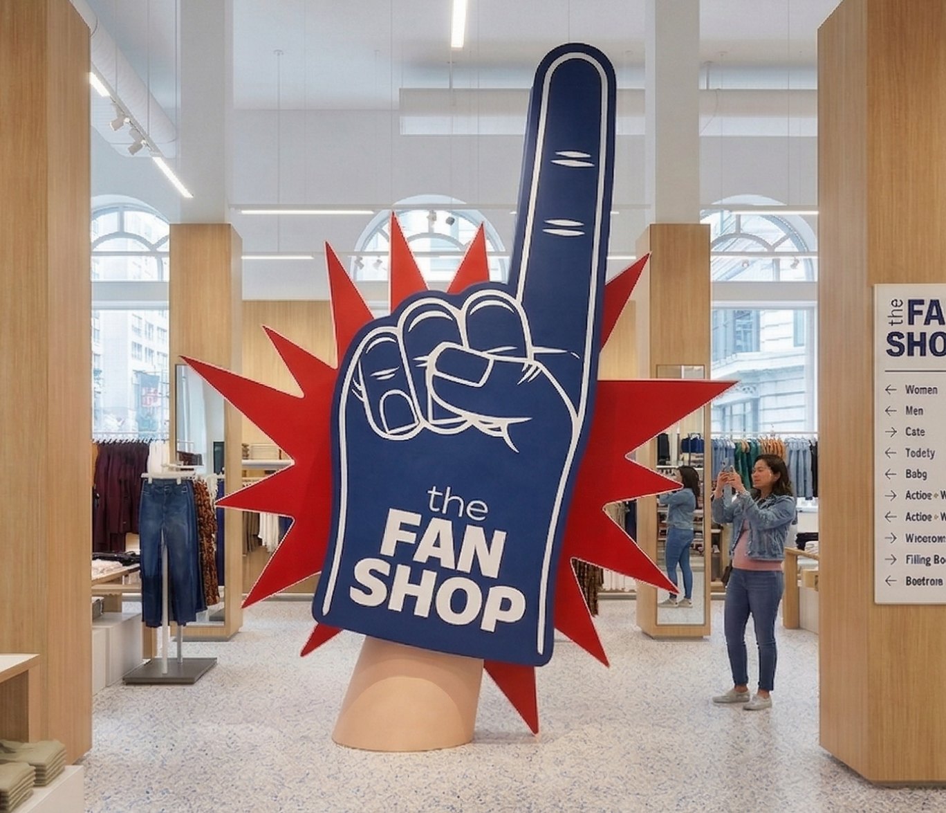
The Fan Shop
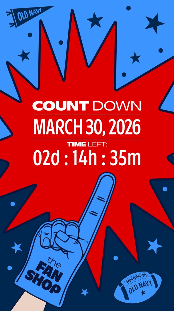
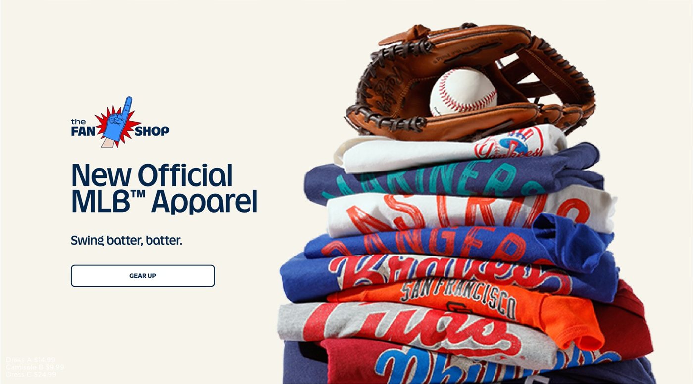
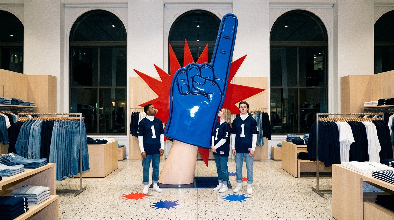
In which a foam finger goes all in.

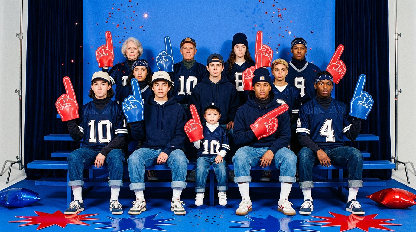
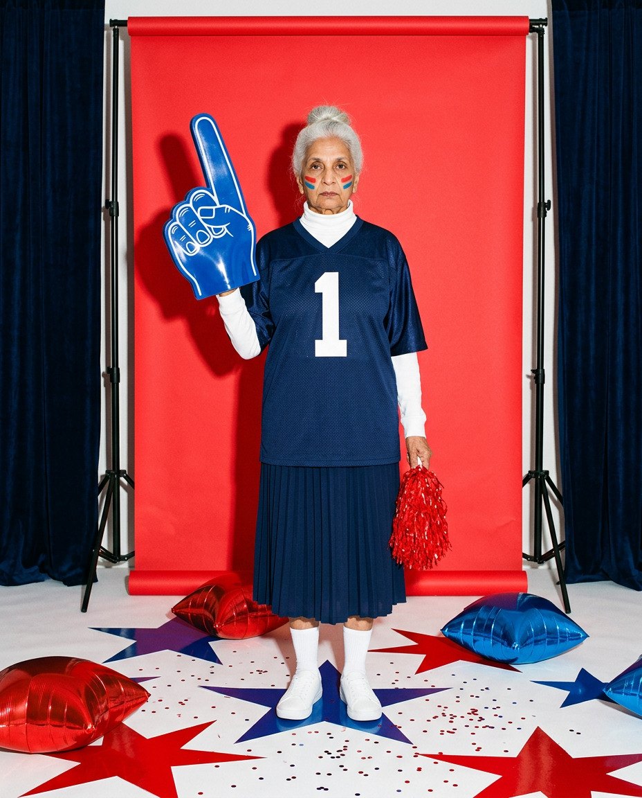
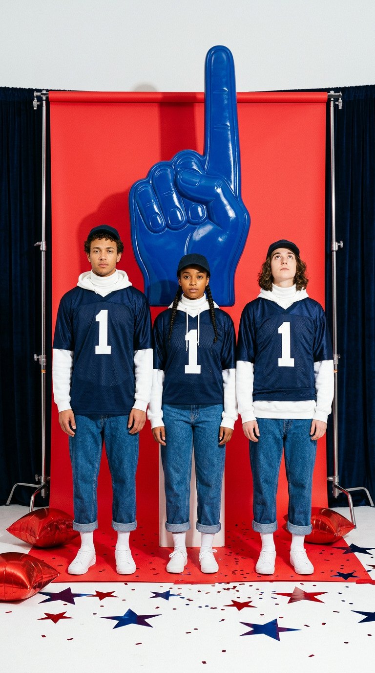
The universal sign of being all in, built into a kit of starbursts, halftones and pennants so it can suit up for any team, any league and any country, from a countdown story to the homepage.
The Culture Club
In which everyone is talking about it.

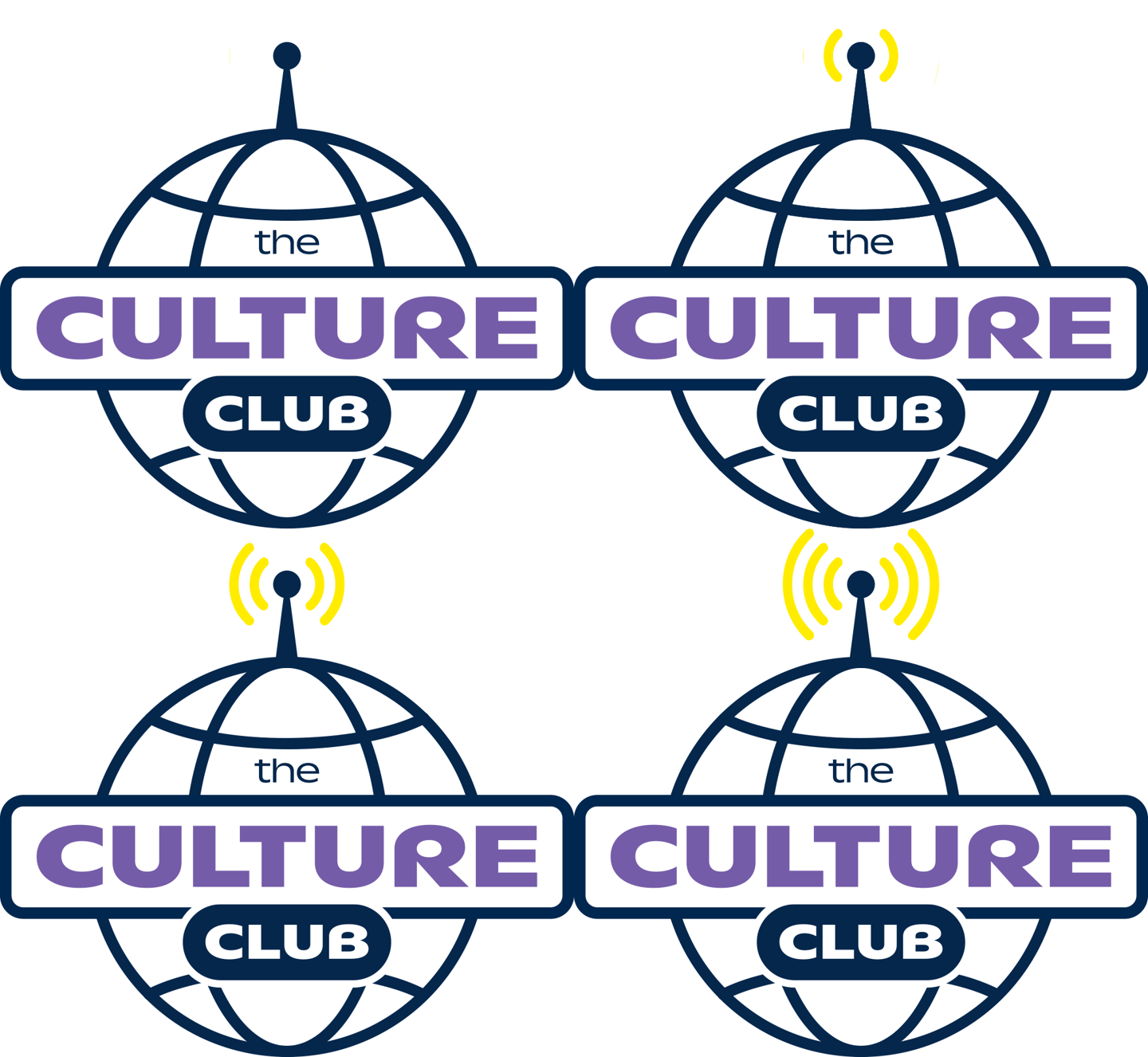
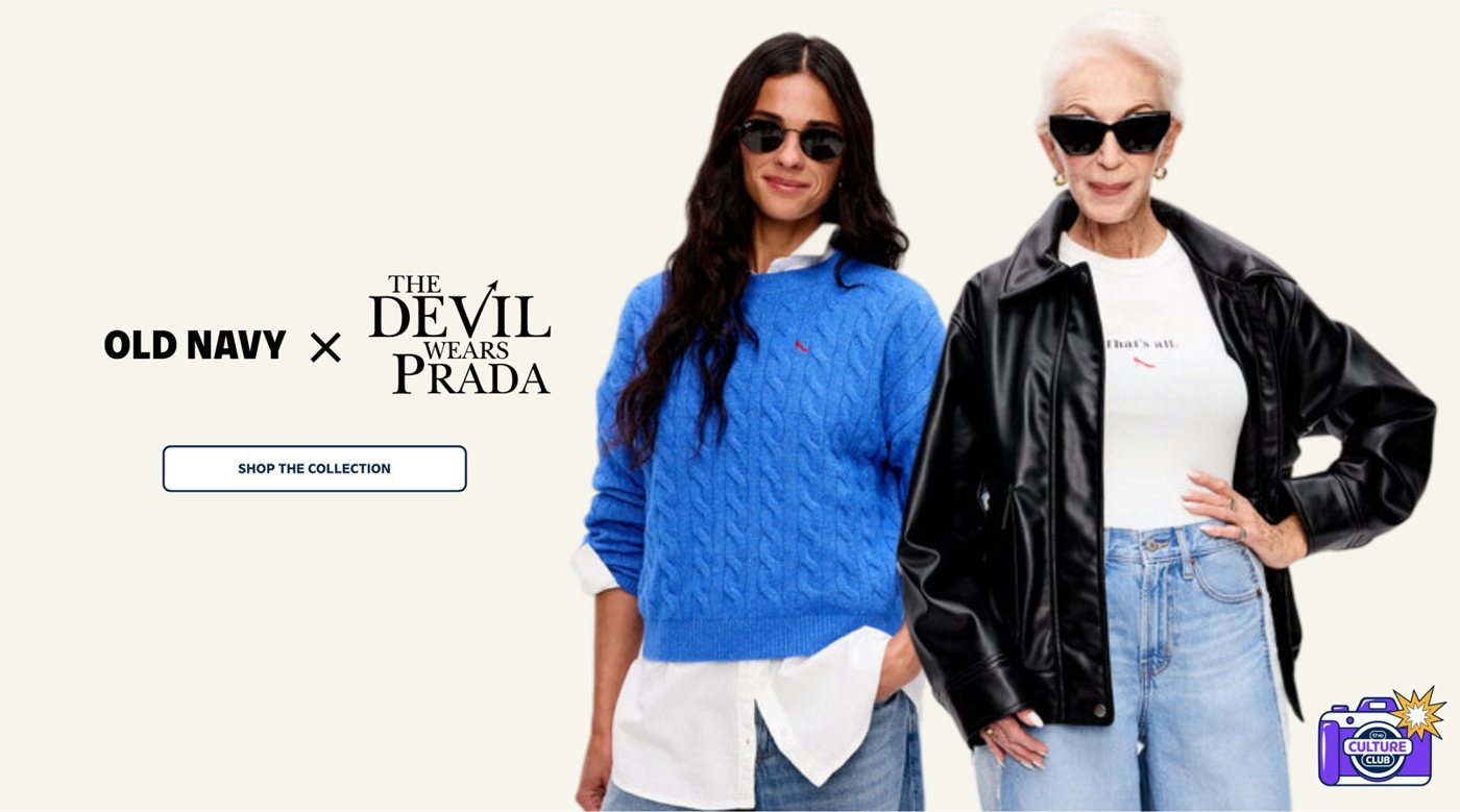
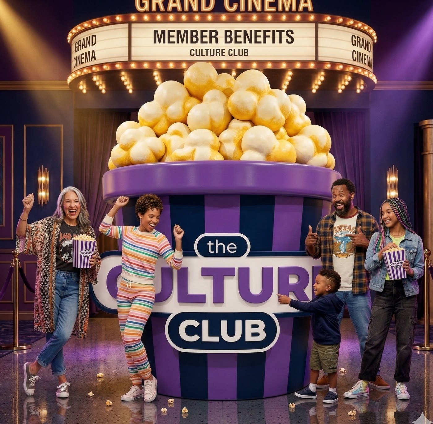
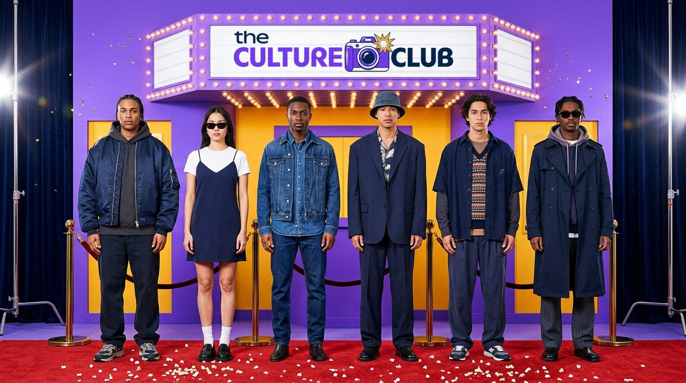
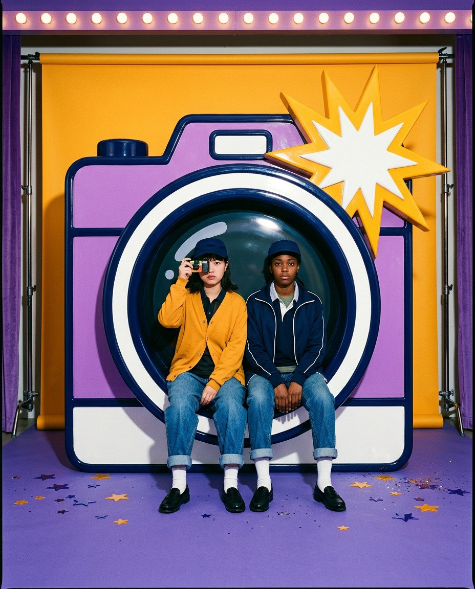
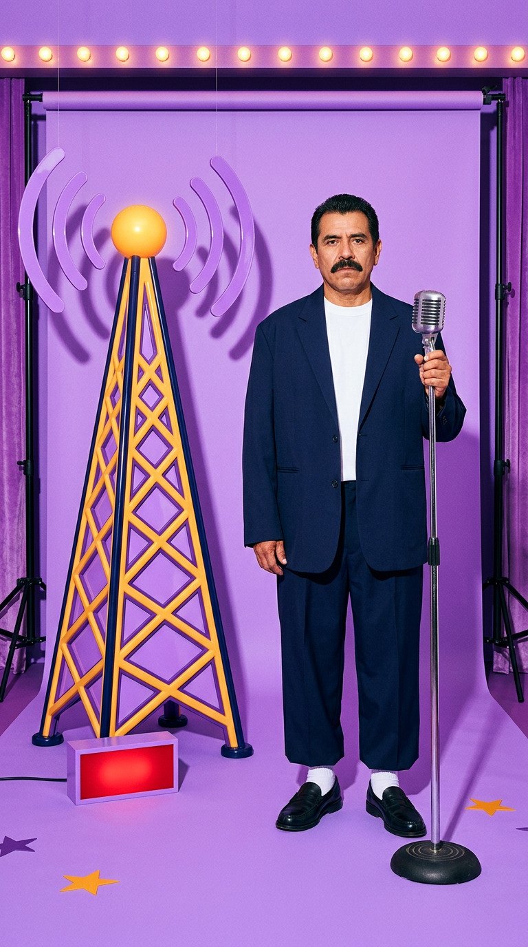
The program that has to stretch the furthest, from a film collaboration to the next music moment. I explored routes from a vintage camera to a broadcast tower, each a different way of saying it’s on.
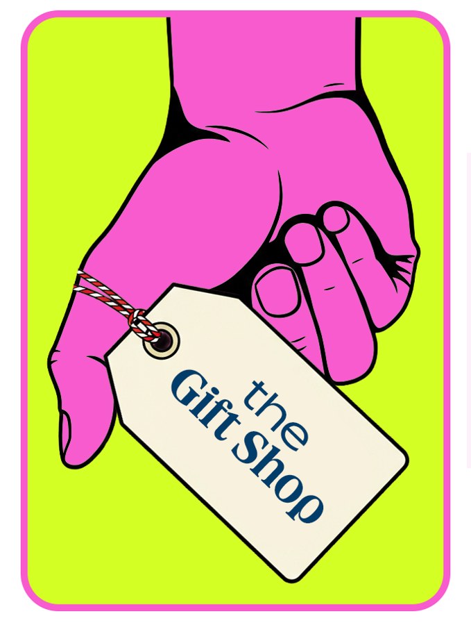
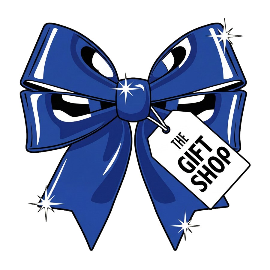
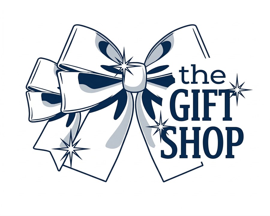
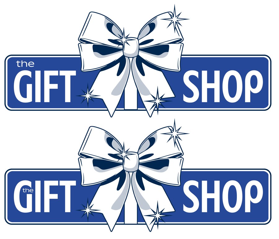
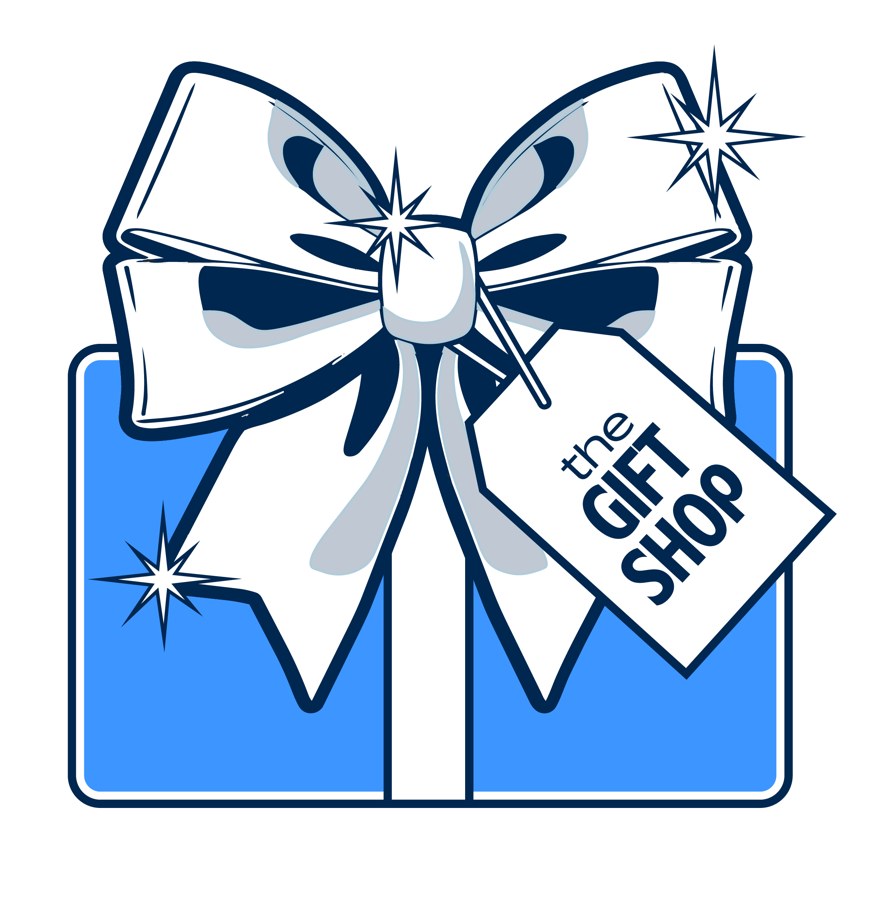
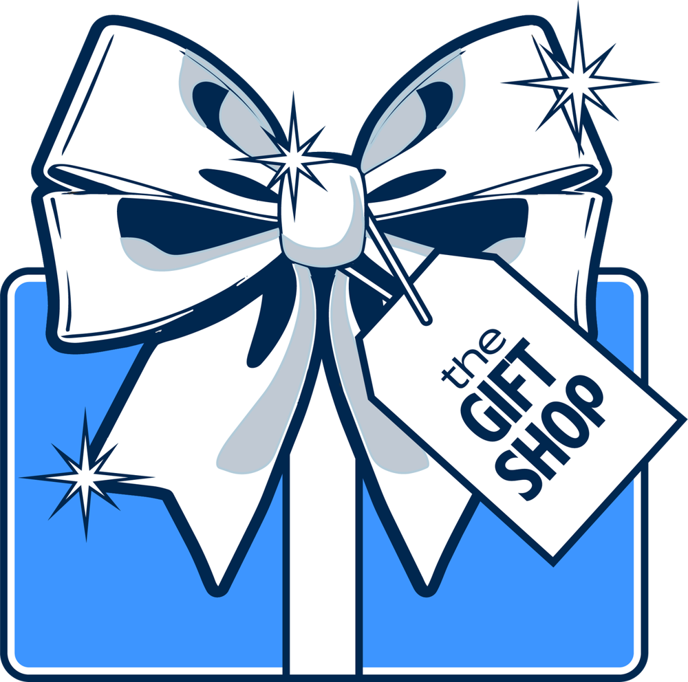
The Gift Shop
In which a bow steals the room.
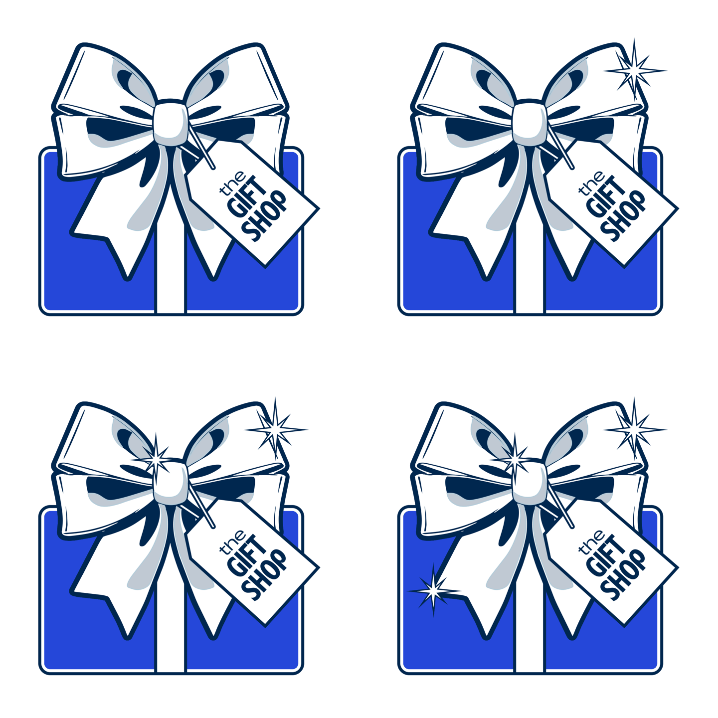
A glossy bow and a gift tag, drawn to feel like the best present in the room. It anchors gift guides and matching family looks, from Father’s Day through the holidays.
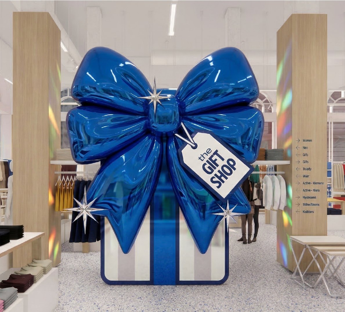
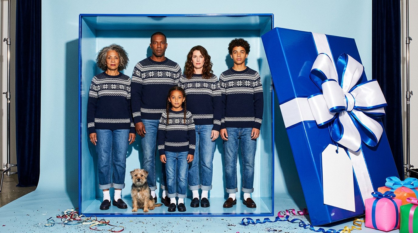
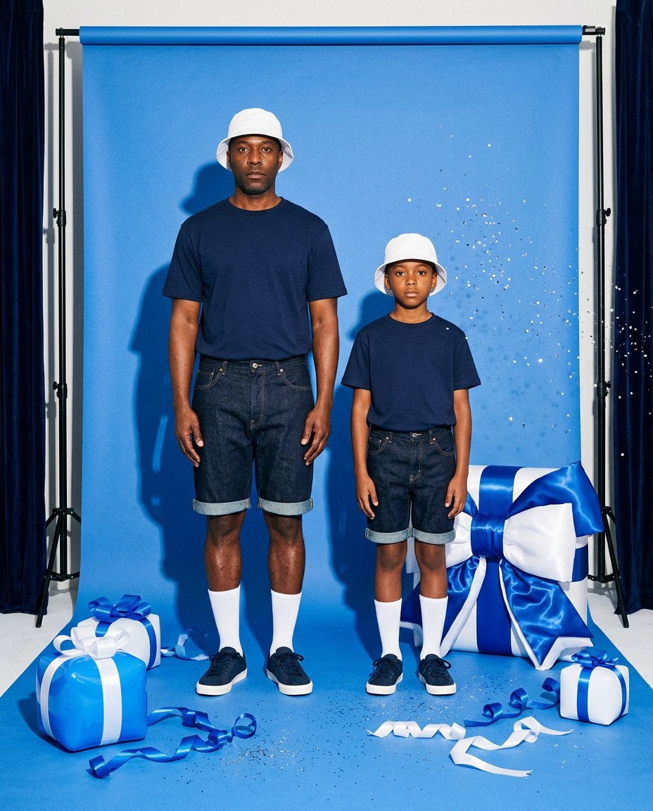

One Family
All four share one navy keyline, flat saturated color and a little shine. Each comes as a badge, a horizontal and a stacked lockup with its own palette, so a new moment can drop every month on a story, a homepage card, an email or a store wall without redesigning a thing.

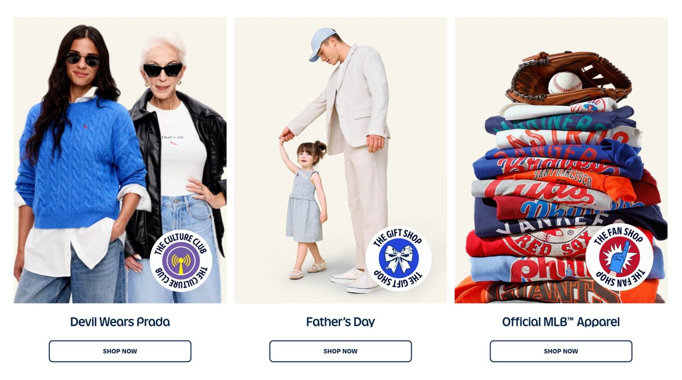
How it was made
I move fast between drawing, collage and AI image tools, then redraw every final mark in vector so it holds up at any size. The same tools let me show each mark at store scale before anything was built.