Kasics
A curvaceous identity for a label of everyday basics.
To bring to life a brand of basics by trusted online personality, Katherine Garbarino.
From the project brief, July 2022.
An identity for Kasics, a brand of basics. I took it from moodboards in July 2022 through two rounds of logo design to a brand style guide in August, building the wordmark around the curves of its as letters. Those two letters became the brand mark and a pattern, and later turned up on the product itself.
Finding the k
In which a brand of basics looks for its letterform.
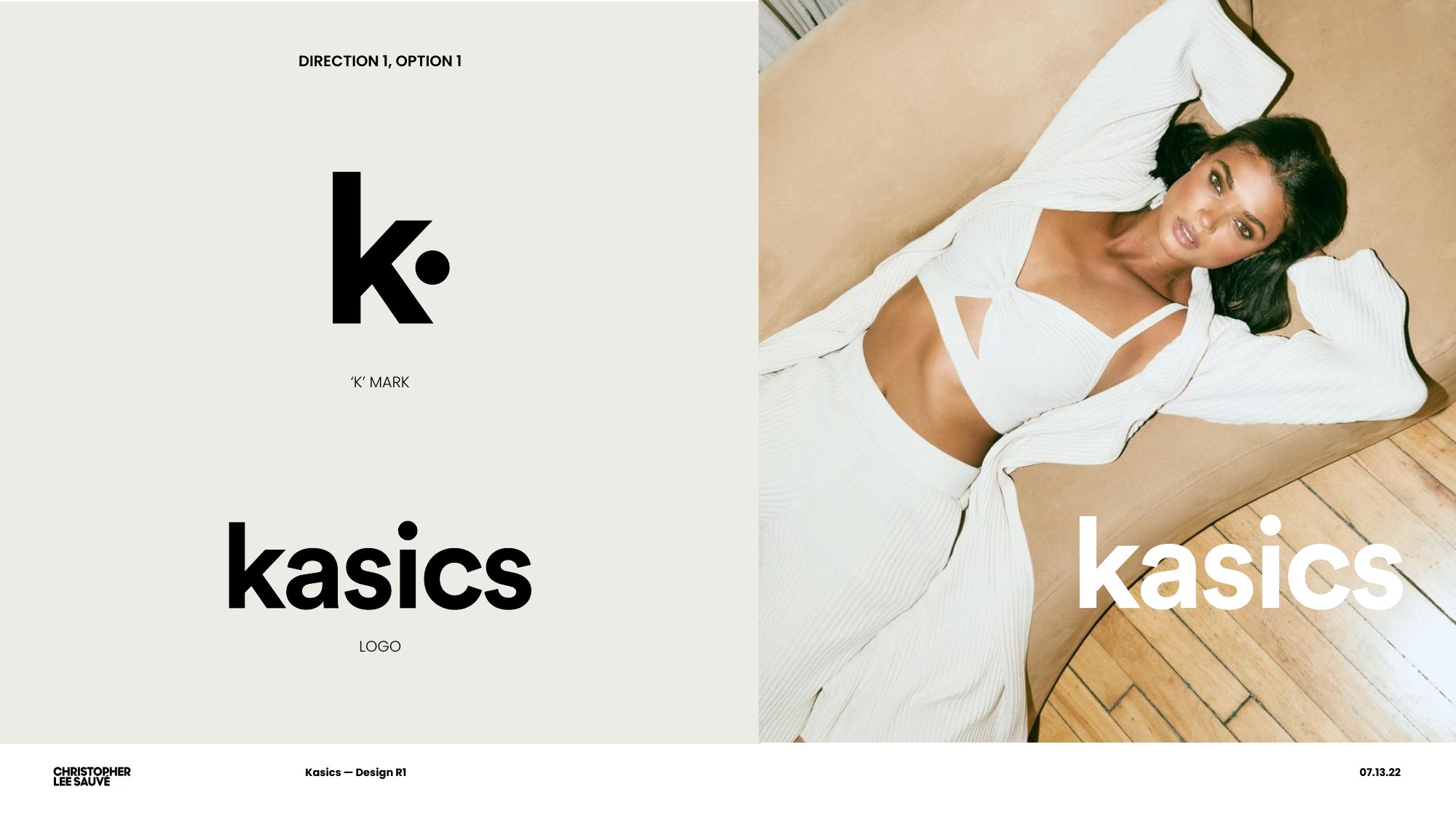
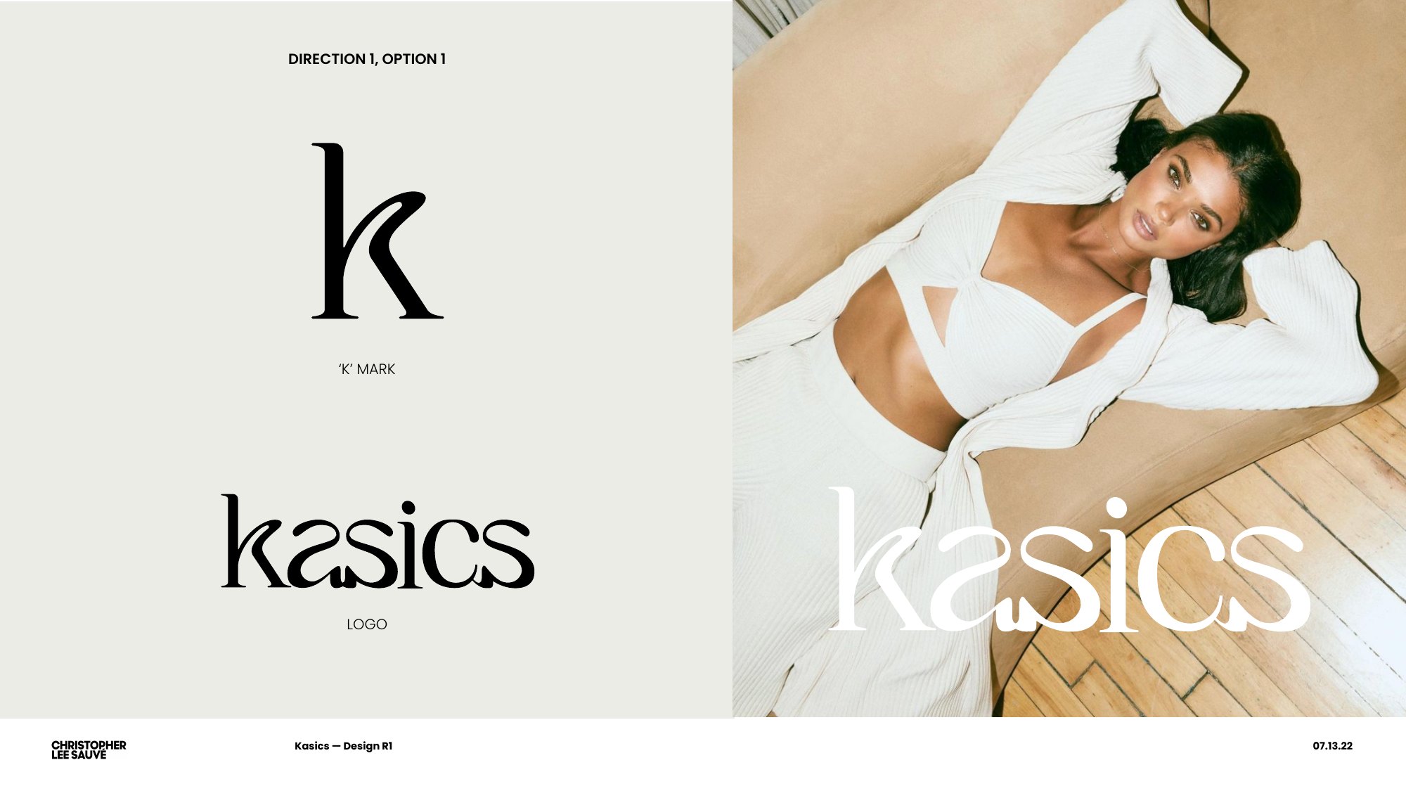
After a first round of eight moodboard concepts, the July 2022 design round set out two logo directions: a bold sans with a dotted k, and a curved serif k that led to the final wordmark.
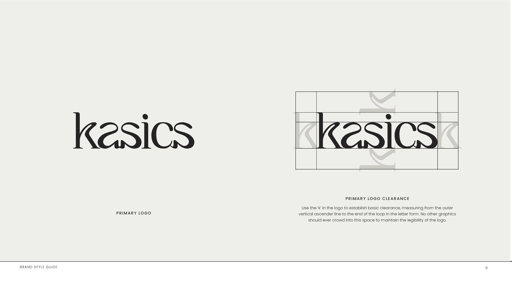
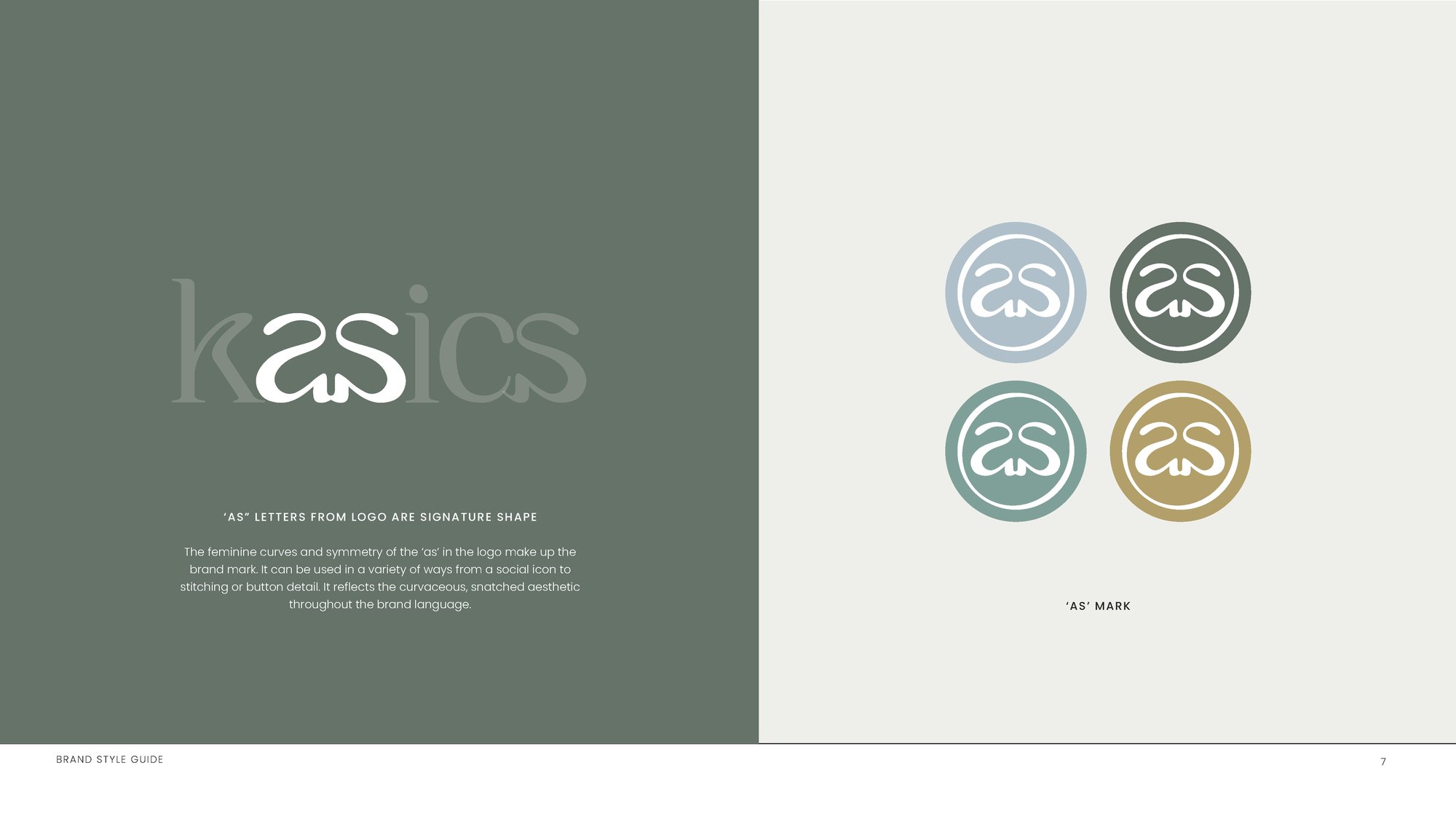
The wordmark and the as
In which two letters become the brand.
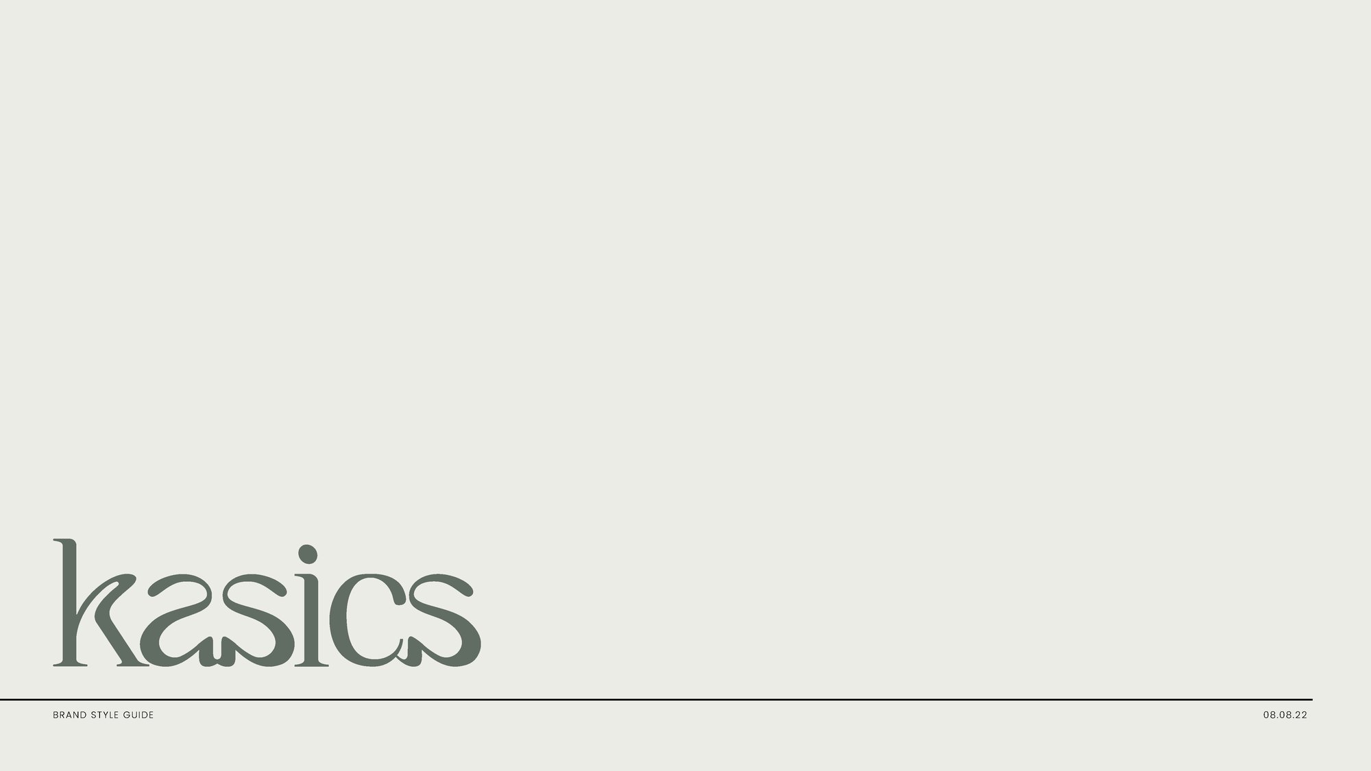
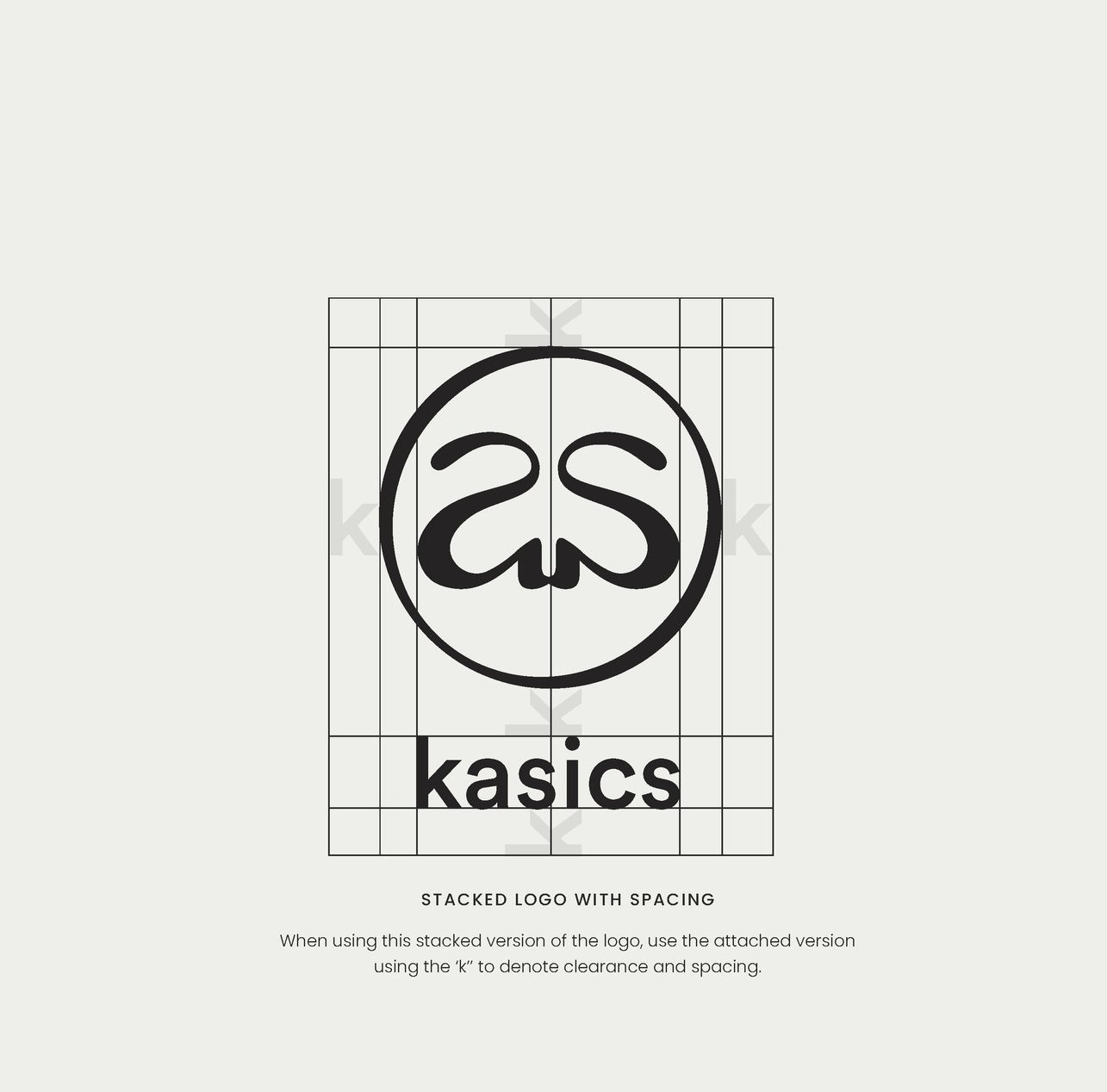
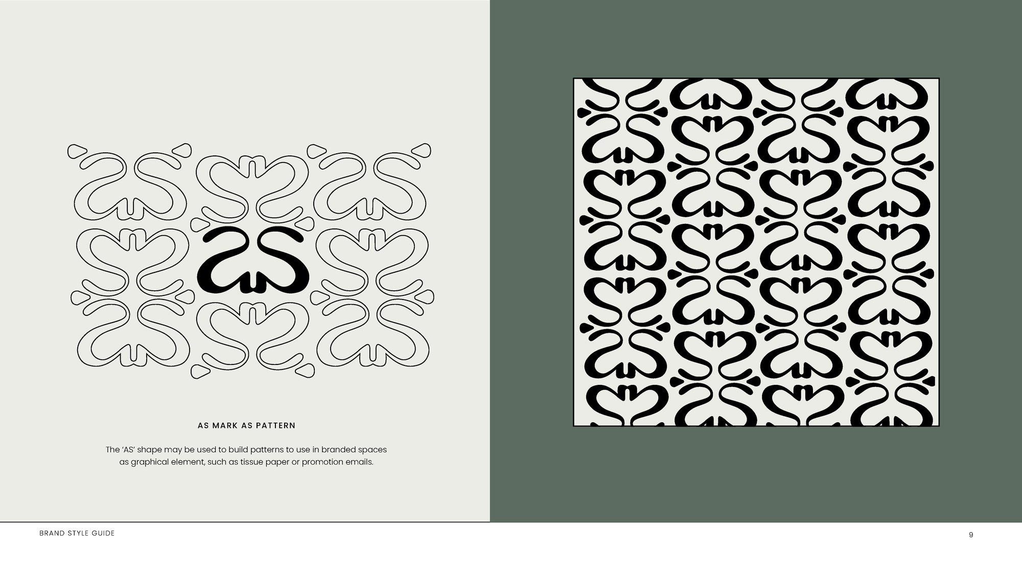
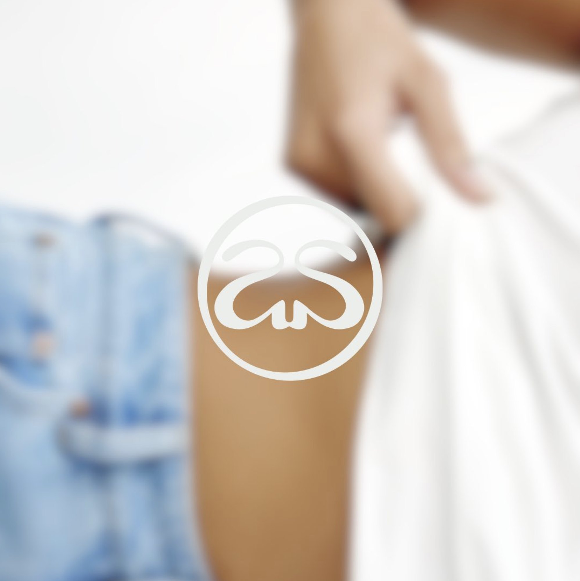
A wordmark that is modern yet curvaceous, set down in the brand style guide in August 2022. The as pulled from it works on its own as a seal, a social icon, a stitch or button detail, or a repeat pattern.
Color, type and rules
In which the system gets written down.
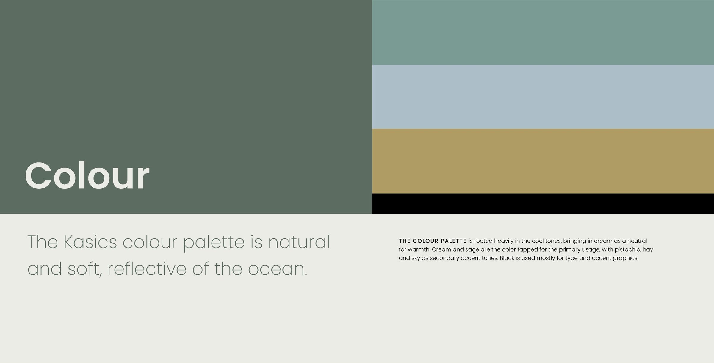
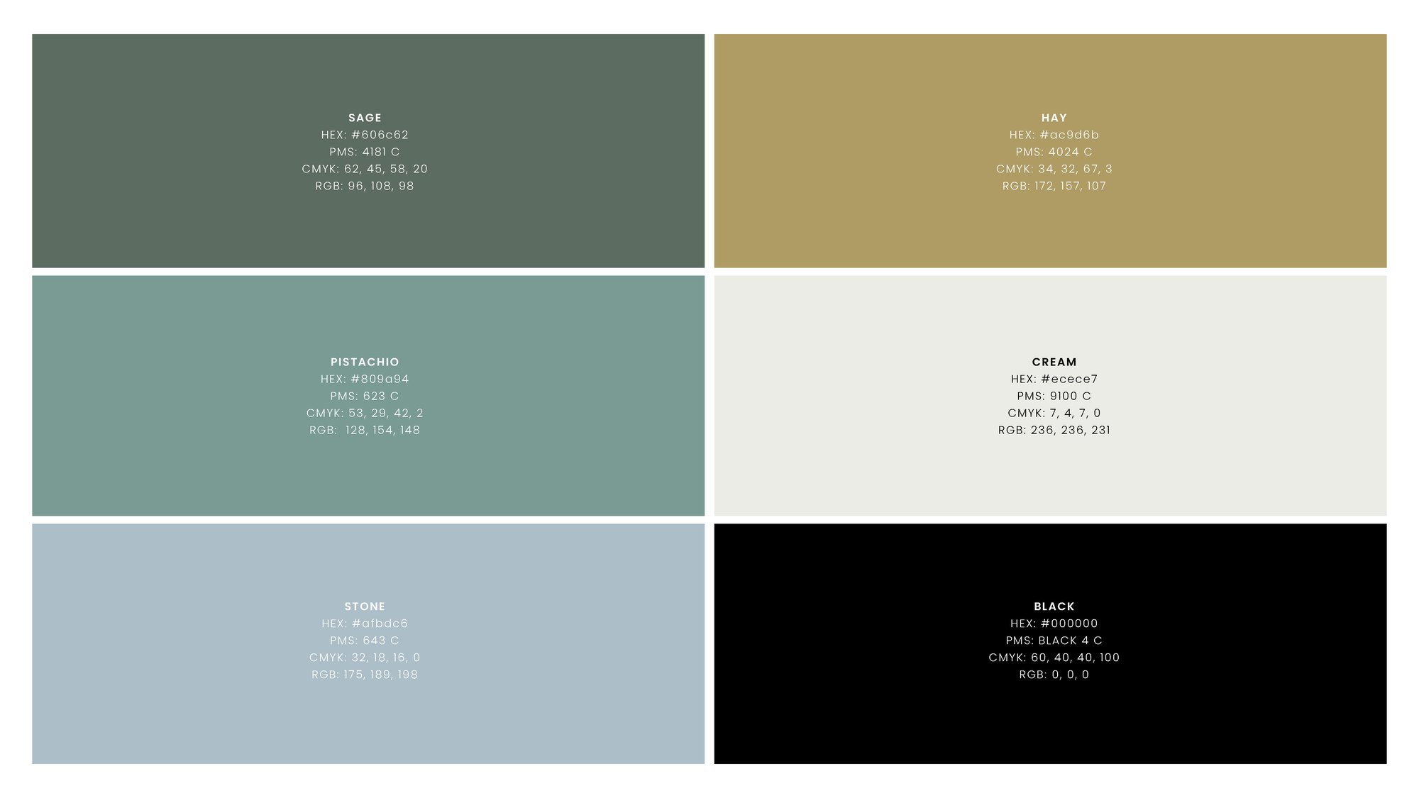
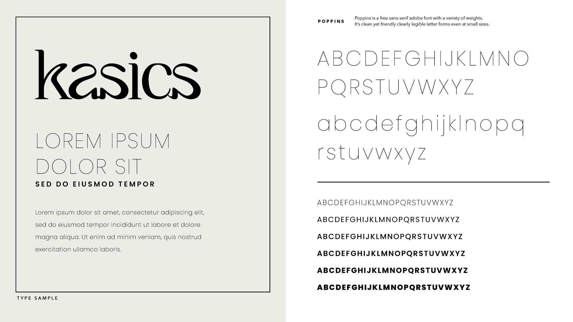
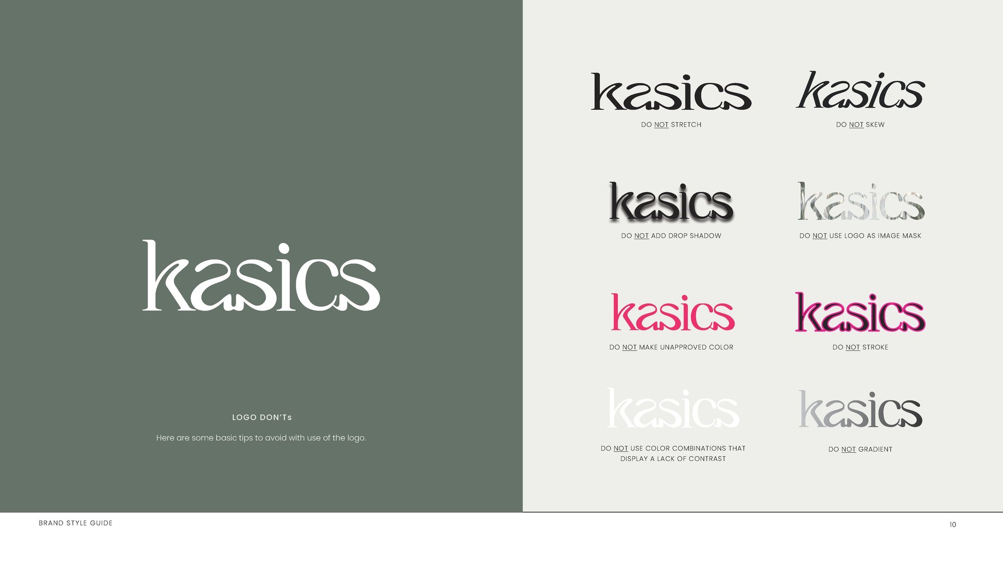
The brand style guide of August 2022 sets a palette that is natural and soft, reflective of the ocean: cream and sage first, softer accents after, black for type. Poppins is the brand typeface, and a page of don'ts keeps the logo whole.
The identity in use
In which the marks get stitched, stamped and printed.
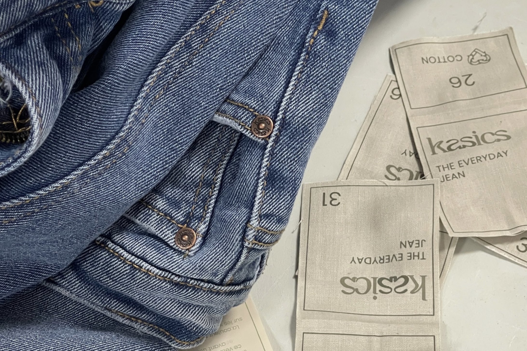
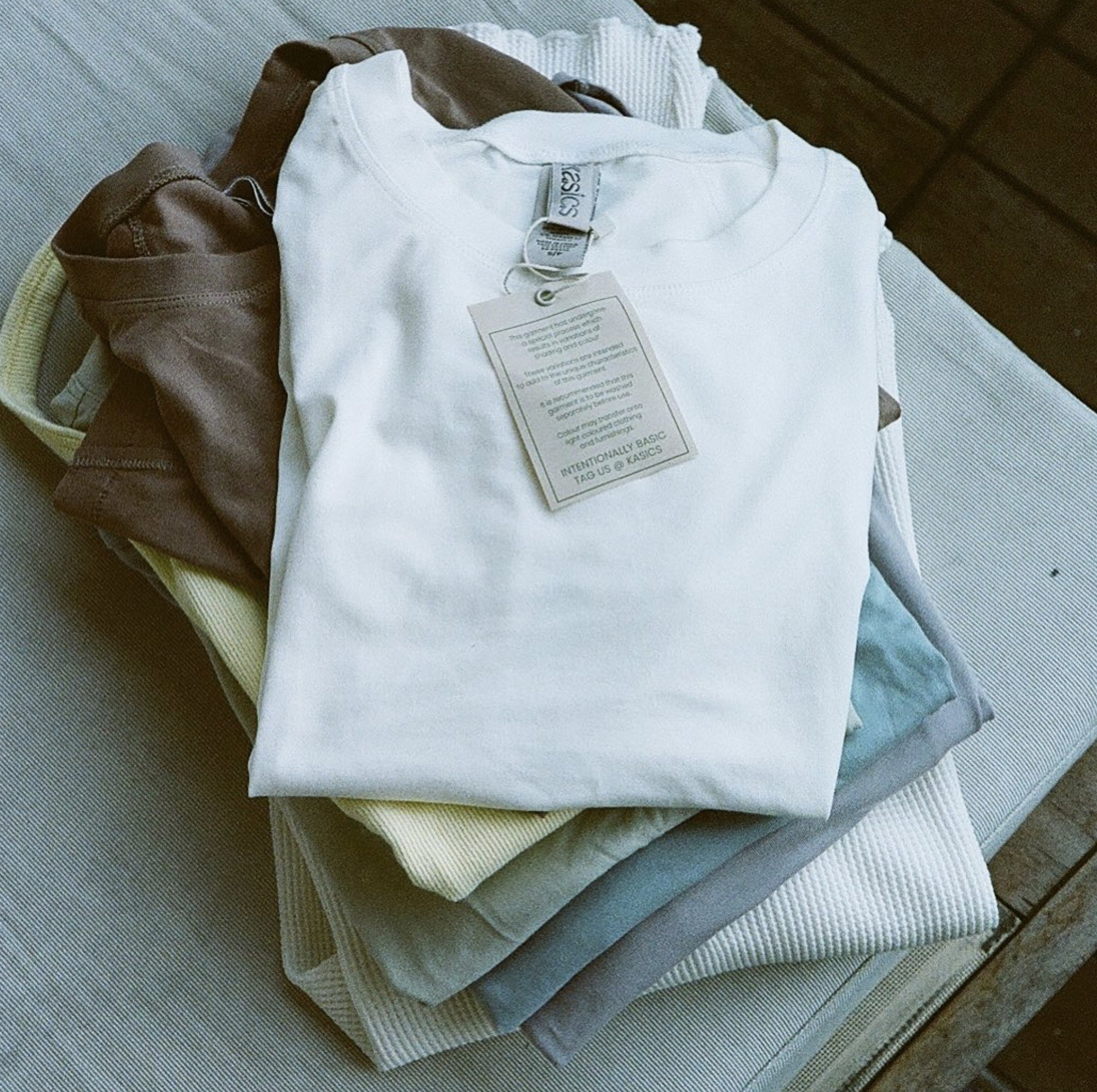
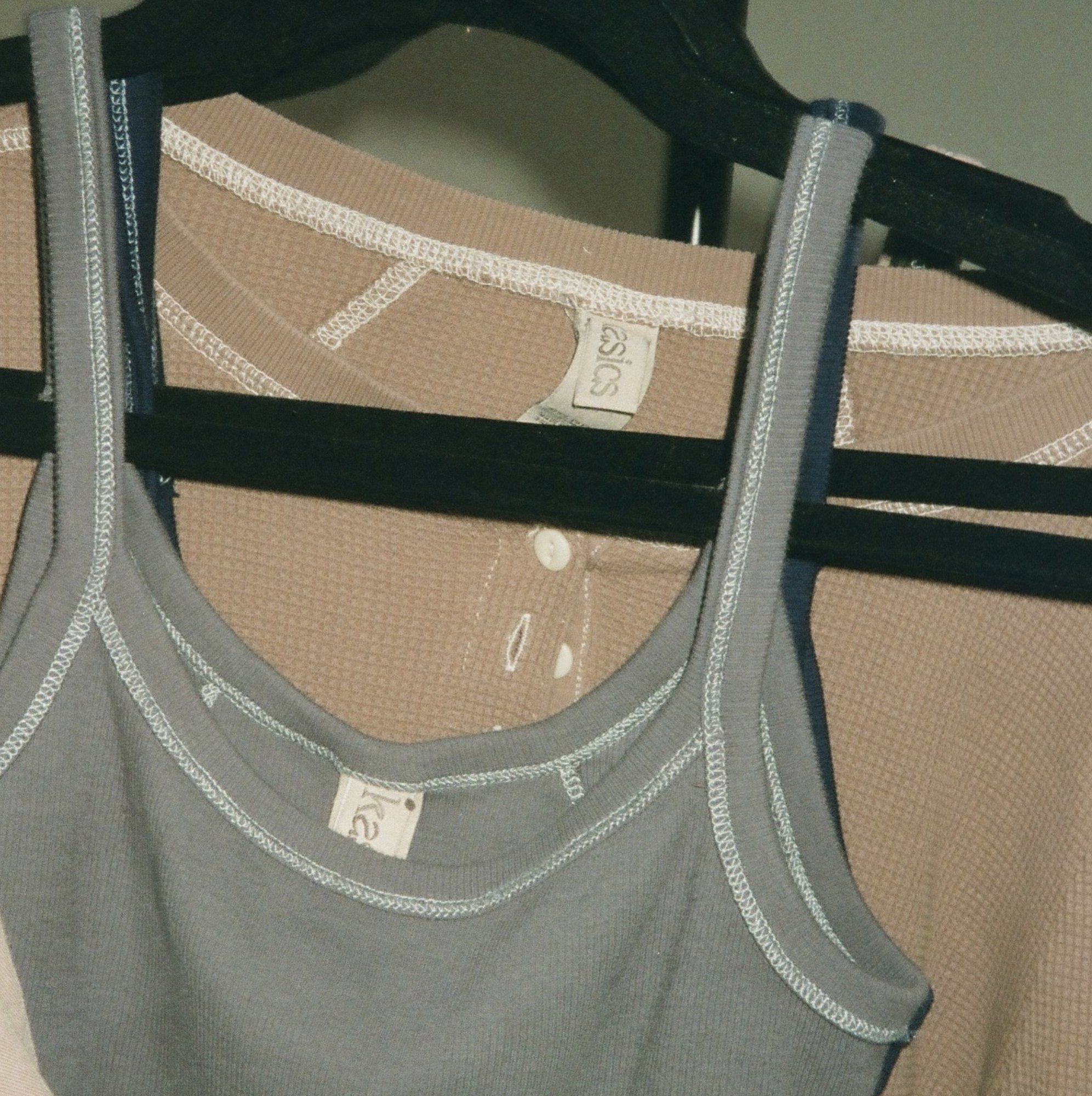
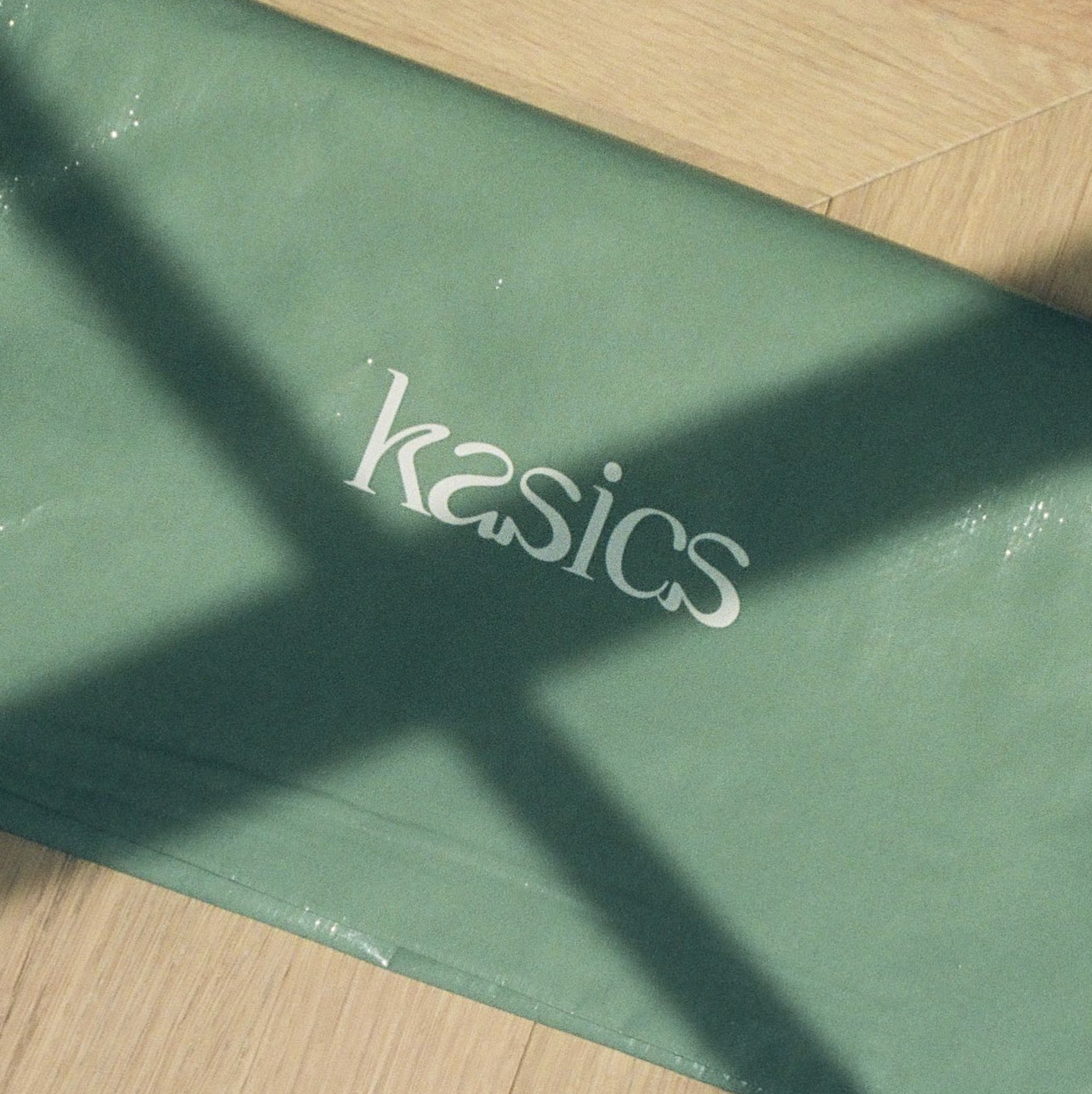
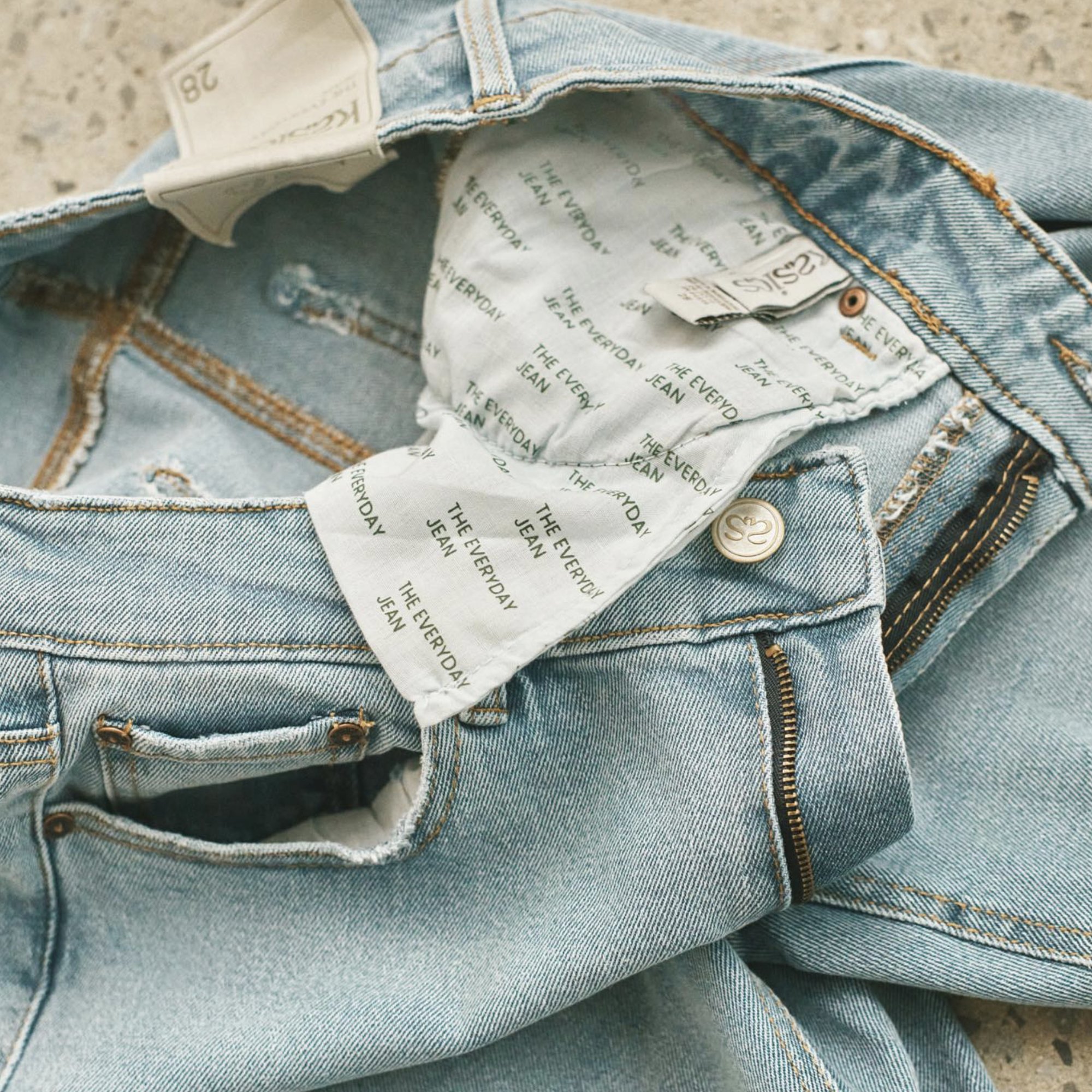
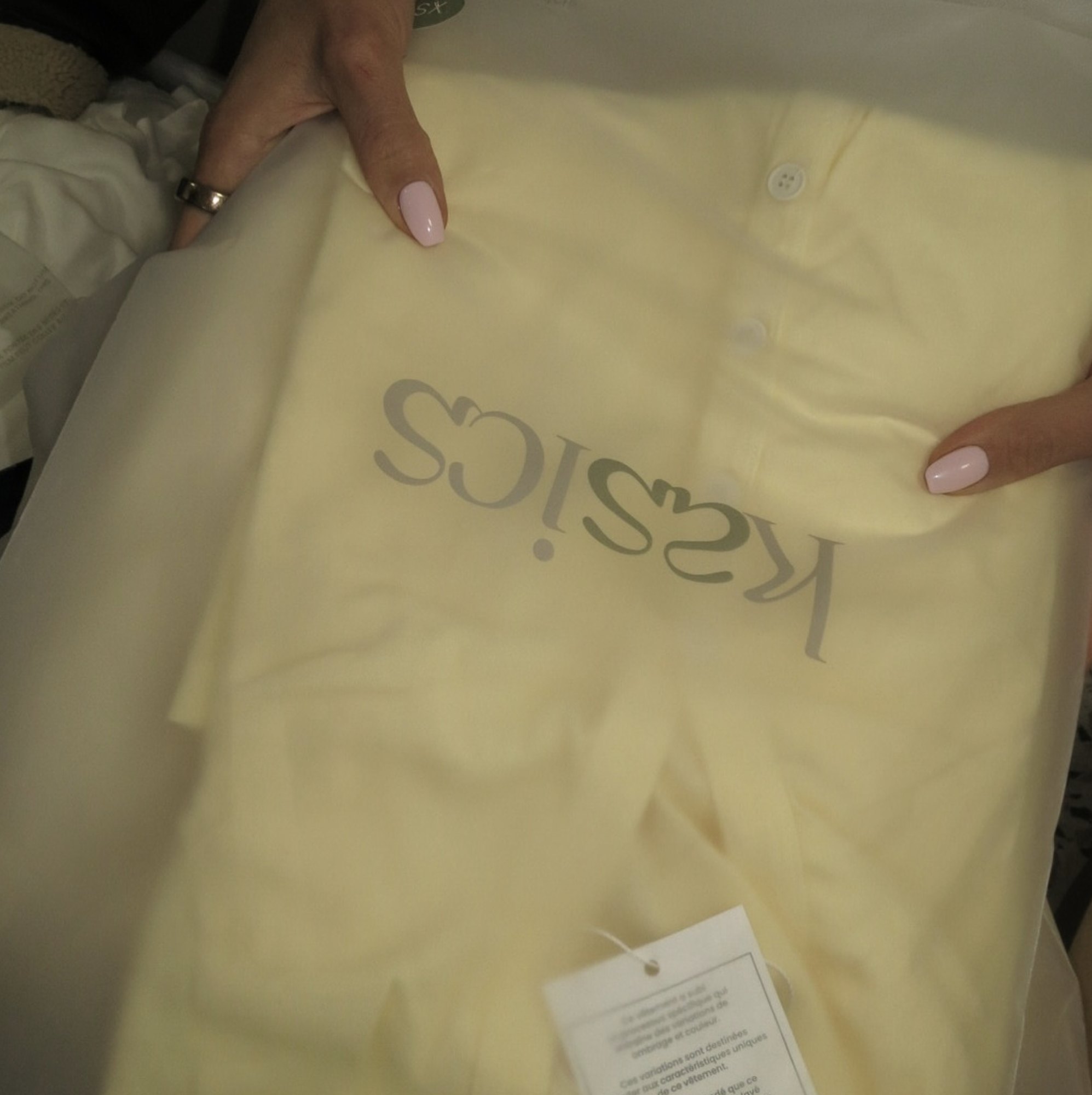
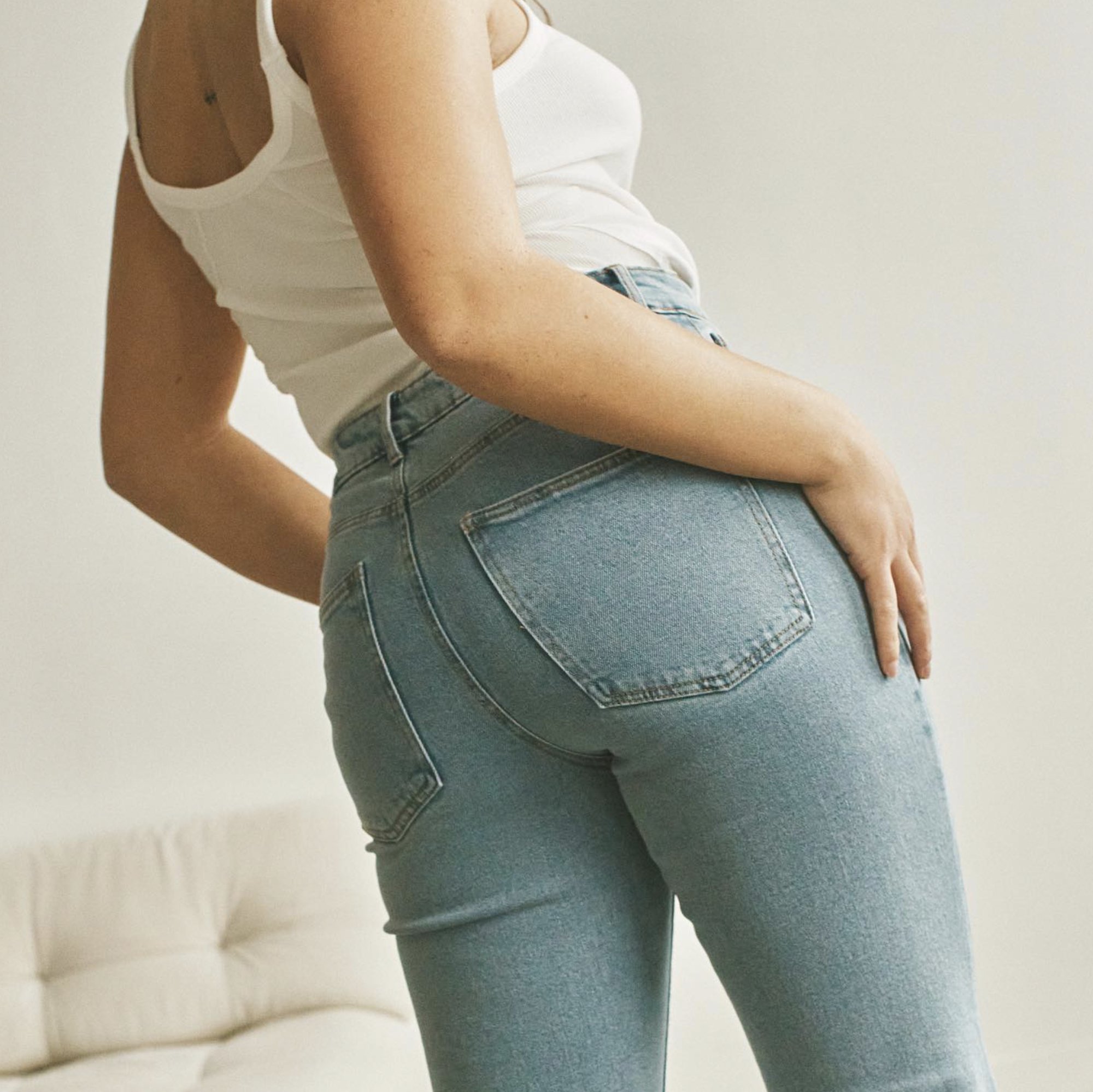
The wordmark and the as on Kasics product and packaging: woven labels for The Everyday Jean, neck labels, a hang tag that reads Intentionally basic, an as button, printed pocketing, garment packaging and sage tissue.
Photography
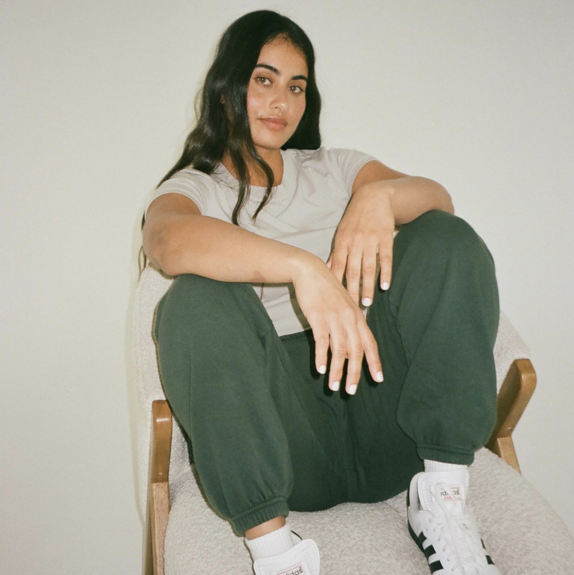
Photography: Kasics.