Jaclyn Cosmetics
The original logo and identity for Jaclyn Cosmetics, for Morphe.
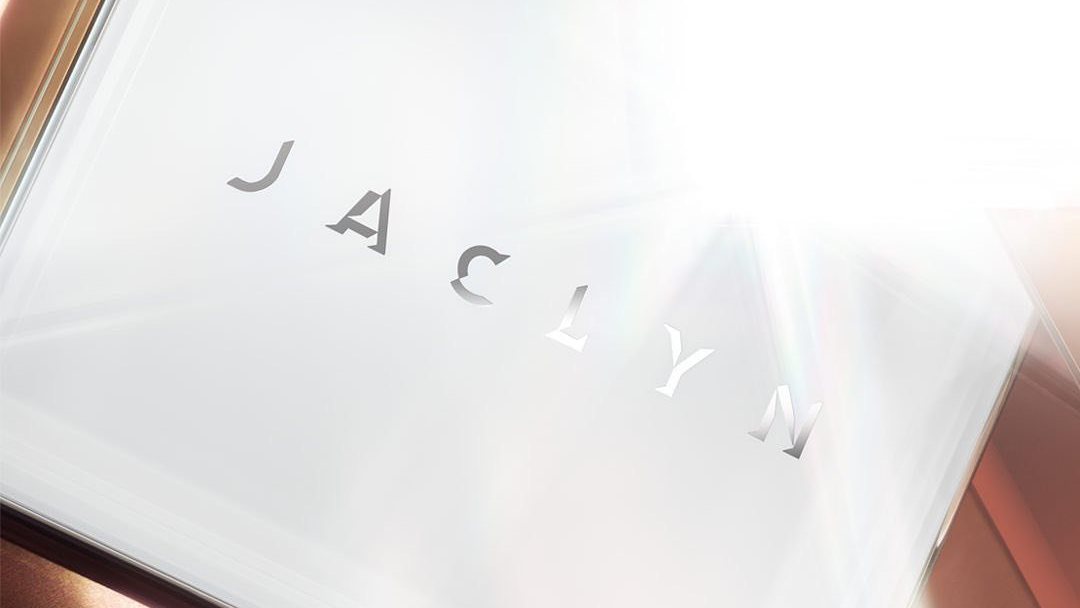
Build a beauty brand from a name: a wordmark to set, a monogram to repeat and a world to launch into.
The original logo and brand identity, for Morphe.
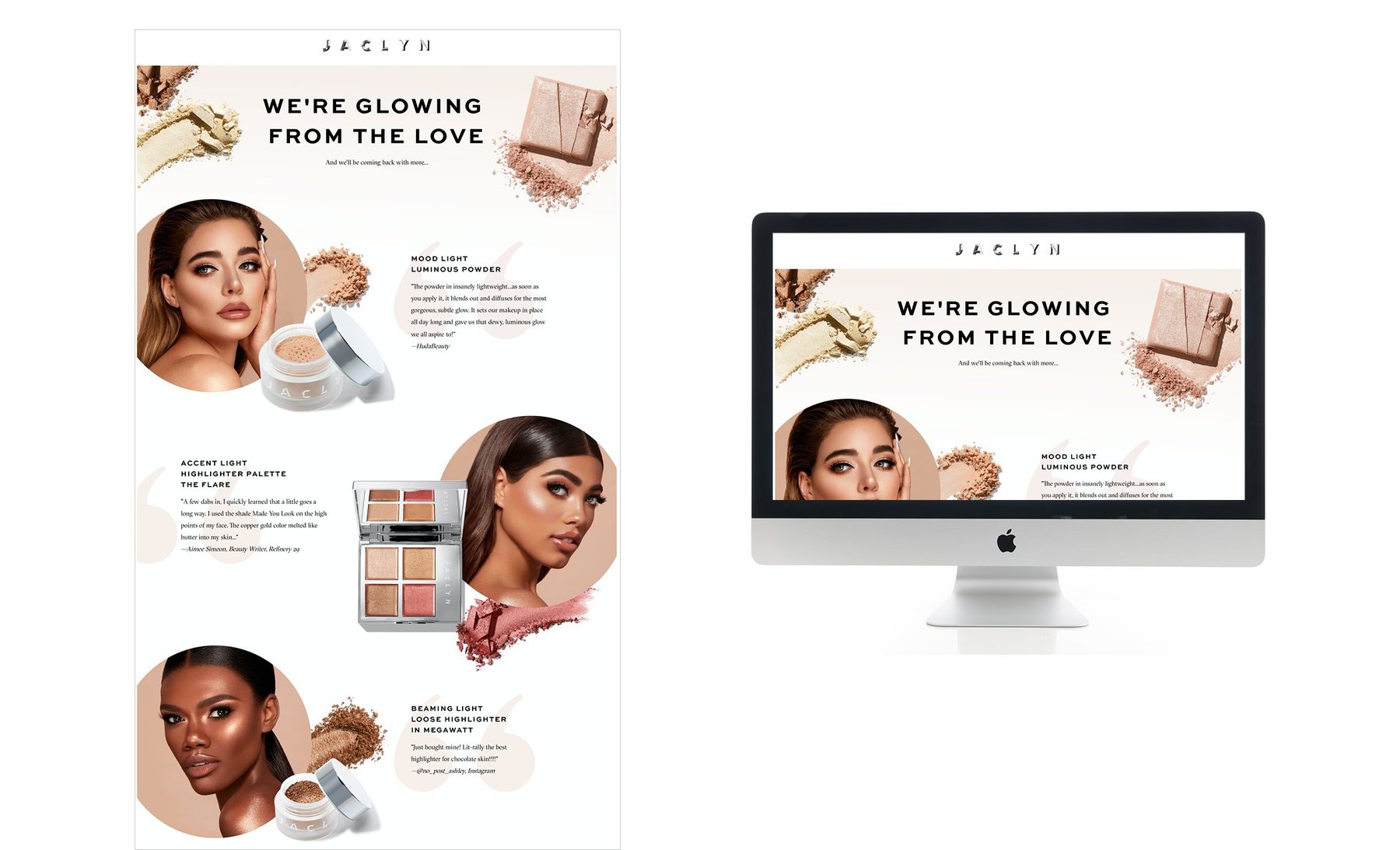
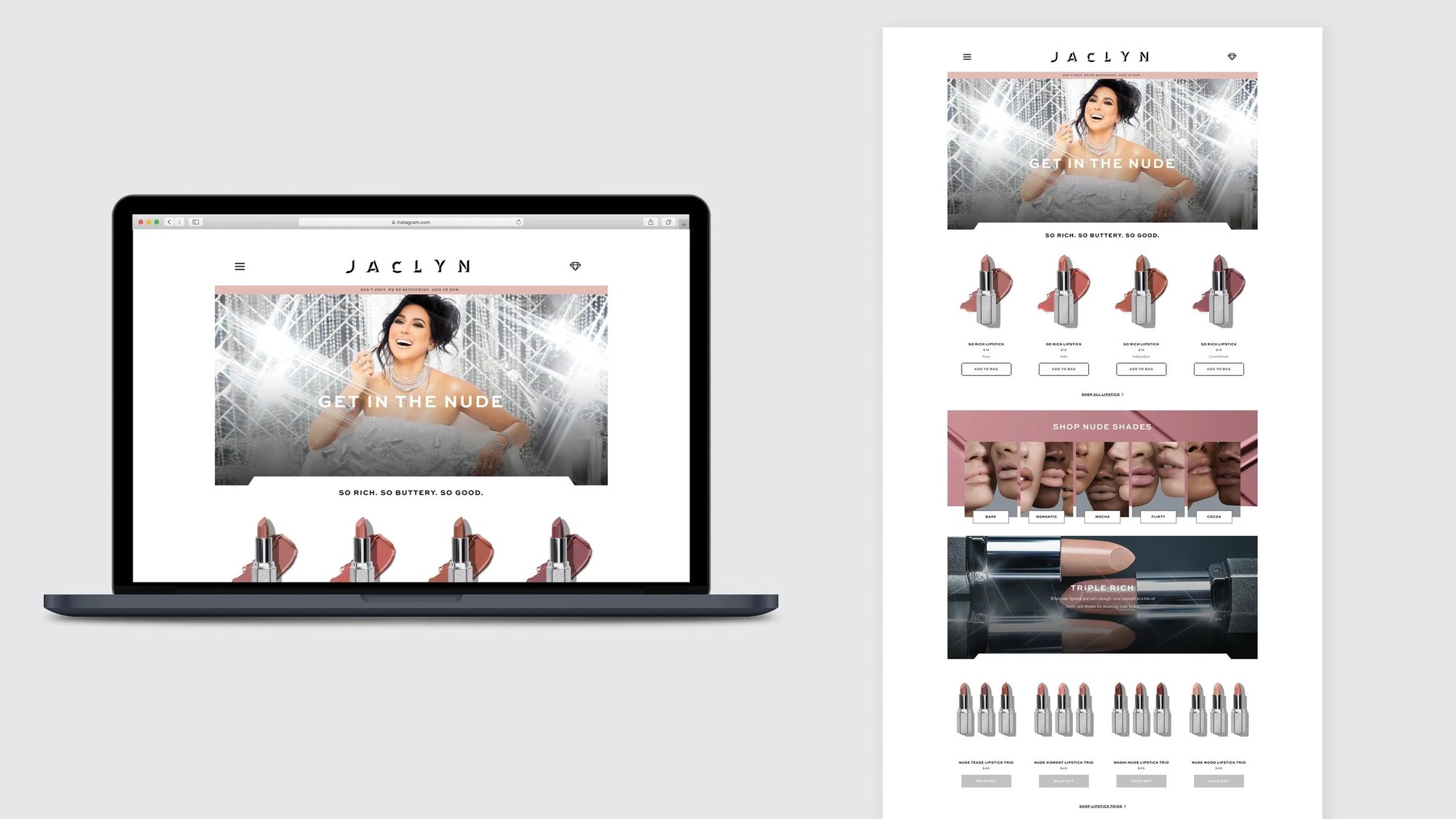
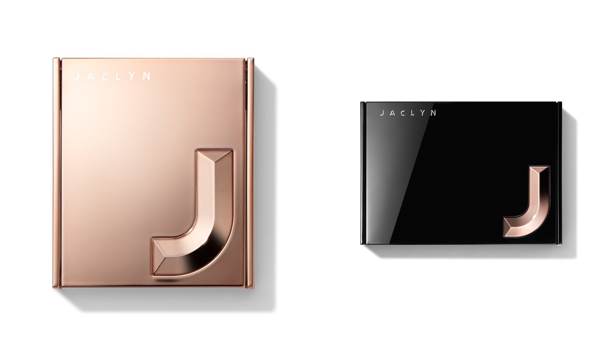
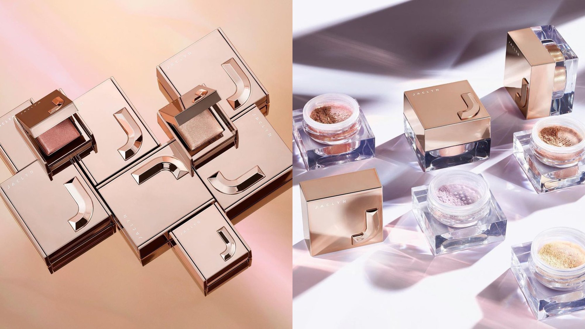
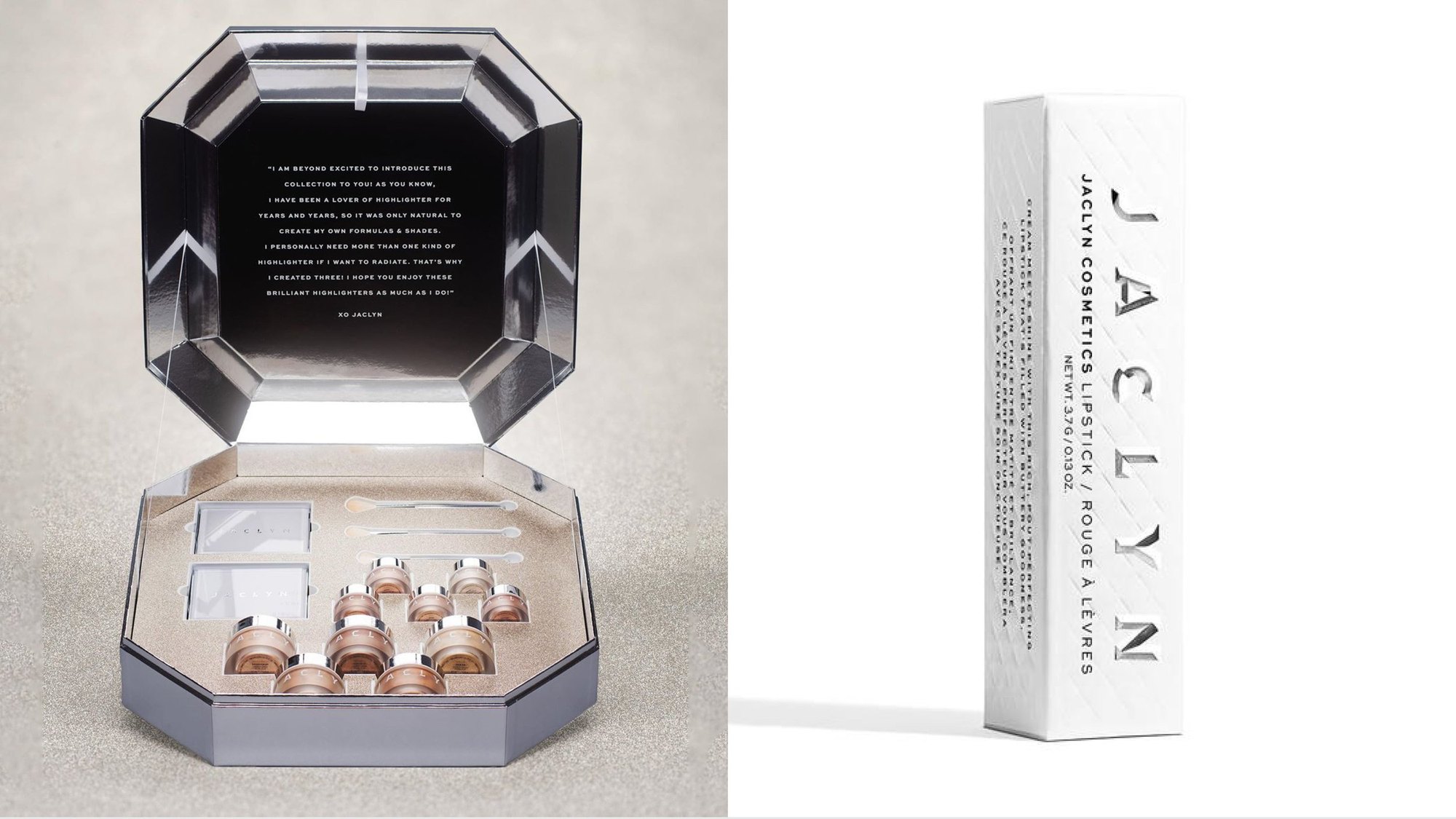
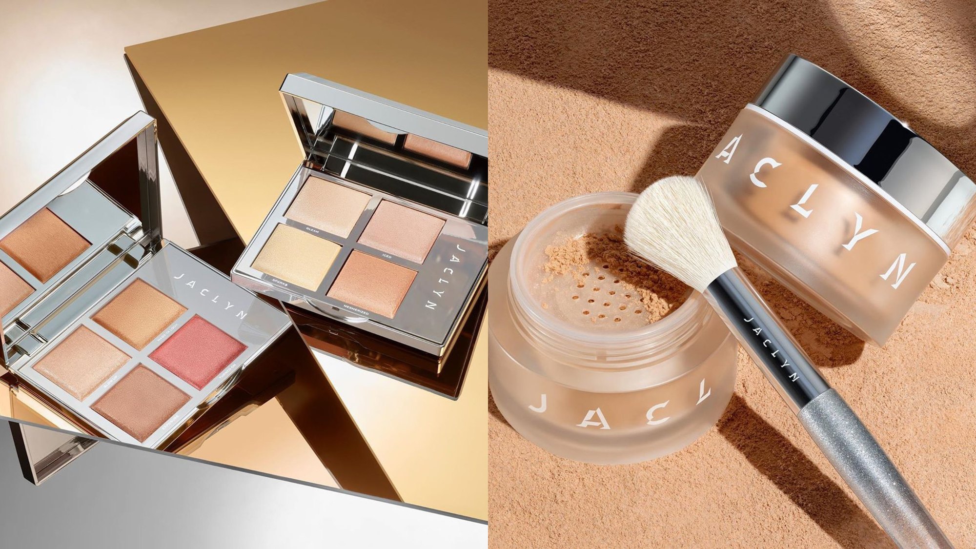
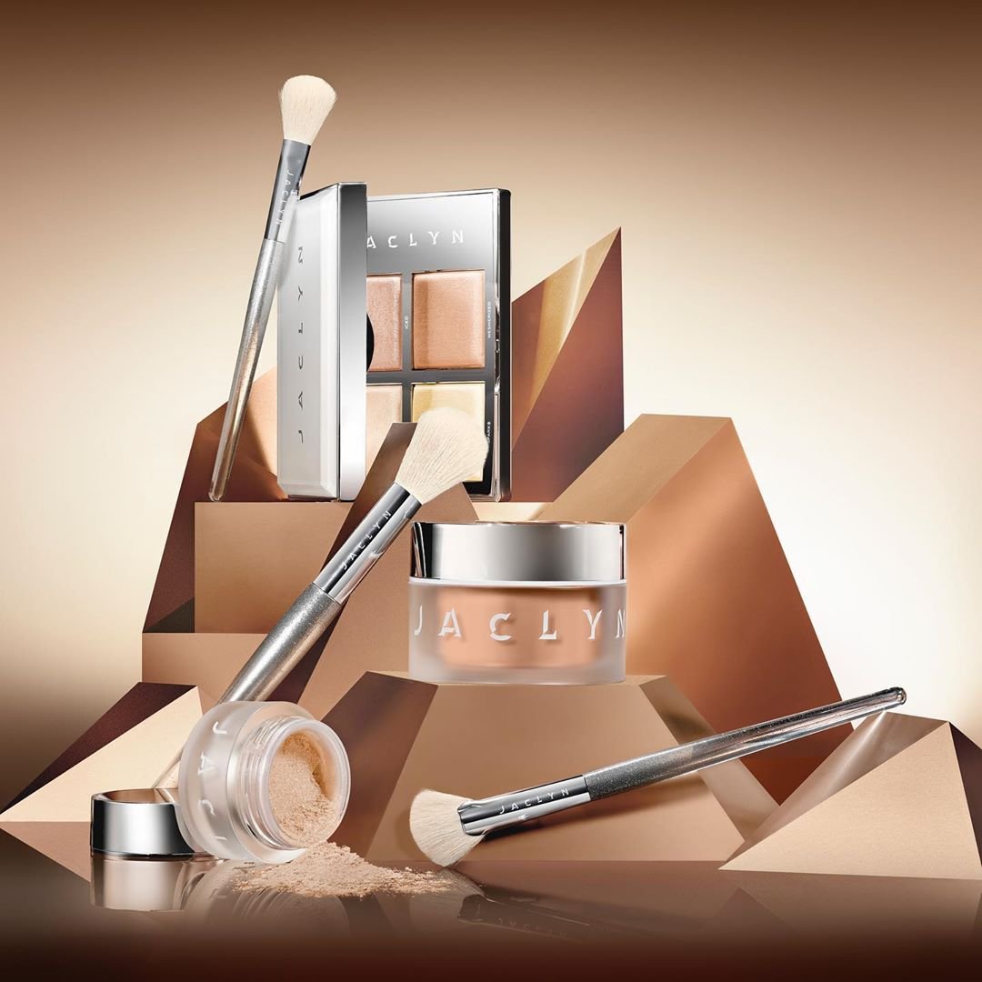
I designed the original Jaclyn Cosmetics logo and brand identity for Morphe, including packaging direction: a widely spaced wordmark, a J monogram that repeats into pattern, and a palette of chrome, nude and gold that carried the launch across compacts, brushes, site and social.
Jaclyn Hill
In which a YouTube star gets a brand of her own.
Jaclyn Hill built her following on YouTube, filming makeup videos since 2010 for millions of subscribers. Her line, it is more than just makeup, set the tone: the brand had to feel like her channel, then go further.

The wordmark
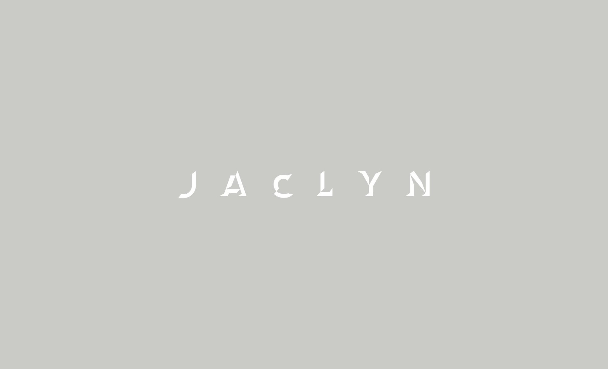
In which the letters are cut like a diamond.
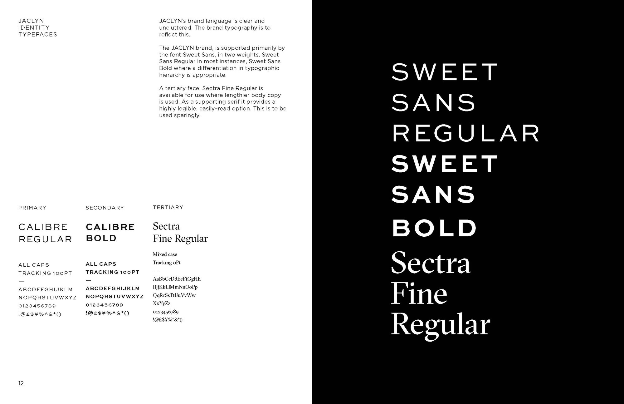
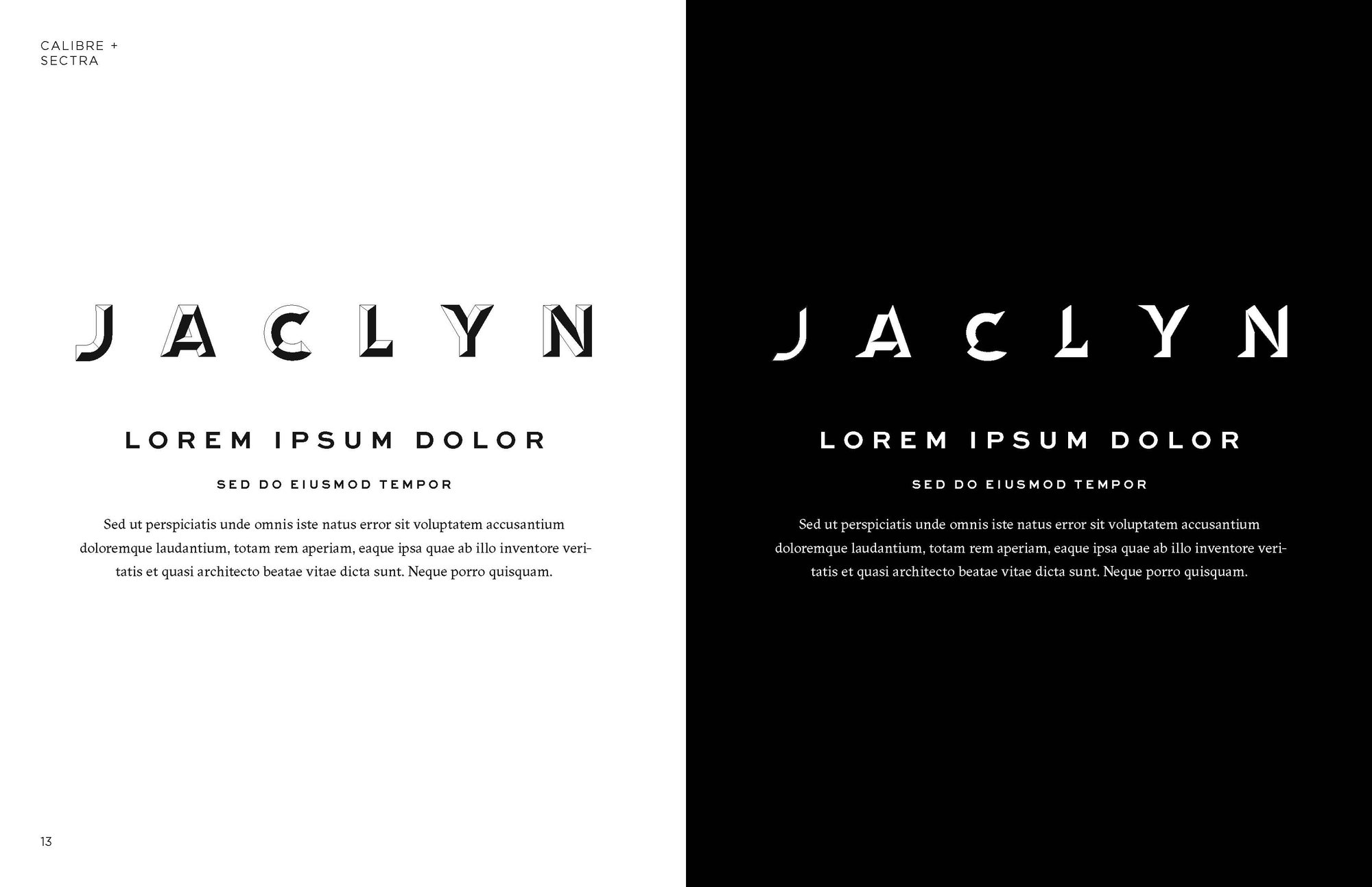
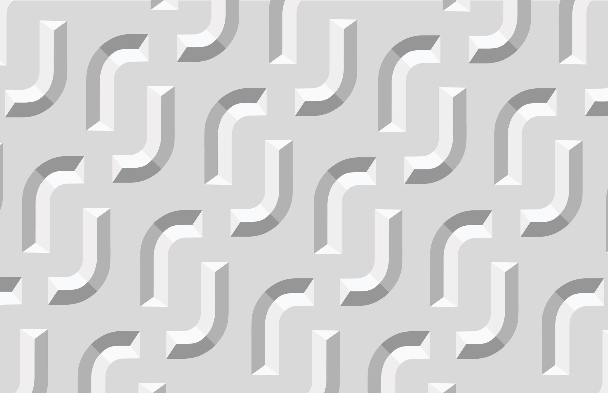
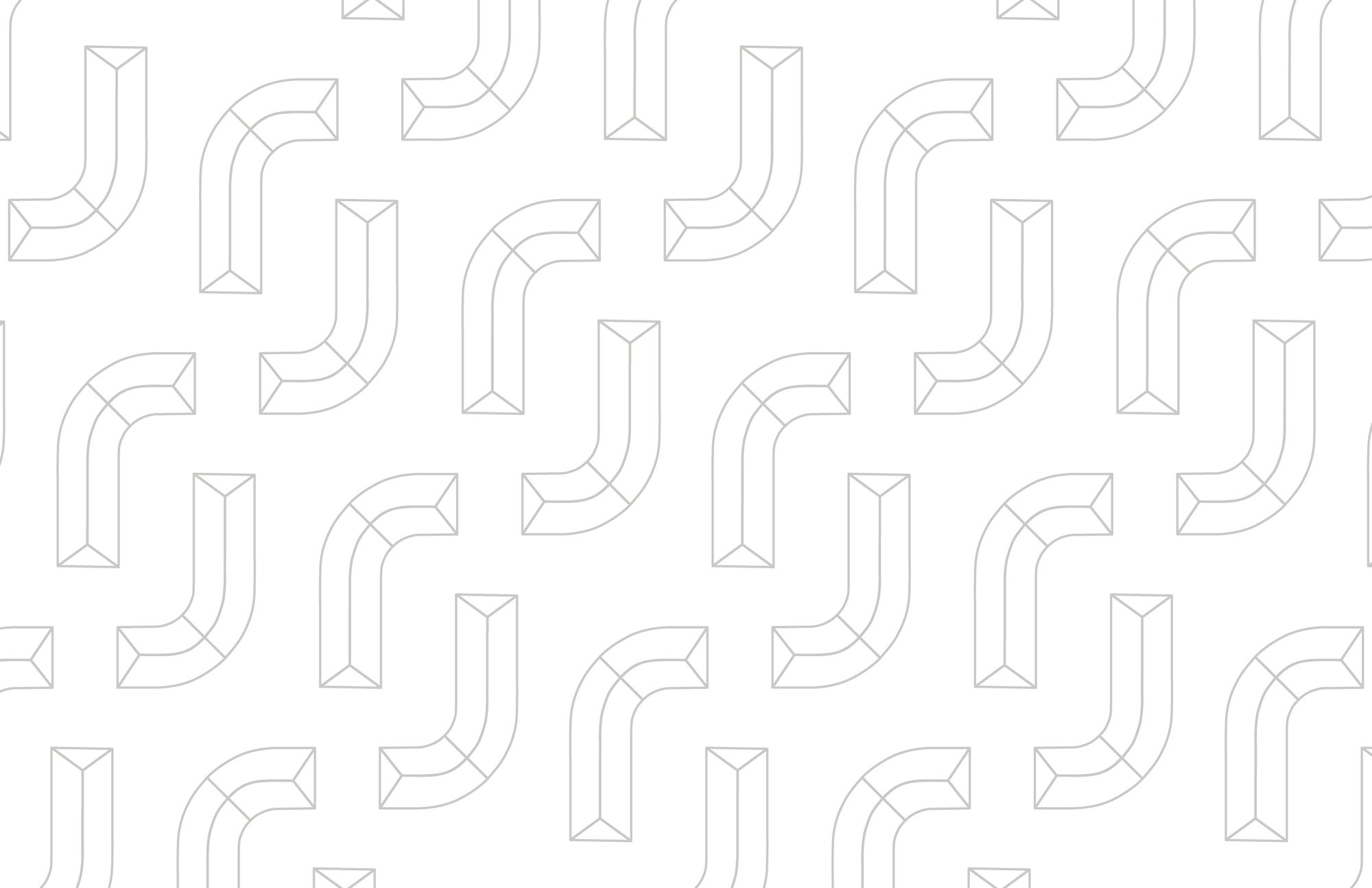
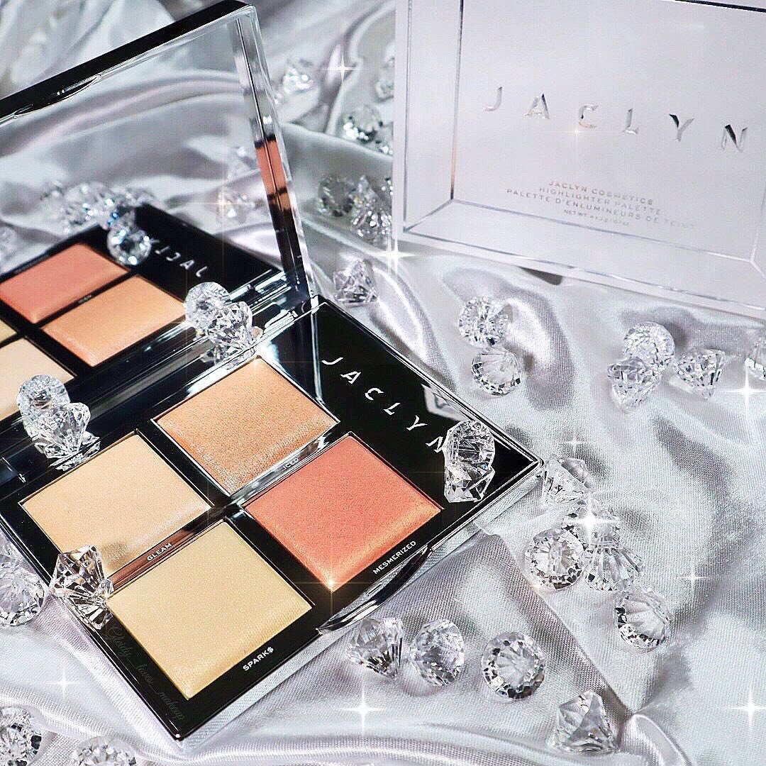
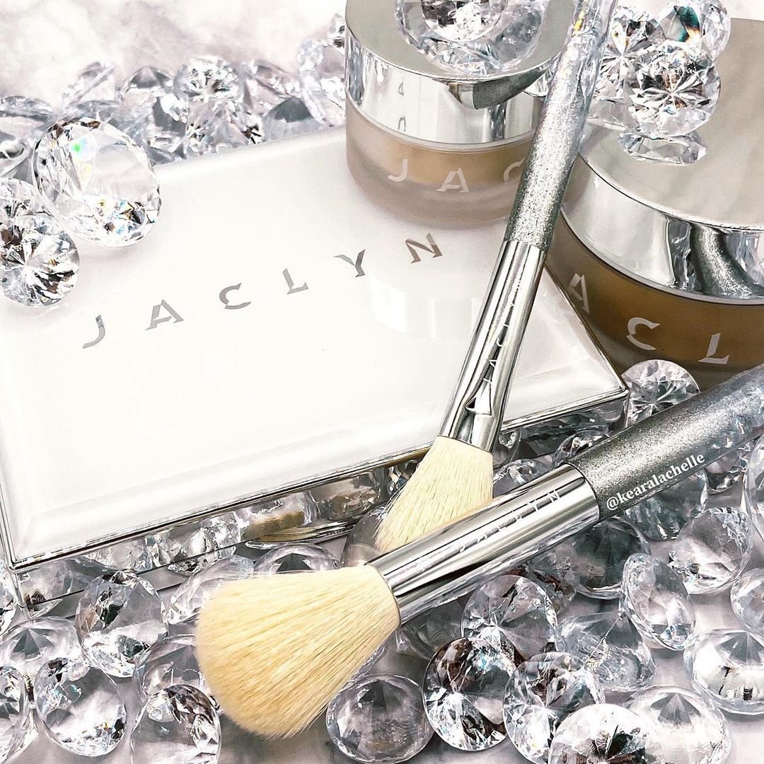
The wordmark is a custom typeface I drew, inspired by the cuts on a diamond. Set wide, with a faceted J monogram that repeats into pattern, all set out in a style guide so the brand could grow without me in the room.

Chrome, nude and gold
In which the monogram goes on everything.
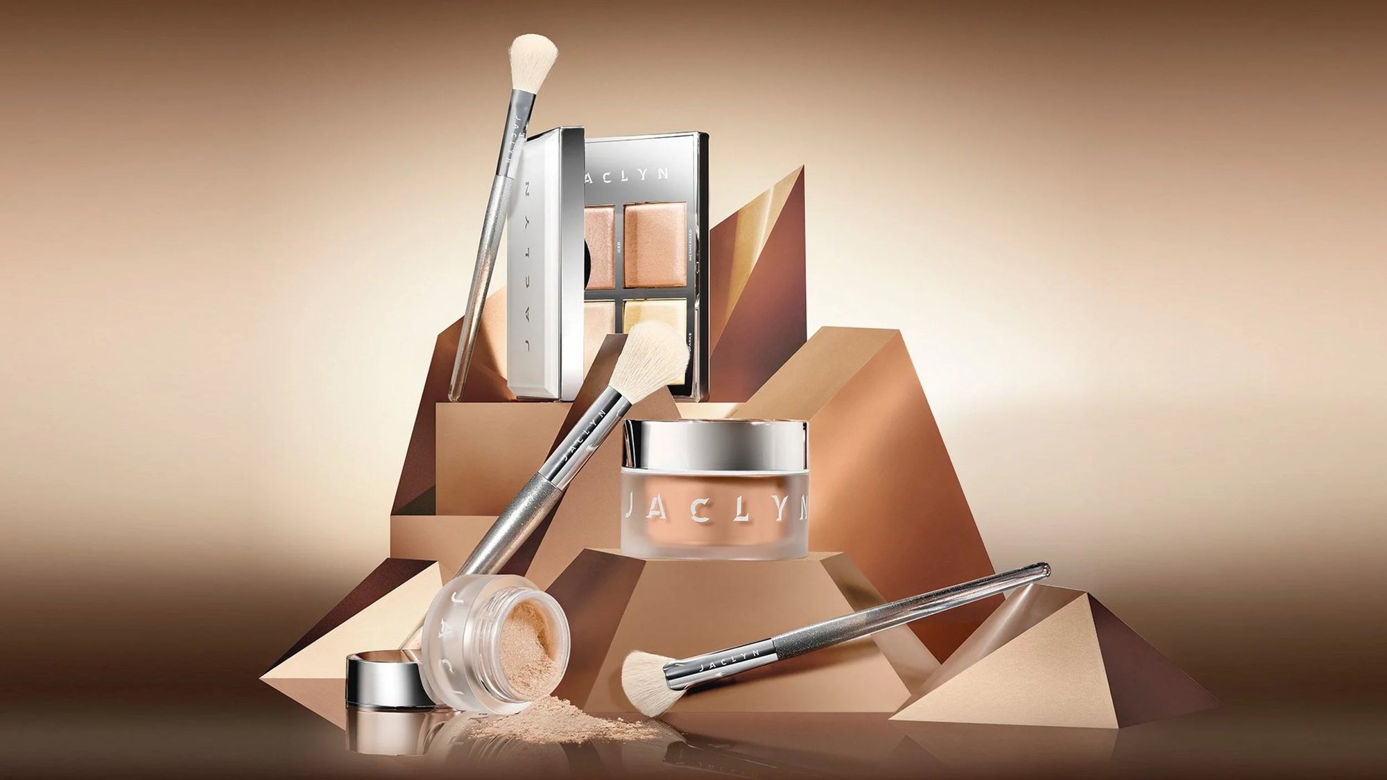
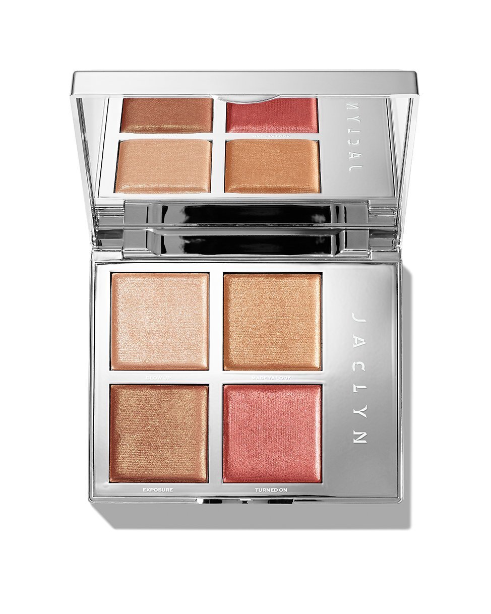
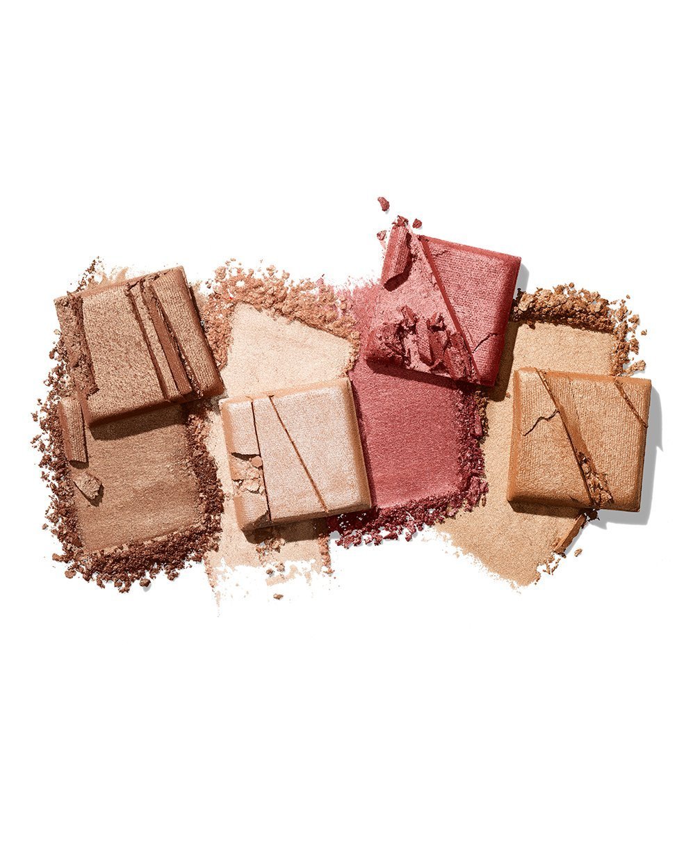
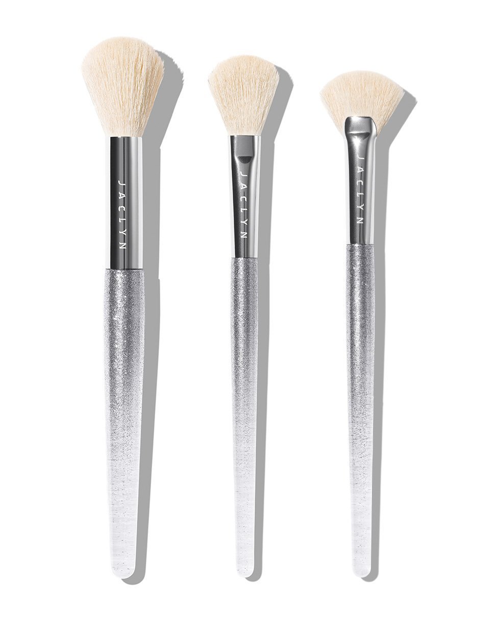
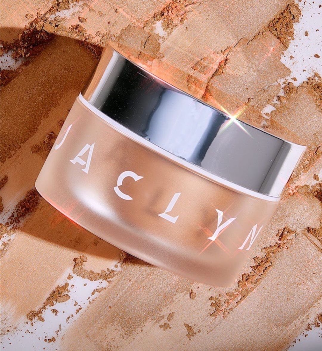
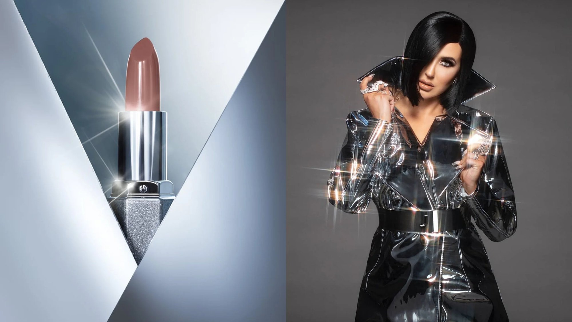
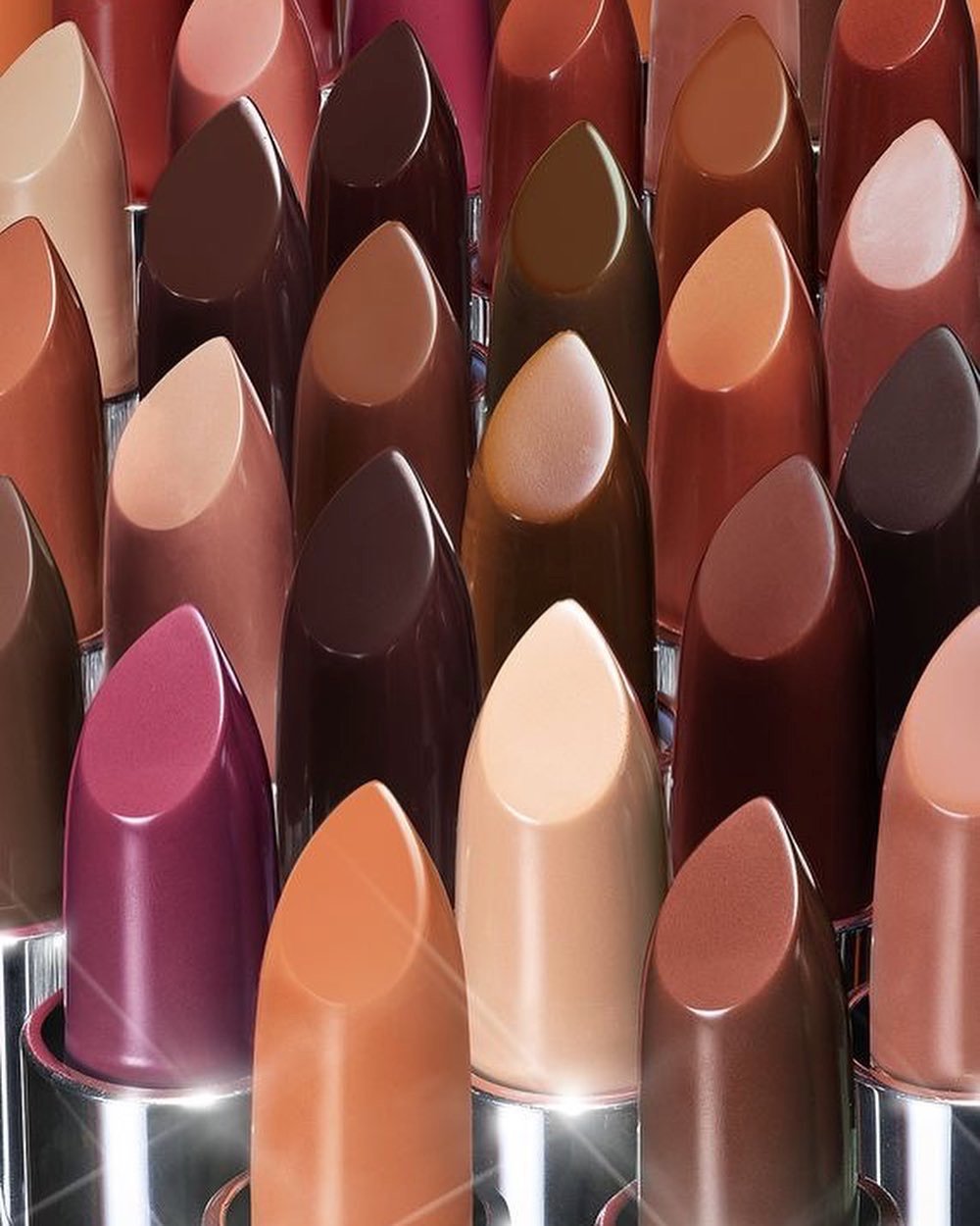
Packaging direction for compacts, palettes, brushes and jars: high-shine mirror surfaces and an oversized, dimensional J that sits on every lid.

The campaign
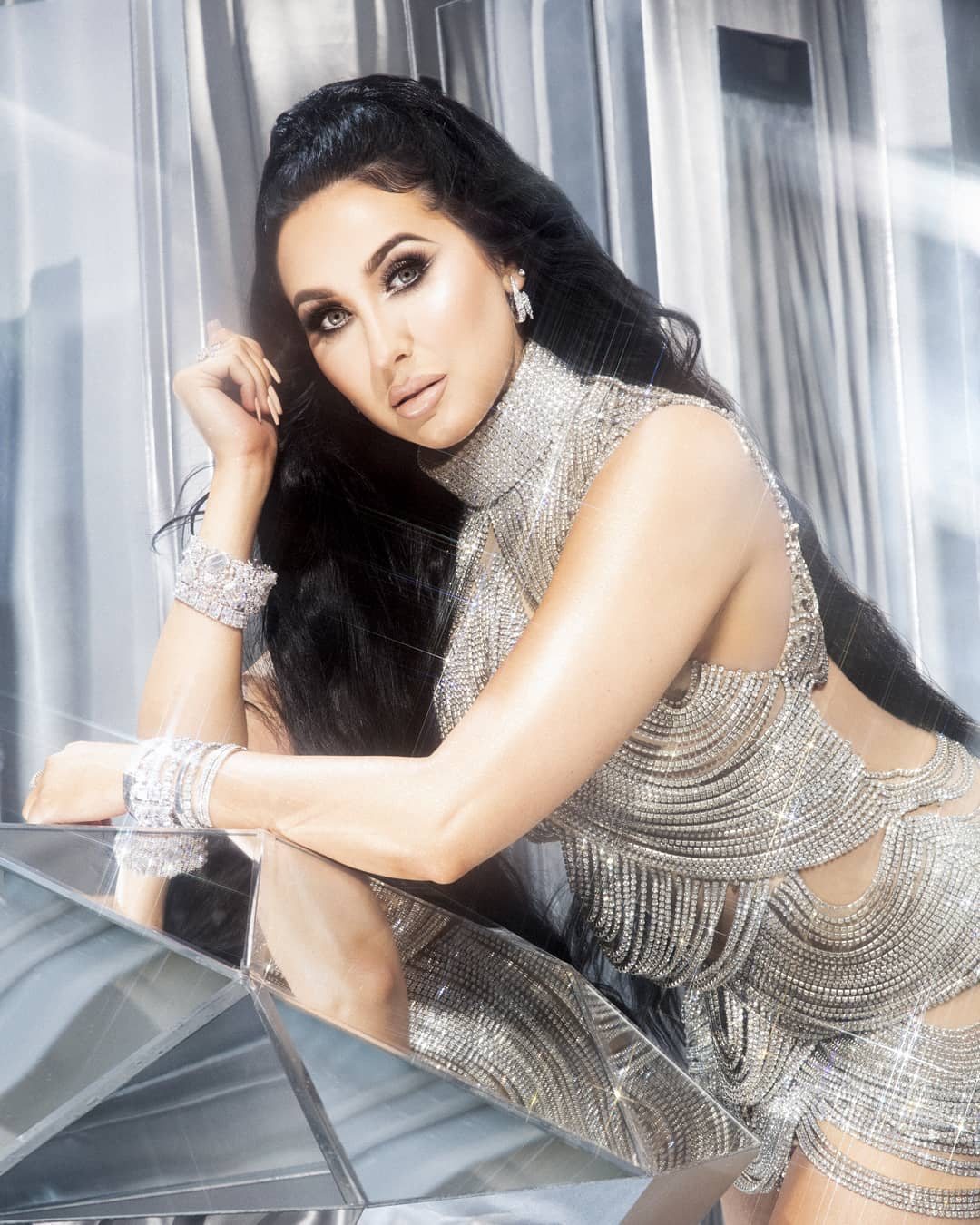
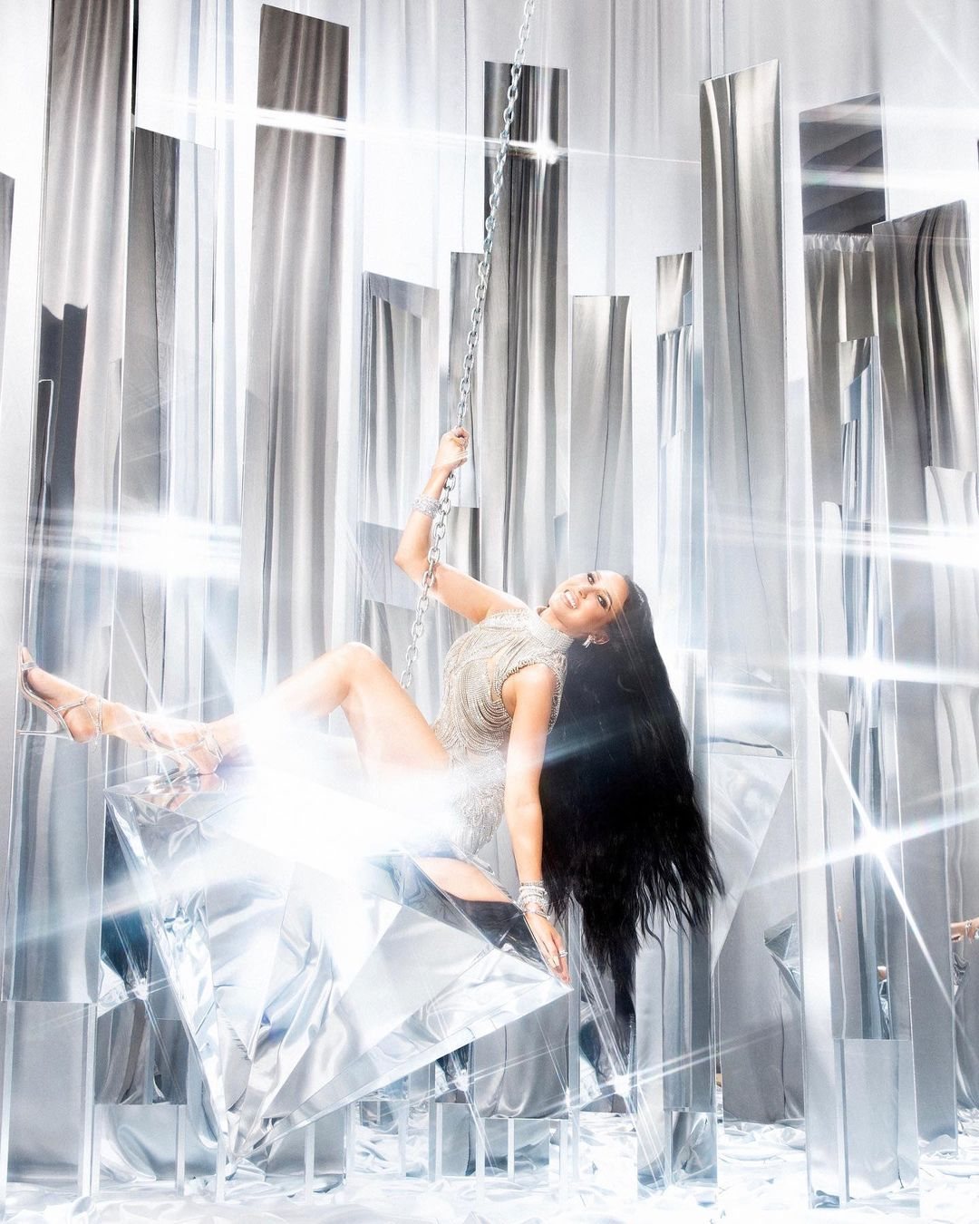
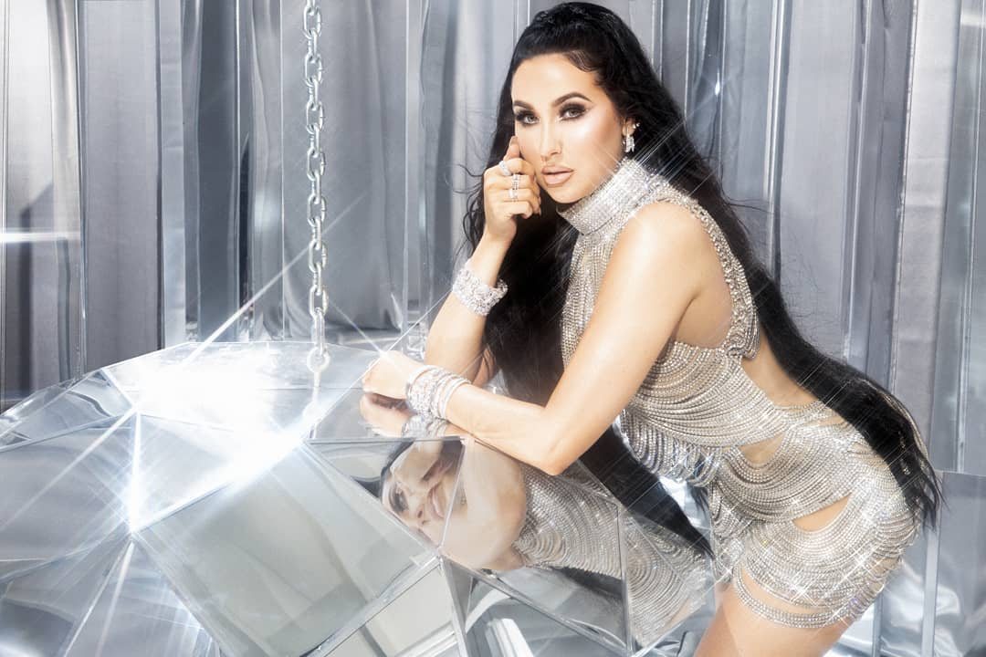
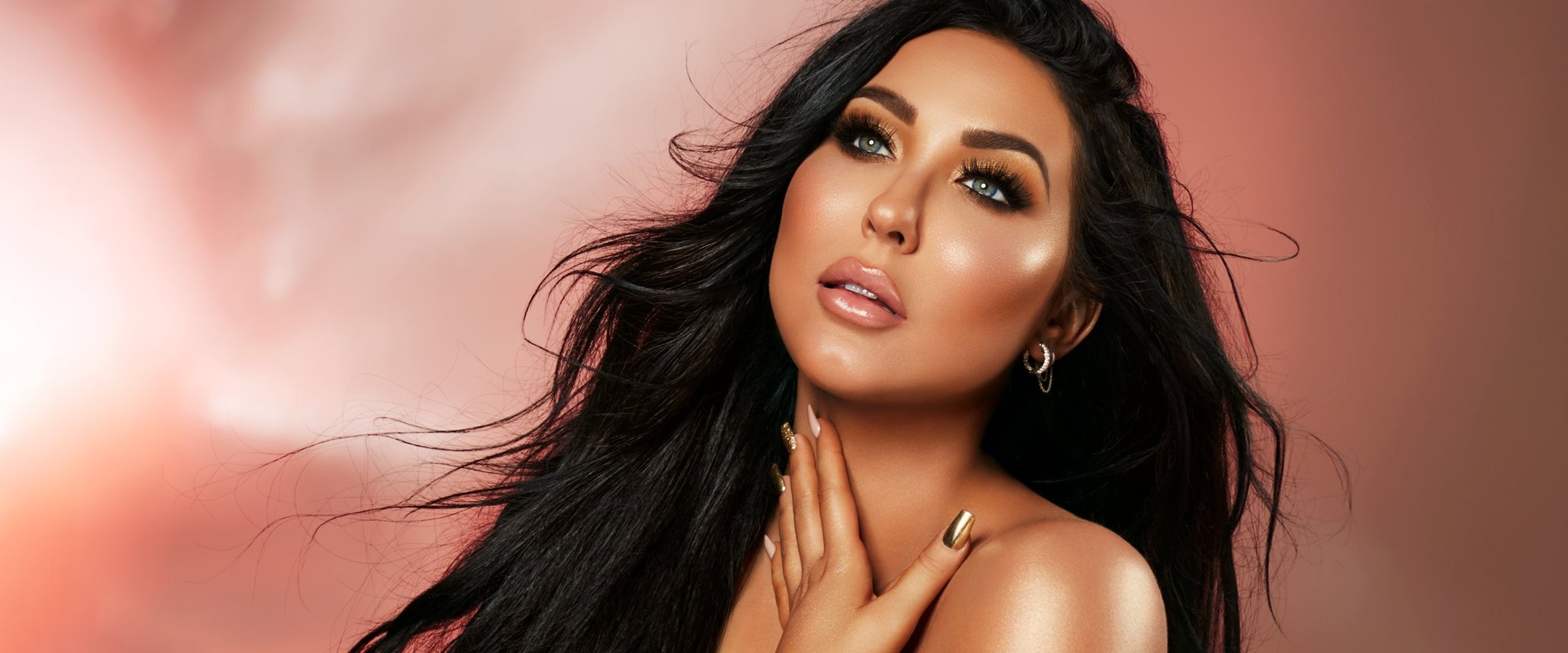
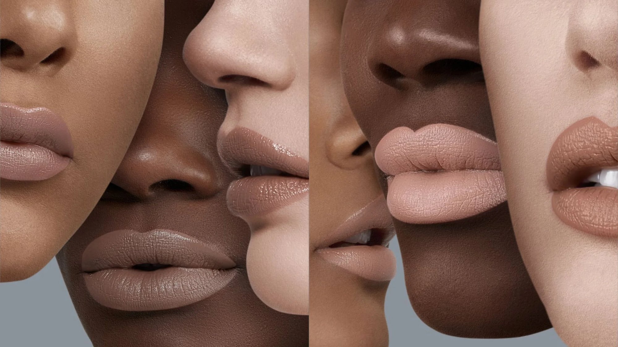
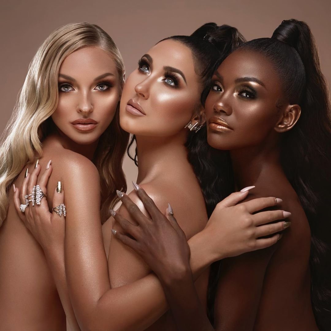
In which the brand gets a face.
Credit
Campaign and product photography by Keate and Warwick Saint. Images courtesy of Alex Freund, Freund Studio.