Zak.
An eye care shop that wants you to give a damn about your eyes.

Zak. exists to connect you to your eyes.
From the mission page of the style guide, April 2019.
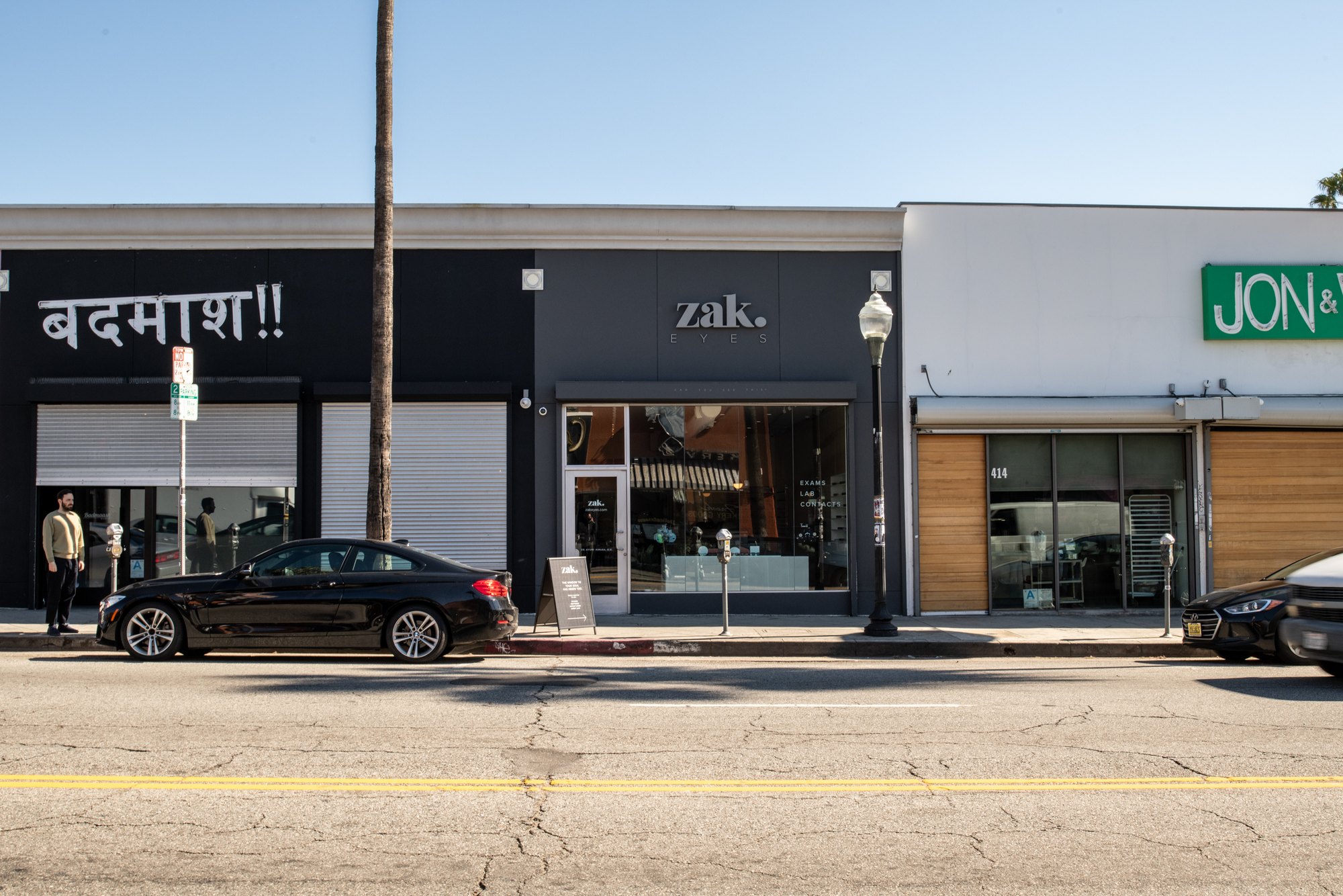
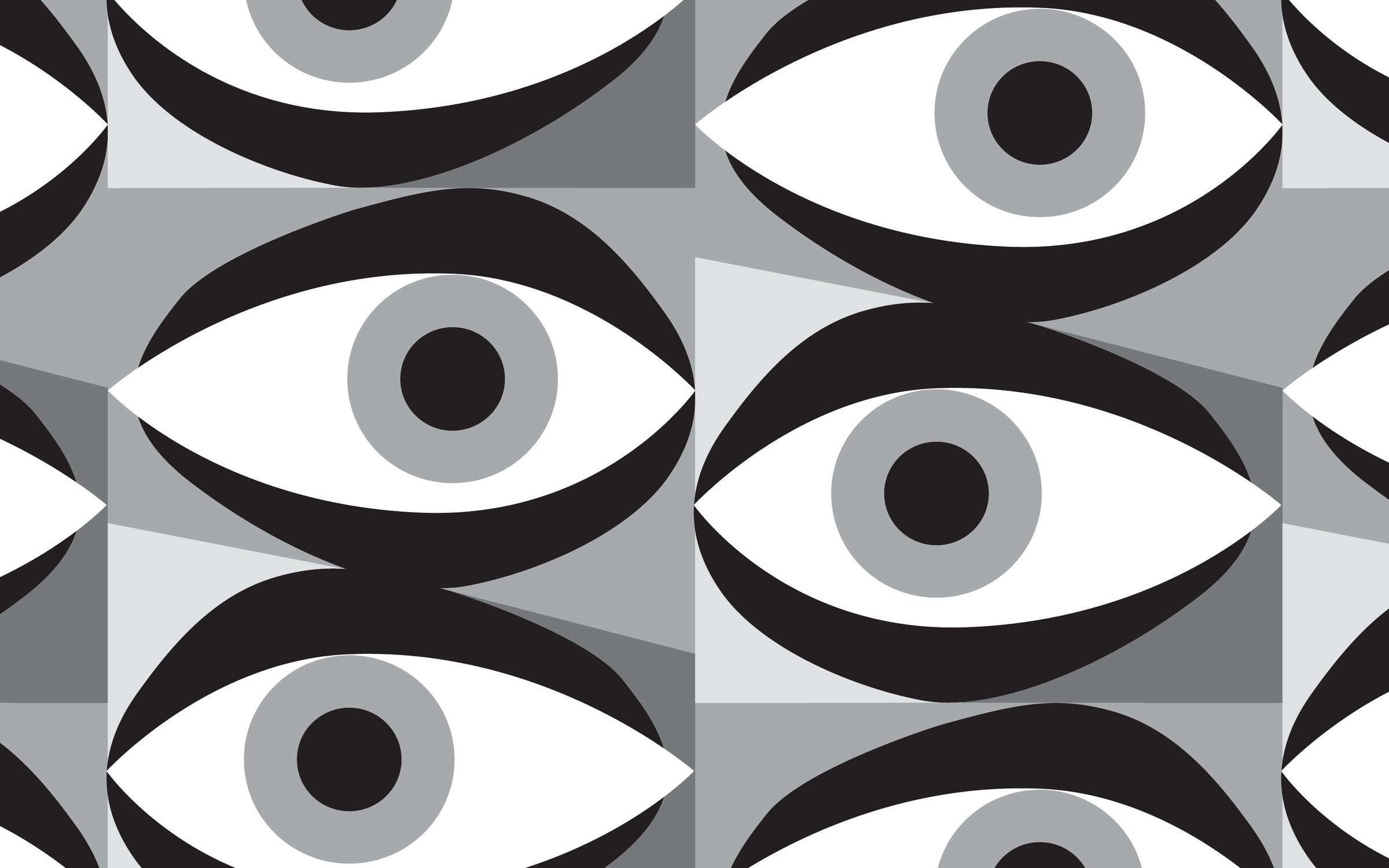
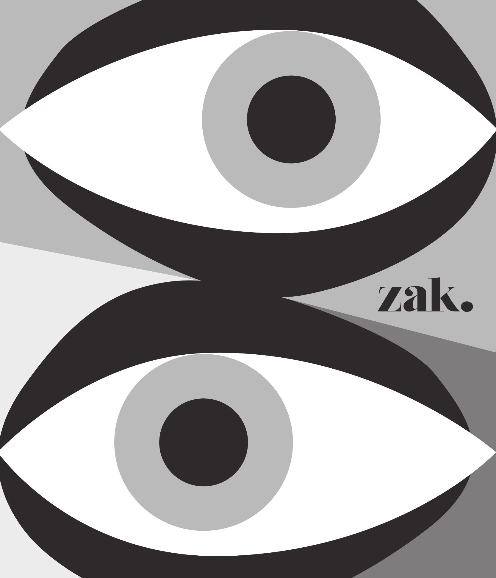
Zak. is an eyewear and eye care shop on Fairfax Avenue in Los Angeles, started on the idea that eyes deserve the same rituals as skin, hair and nails. The wordmark and the photography came from Zak. I built the world around them: an eye illustration, a palette and a style guide, then carried it through social, email, in-store print and signage from 2019 into 2020.
Pictures first
In which the shop and the campaign set the scene.
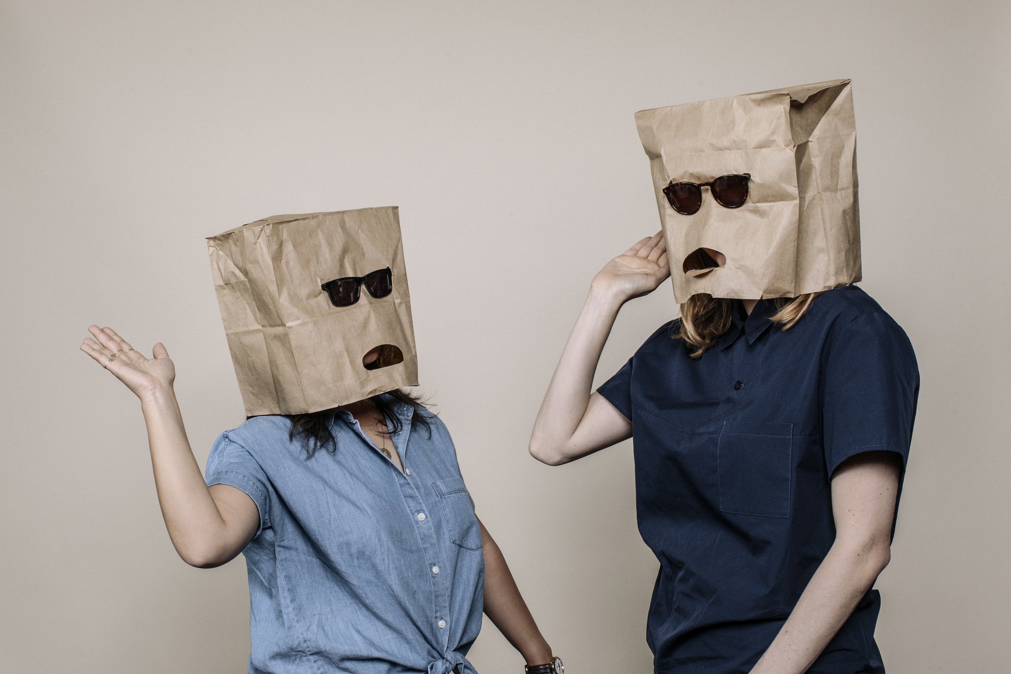
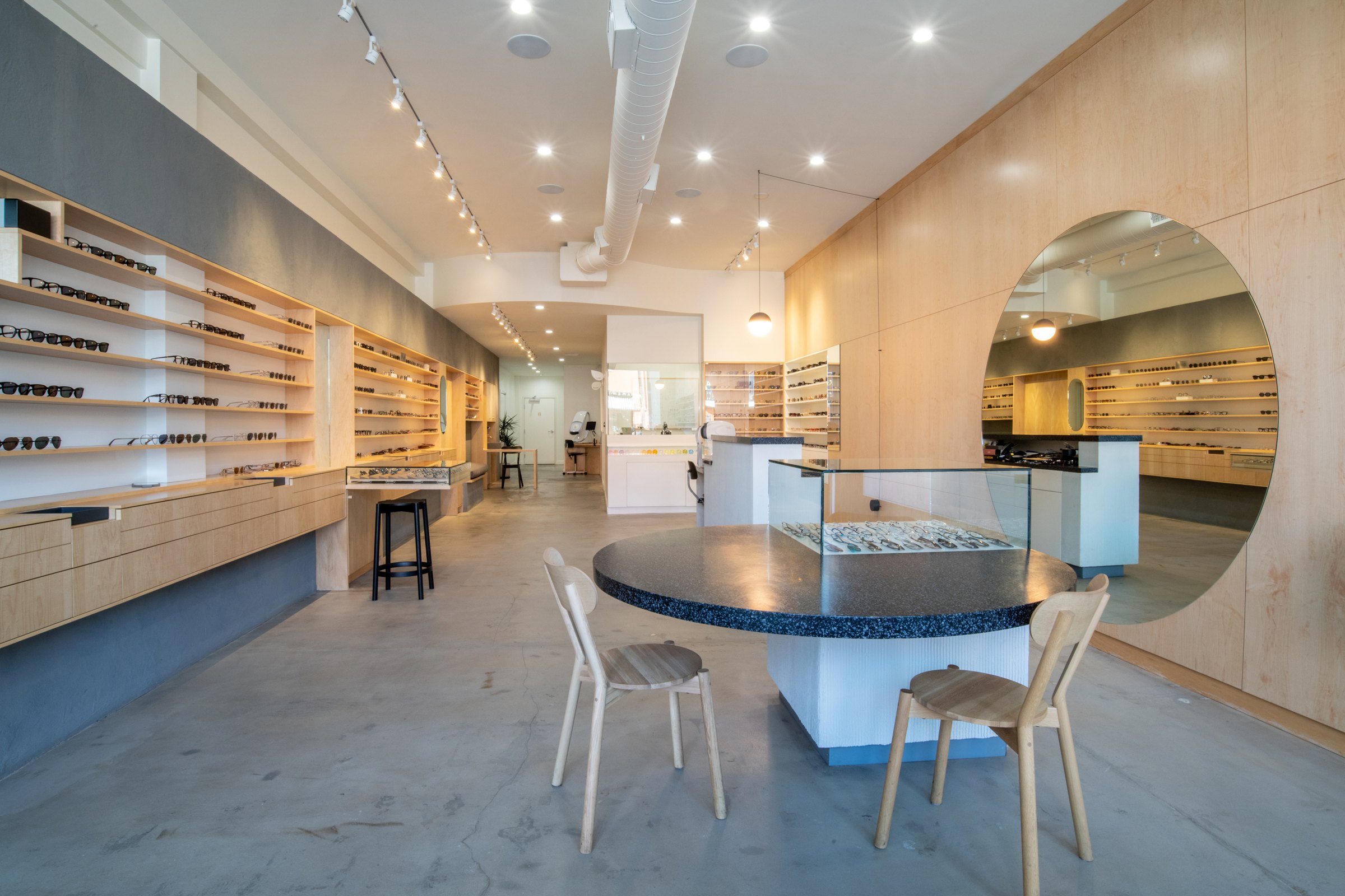
Zak. was founded in August 2018 as a family business. By the time I came in, it had a campaign shot by Jaclyn Campanaro and a shop on Fairfax photographed by Tyler Parker. My graphics had to live next to those pictures: on the feed, in the inbox, on the counter and on the street.

A second signature
In which a brand learns to look back.
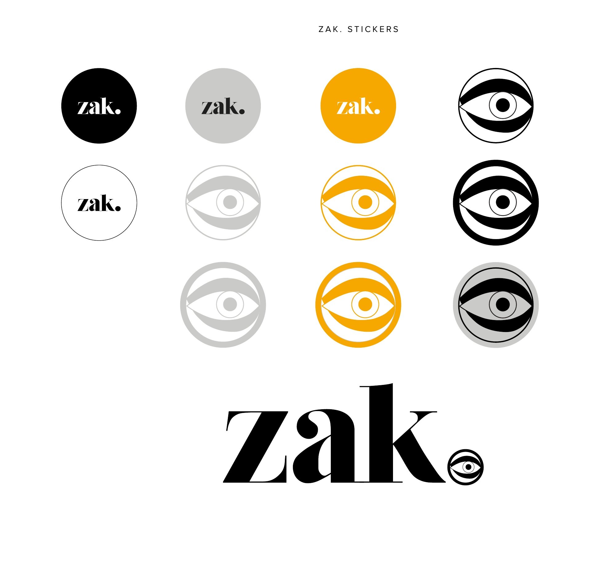
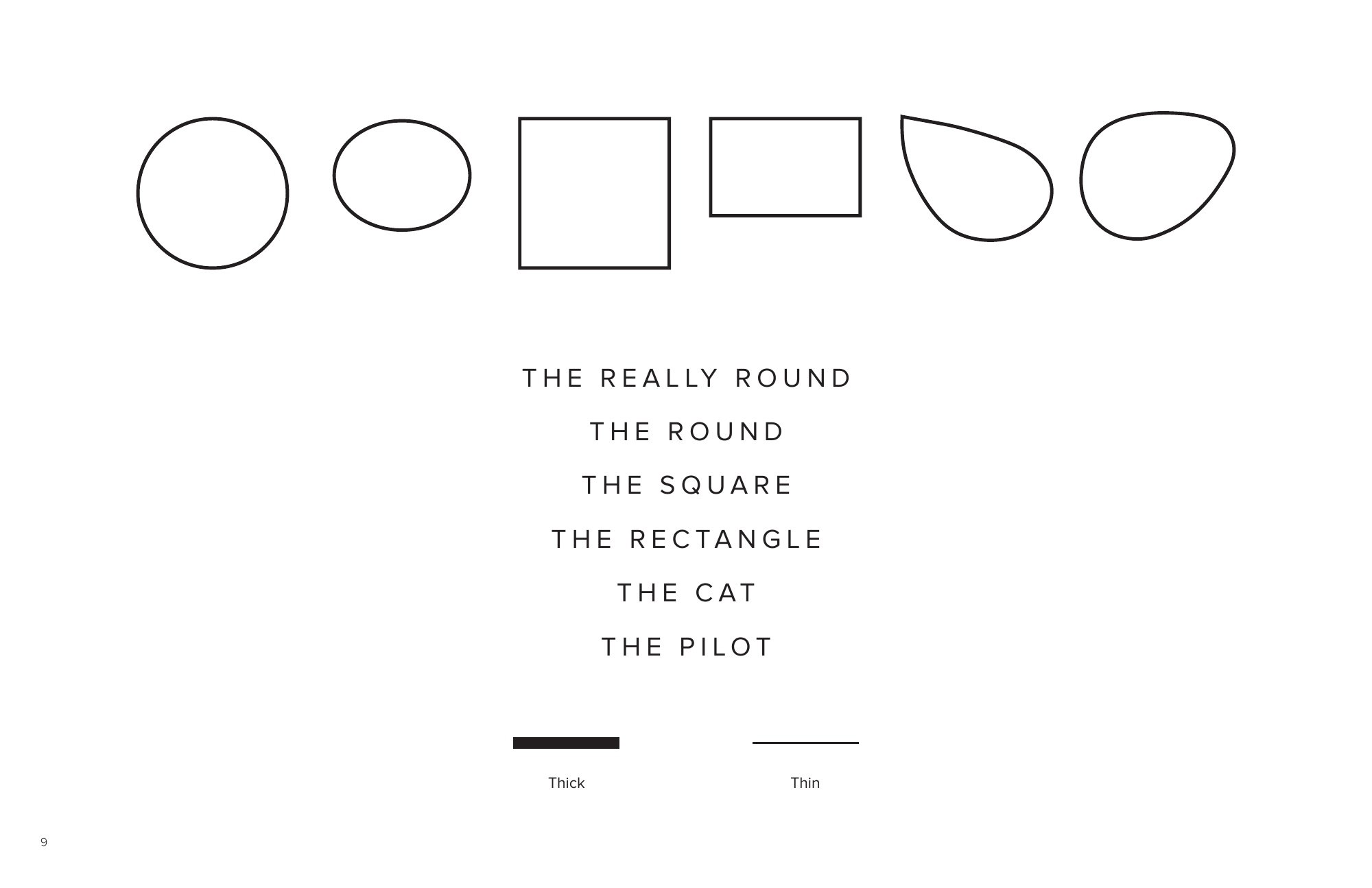
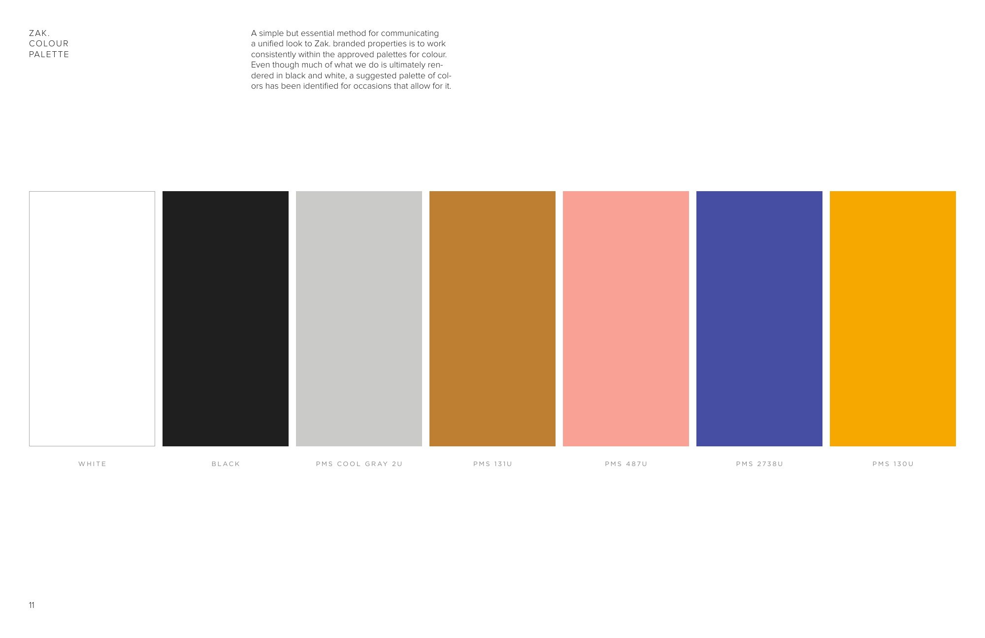
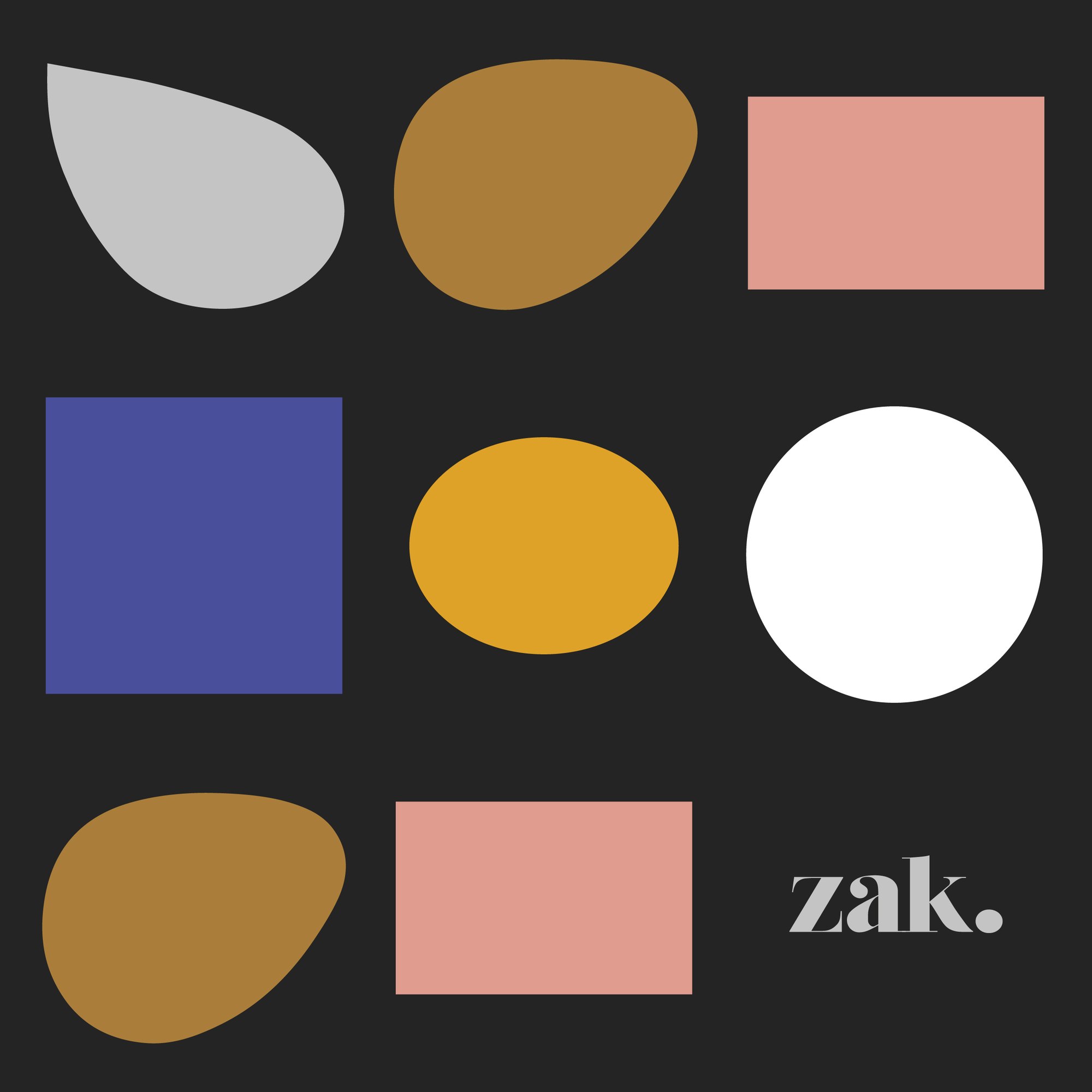
Next to the Zak. wordmark, a graphic eye became the brand mark you could hold: on the lens cloth, the tissue paper and the stickers. For the April 2019 style guide I designed six frame shapes, from The Really Round to The Pilot, and set a seven color palette.
Templates
In which eye care gets a sense of humor.
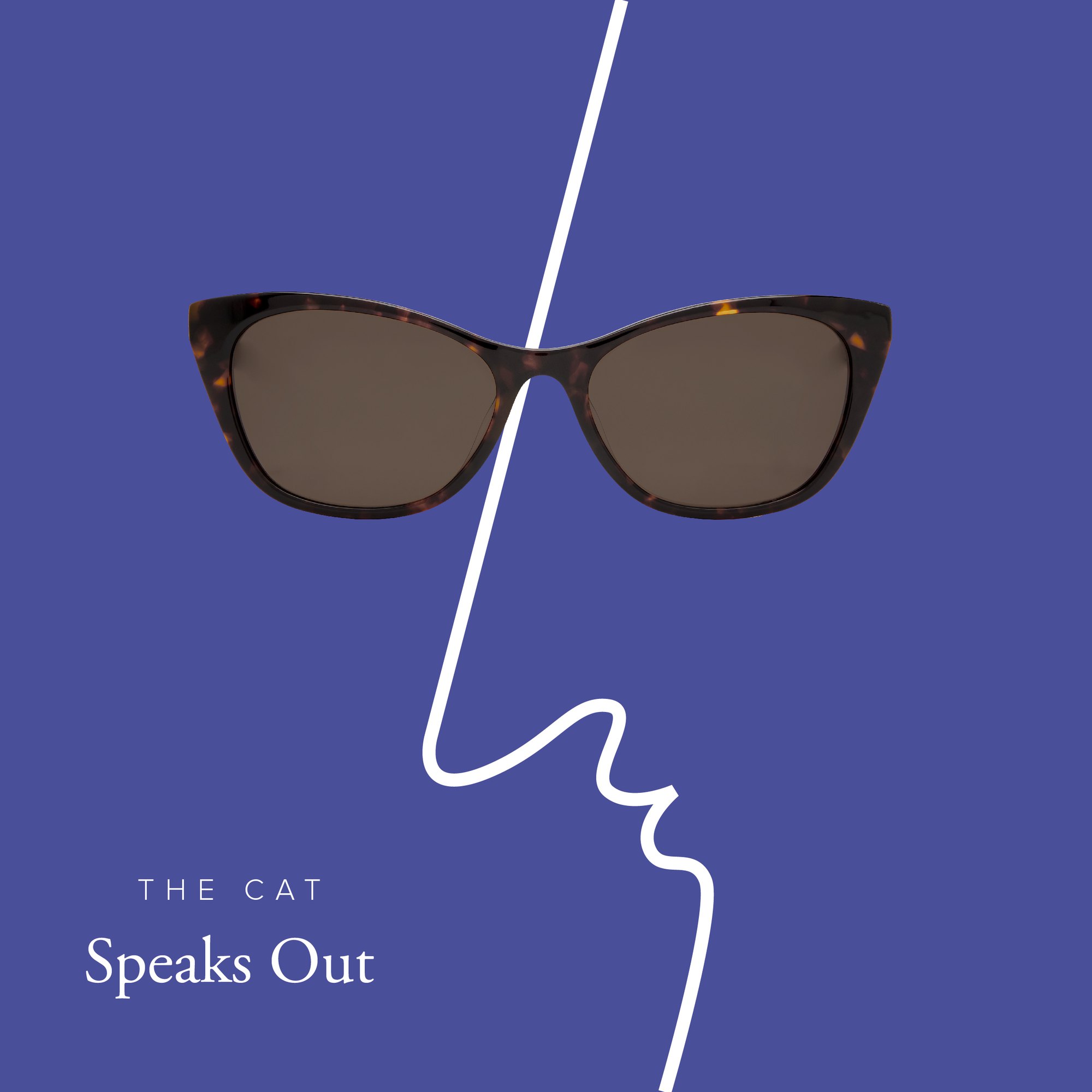
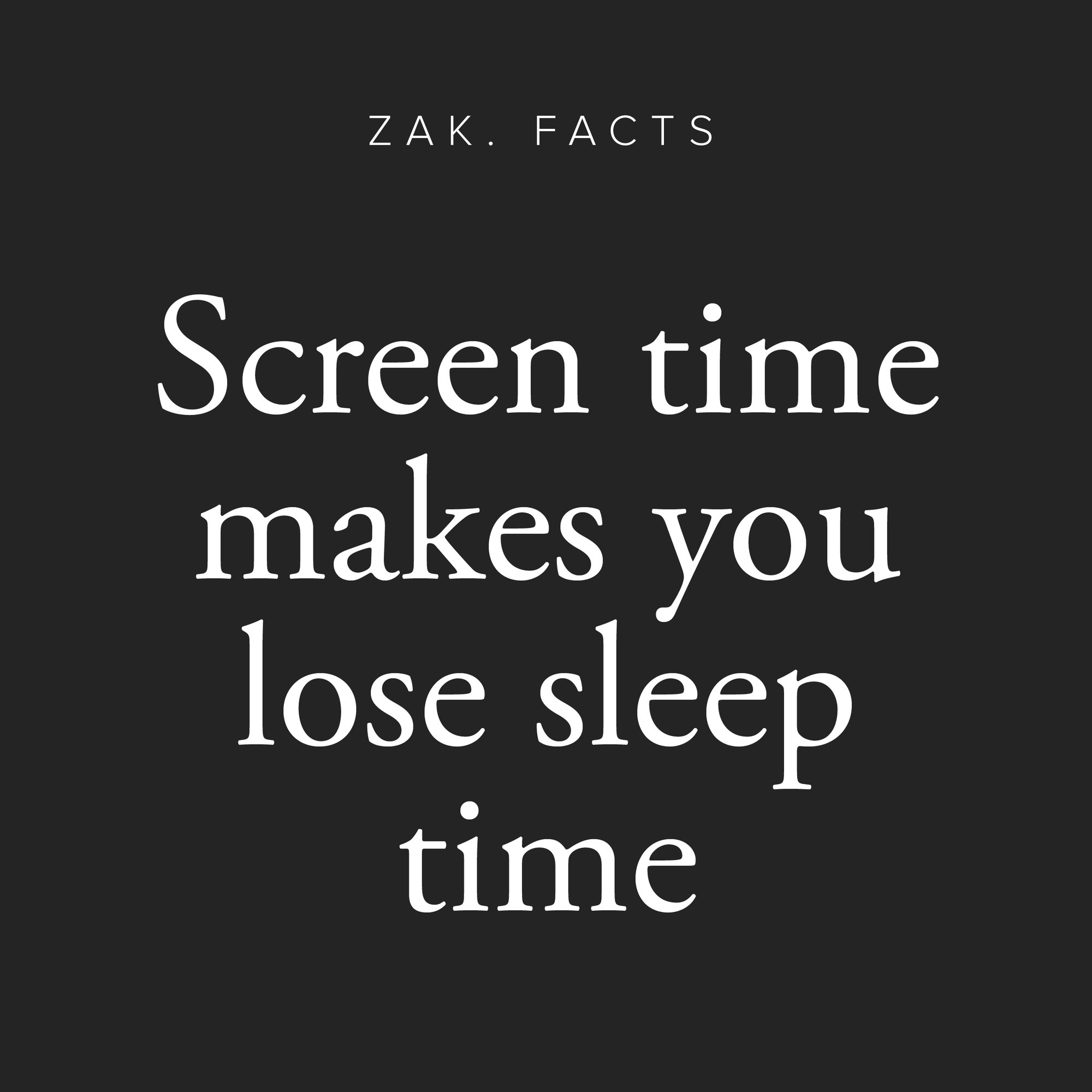
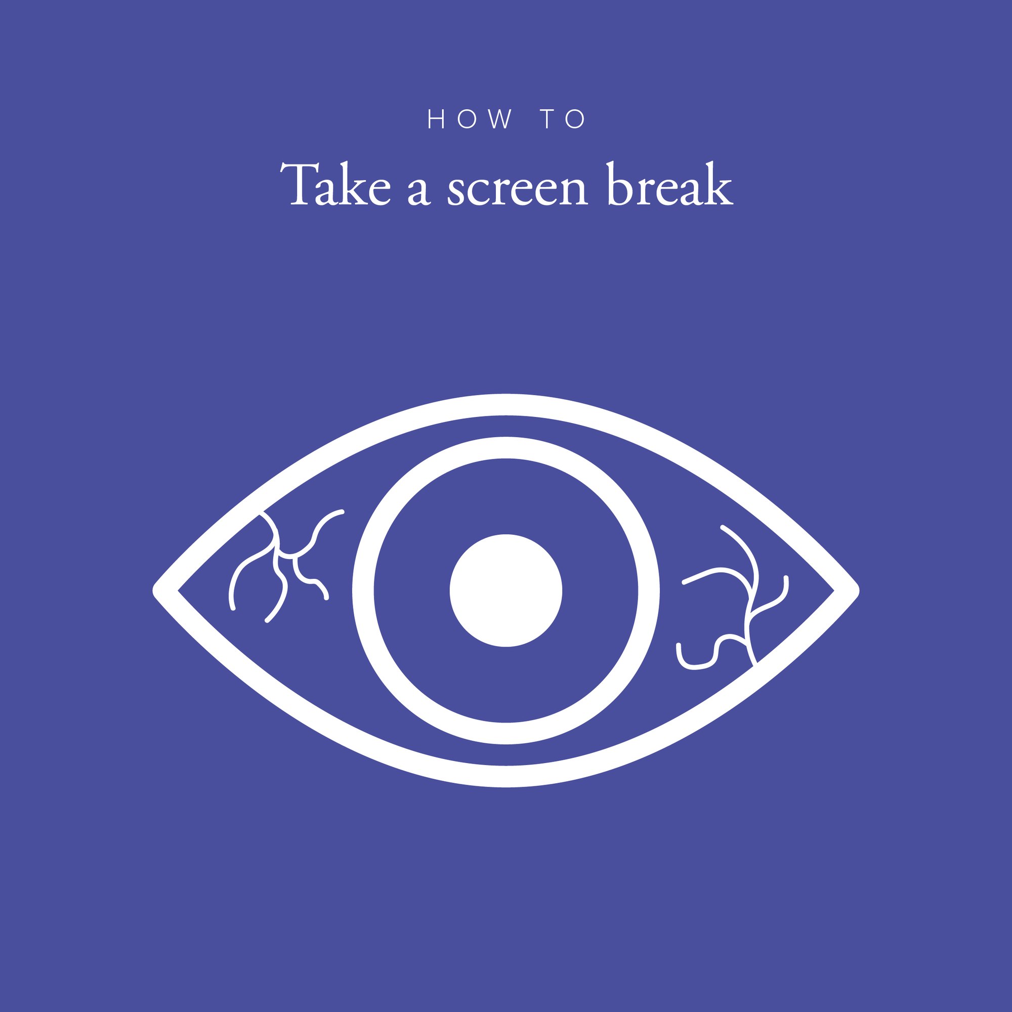
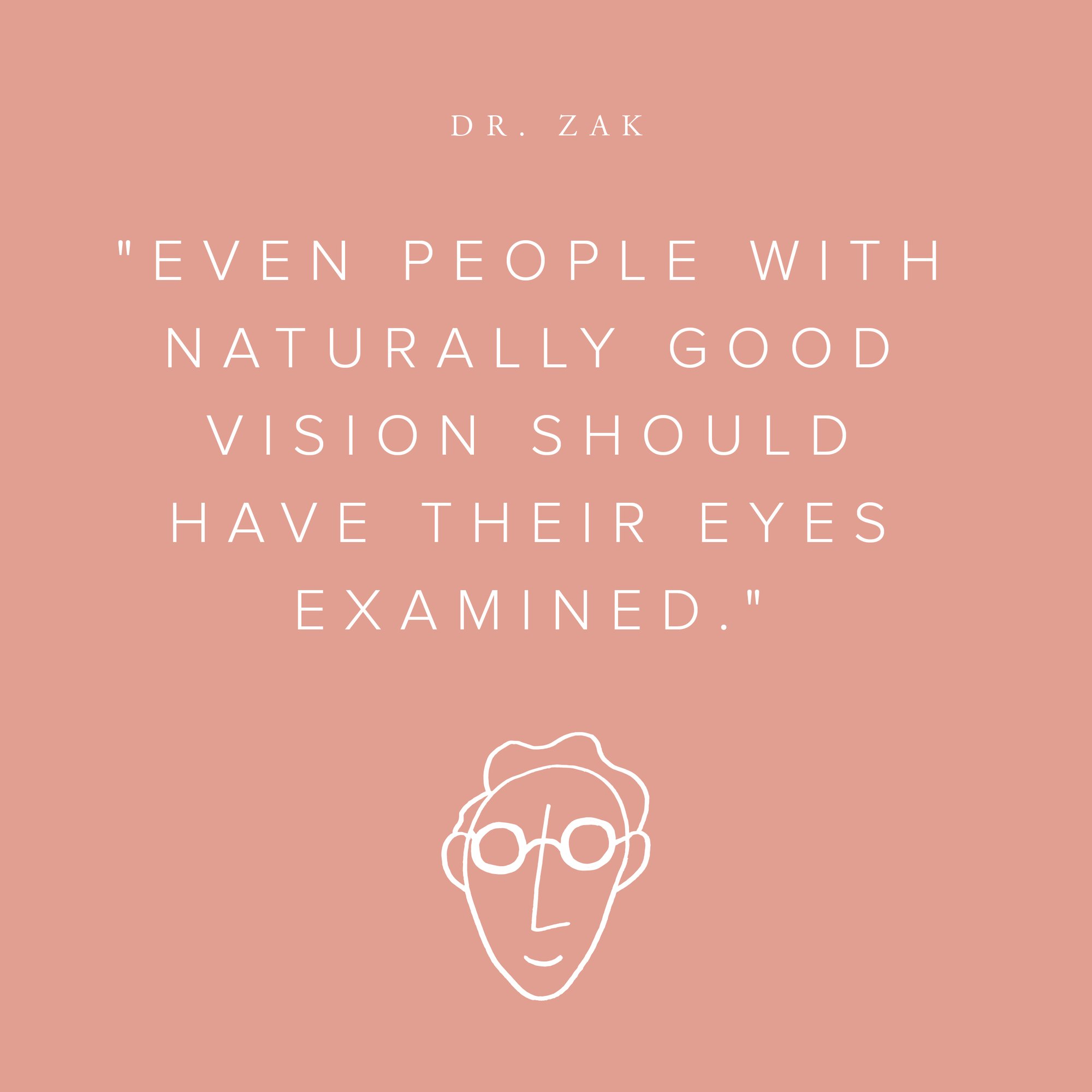
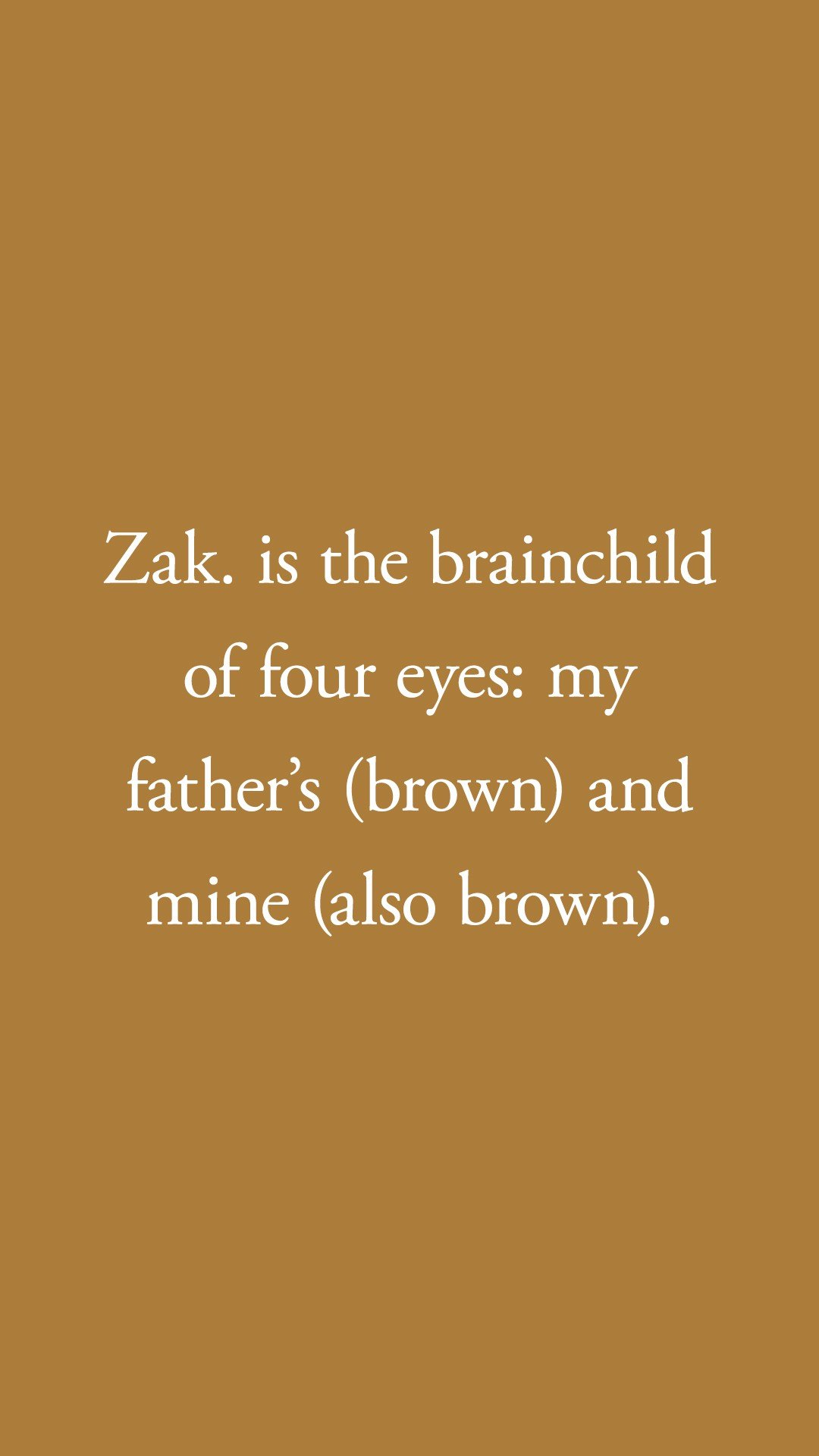
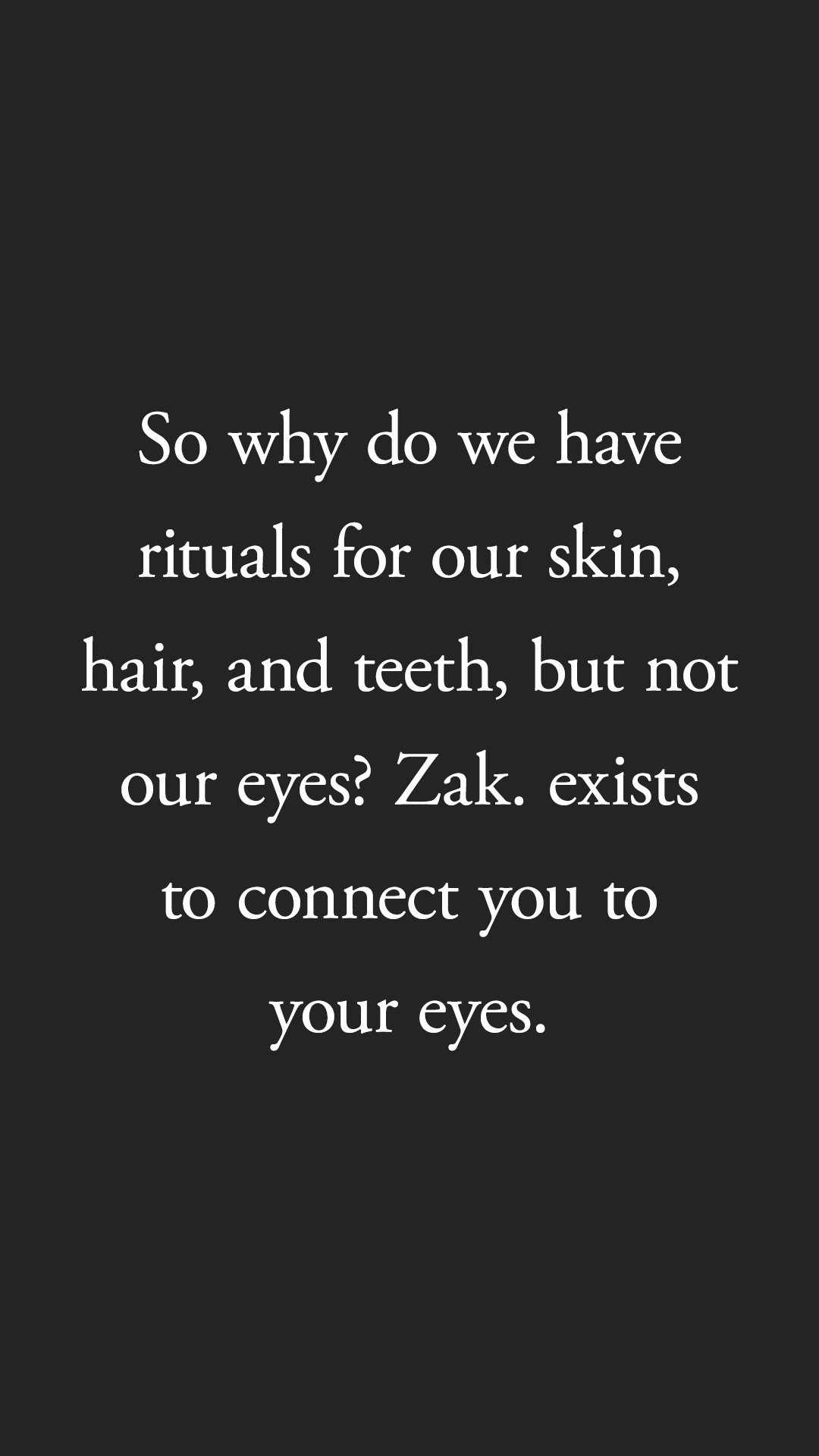
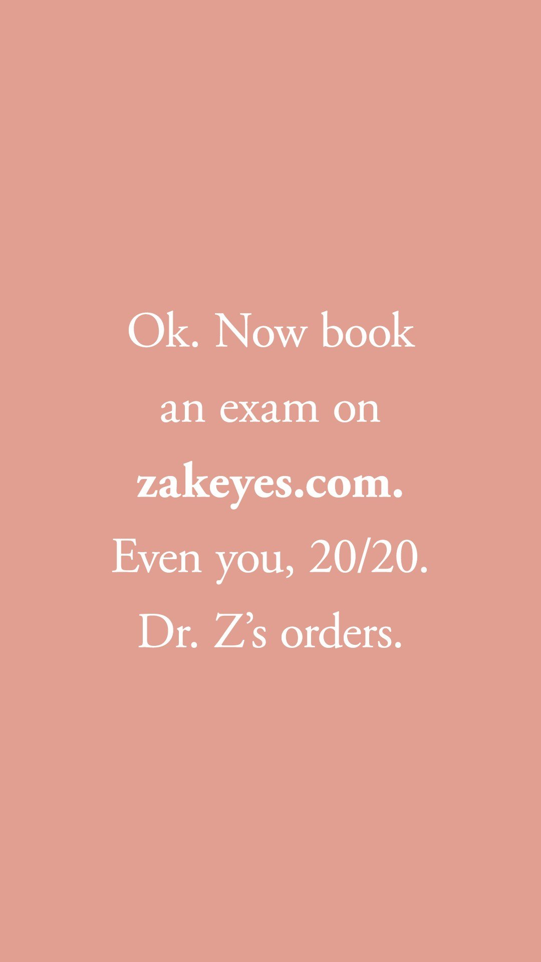
An Instagram system built on the palette, Garamond and Proxima Nova: Zak. Facts, How To, Dr. Zak, testimonials and simple illustration, so the feed could teach as much as it sold.


Email and print
In which the message moves from feed to inbox to counter.
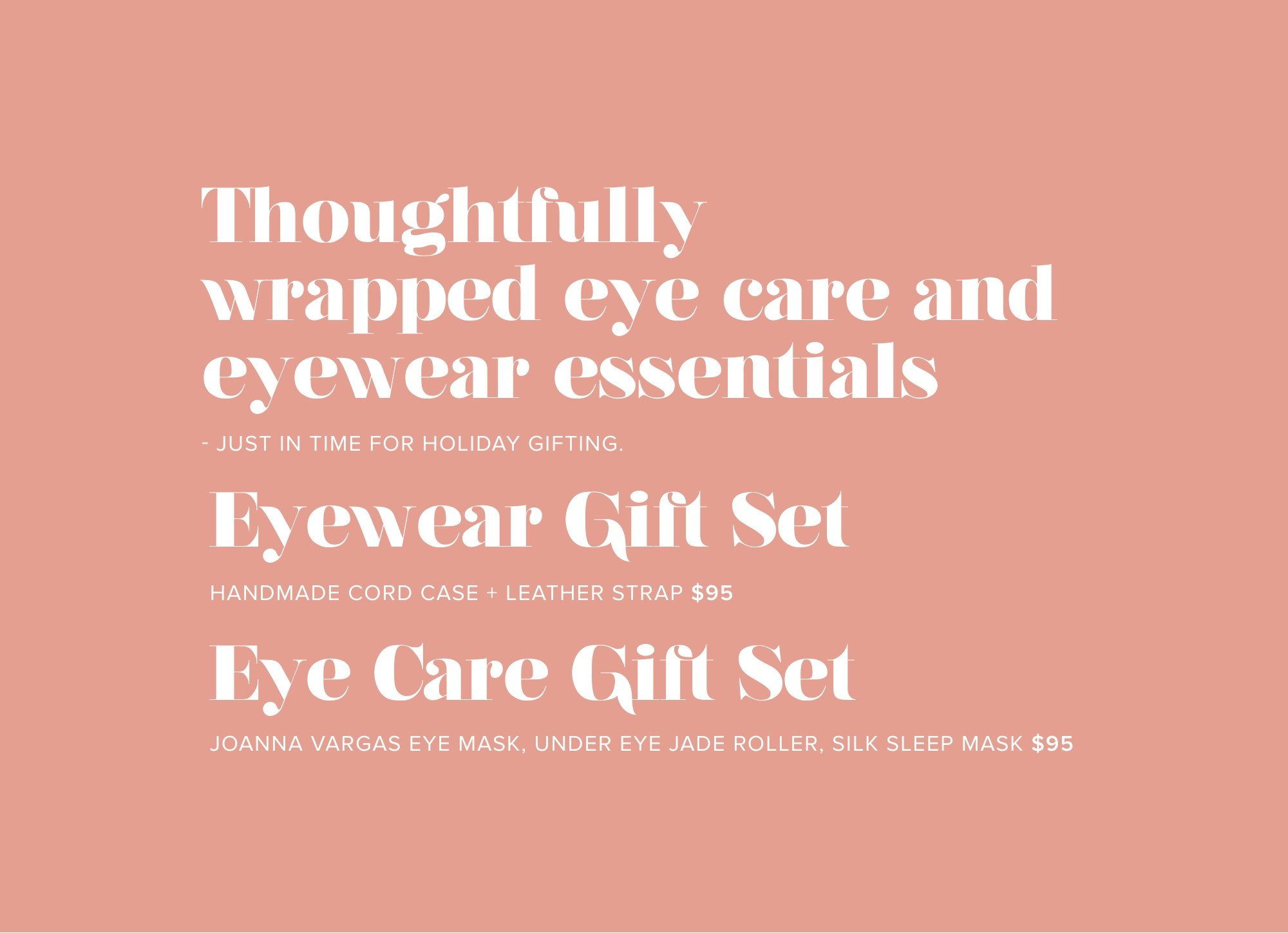
The same voice carried into email, from the welcome note to booking an eye exam, and onto the holiday gift sets on the counter.
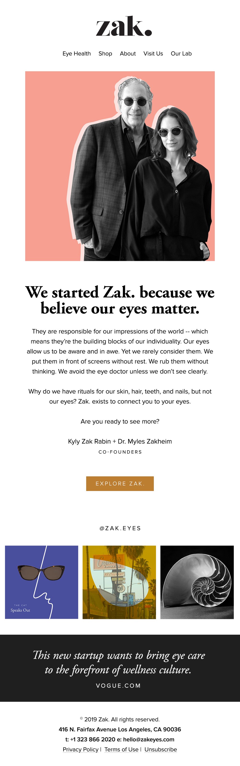
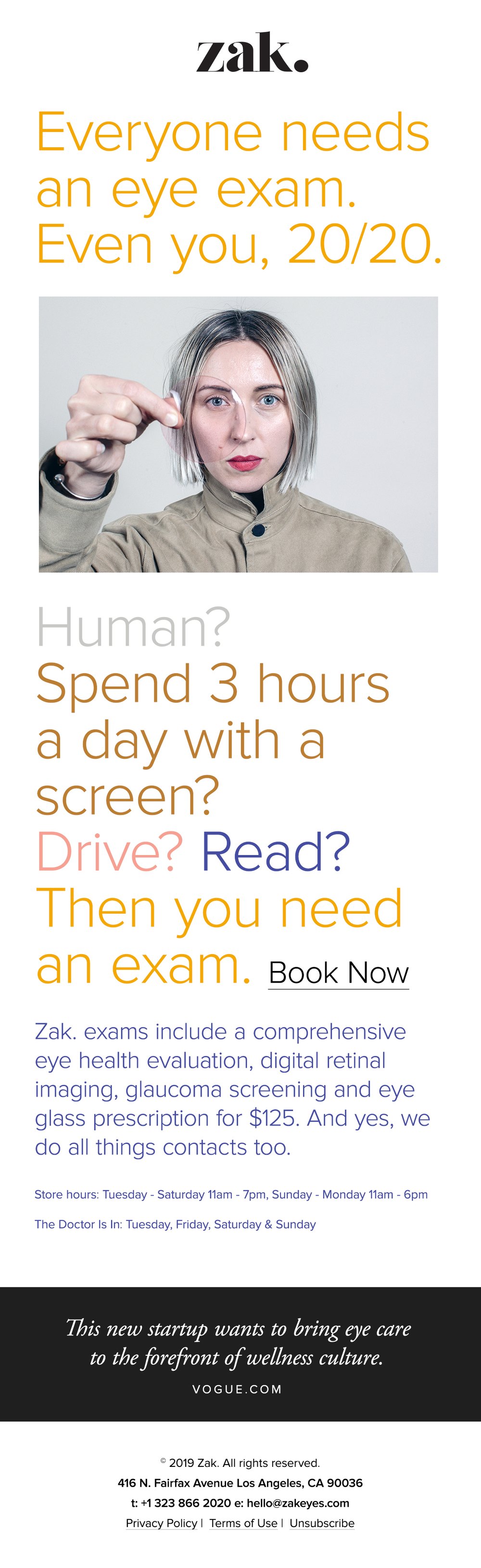
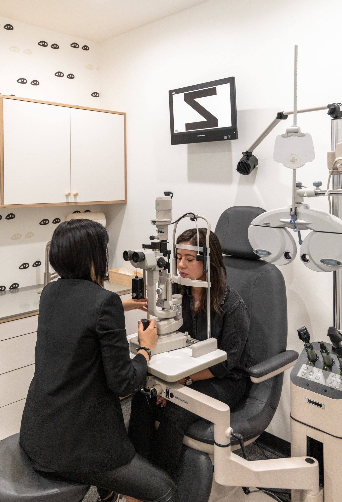
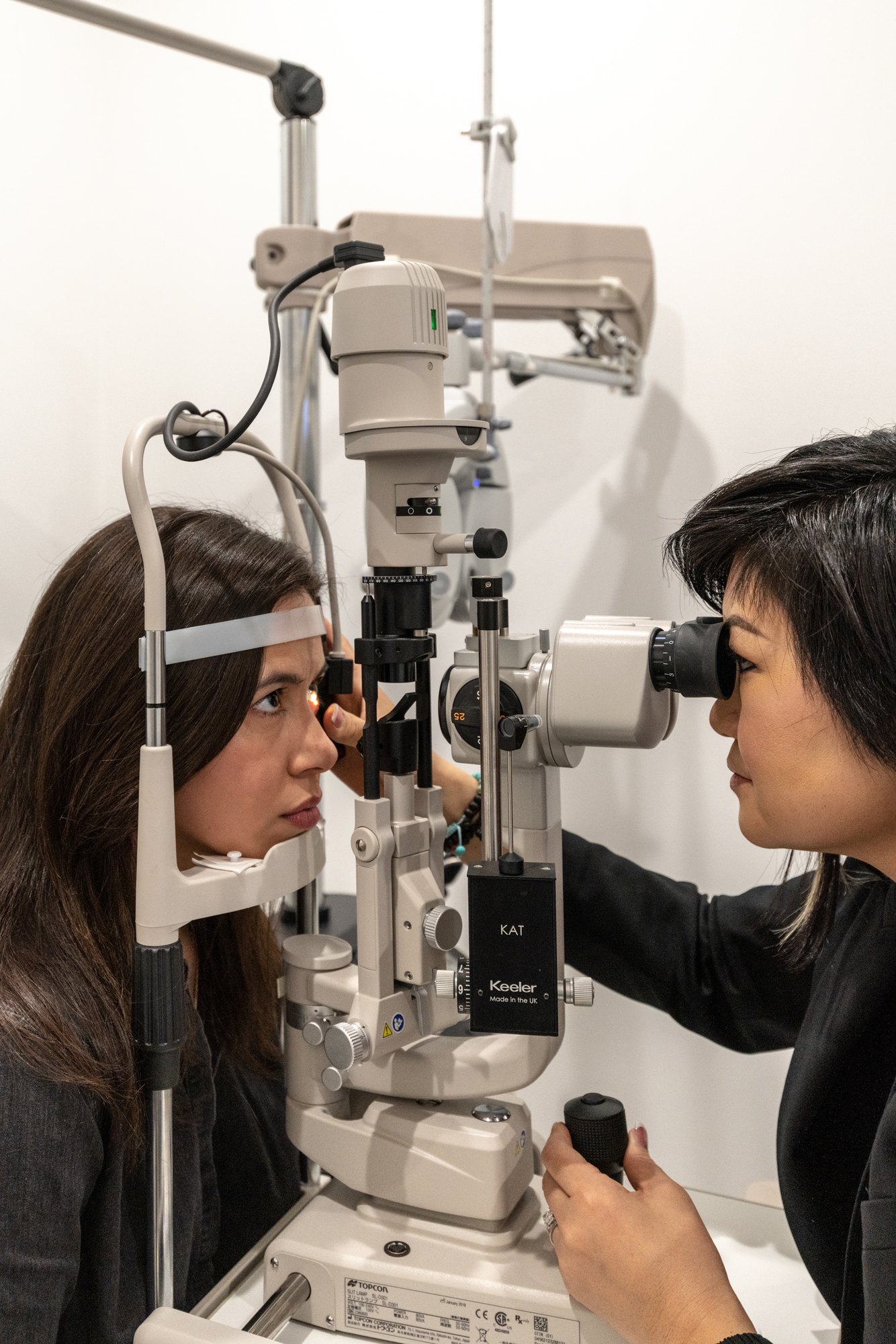
This new startup wants to bring eye care to the forefront of wellness culture.
Hoarding and signs
In which the doors close and the brand stays open.
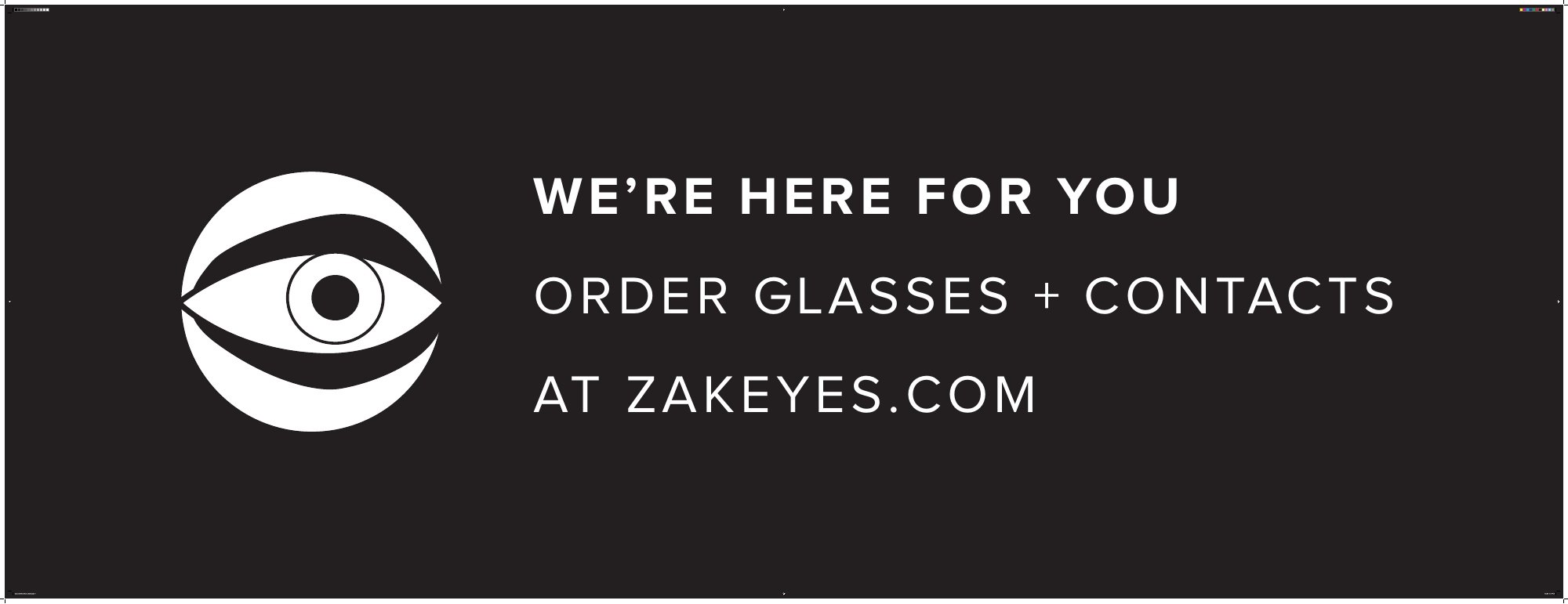
In April 2020 the storefront hoarding pointed people to zakeyes.com for glasses and contacts. In May a set of store signs handled curbside pickup and sanitized rooms in the same type.