THESIS
An identity for a nail polish made by scientists, marked with an asterisk.
To introduce nail polish that's safer and works better.
The mission, from the brand guidelines, June 2024.
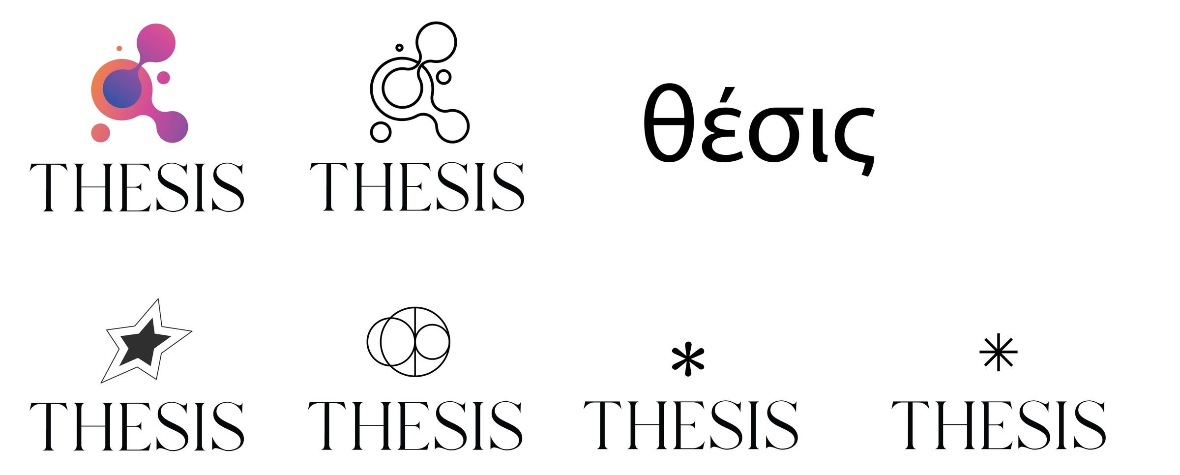
THESIS is nail polish reinvented by a group of scientists: PhDs, not MBAs. In 2024 I was creative director, alongside a brilliant team: Tessa Lund, Holly Siegel and Jaime Ellison. Between the first logo rounds in March and the brand guidelines in June we made a serif wordmark, an asterisk, patterns, a bottle proposal and the first launch mockups.
The wordmark and the asterisk
In which a footnote becomes the brand.
A contemporary round serif for the name, classic and clean at once. The icon is an asterisk: one of the oldest marks in academic textbooks, and a sign that there is always more to learn.


Type, repeated
In which the name turns into texture.
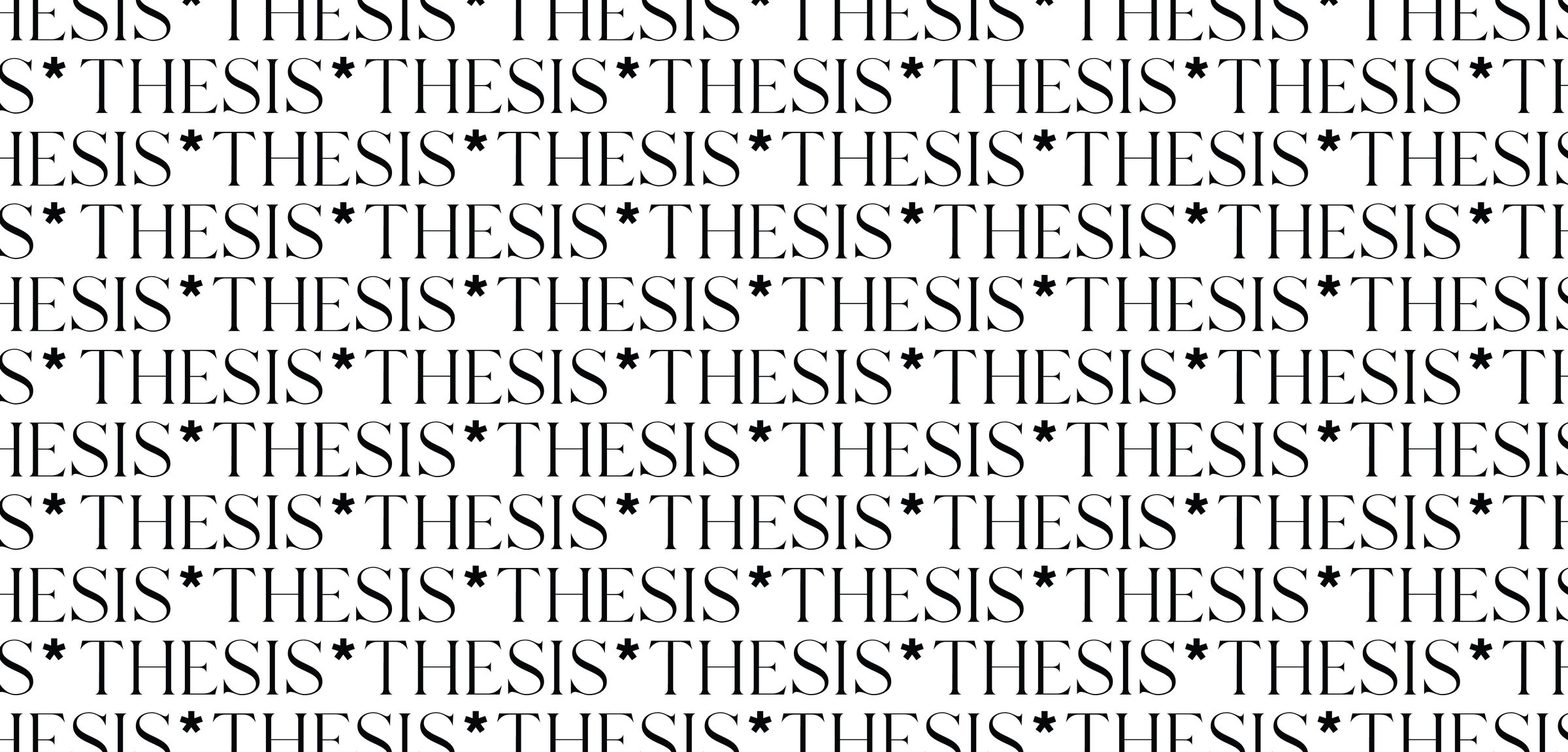
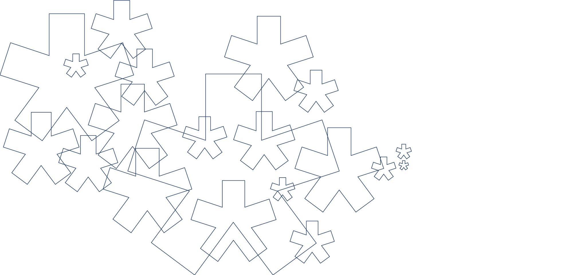
Patterns drawn from academic themes: graphic enough to hint at the science, and a quiet foil for a wide range of colors. They are made for the inside of packaging, influencer kits and social backgrounds.

A bottle with a footnote
In which the asterisk finds the lid.
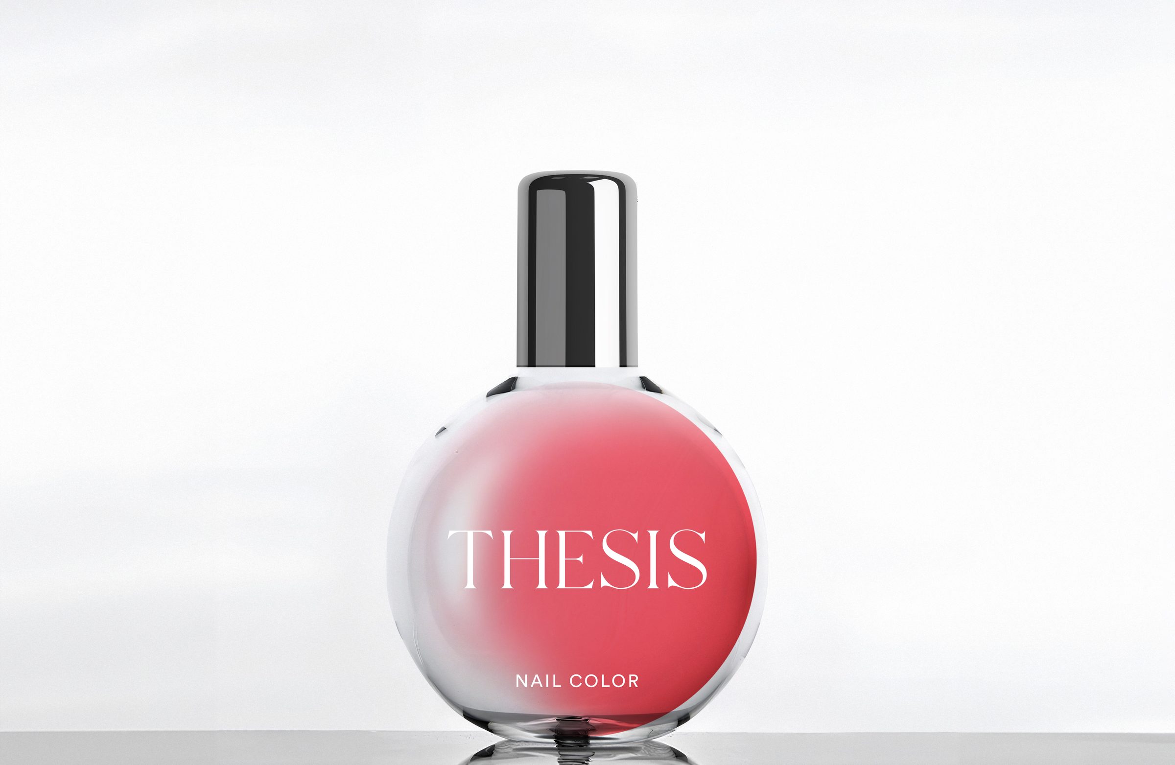
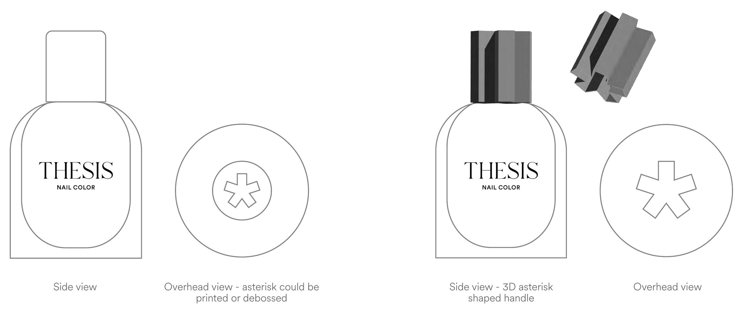
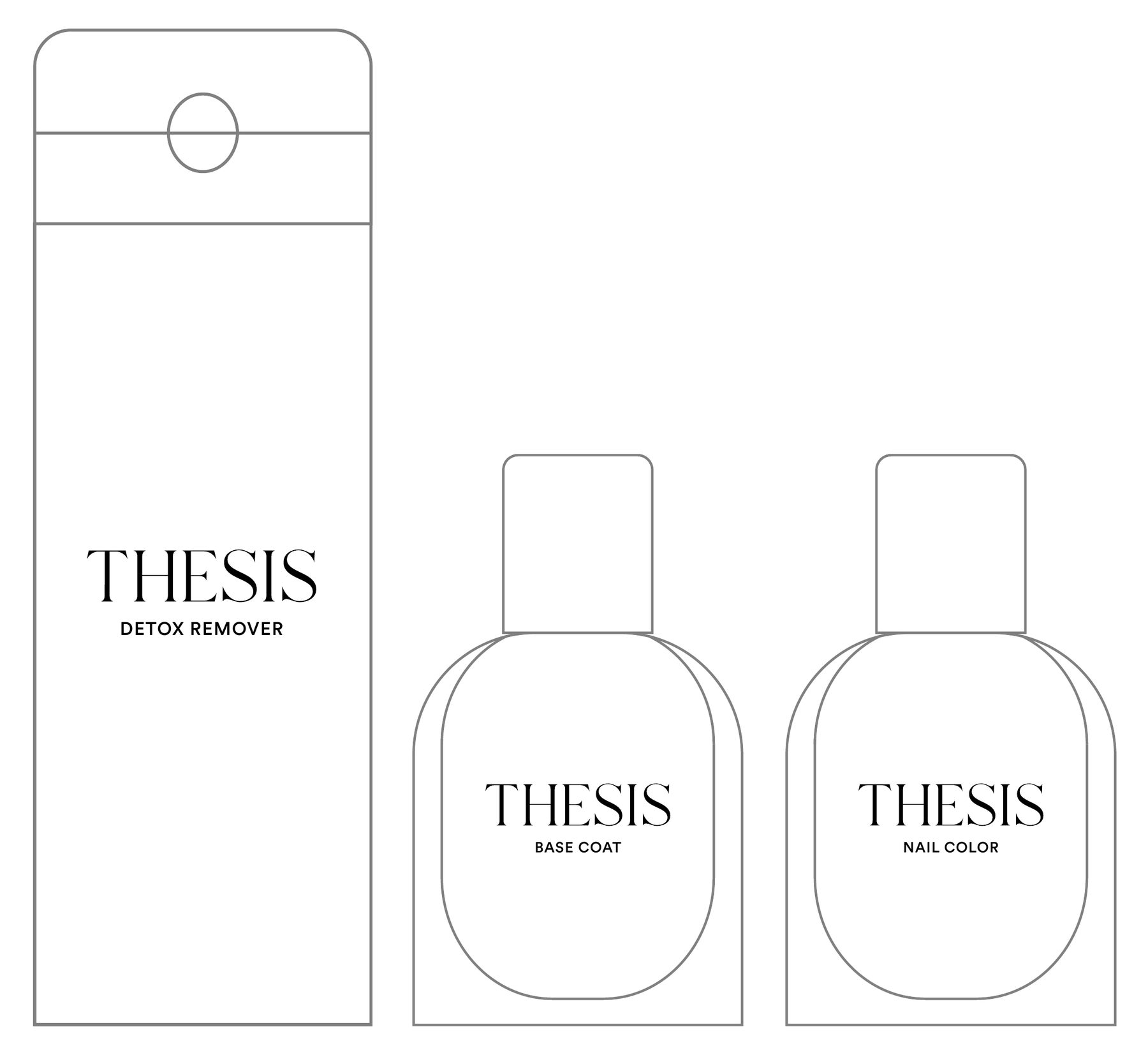
The first bottle round, in May, was a round flask with a silver cap. The June guidelines set a bell shaped glass bottle that nods to the apothecary, with the asterisk printed or debossed on the lid, or the whole cap cut as a 3D asterisk. Remover, base coat and color share one system.
Posters, site and merch
In which the footnote goes public.
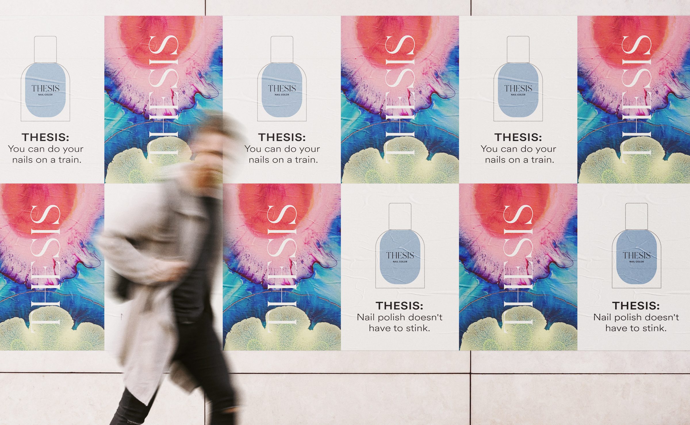
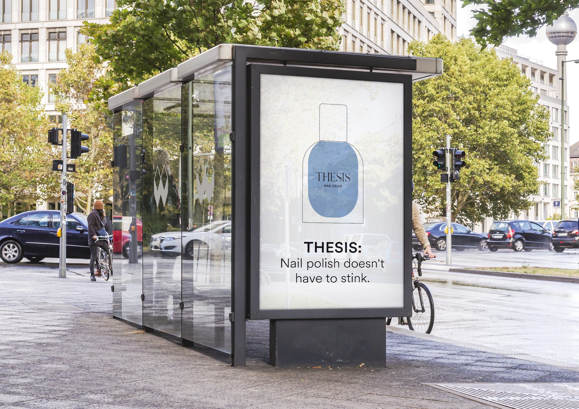
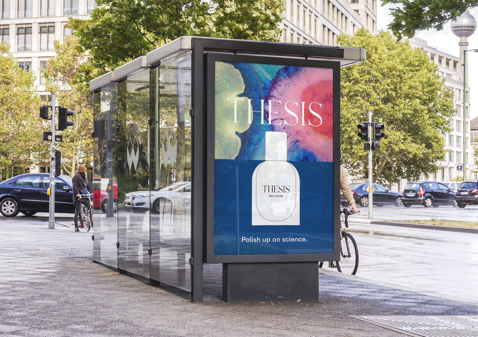
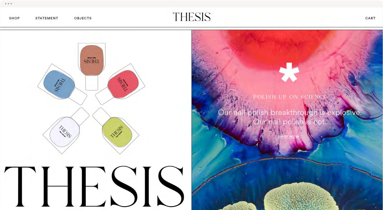
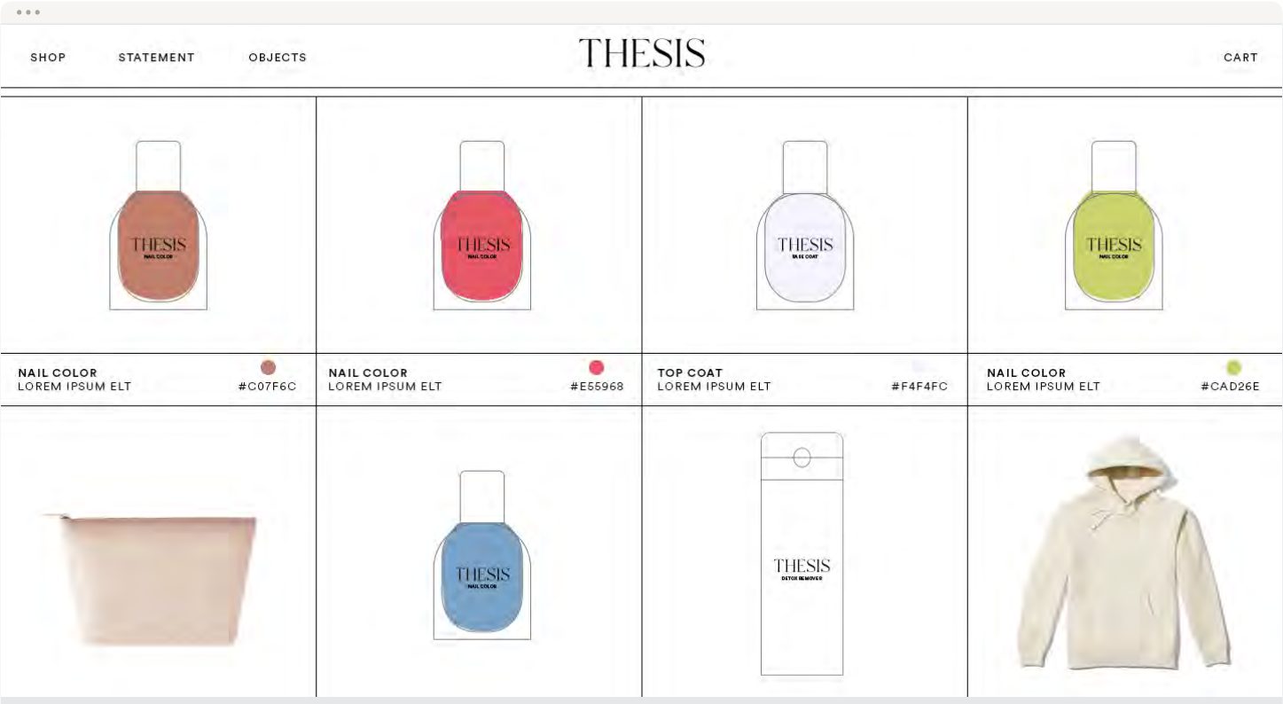
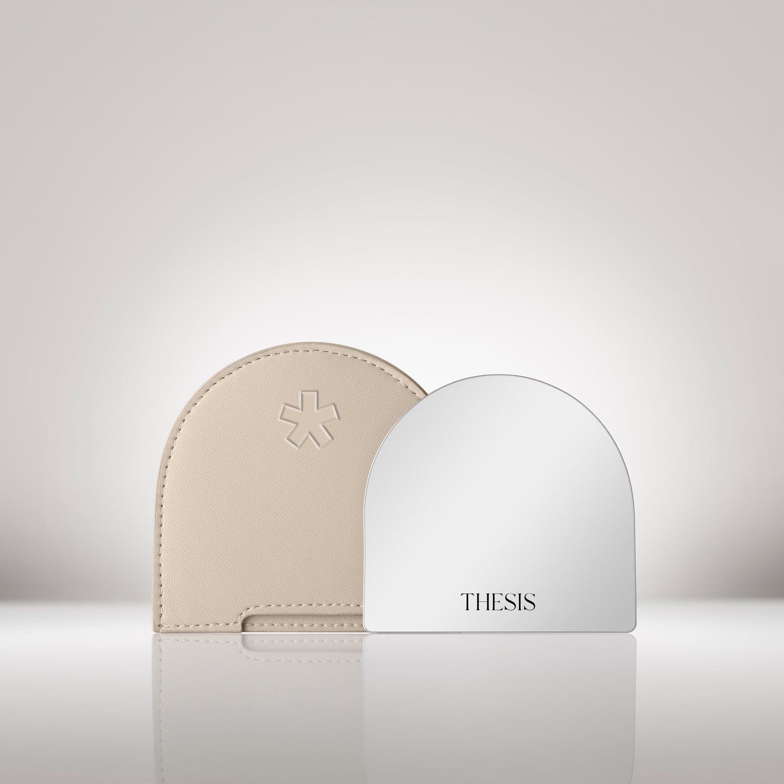
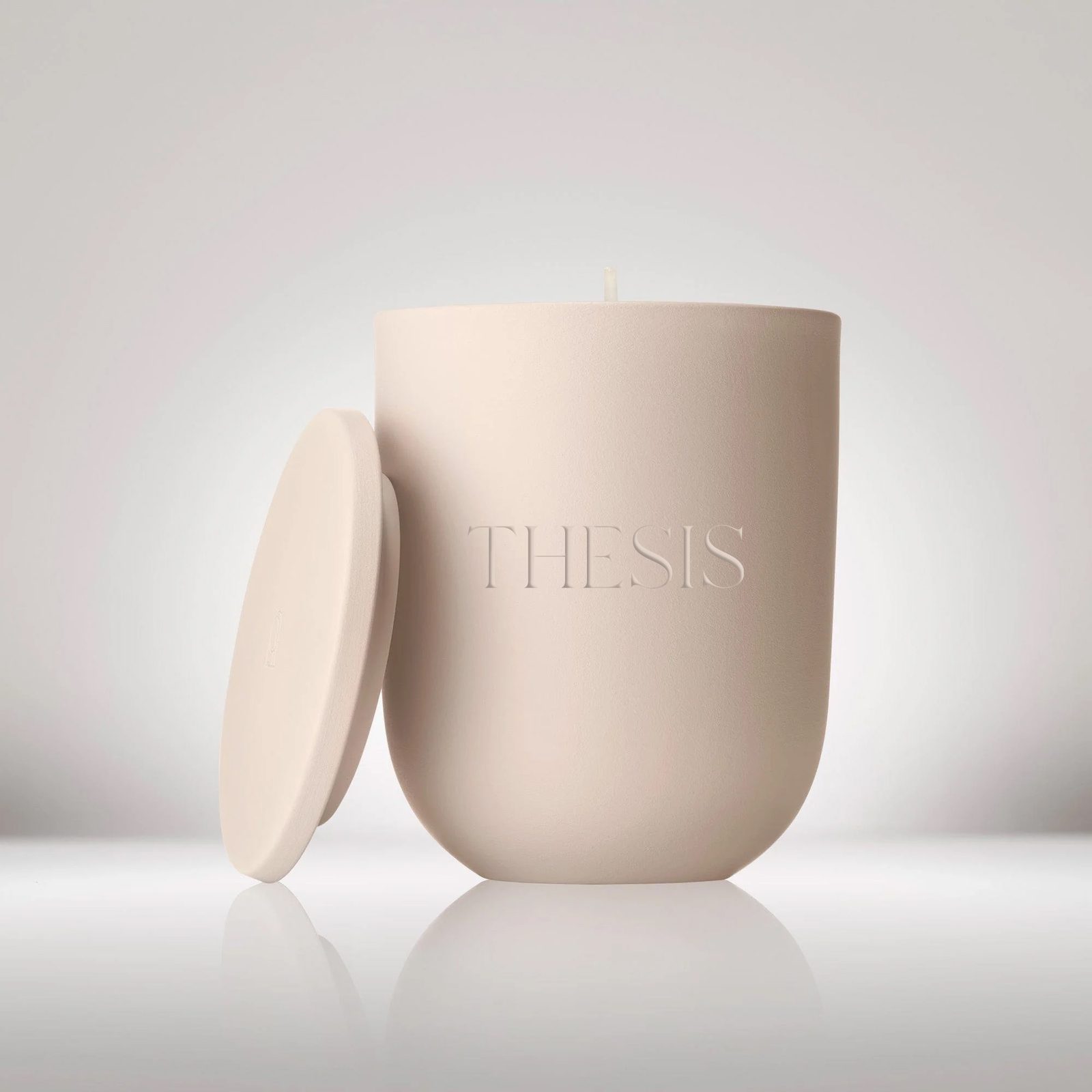
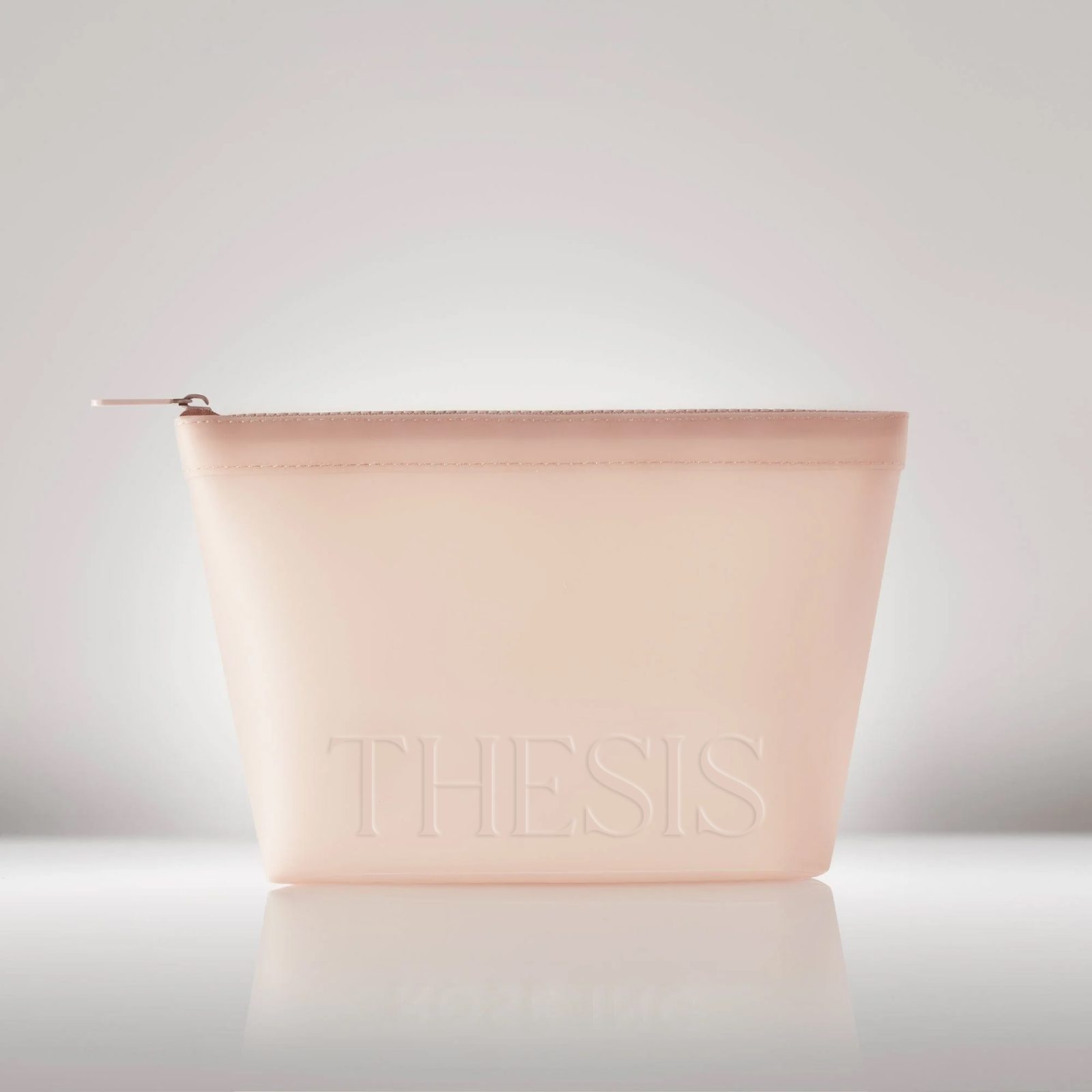
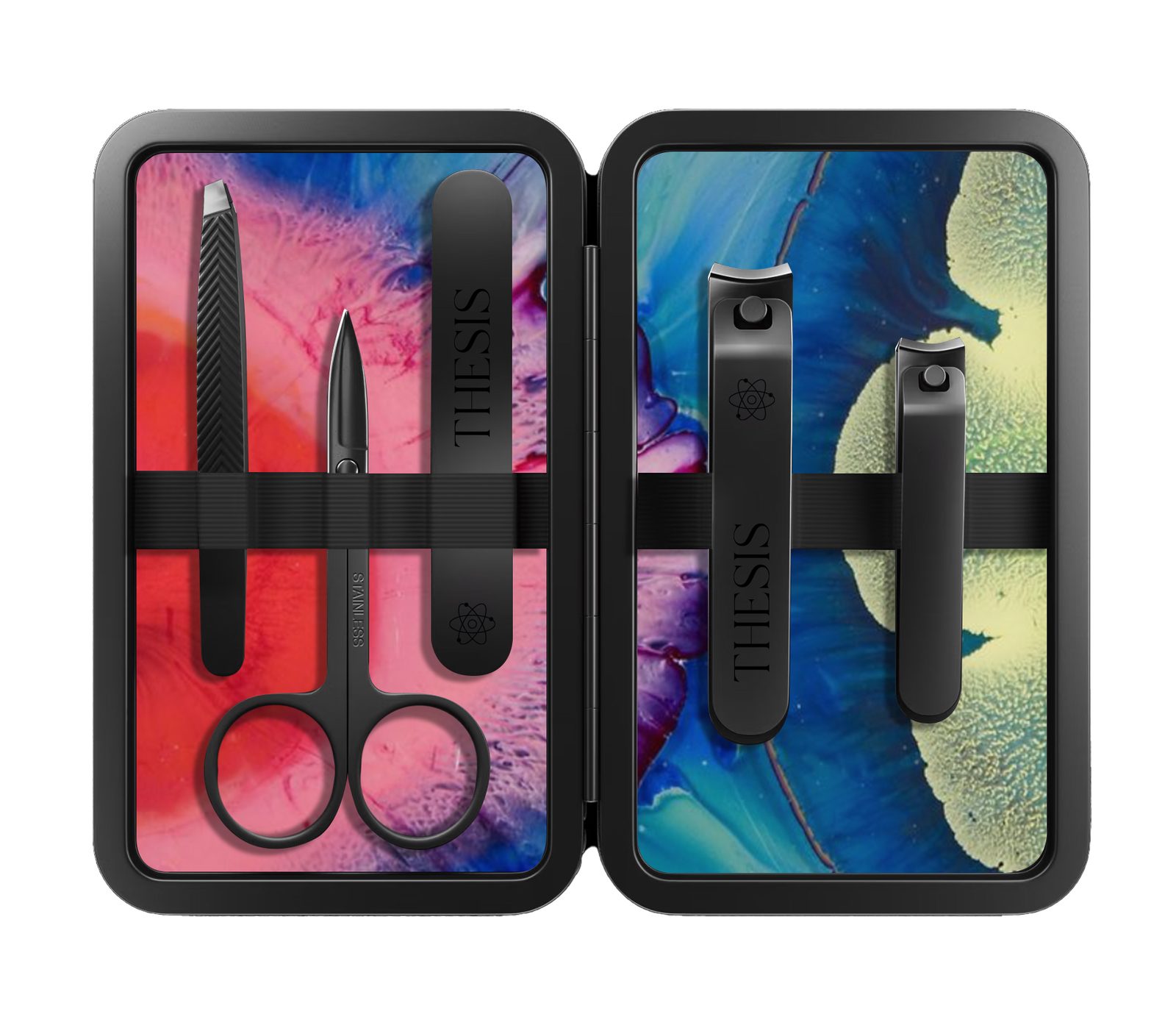
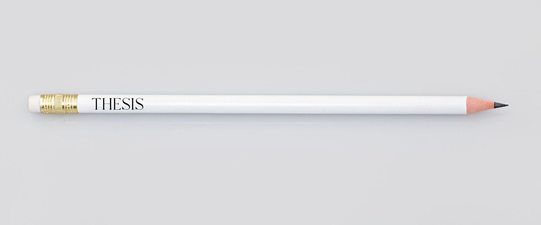
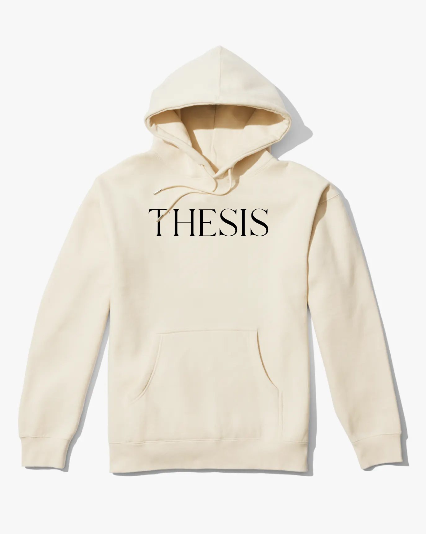
Launch mockups from the guidelines: wild postings and bus shelters with lines like Nail polish doesn't have to stink, a site that shows the range in color, and merch that keeps the asterisk close.
Imagery
The marbled texture images and the street scenes in the mockups are third party.