Kenneth Cole
A brand with something to say, in my handwriting.
Mark forty years of a brand that has always spoken up, and make it feel handmade.
Six seasons of campaign, store, product, site and email.
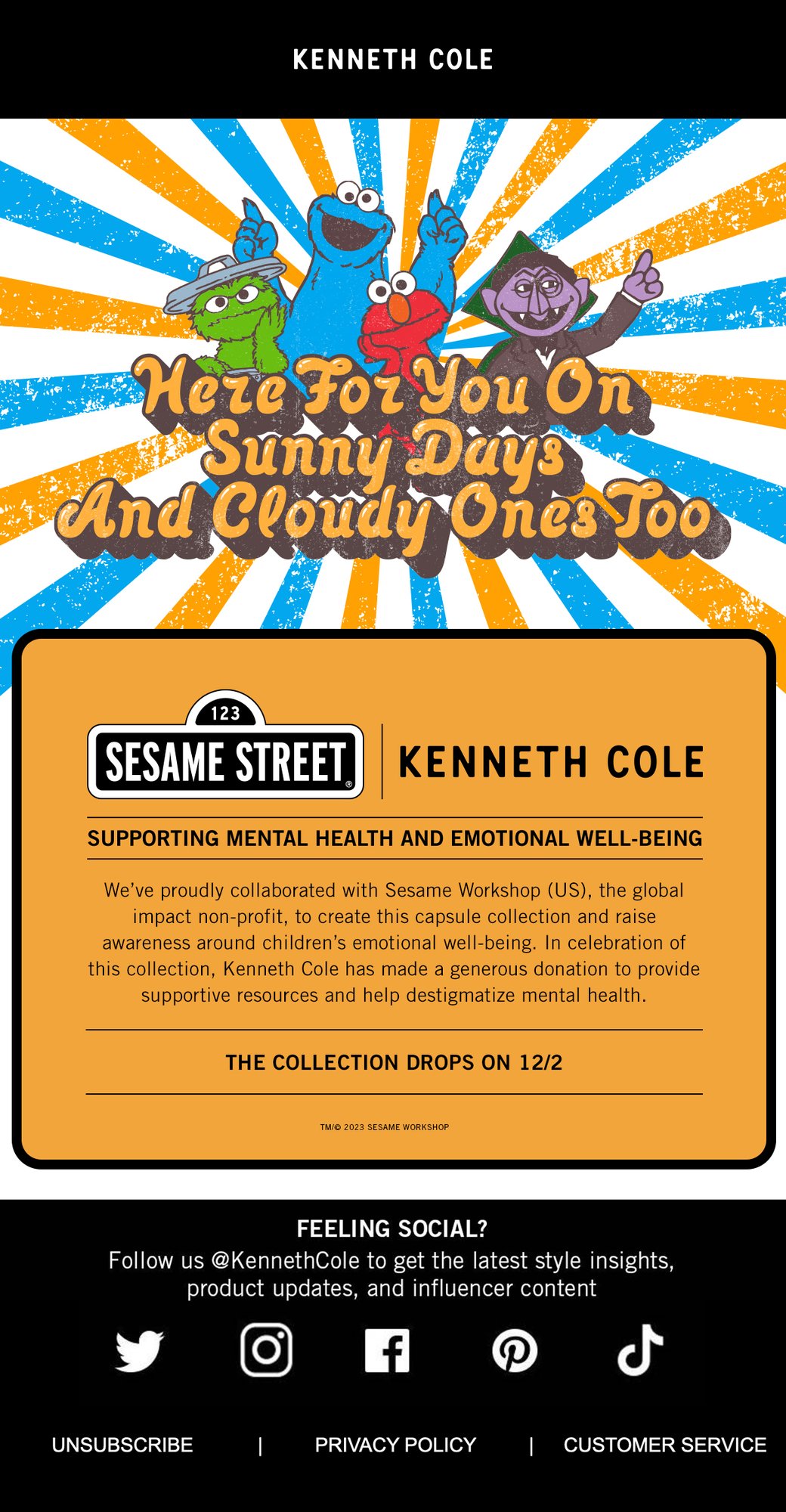
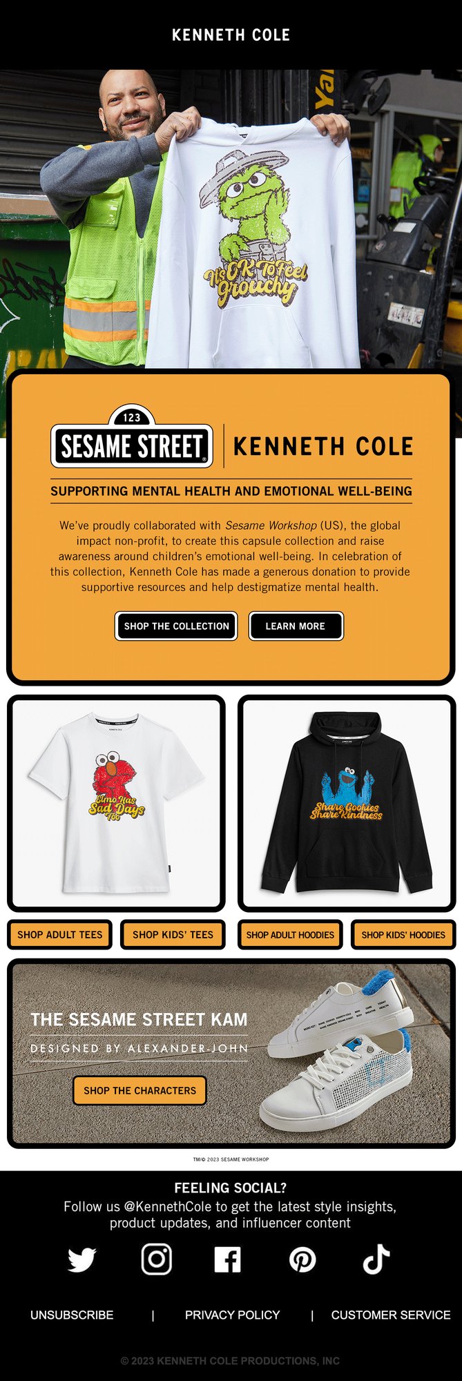
I led creative across six seasons for Kenneth Cole and Kenneth Cole Reaction, a brand that has always had something to say. I directed the Sesame Street x Kenneth Cole collaboration, illustrated every character myself and hand-lettered all of its type. For the 40th anniversary I covered windows, tees and the site in hand-drawn type. And I art directed Voice Wear, the brand’s tees with a point of view, and its 2024 vote campaign with I am a voter.
Sesame Street x Kenneth Cole
In which Elmo has sad days too.
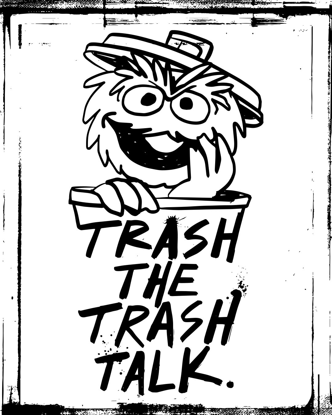
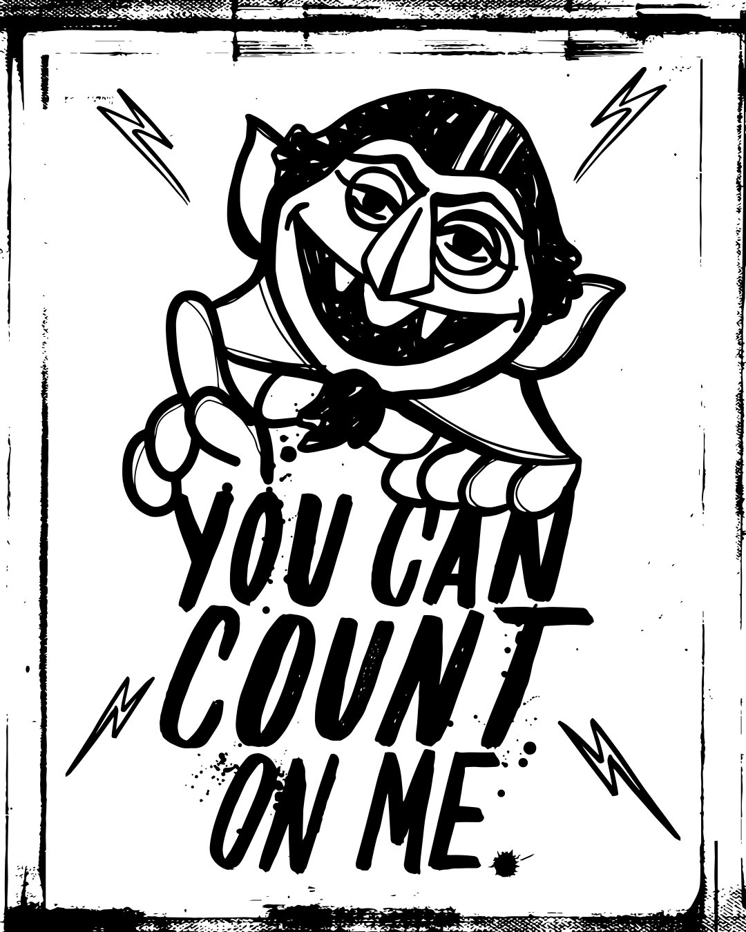
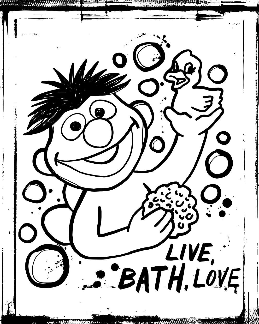
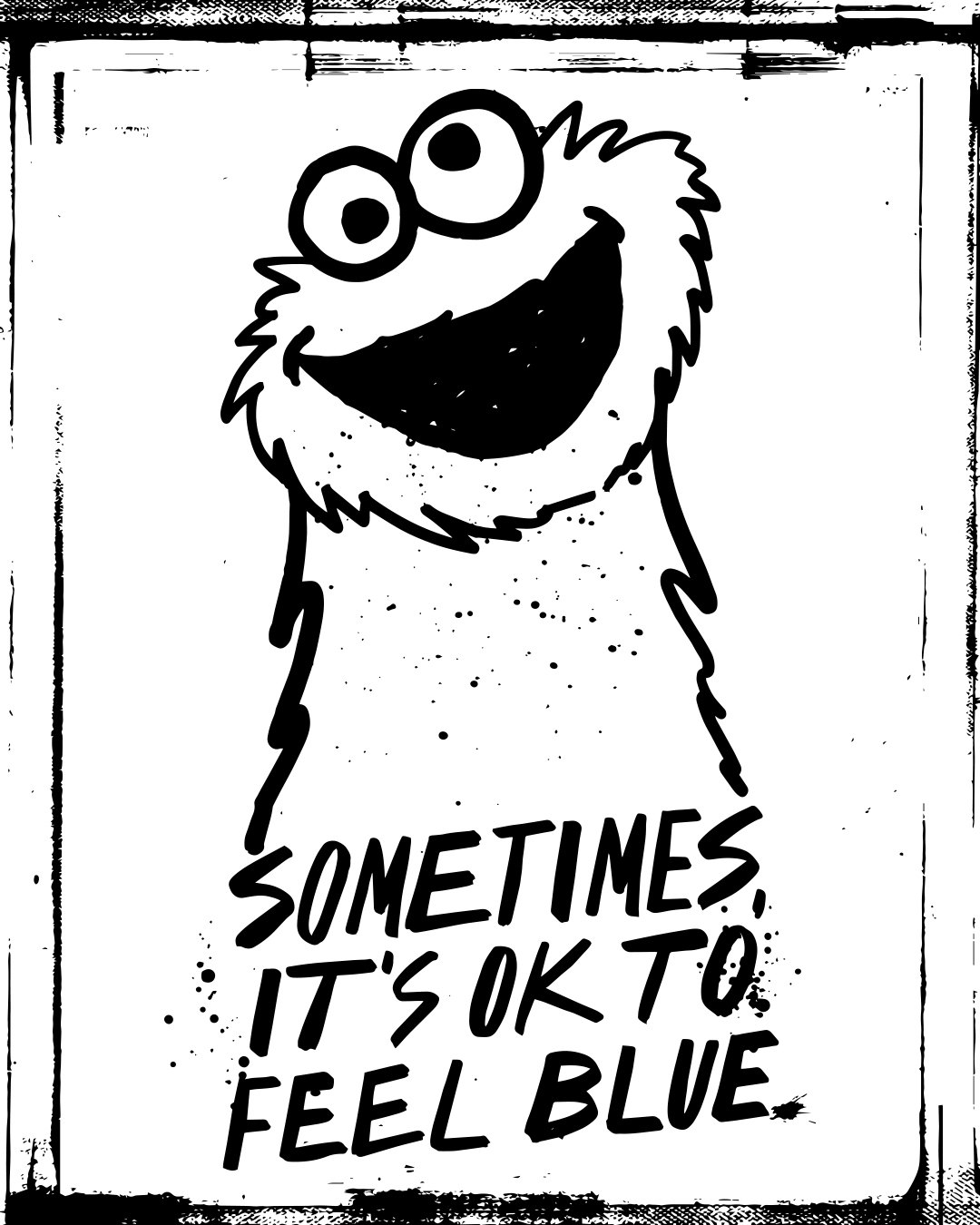
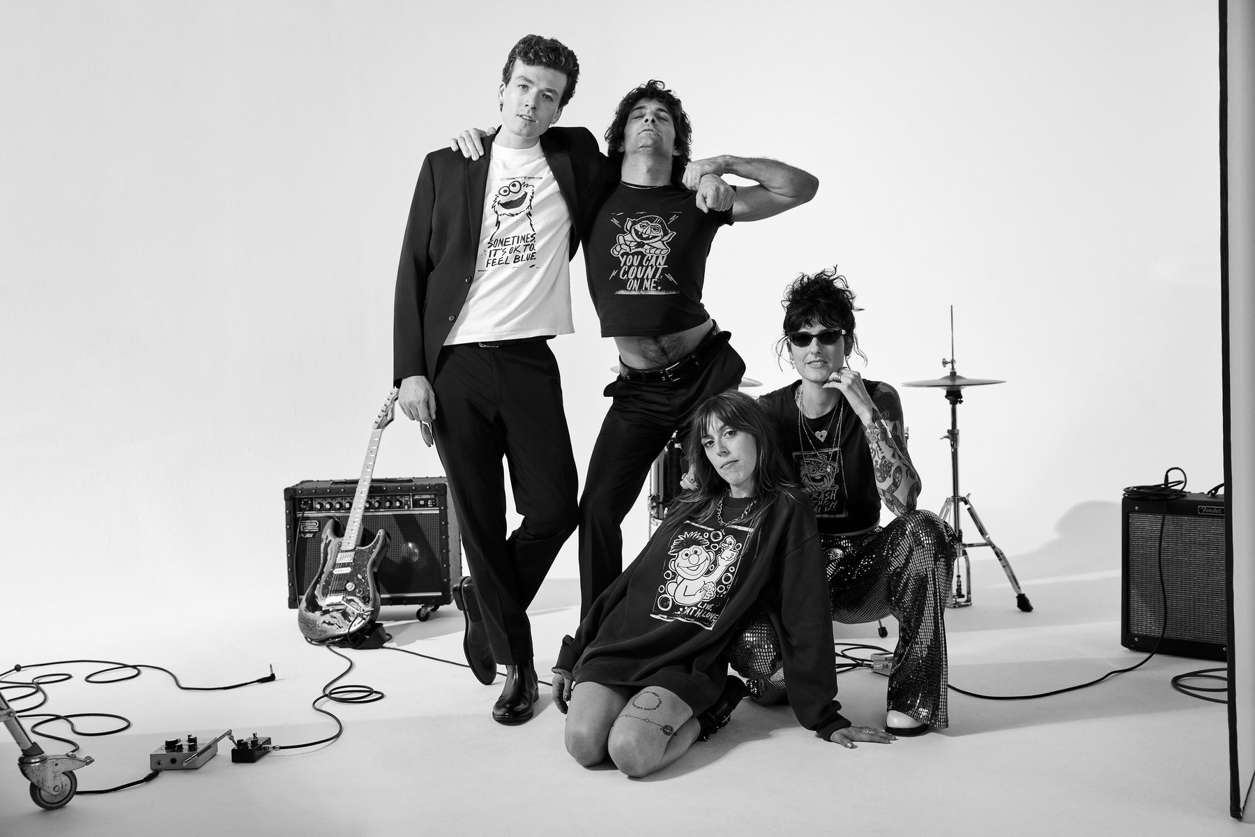
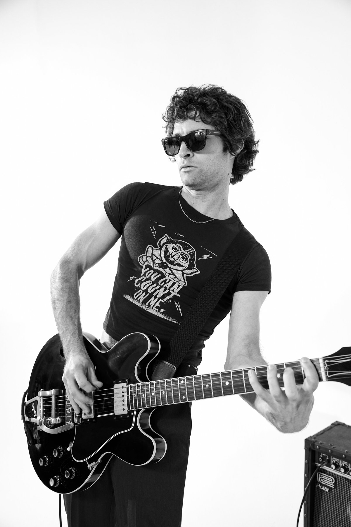
A Holiday 2023 capsule with Sesame Workshop, made to support mental health and emotional well-being. I illustrated every character myself and hand-lettered all of the type, then directed the collaboration around them: the film, the posters, the tees and hoodies, the site and the emails.

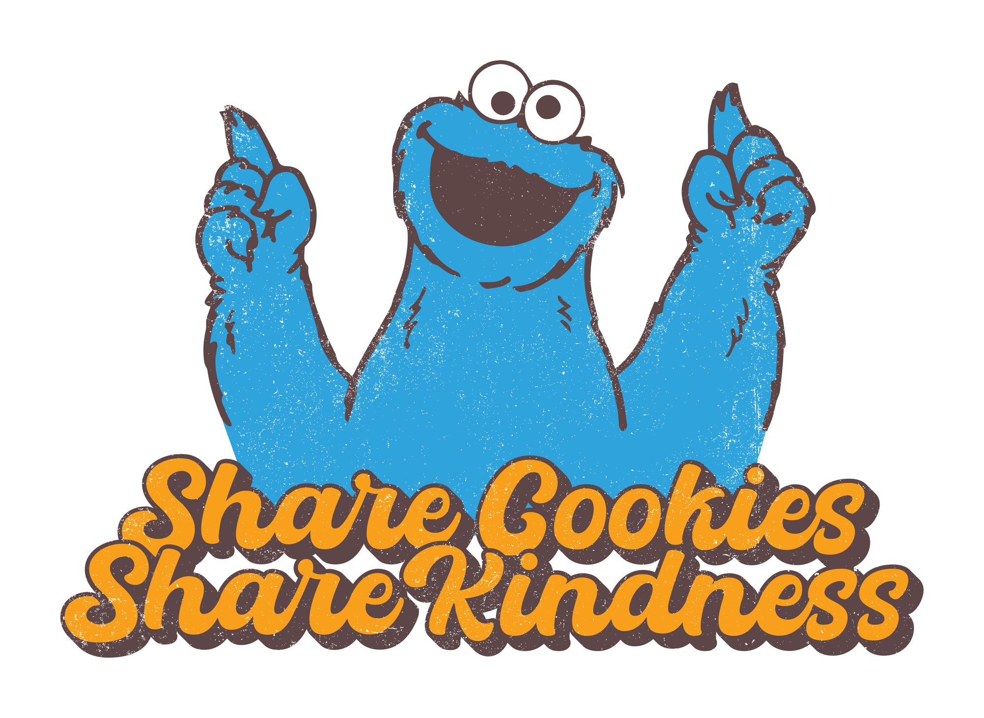
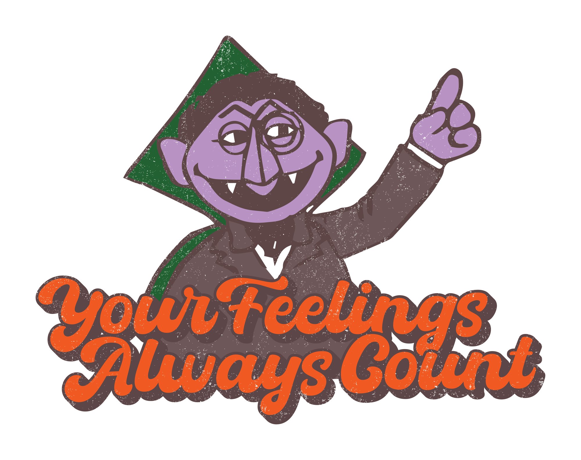
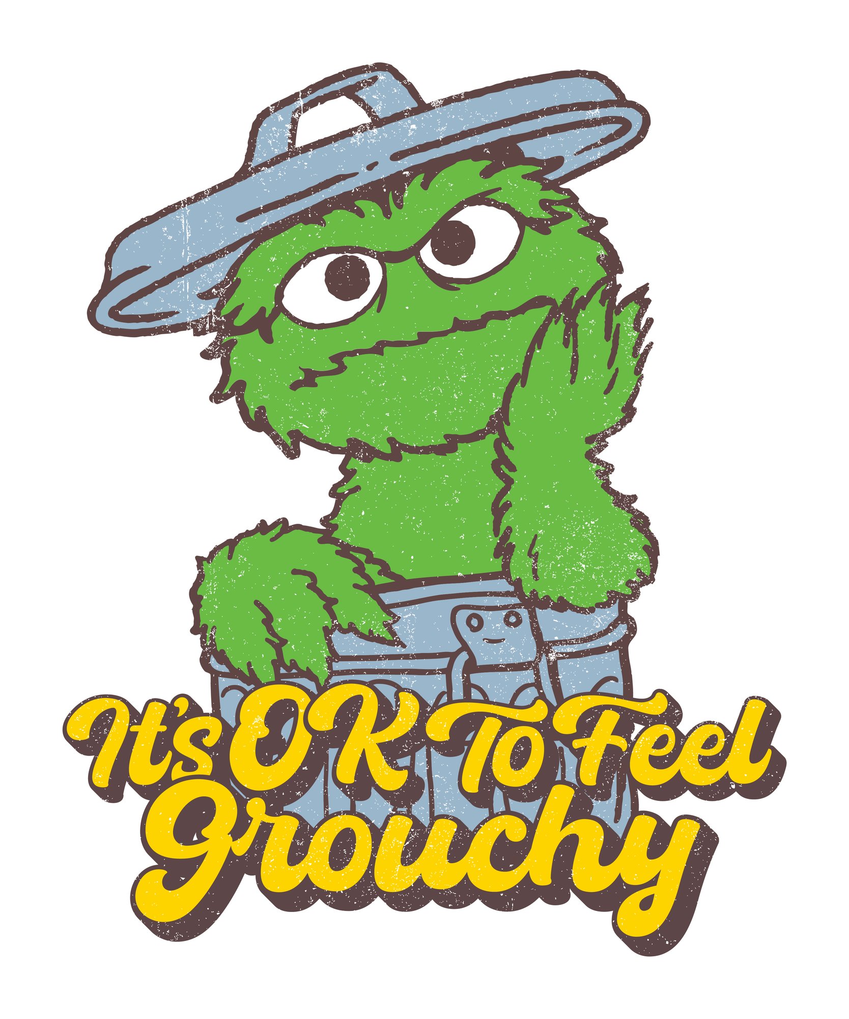
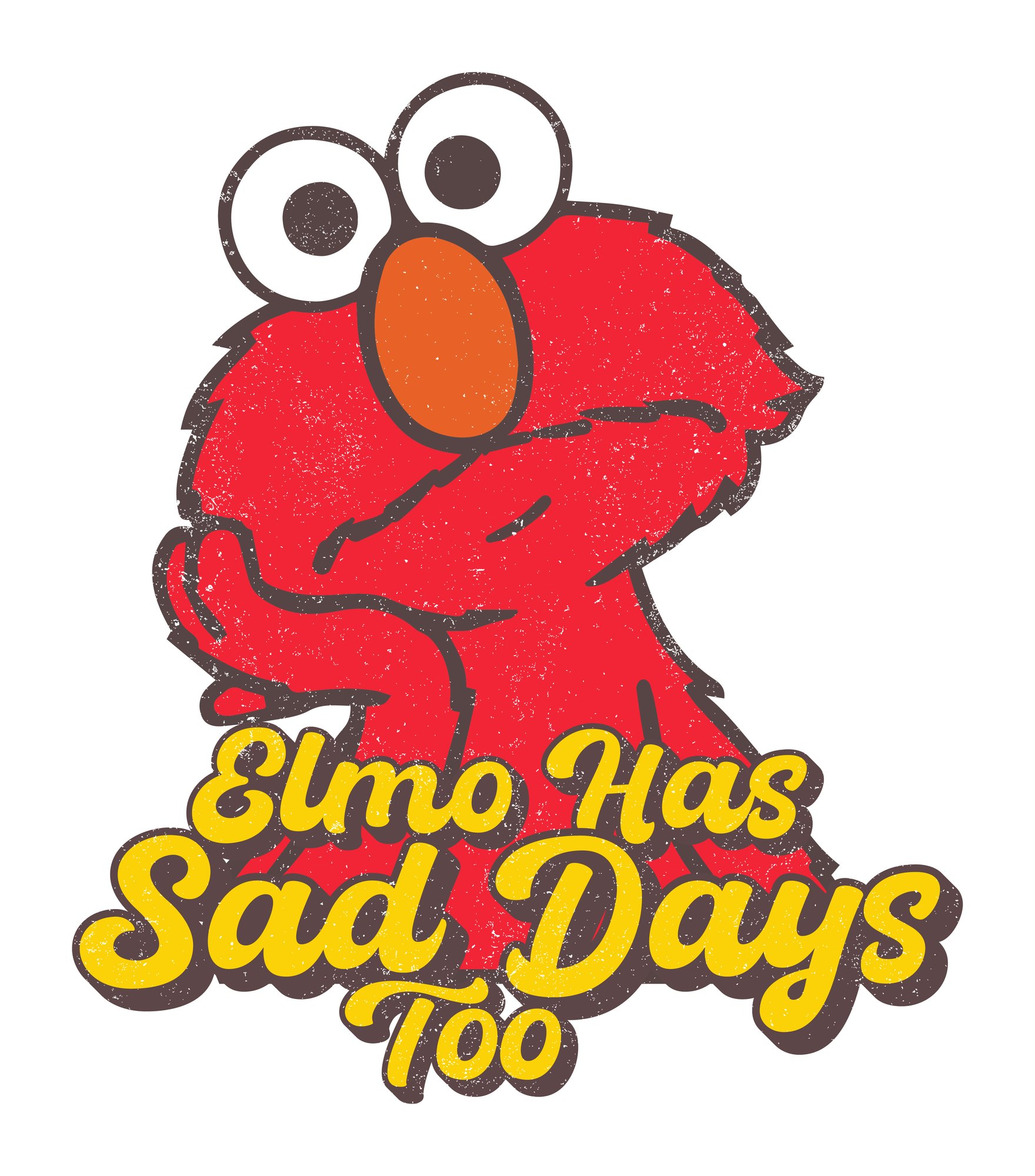
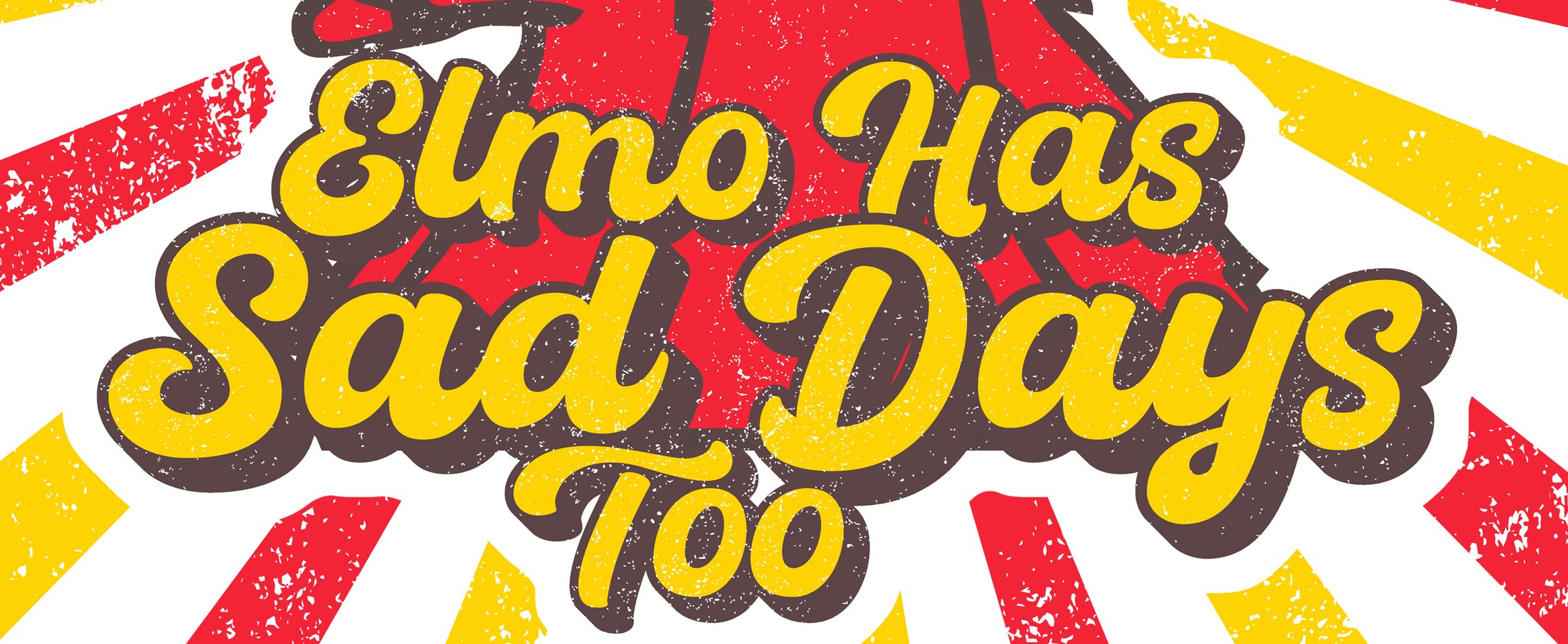
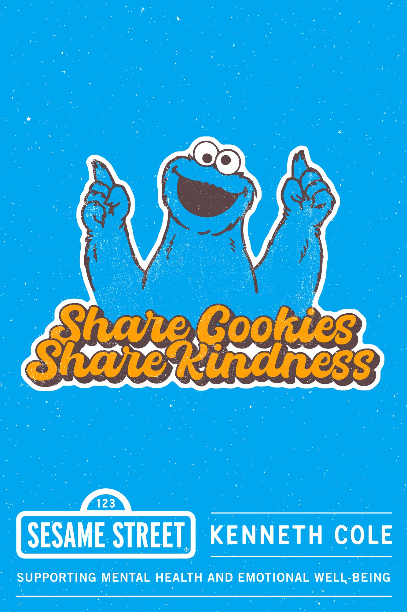
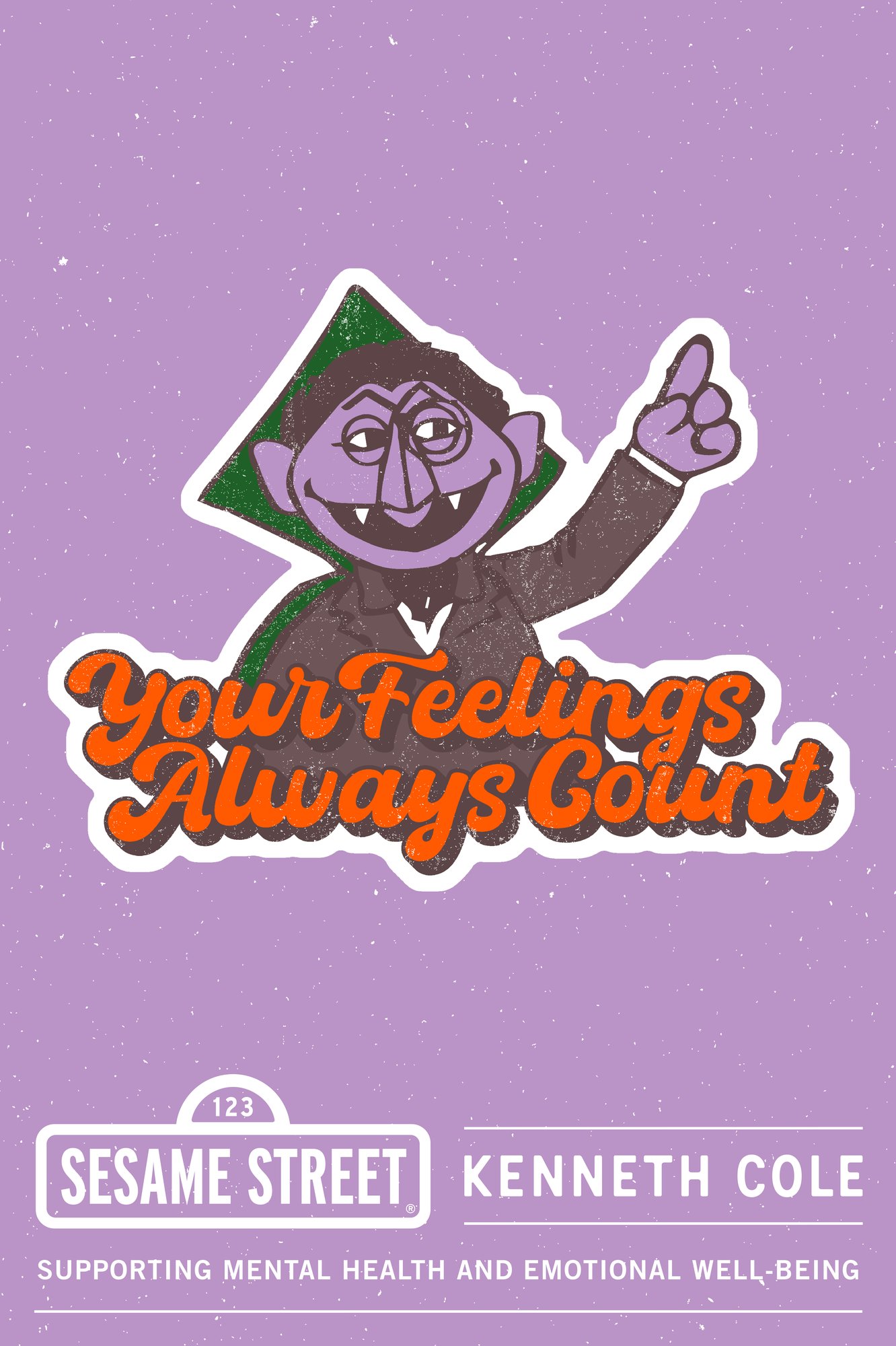
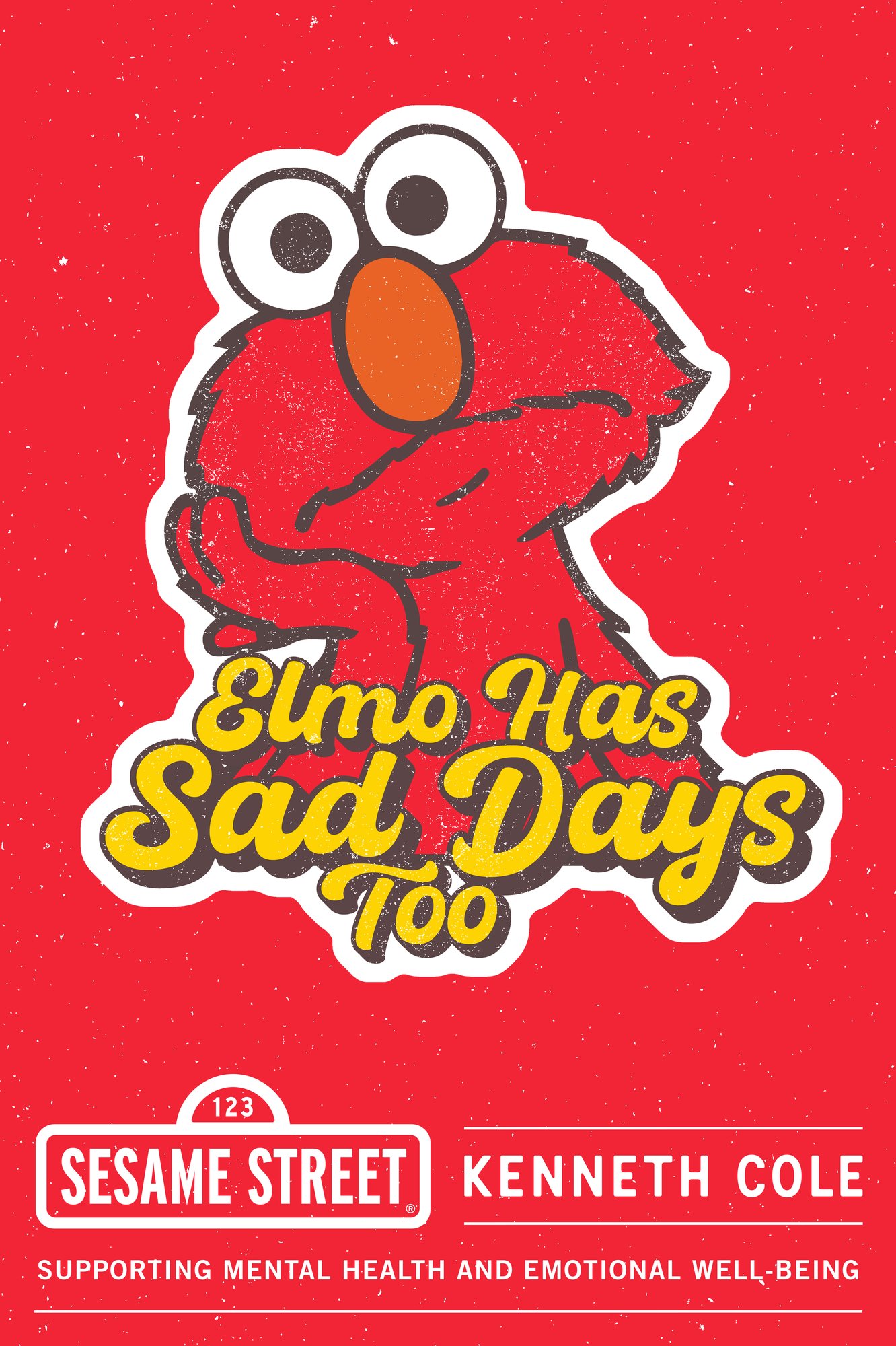
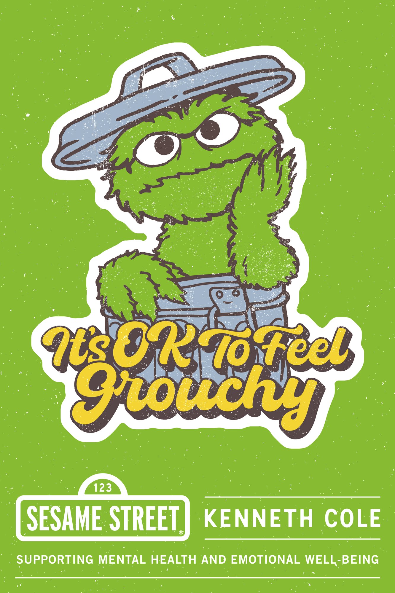
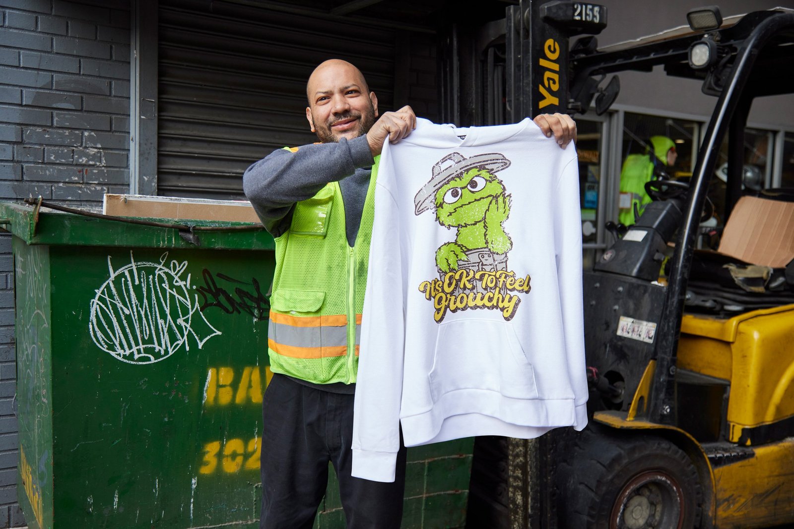
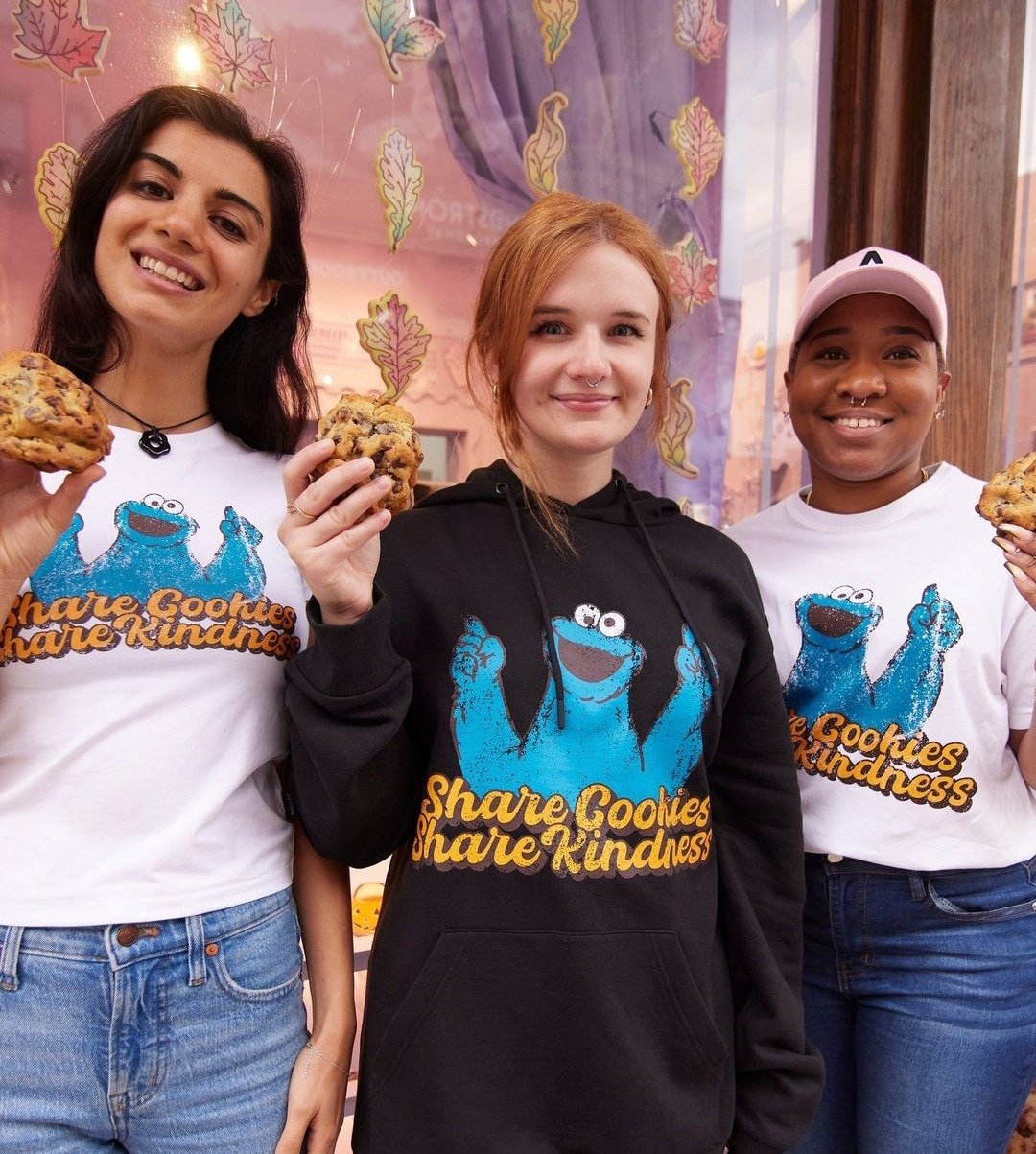
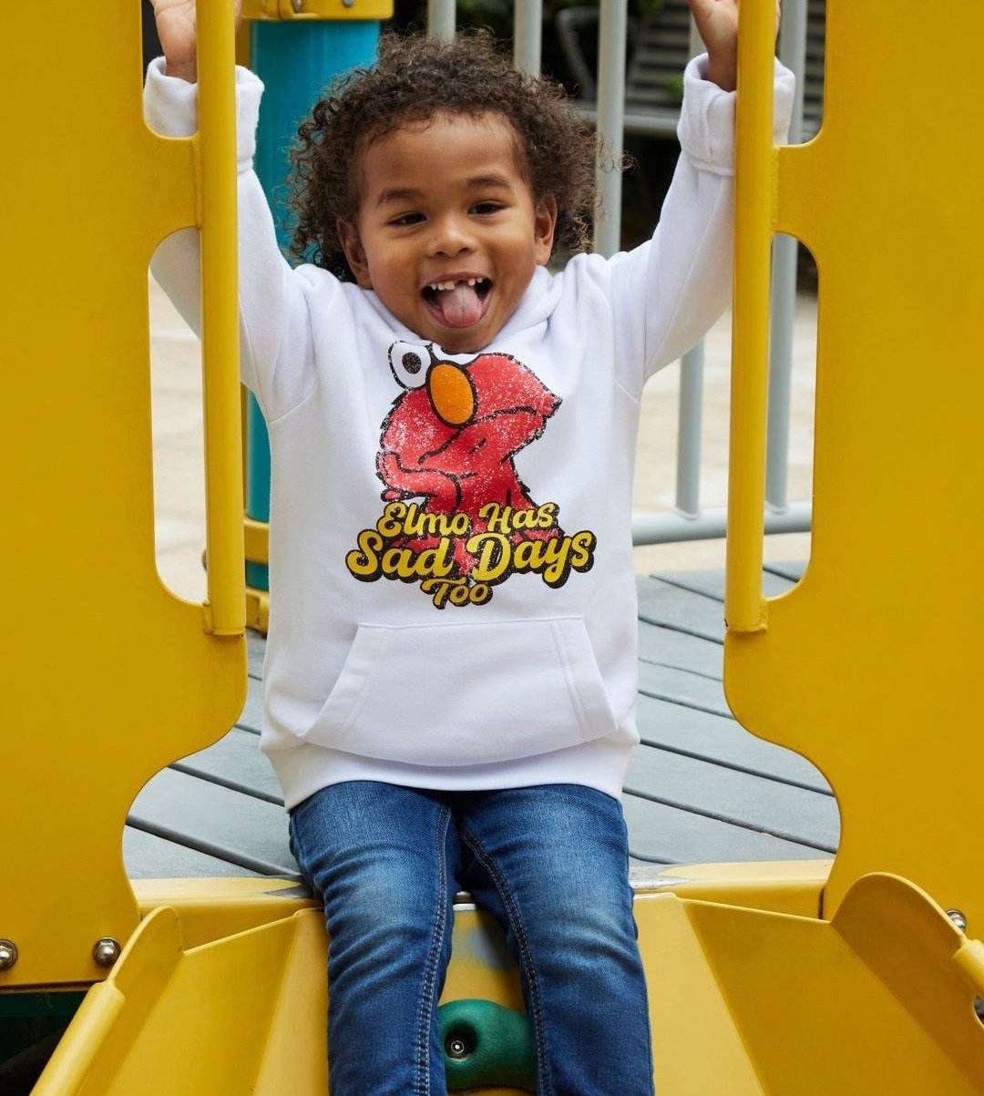
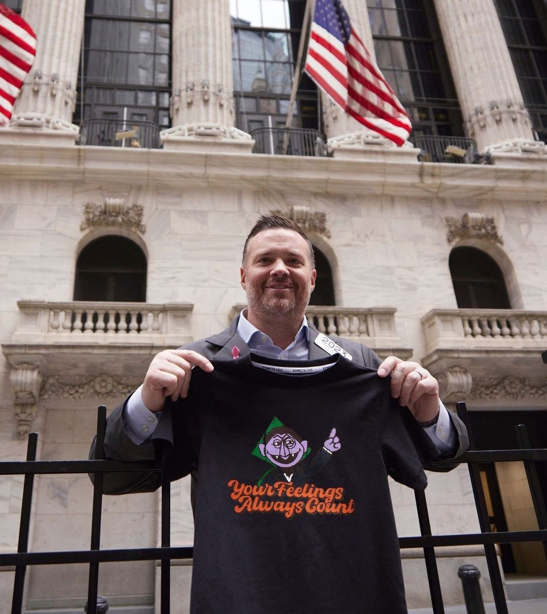
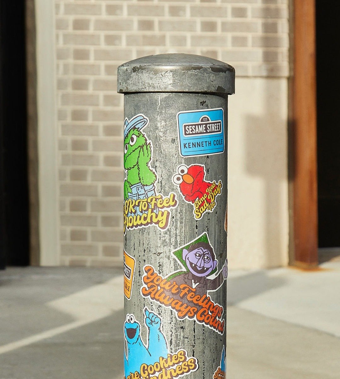
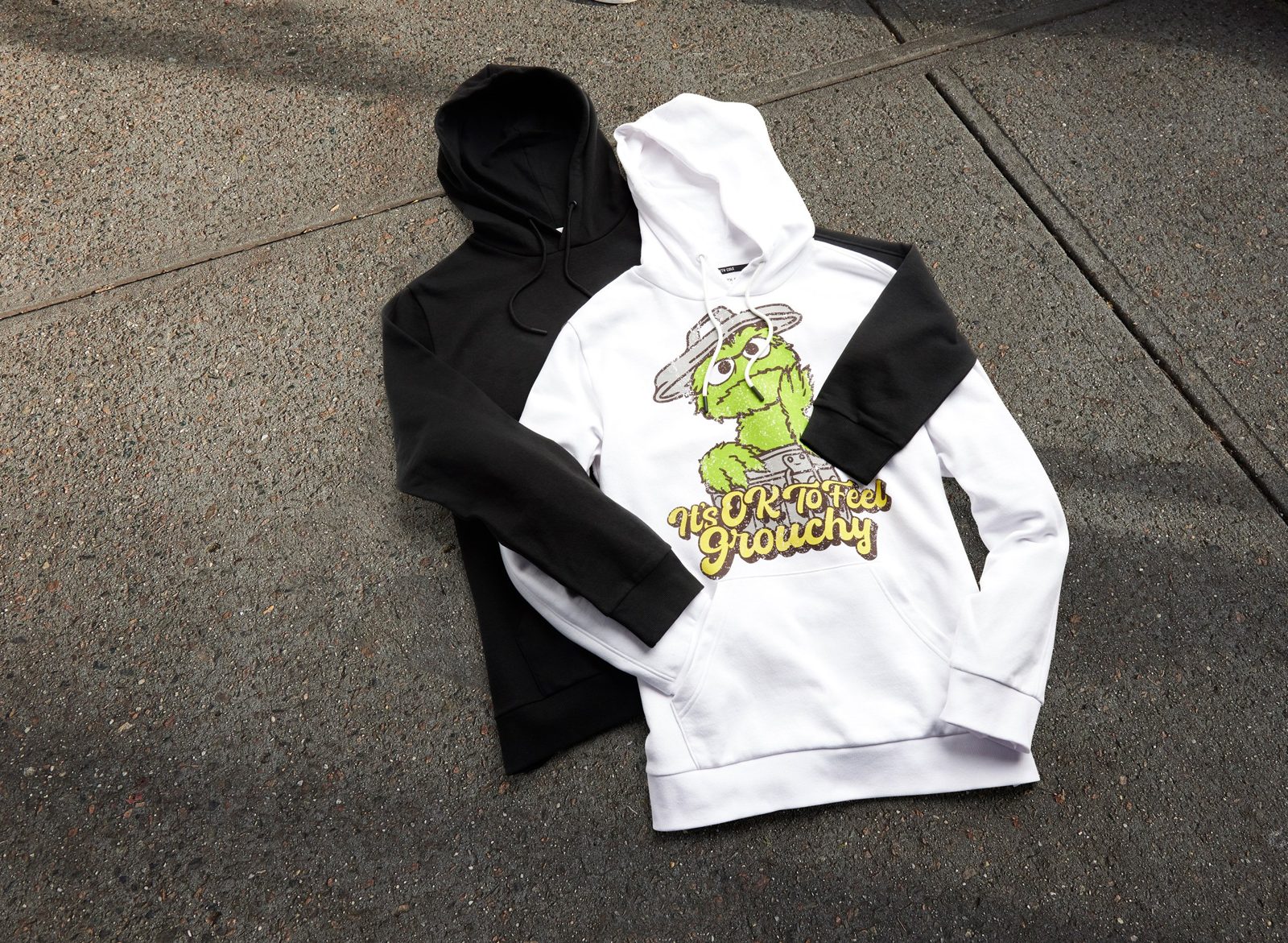
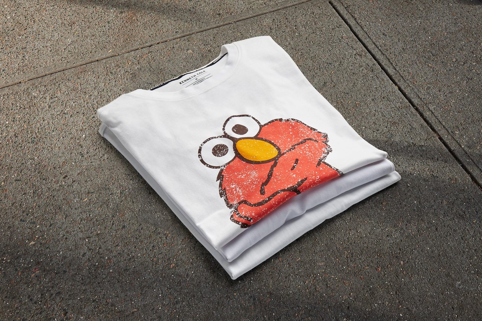

Drawn by hand
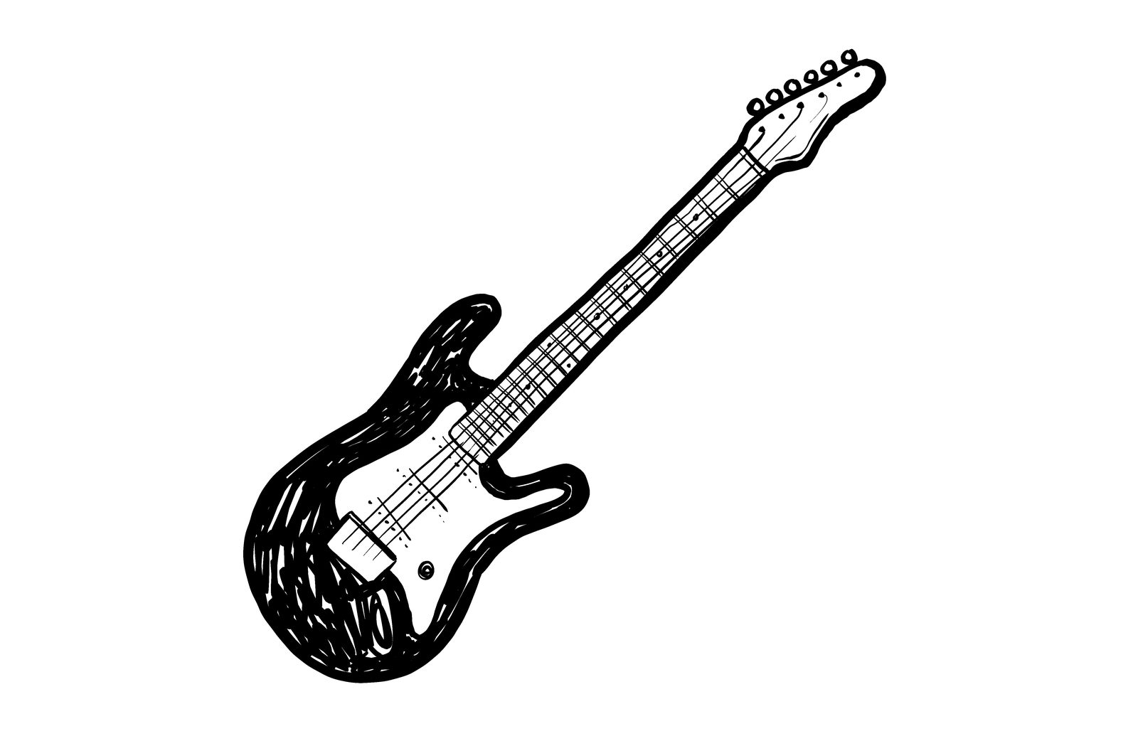
Every character inked in brush and marker, then built into stickers, totes, postcards and email.
40 Years Bold
In which the windows get written on.
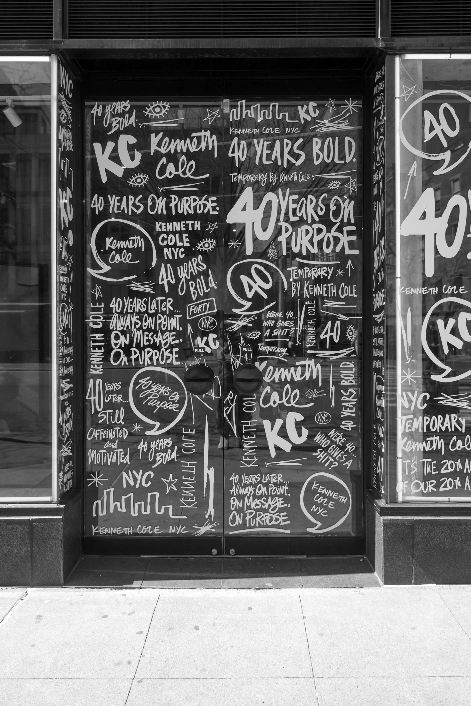
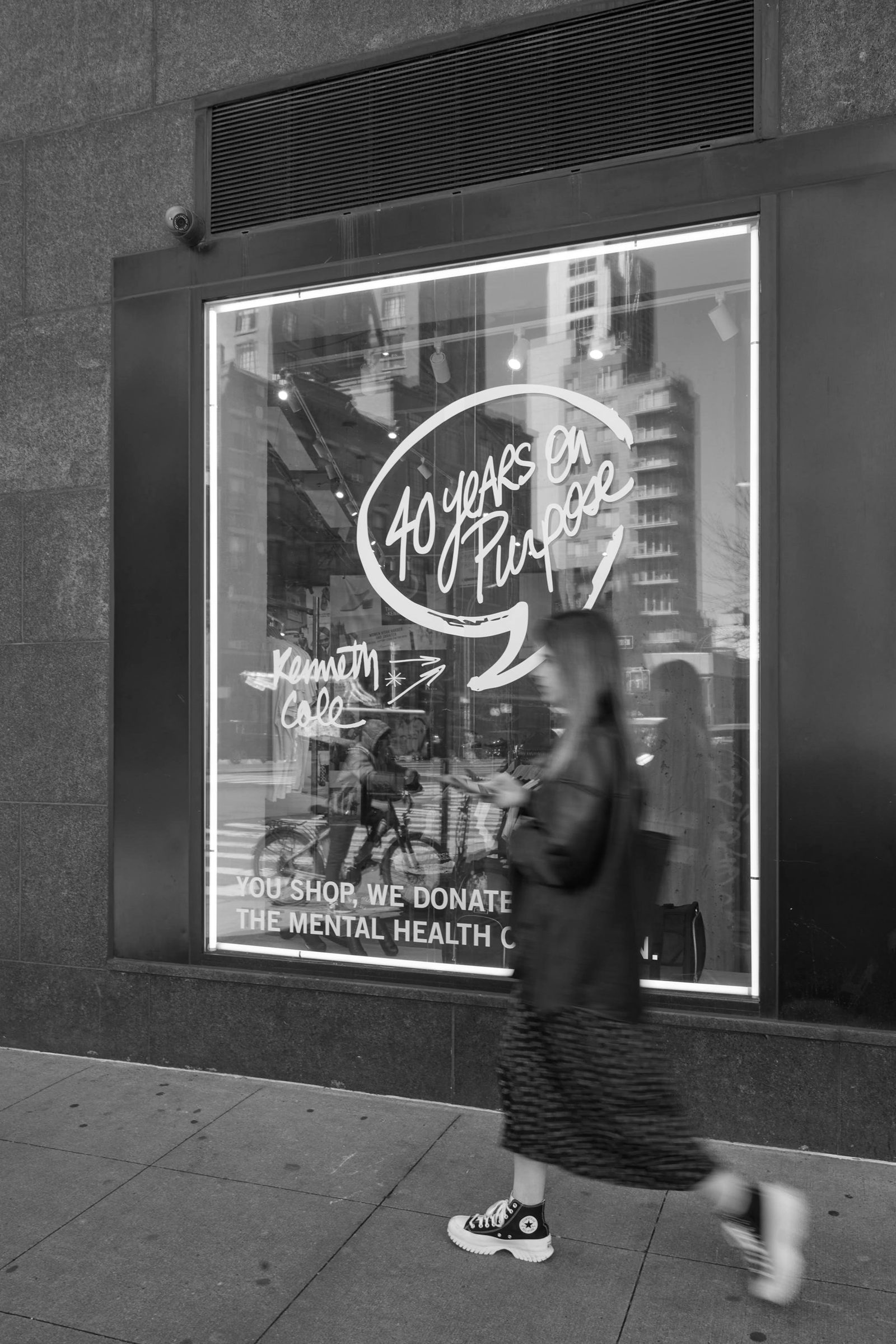
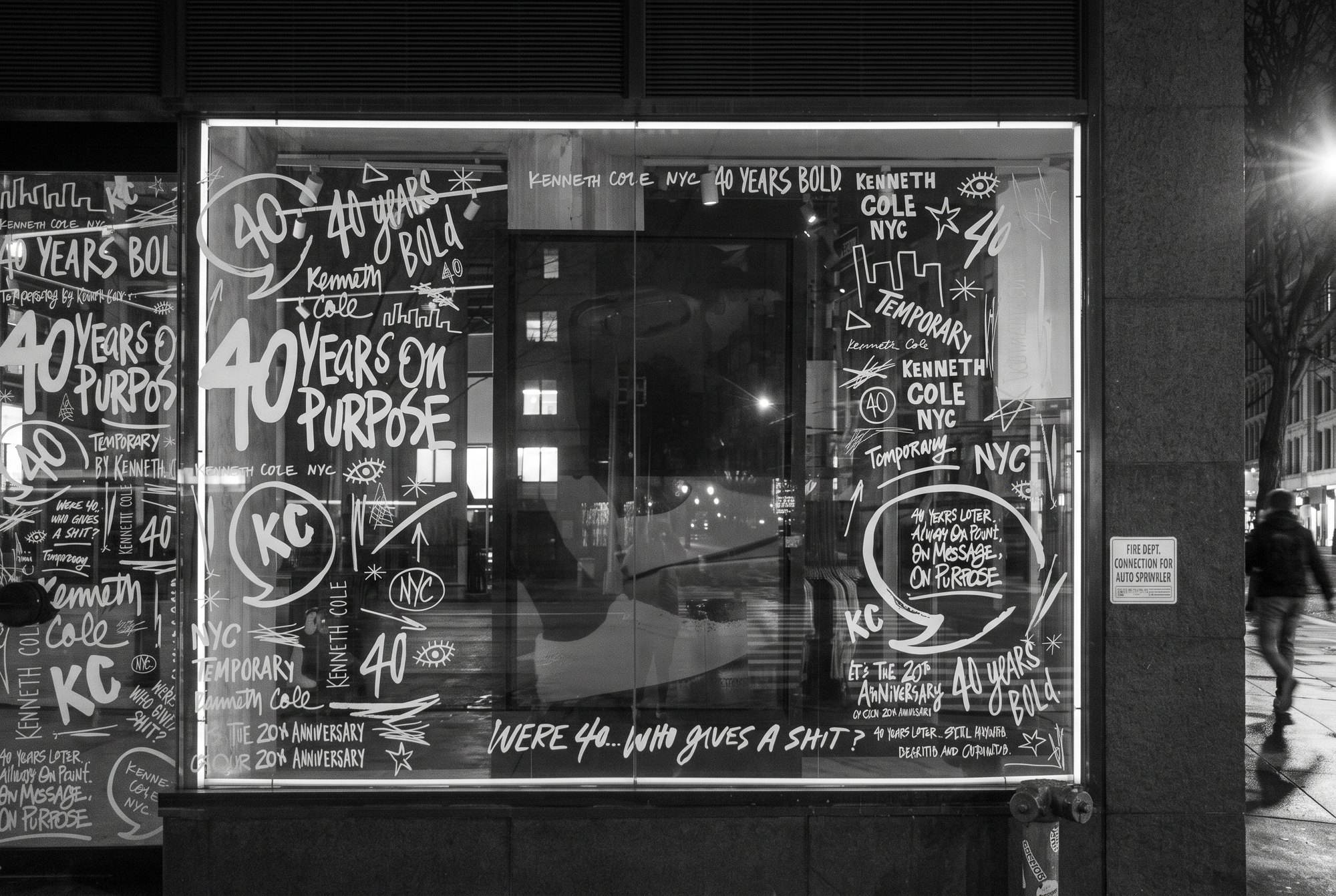
For the 40th anniversary I hand-lettered the windows, tees and site: forty years of Kenneth Cole slogans in one continuous hand, from a temporary storefront to the homepage.
Dude With Sign
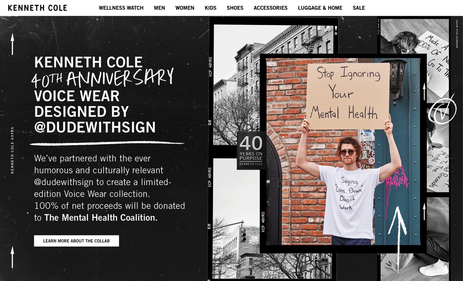
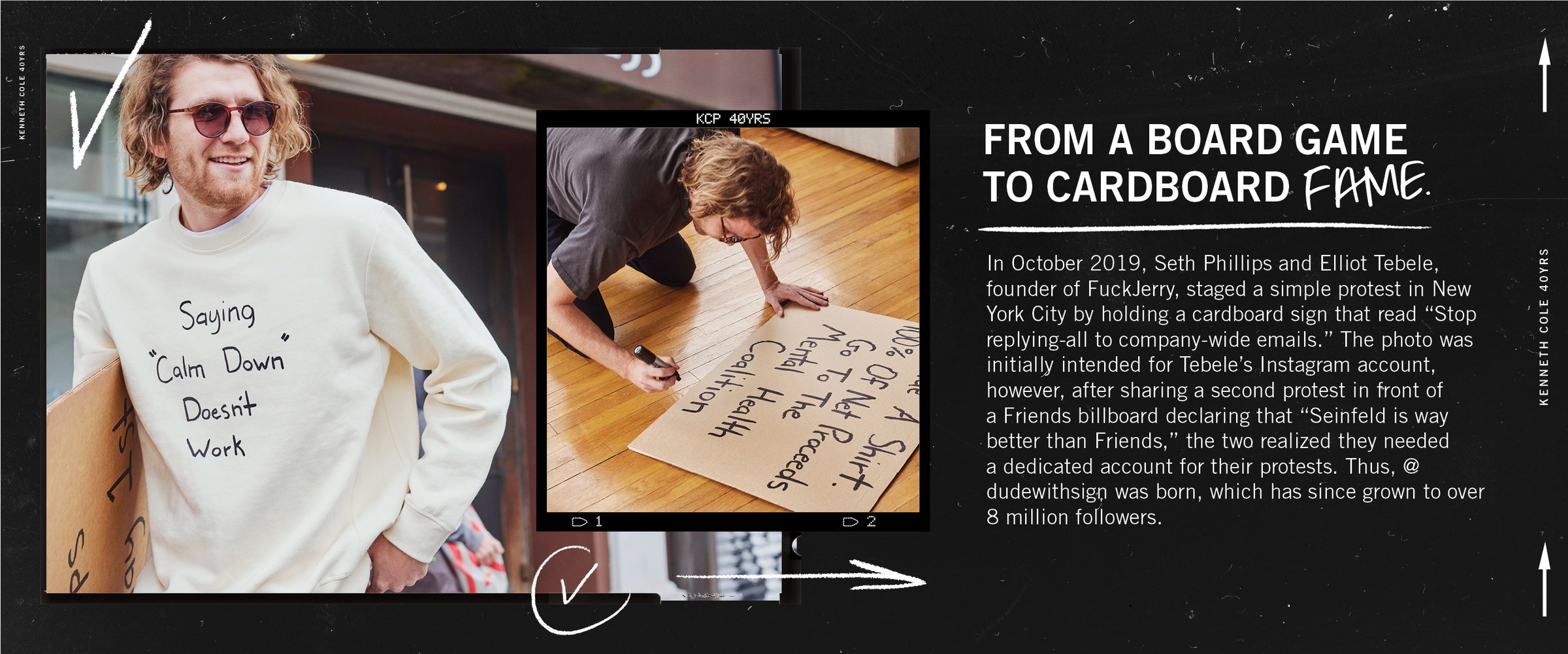
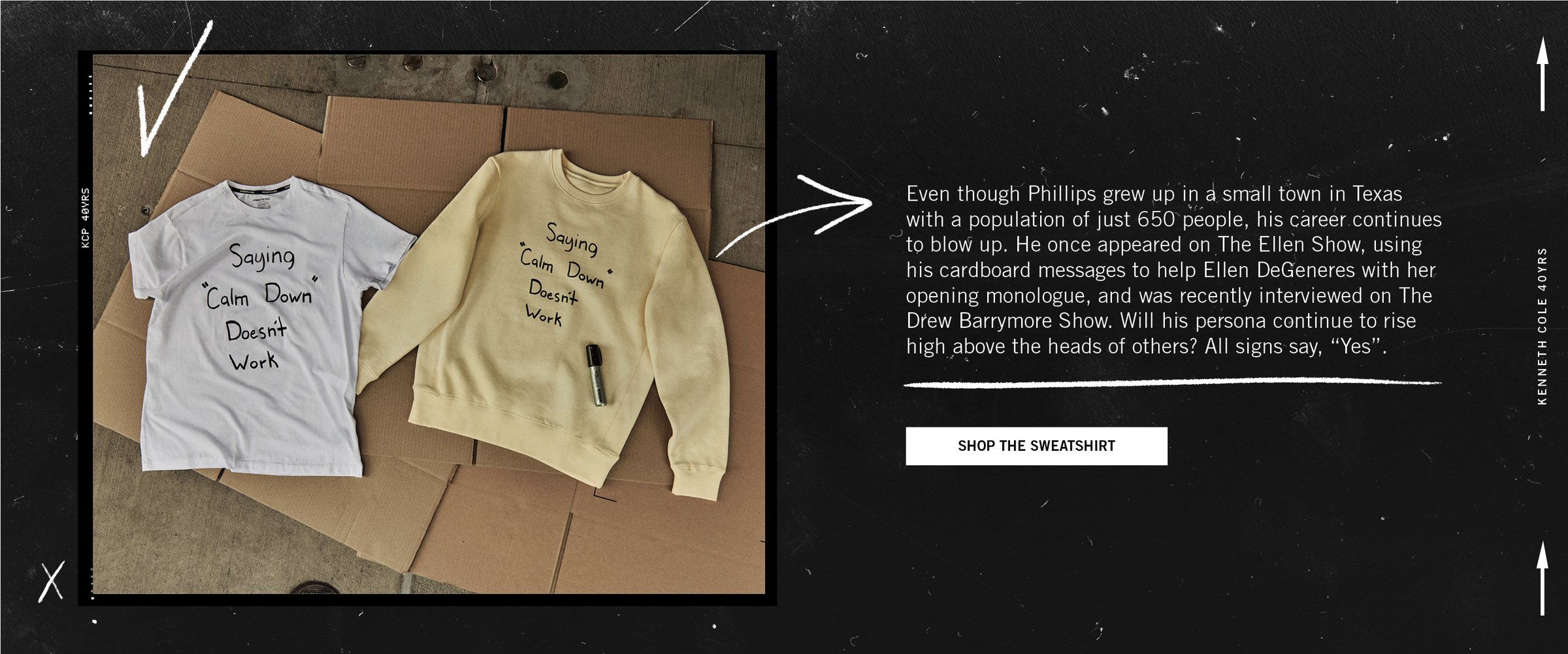
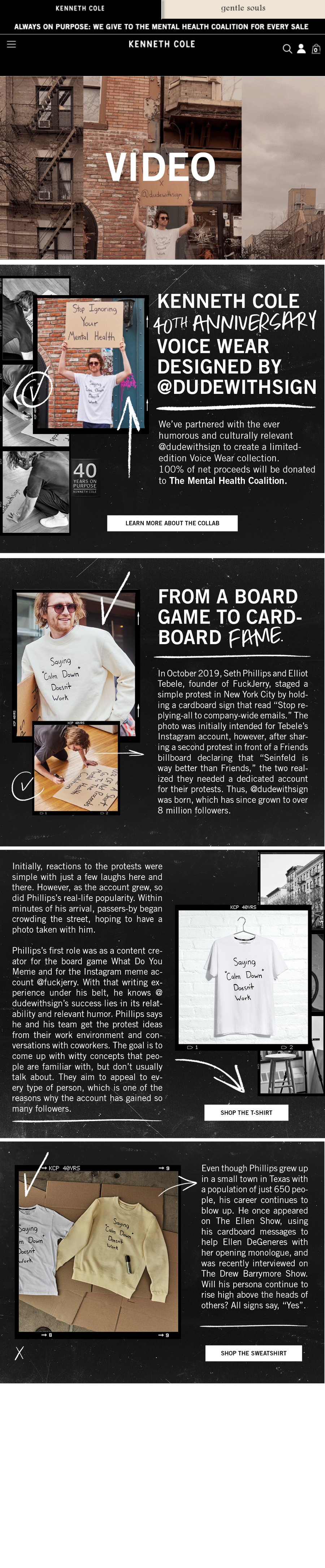
For the 40th, a limited-edition Voice Wear collection designed by @dudewithsign, Seth Phillips and his cardboard signs, with 100% of net proceeds going to The Mental Health Coalition. I was art director on the launch film, and I designed the launch around his handwriting: the homepage, the landing page and the emails.
Voice Wear
In which a T-shirt speaks up.
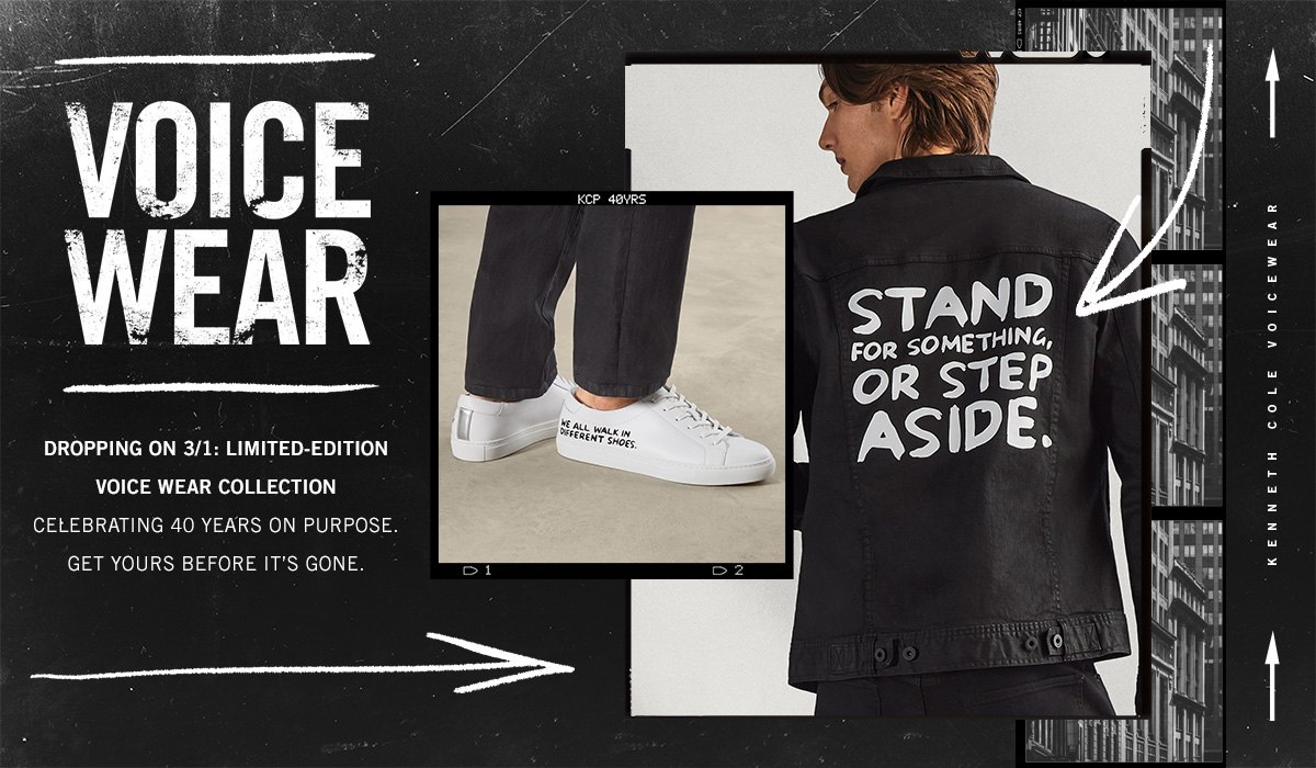
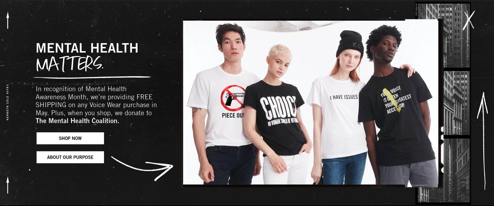
Kenneth Cole has always put a point of view on the street. Voice Wear puts it on a T-shirt: tees that speak up on mental health, gun safety, Pride and voting. I art directed the drops and lettered the lines by hand.
Mental health
Handle with care. Disconnect to connect. Emotionally available. Three lines written in a loose marker hand, so they read like a note to a friend.
Downtown flyers
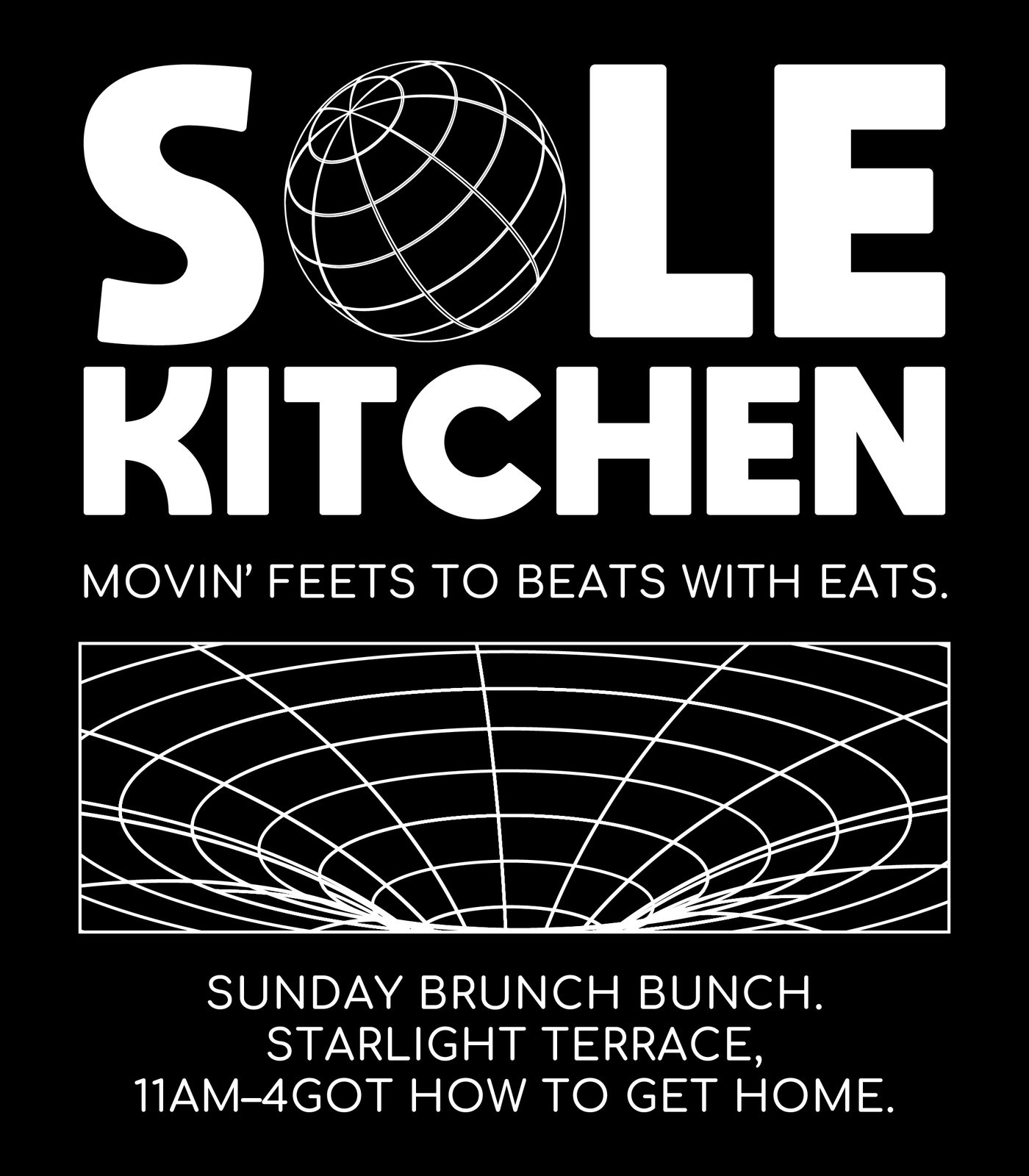
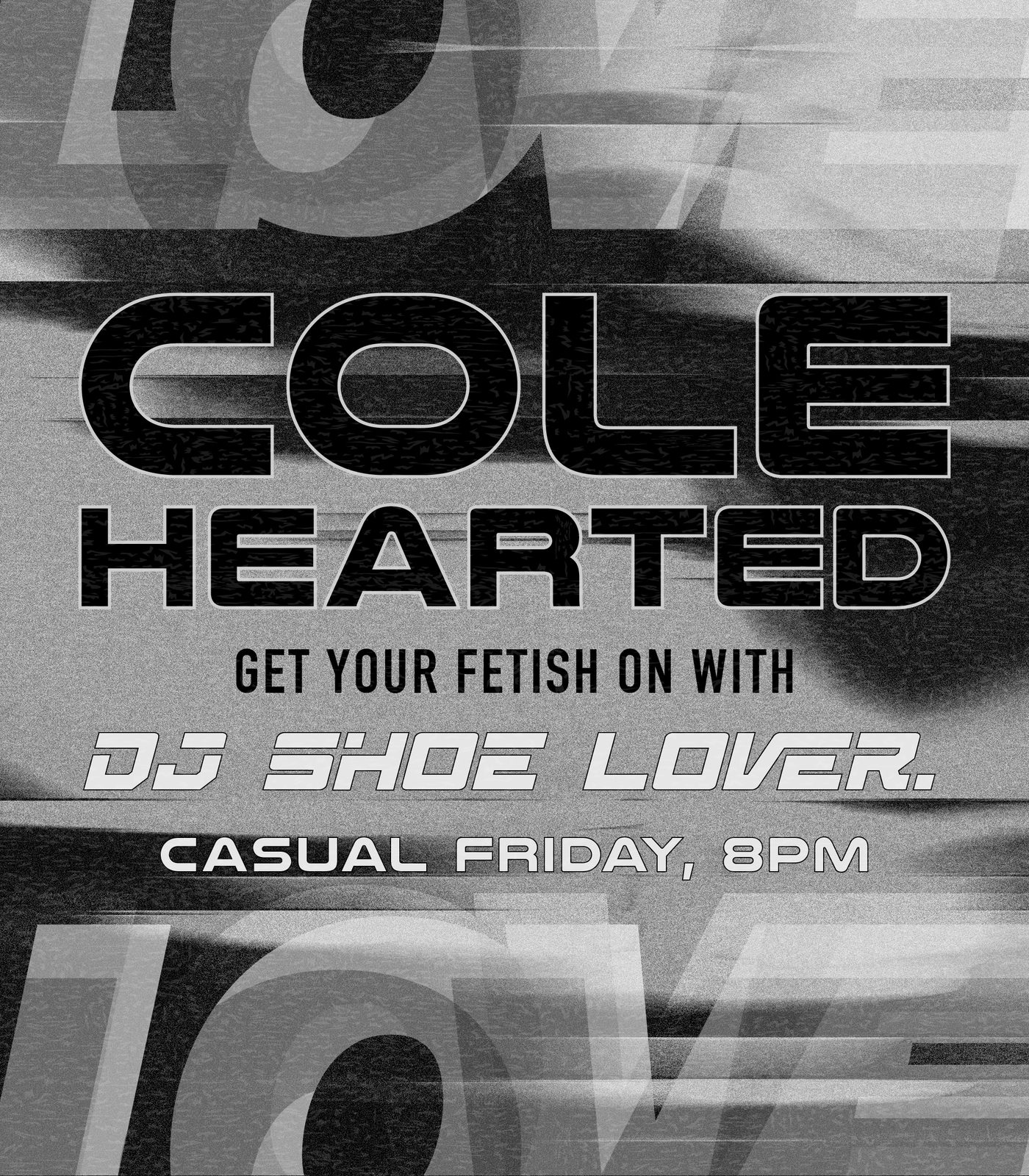
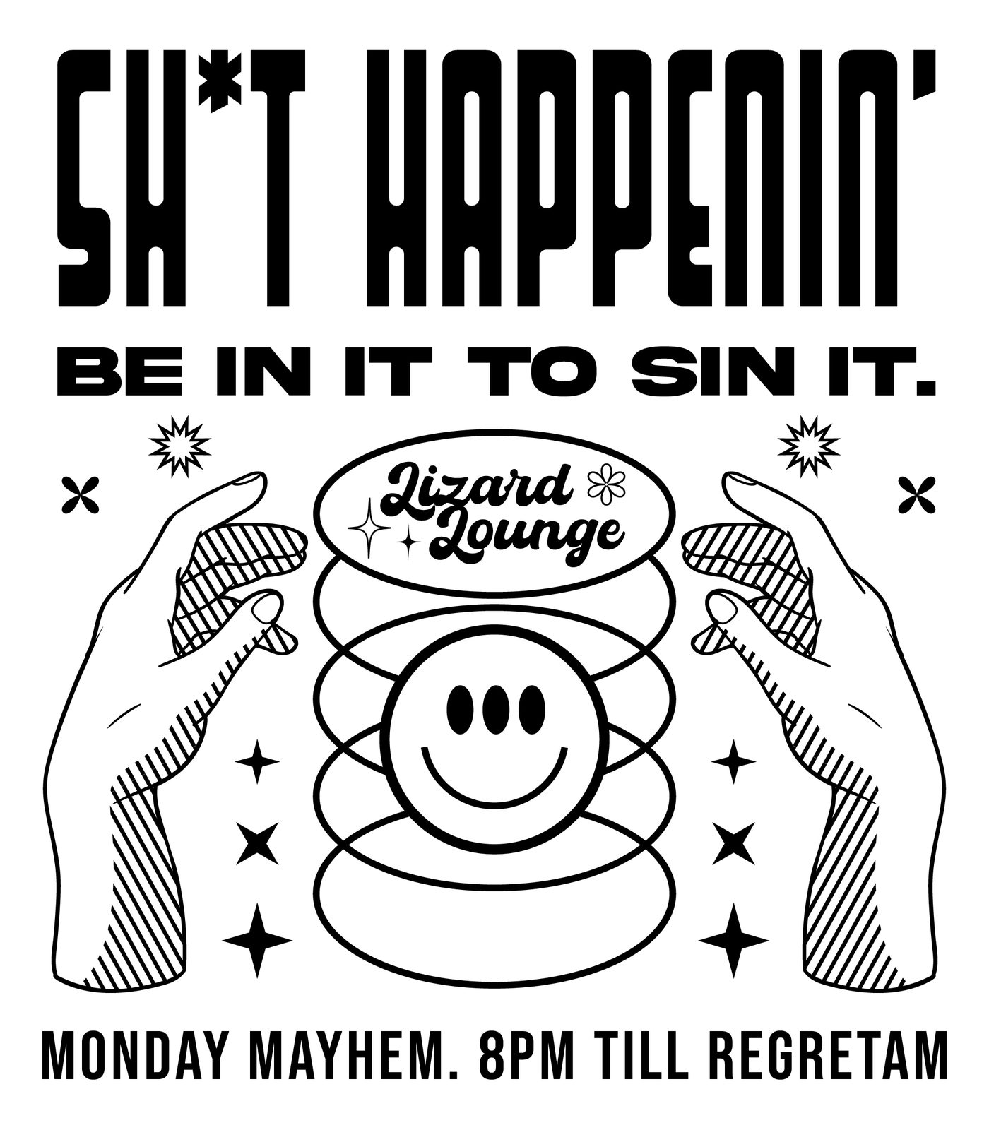
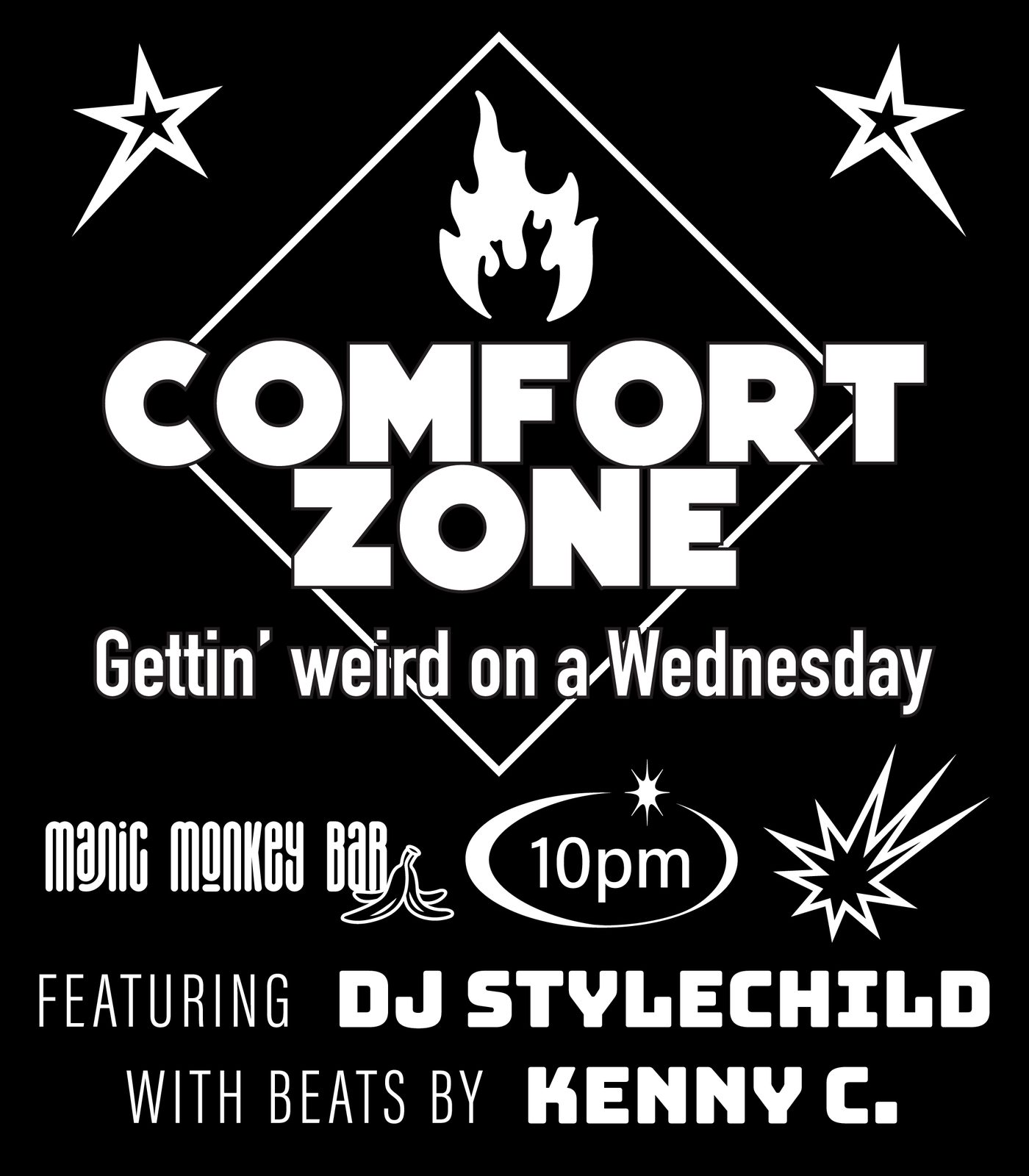
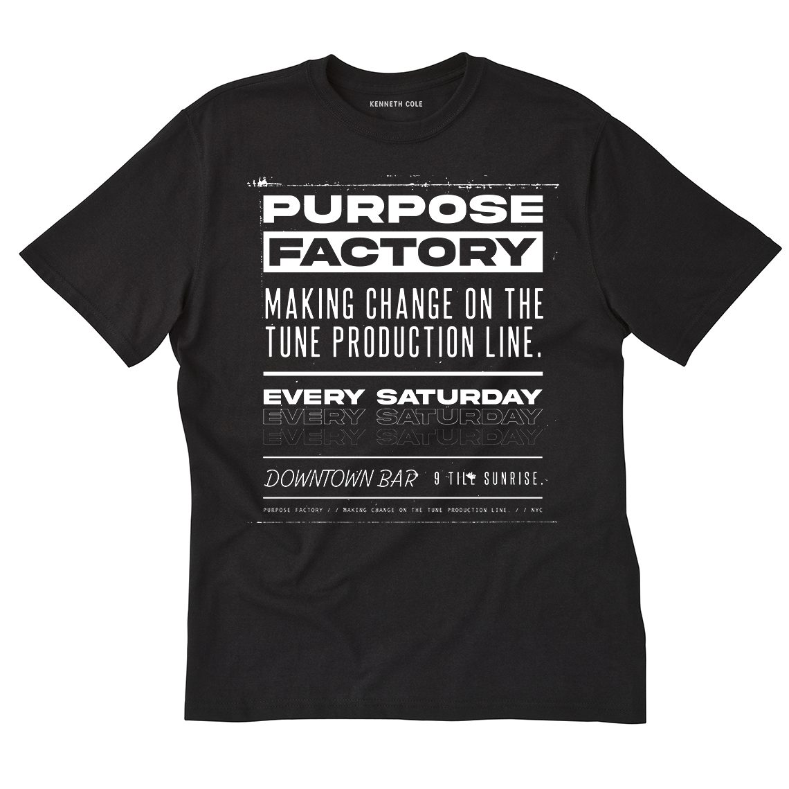
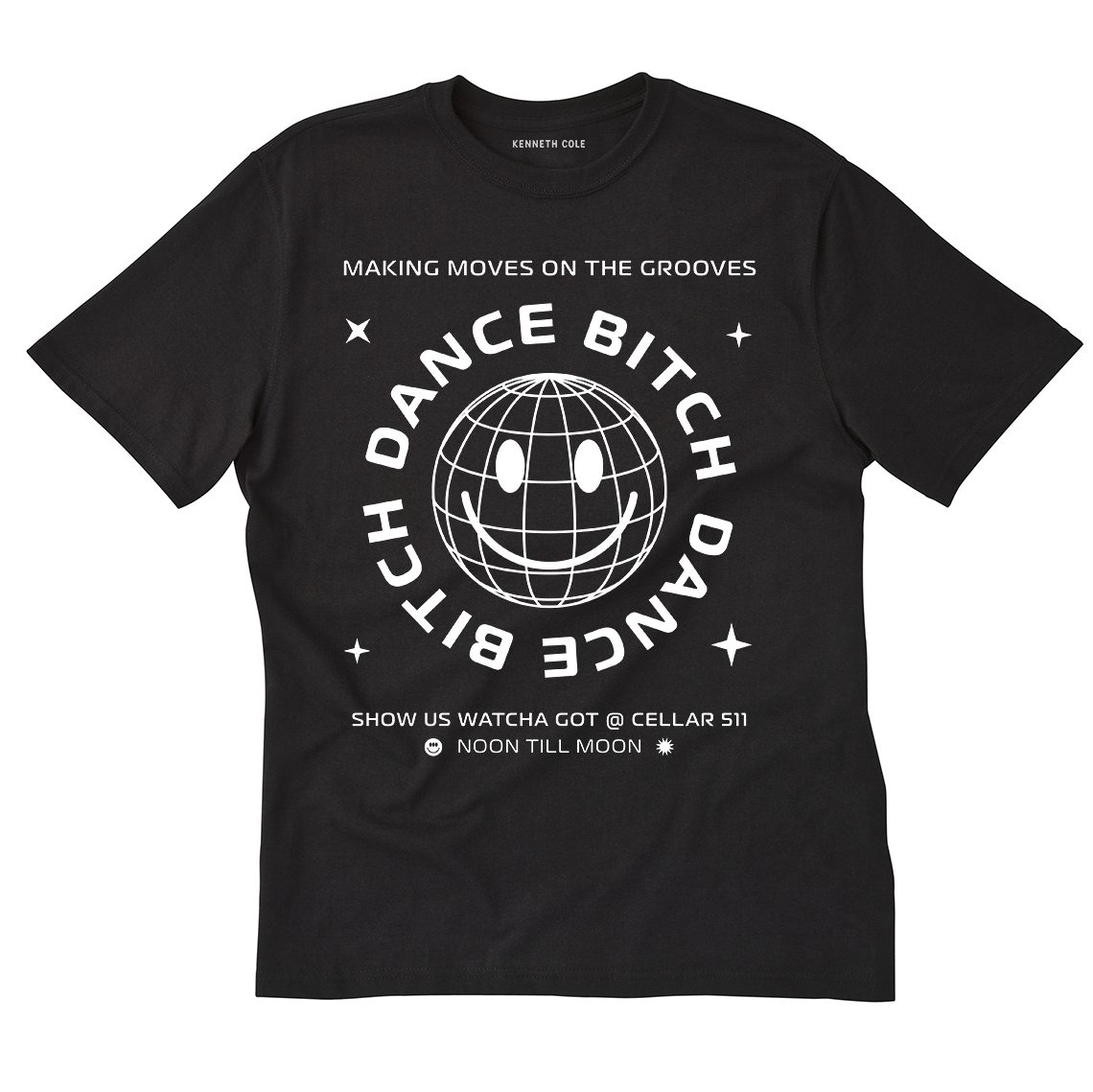
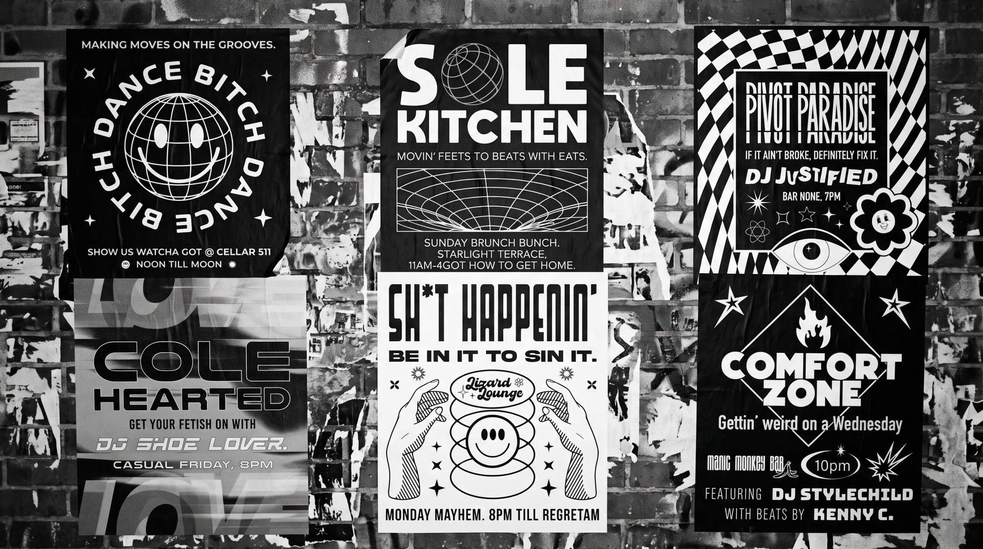
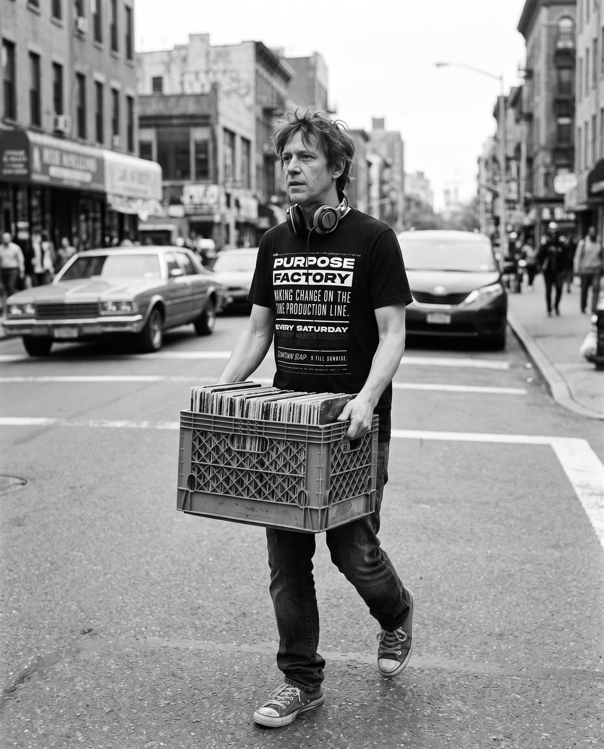
Kenneth and Emily Cole wanted the energy of 80s and 90s New York nightlife flyers. So every message became a party that never happened: Purpose Factory, Sole Kitchen, Cole Hearted, Pivot Paradise.
On the street
The tees out in the city they were made for. Real Voice Wear graphics, imagined casting.
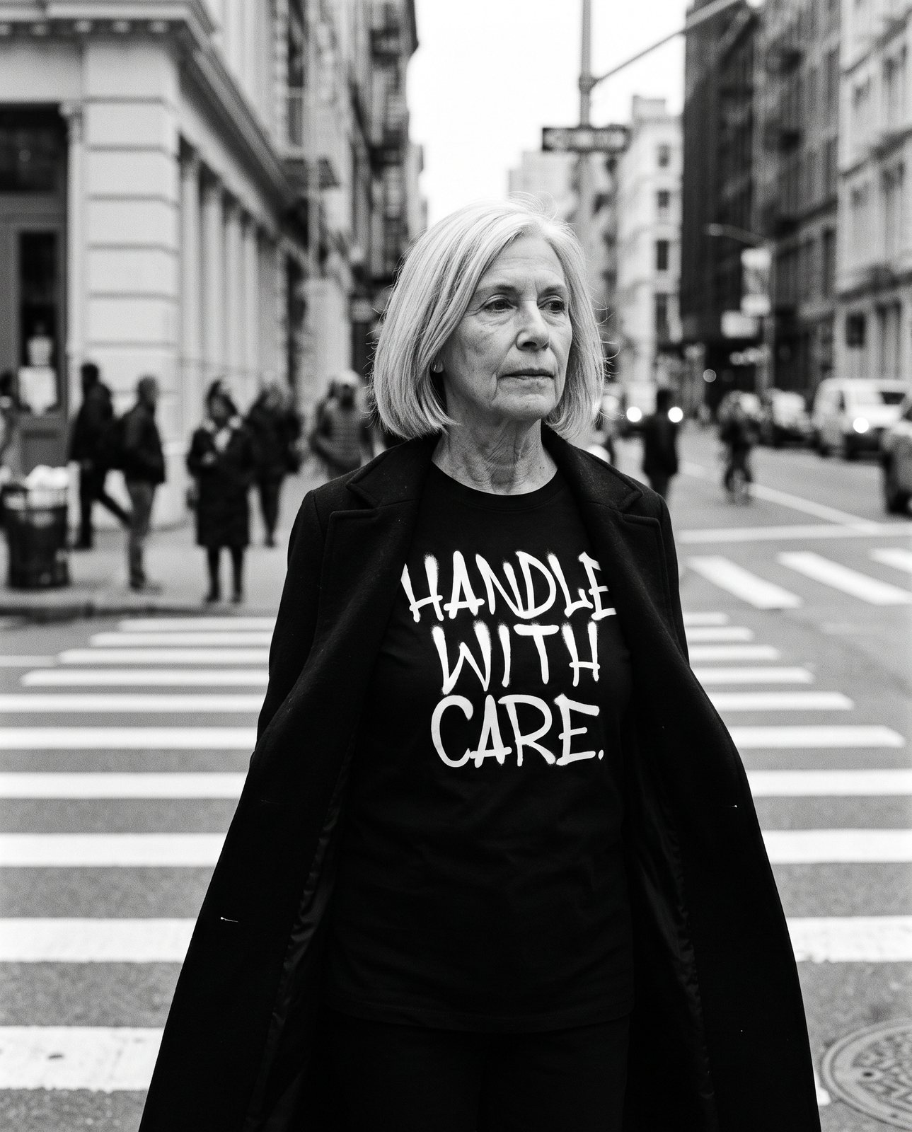
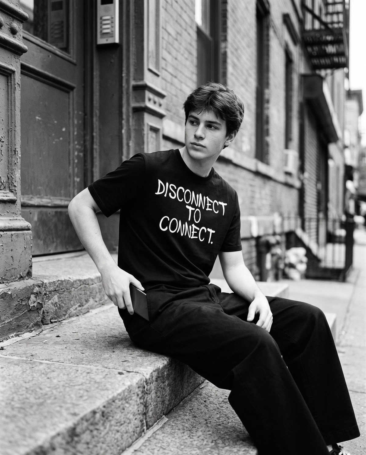
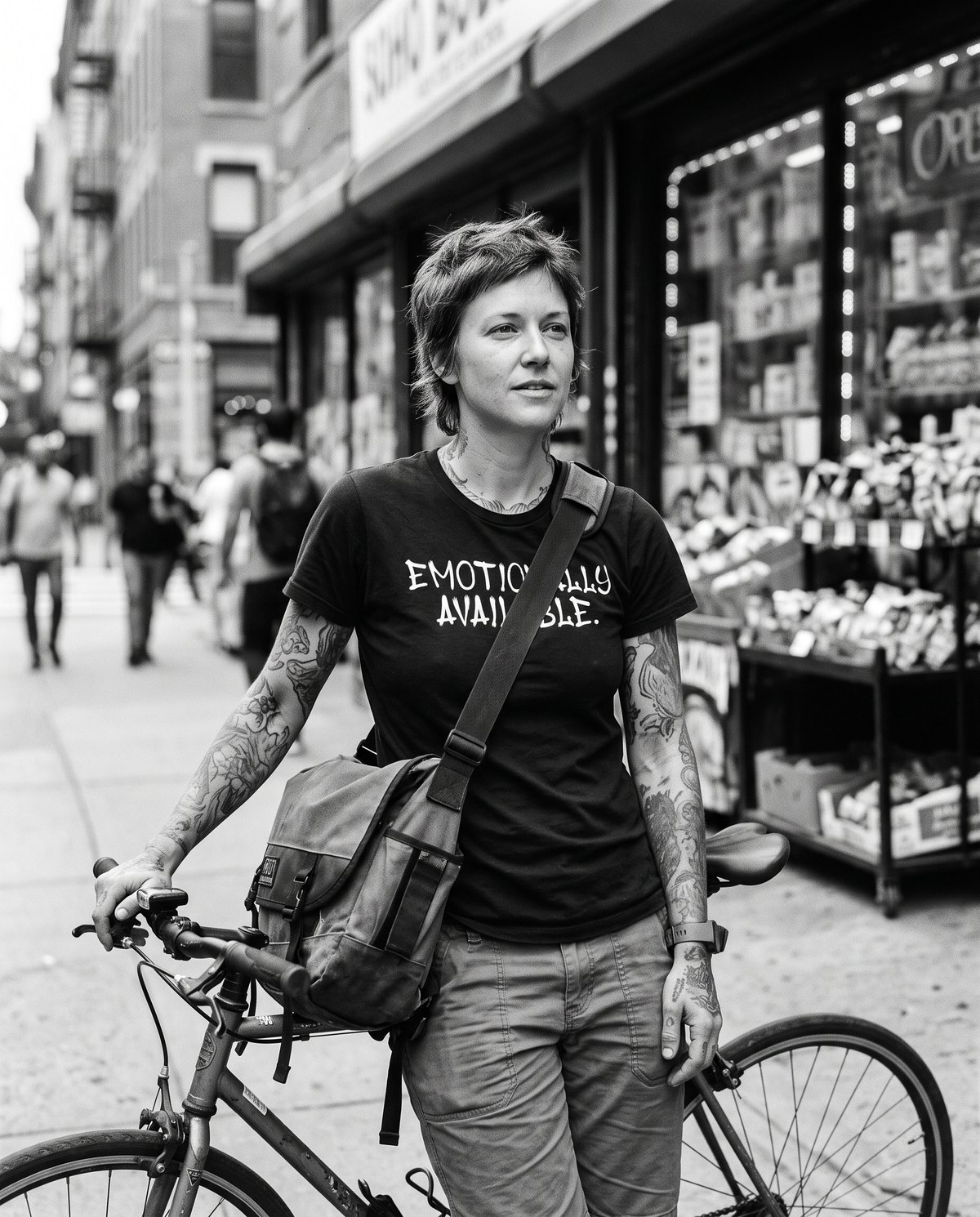
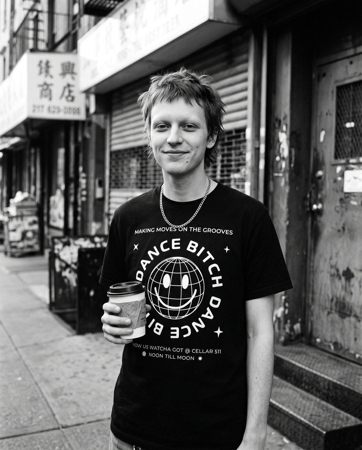
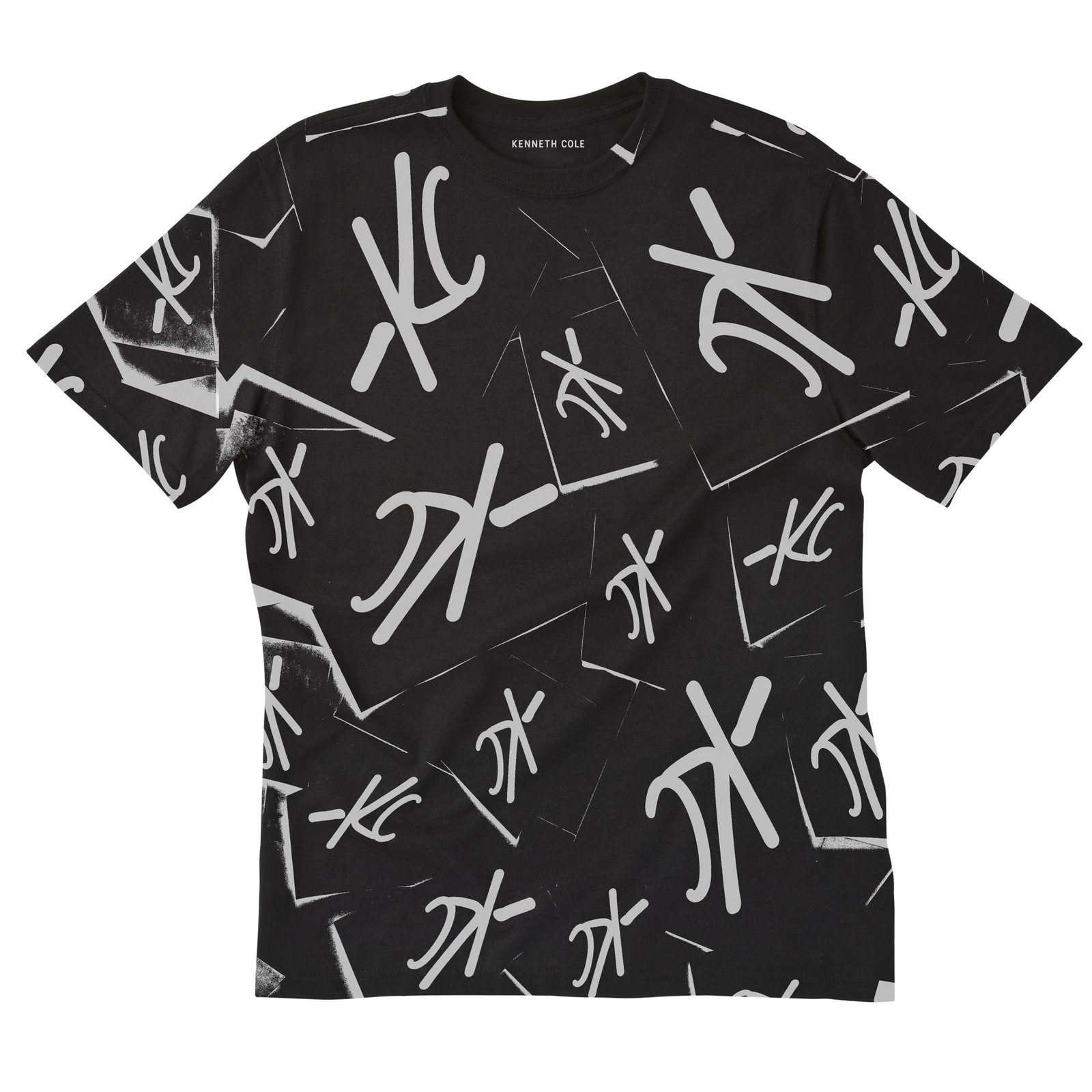
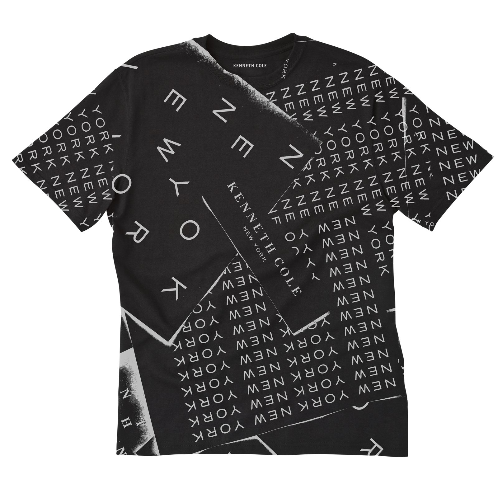
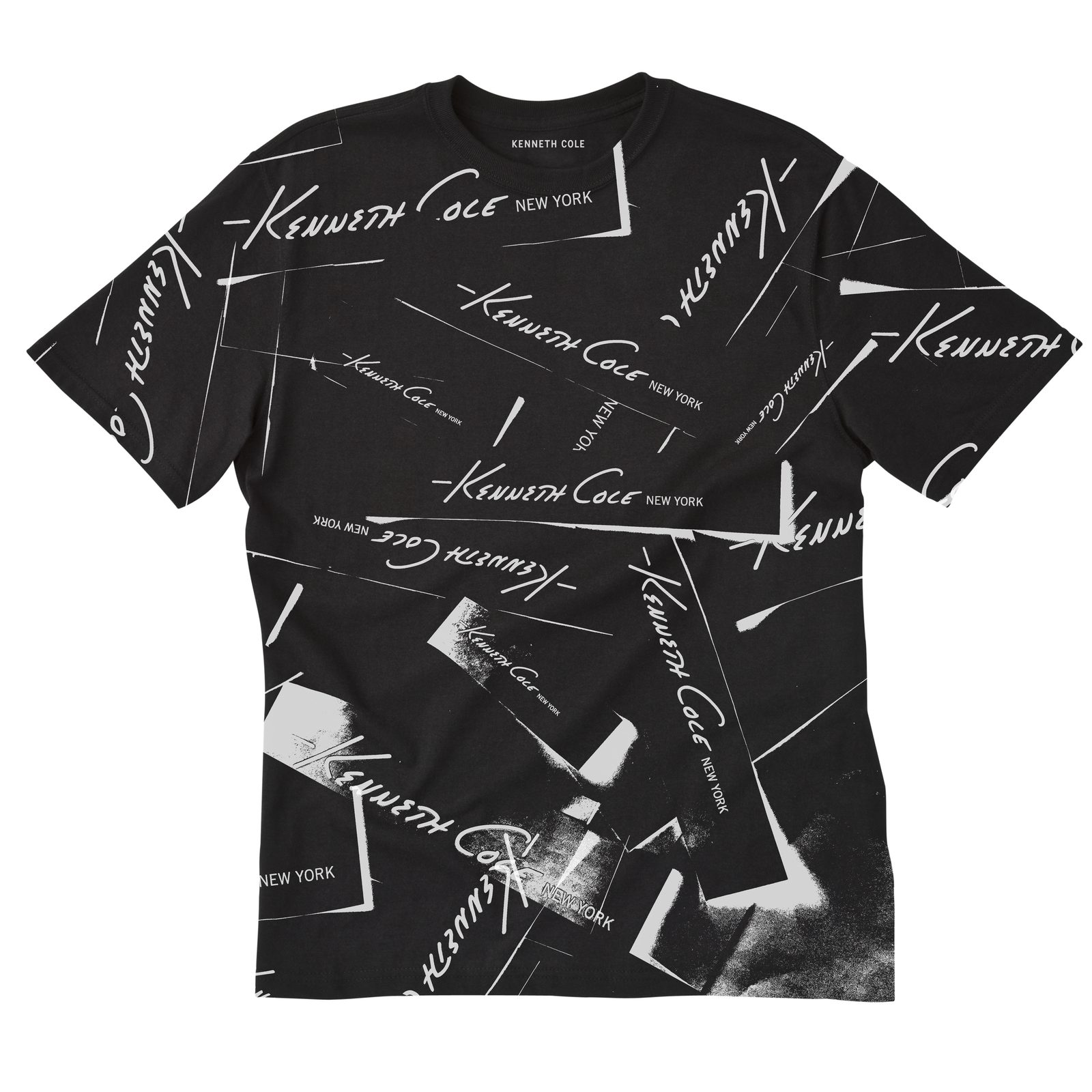
Logo play
The archive logos, cut up and scattered into all-over prints.
Vote, 2024
In which the brand says it out loud.
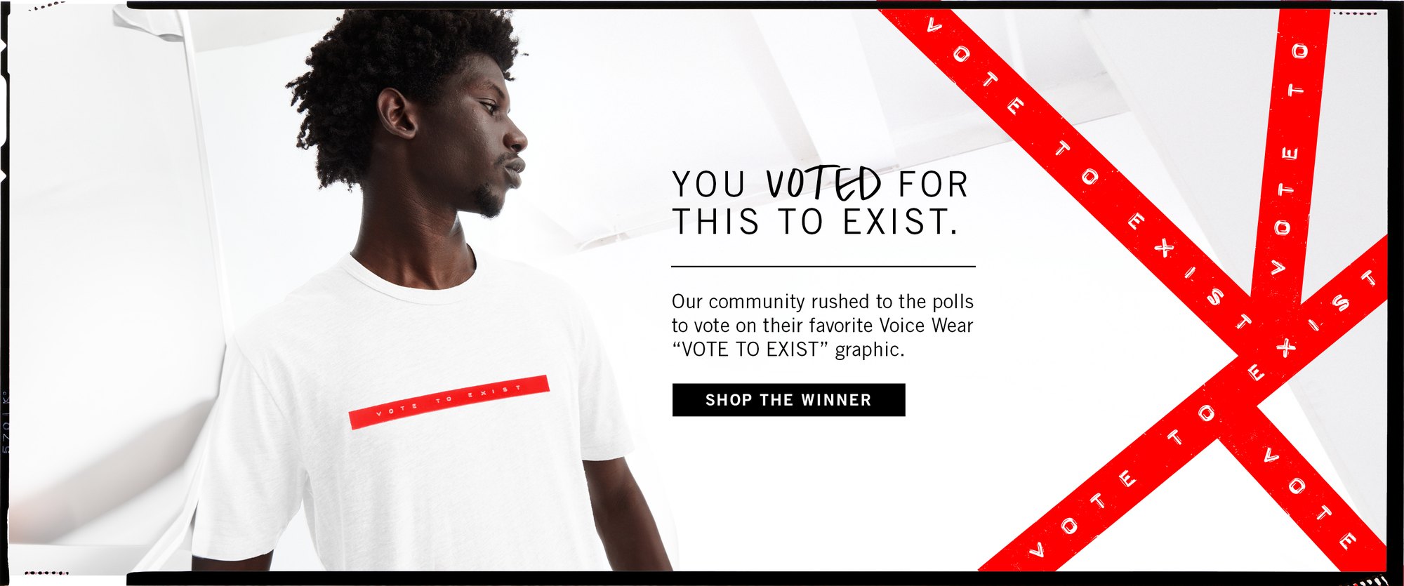
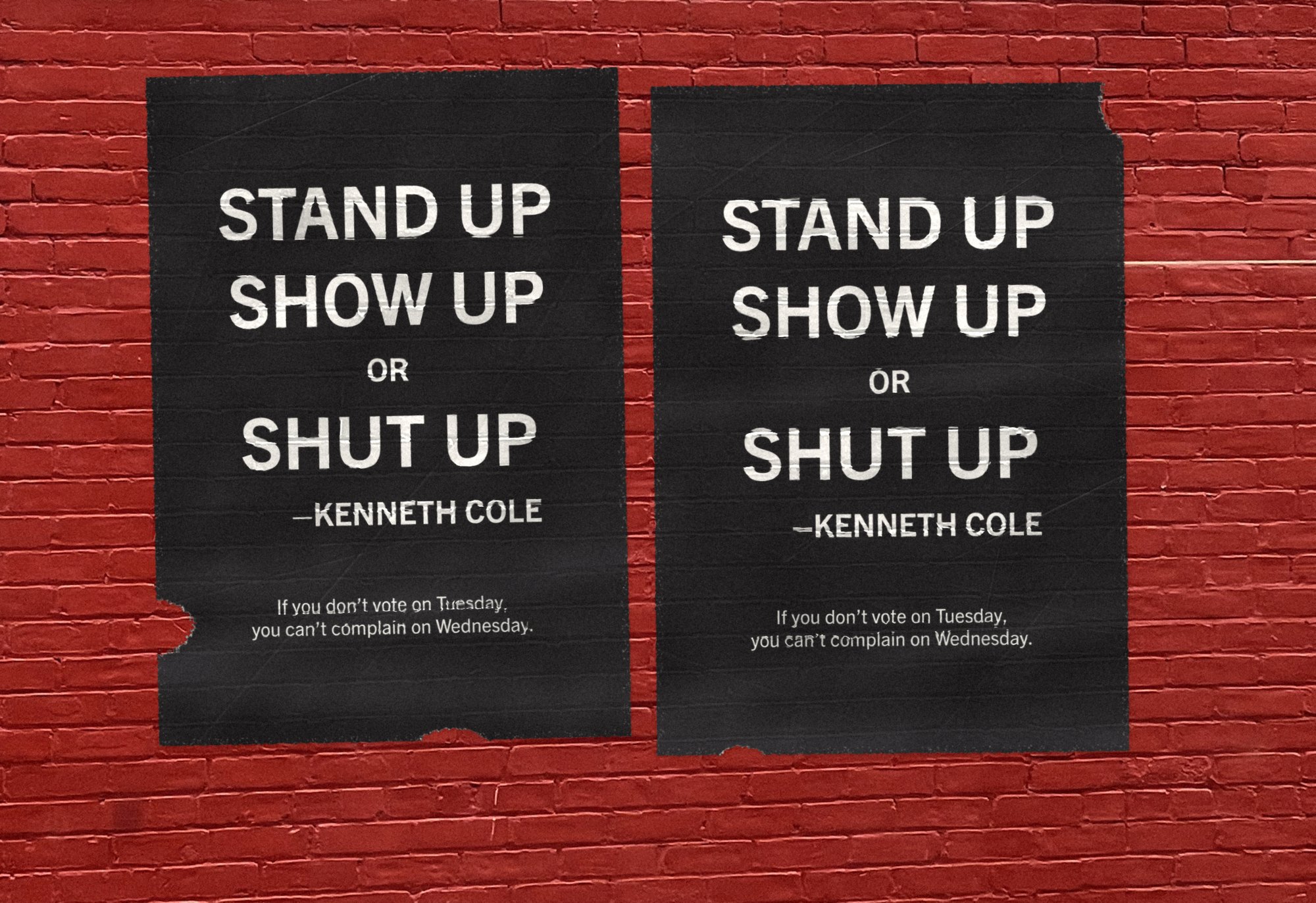
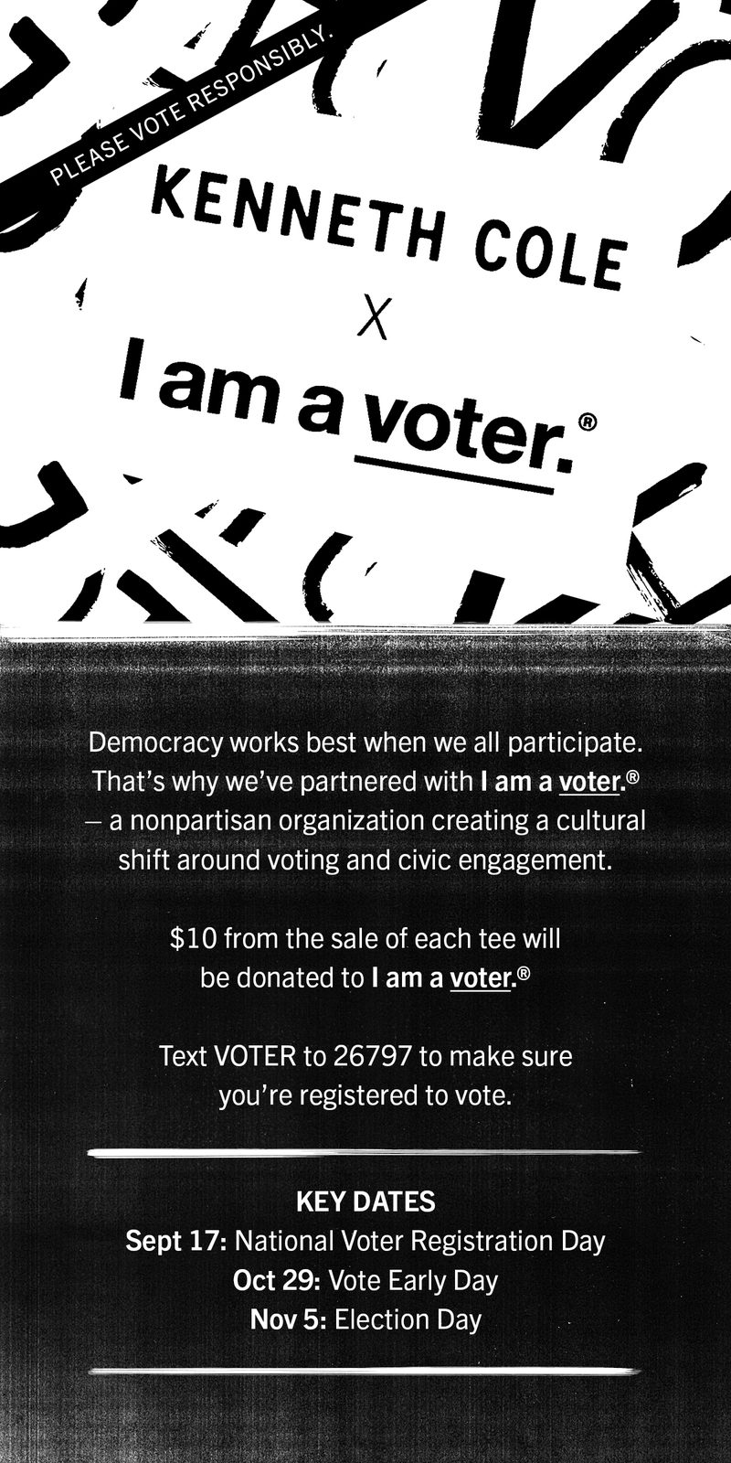
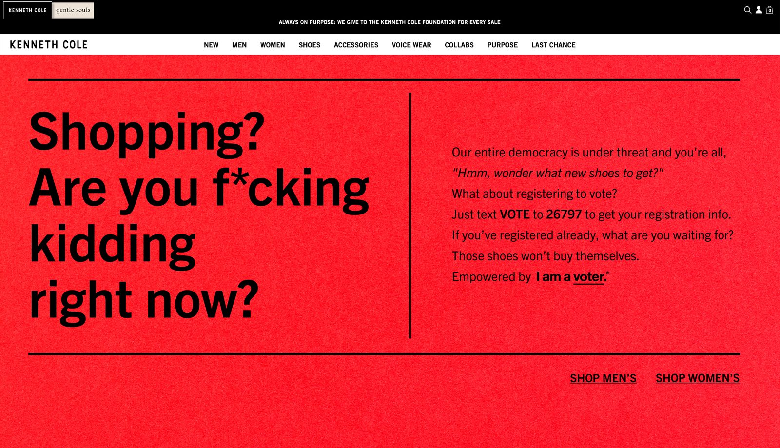
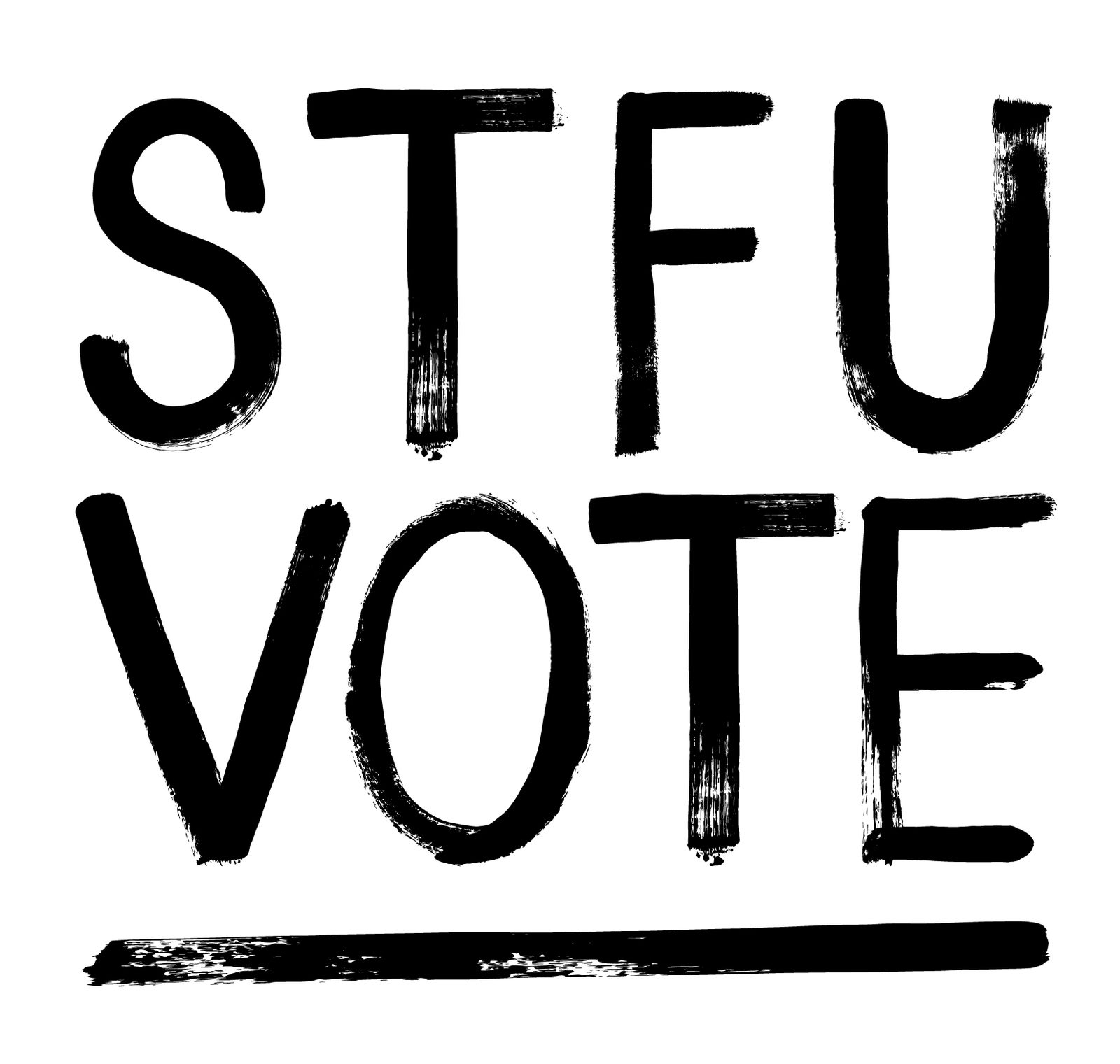
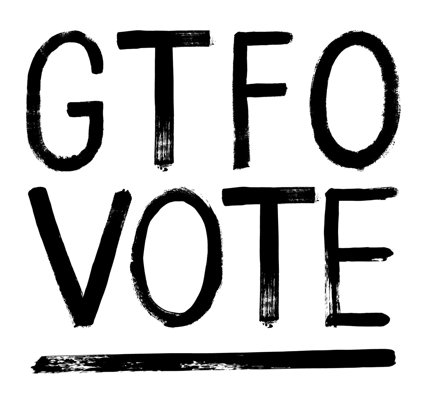
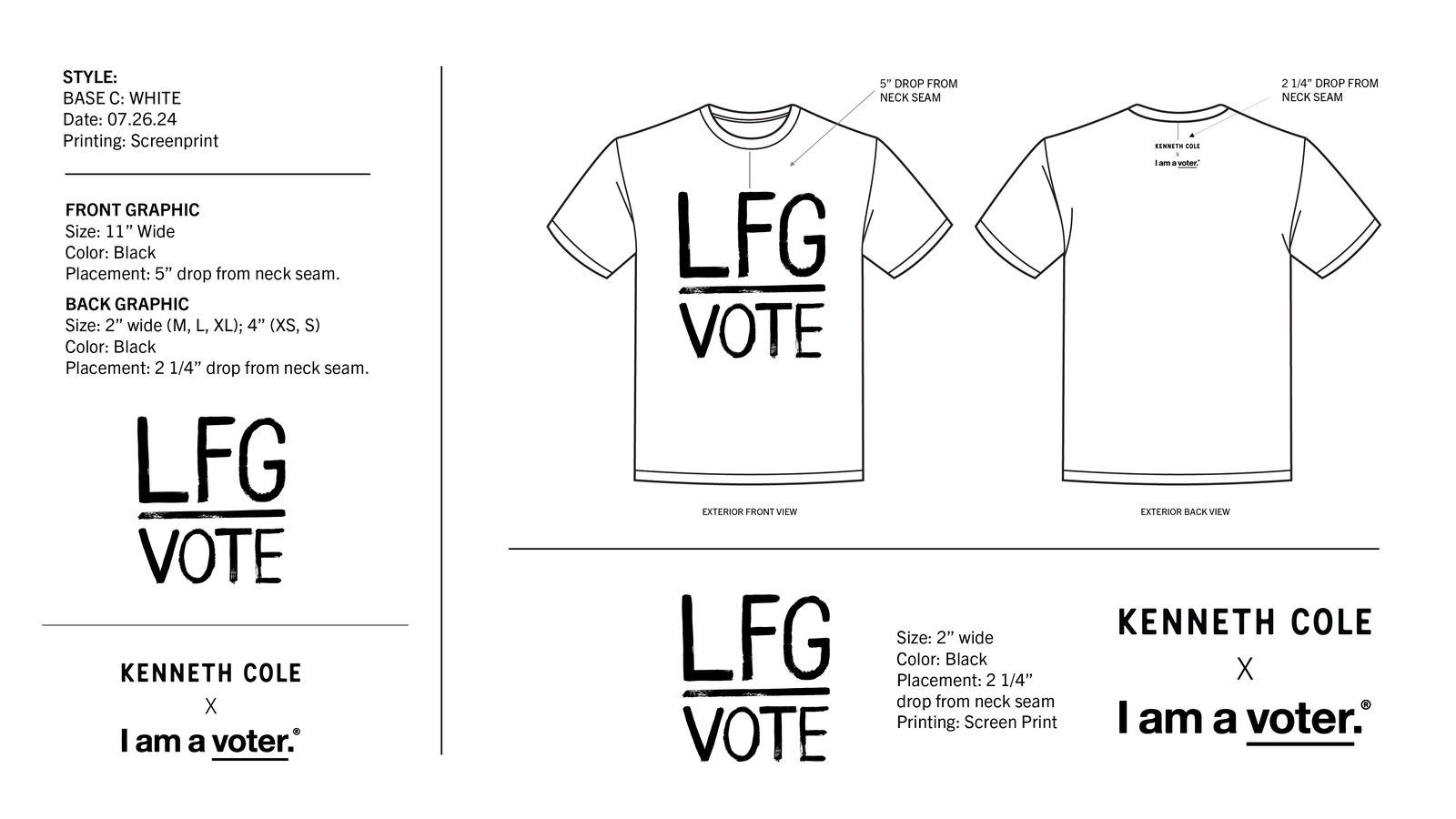
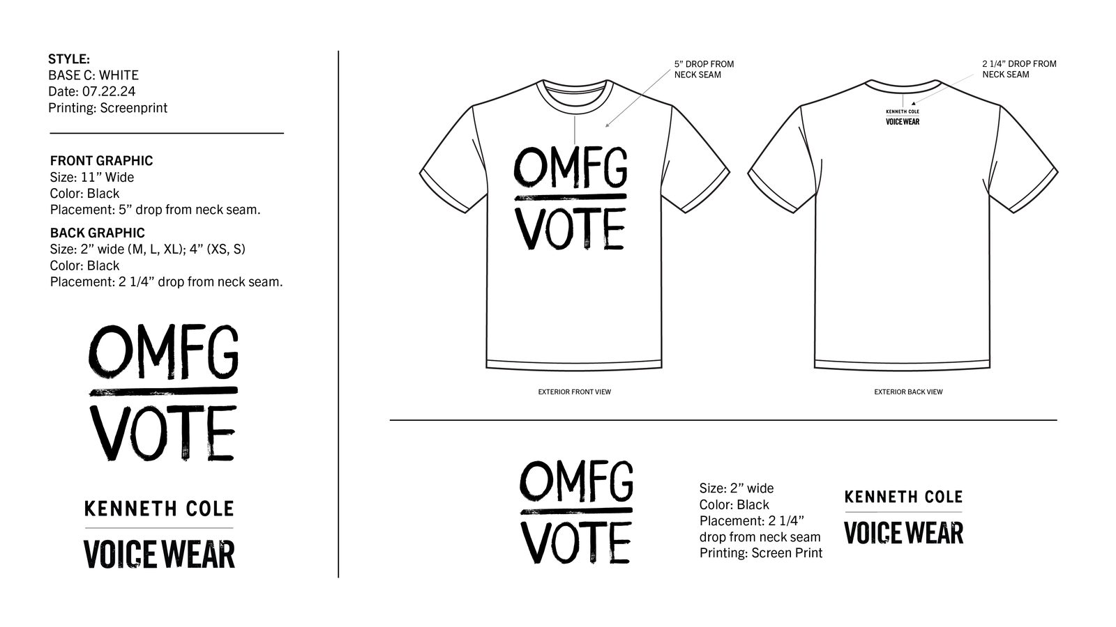
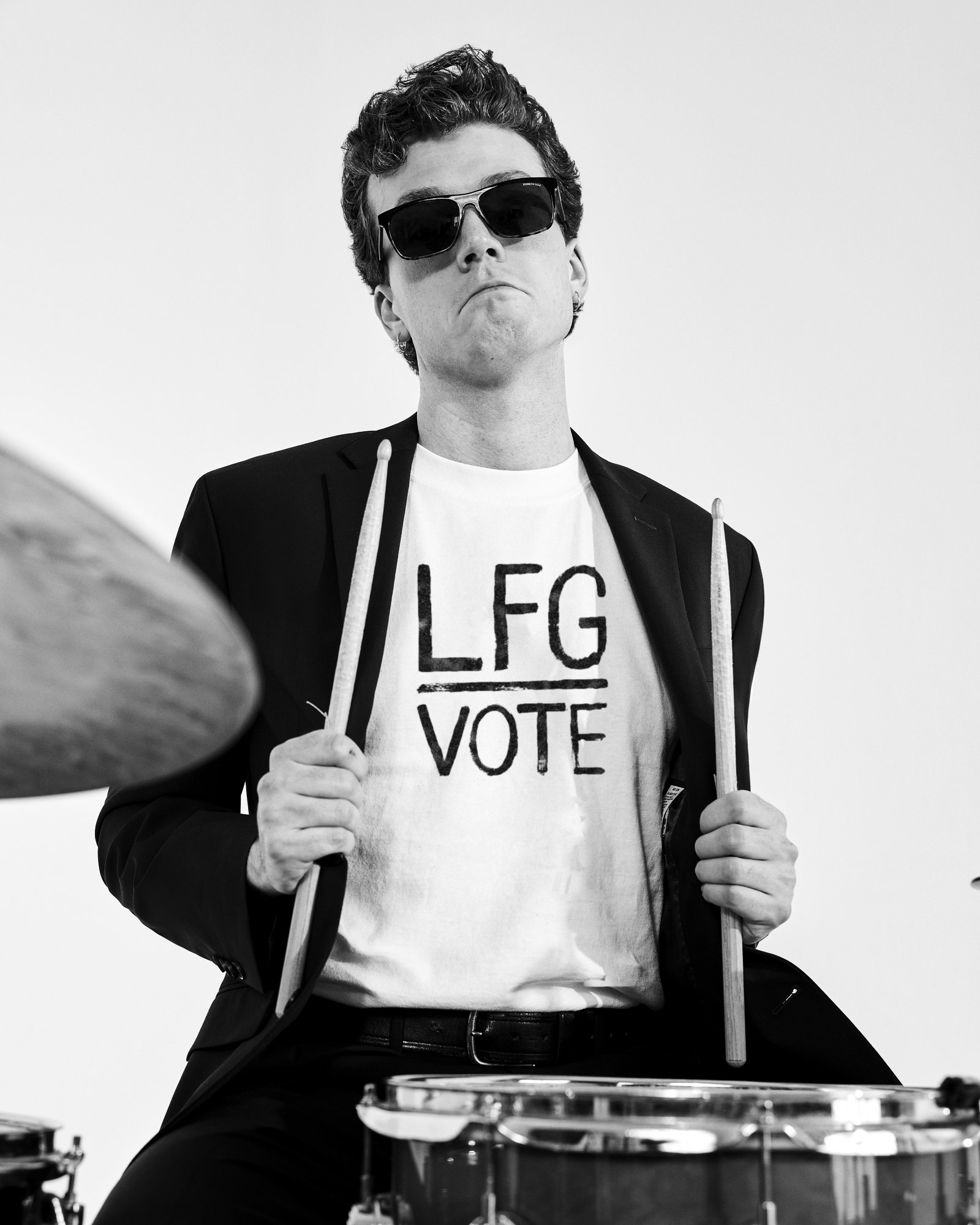
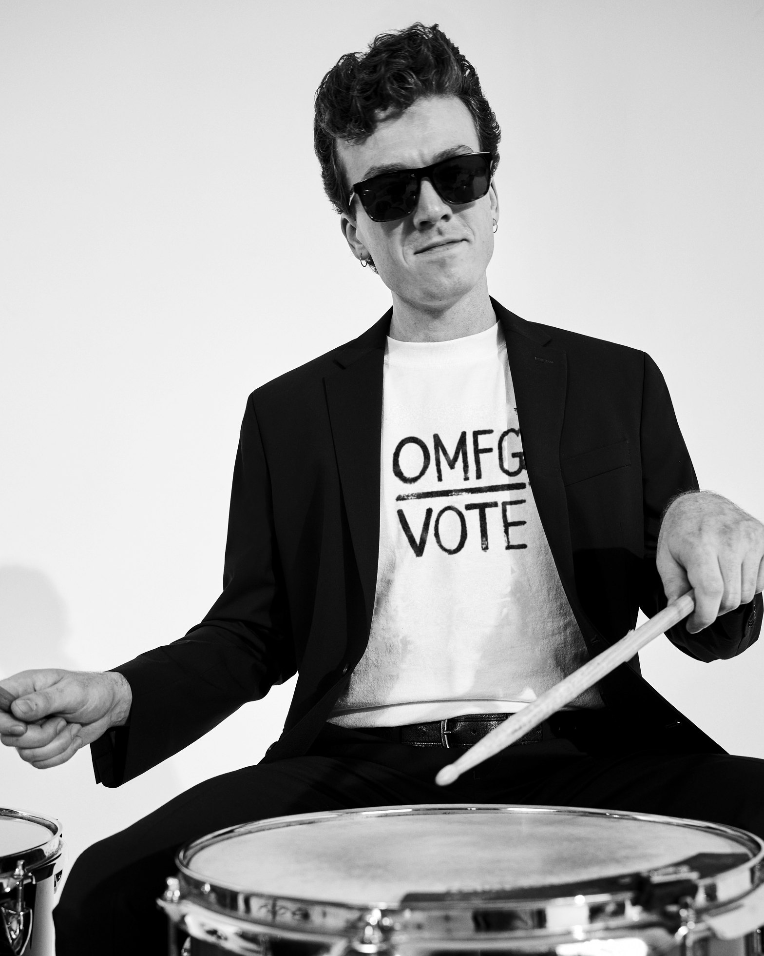
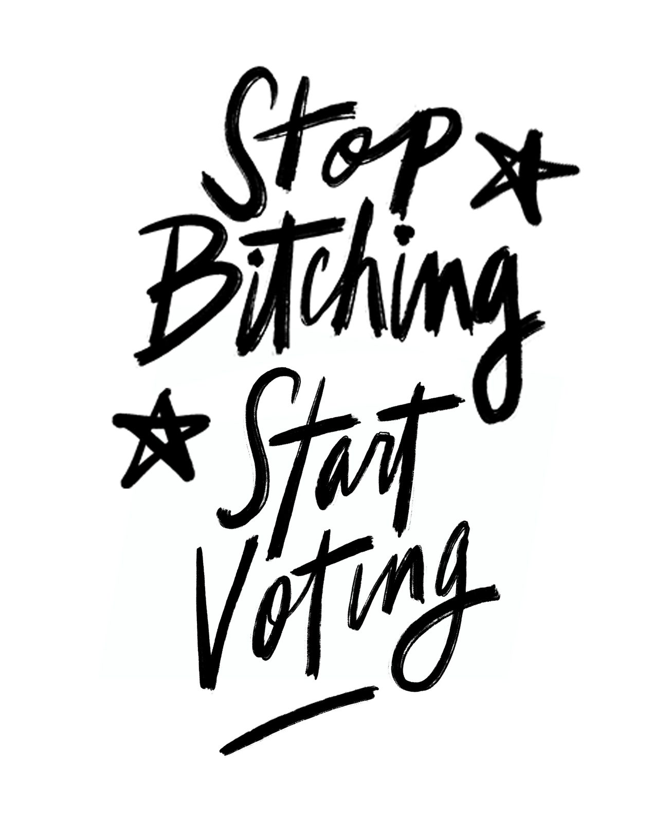
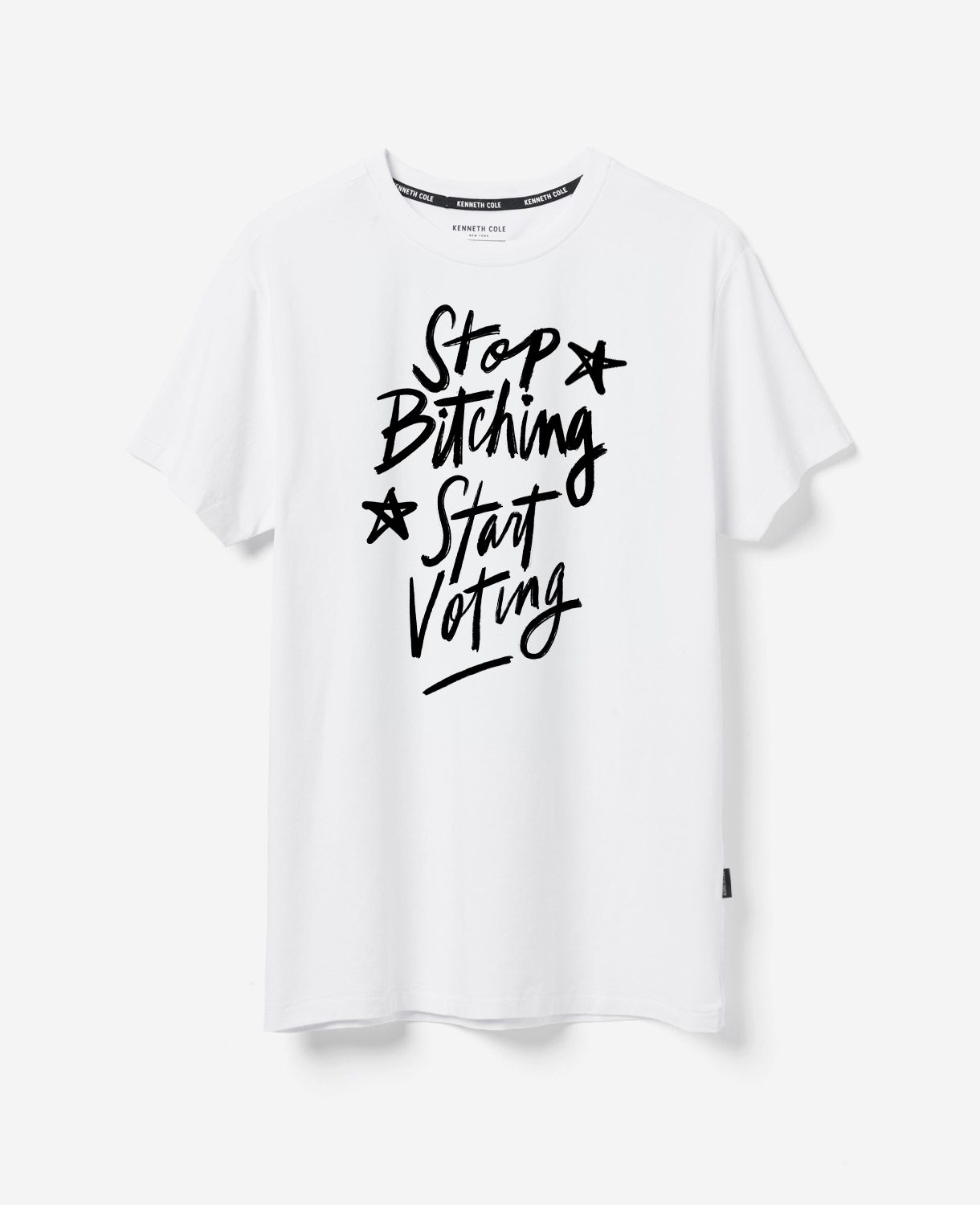
For the 2024 election Kenneth Cole partnered with I am a voter, the nonpartisan organization, and gave $10 from every tee. The campaign said it the way the brand always has: out loud.
Lettering
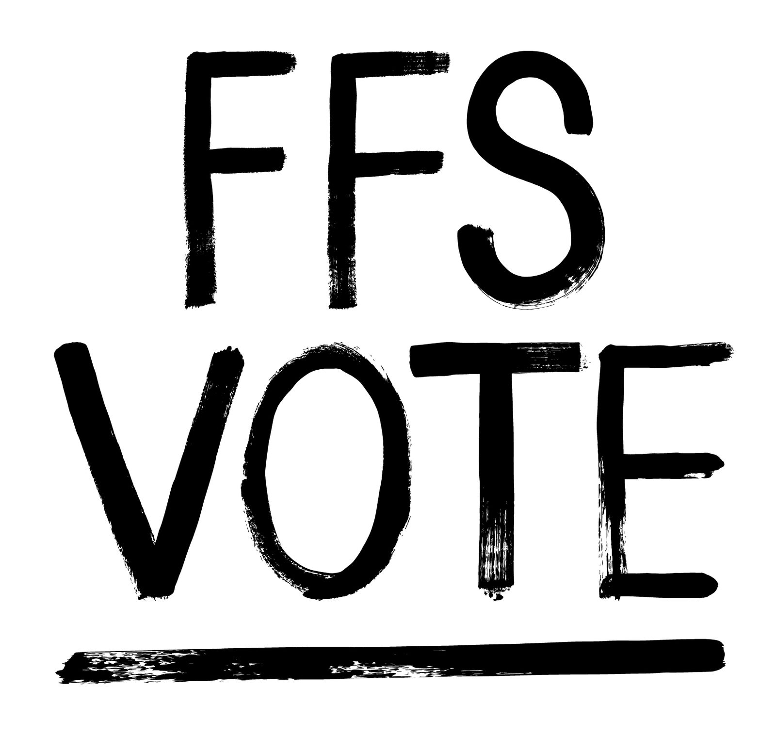
Round after round of brush lettering, until the line felt shouted instead of typeset.
Pride Heritage
In which the archive comes out.
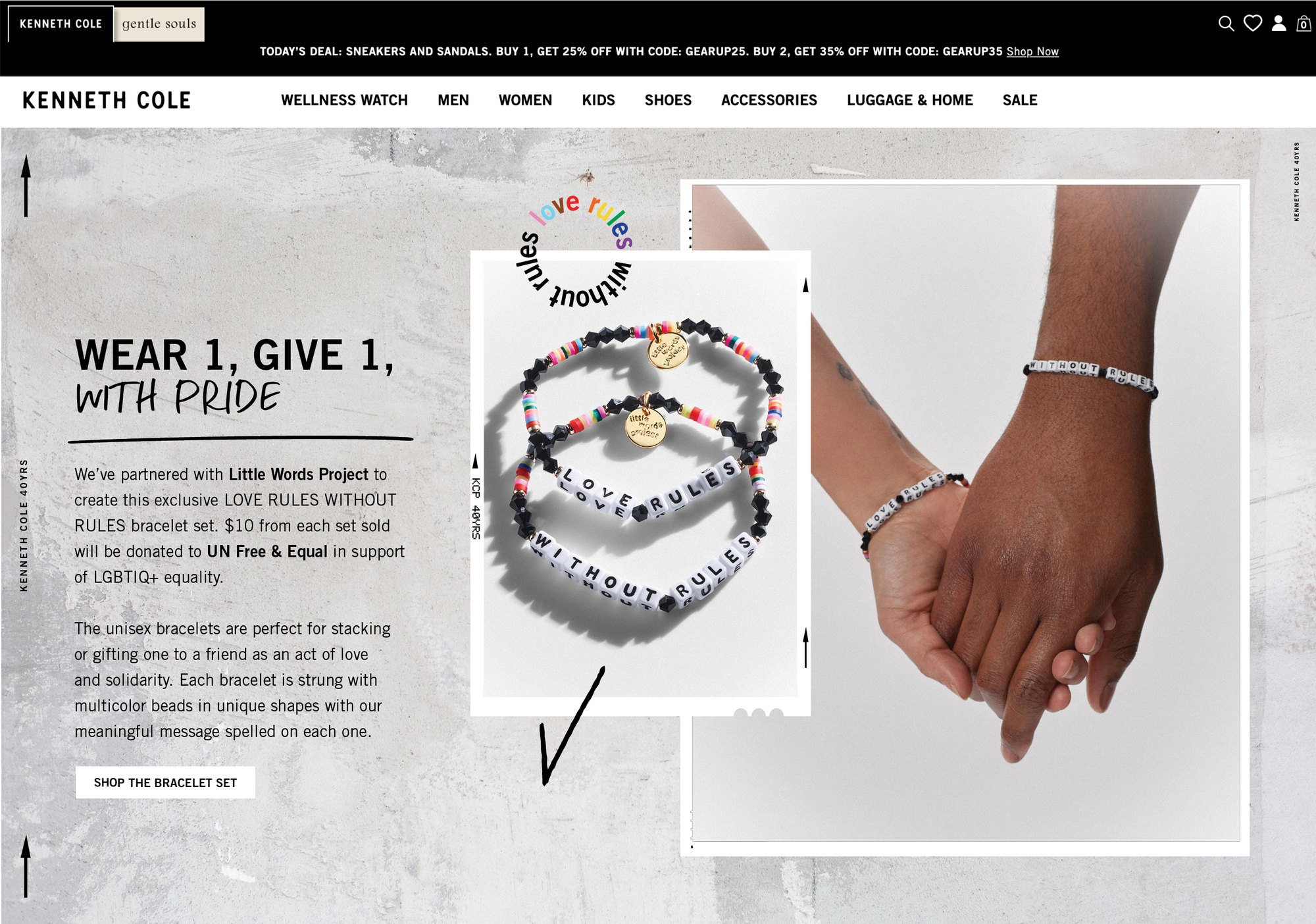
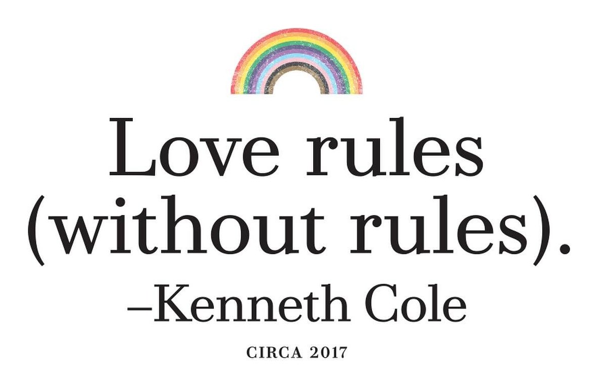
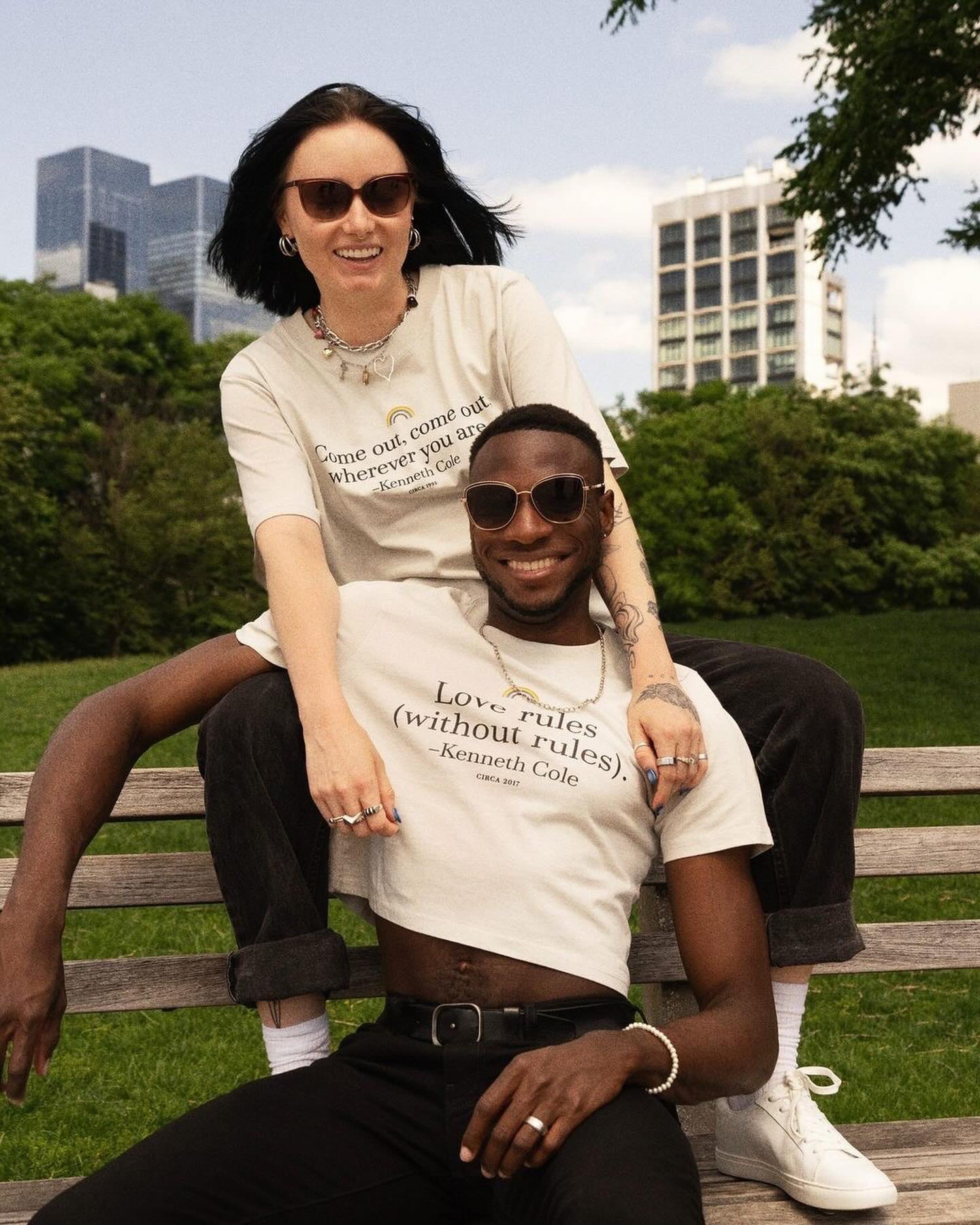
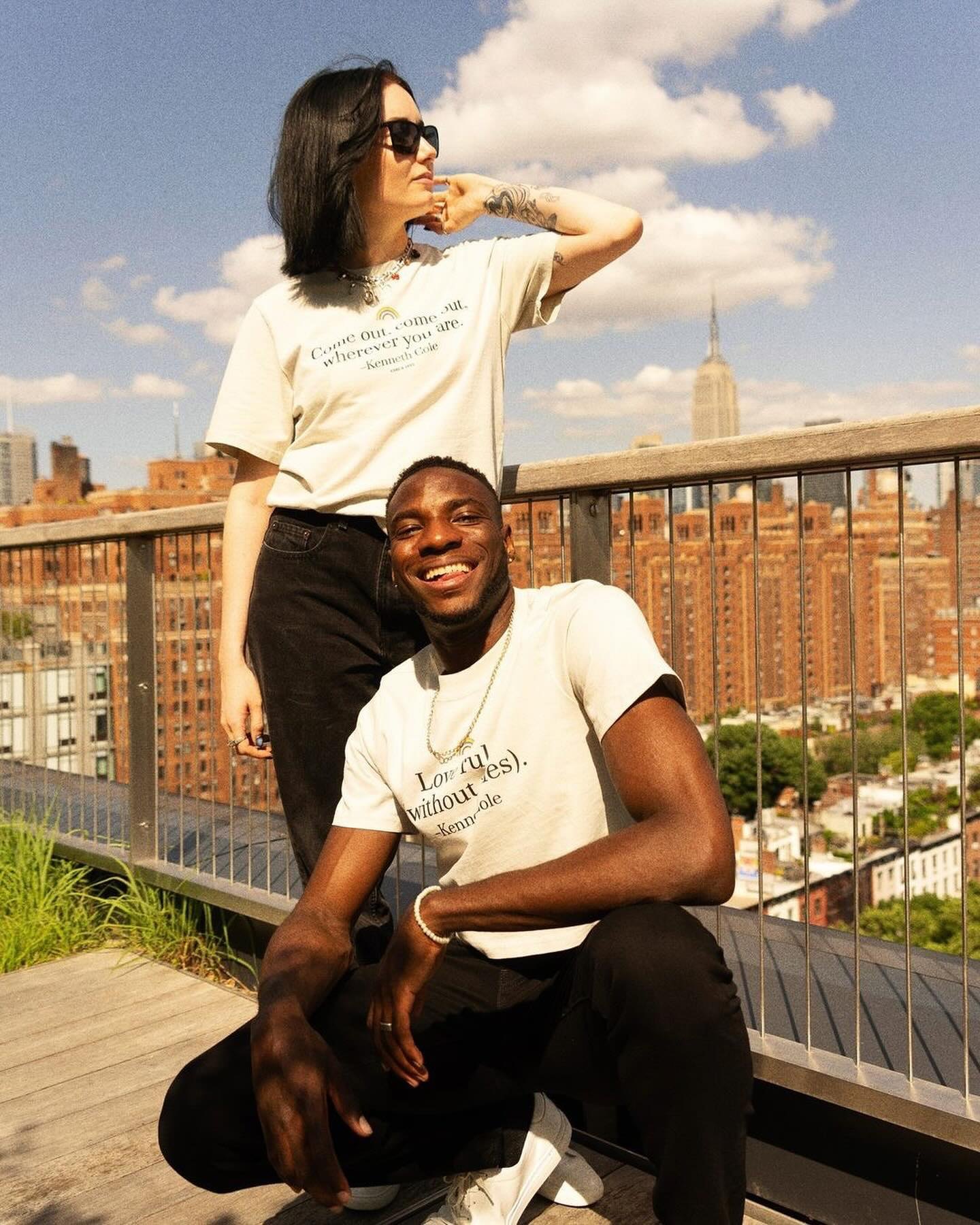
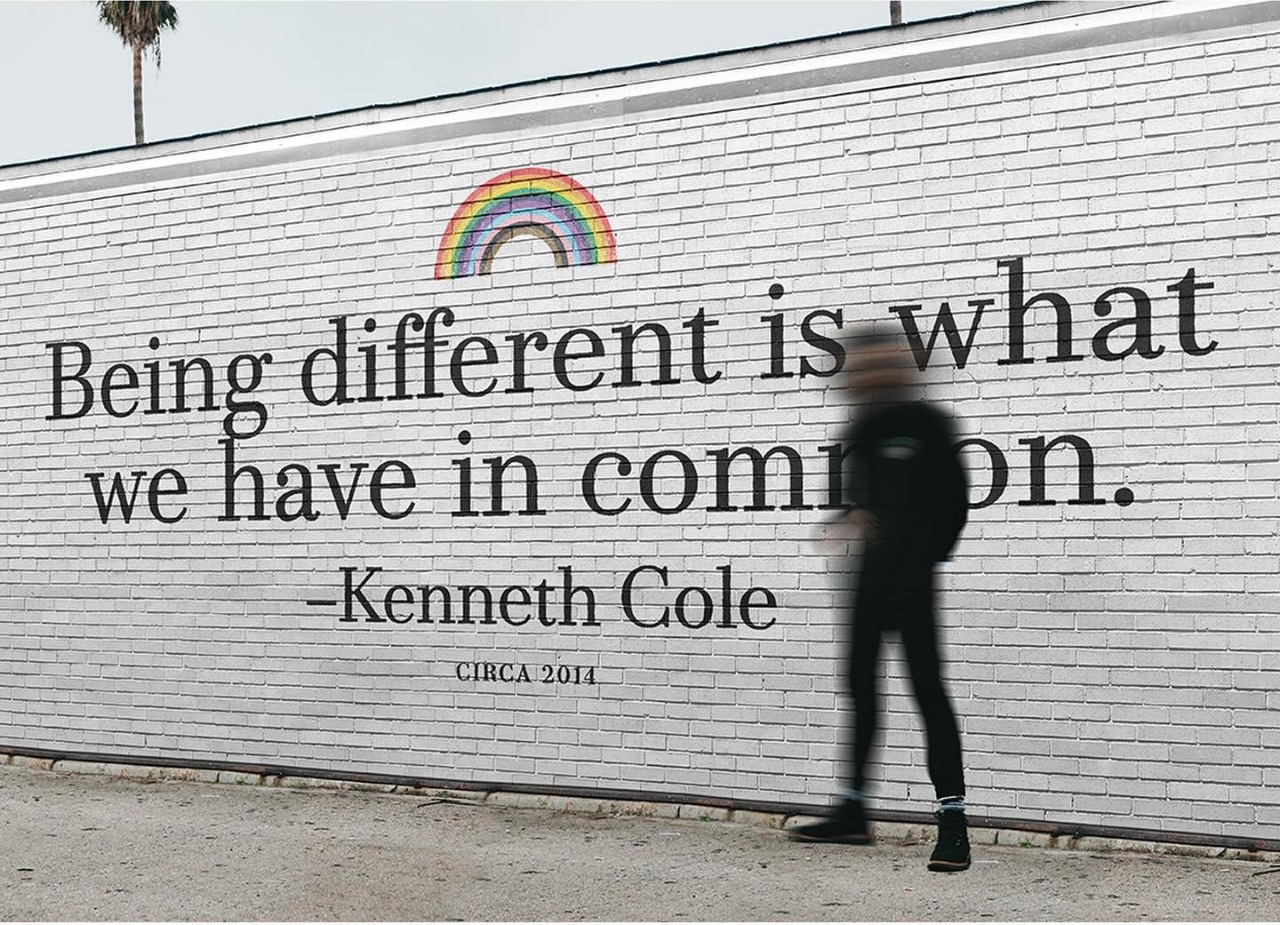
A Pride collection built from Kenneth Cole’s own lines, set in a heritage serif under a rainbow: Love rules (without rules).
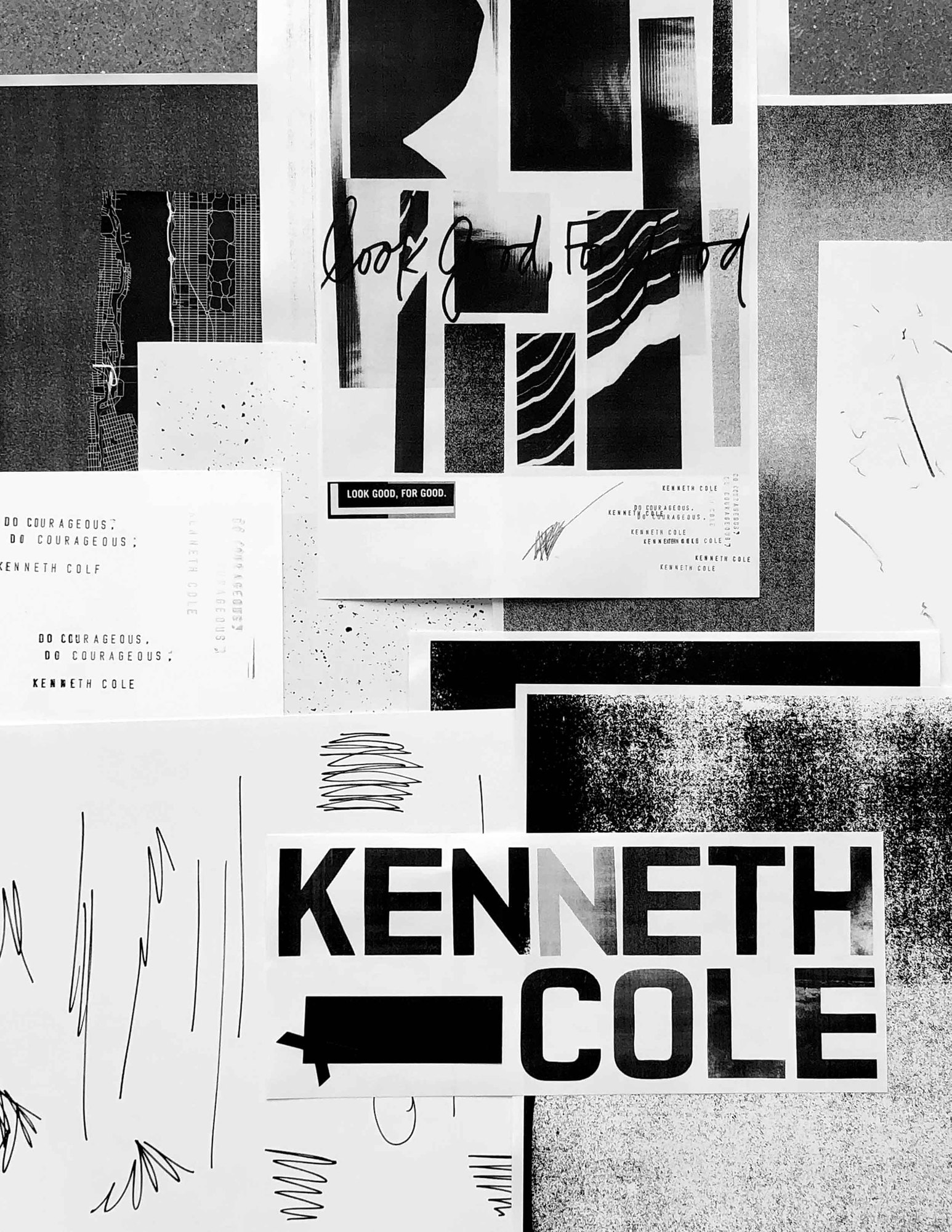
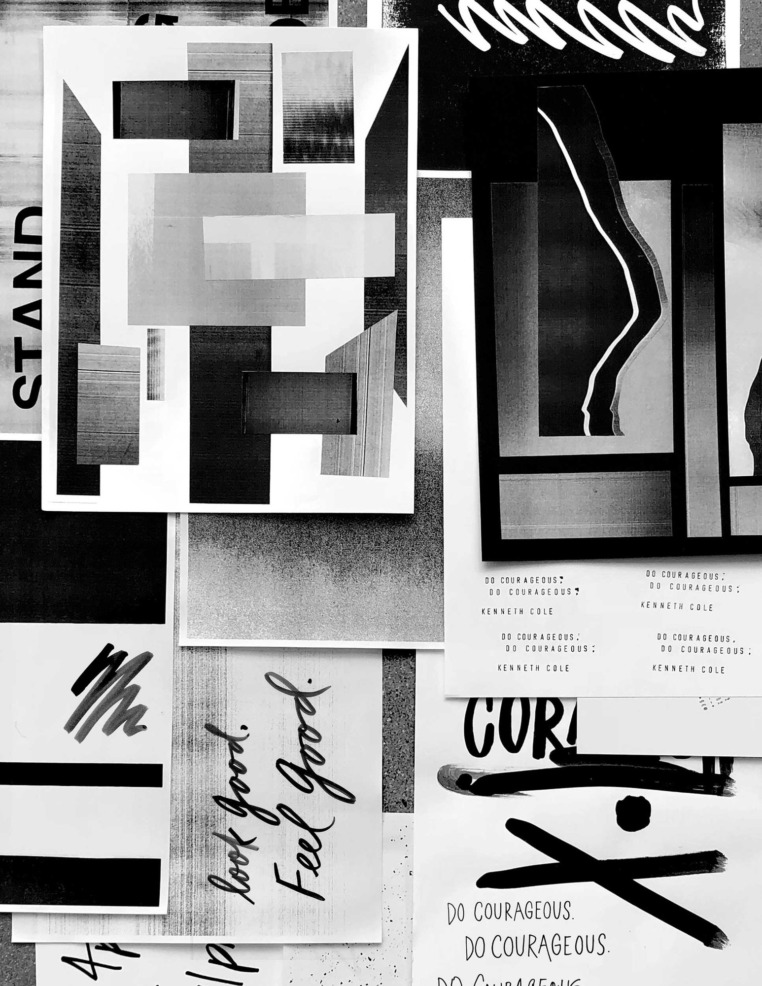
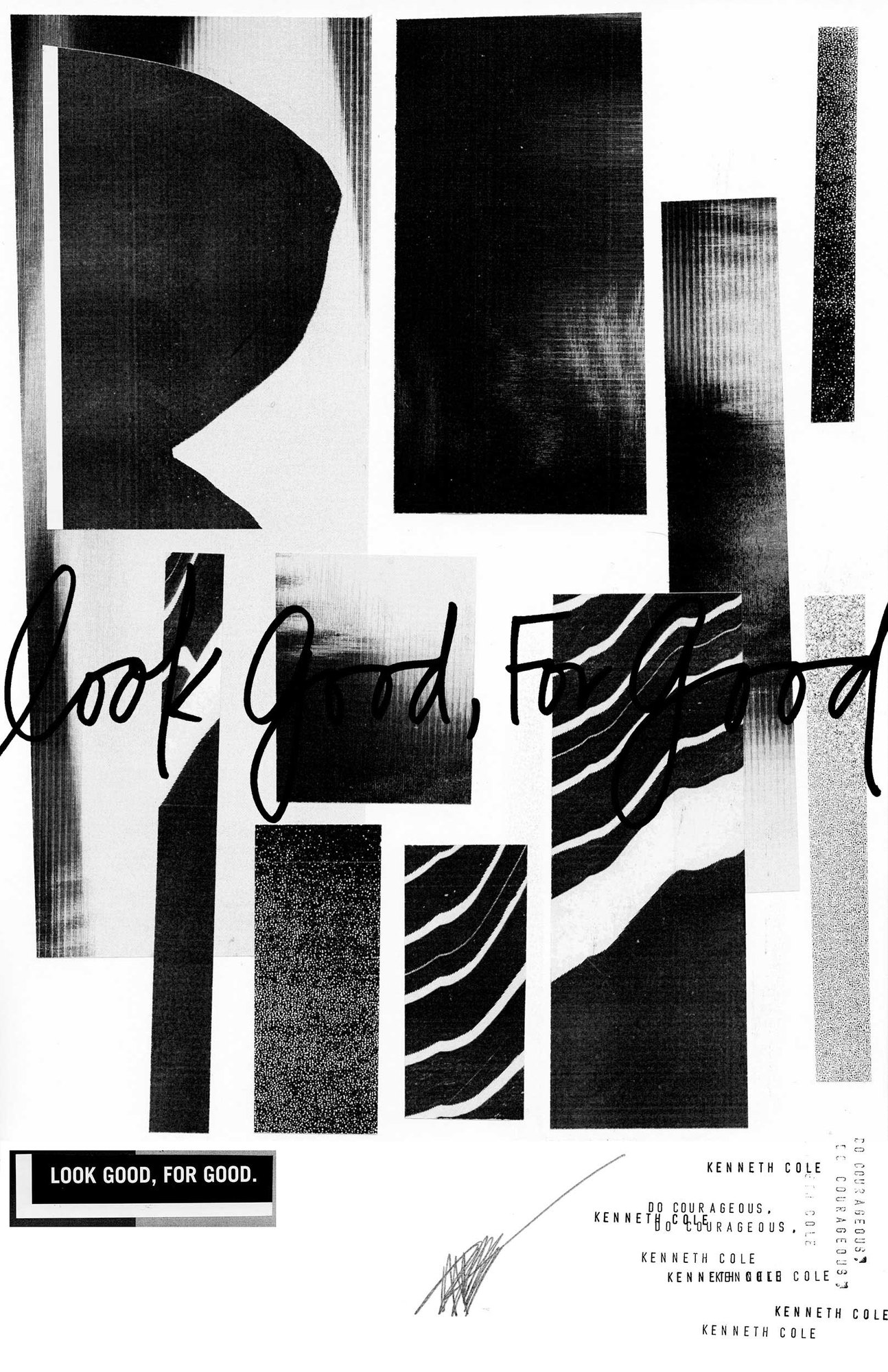
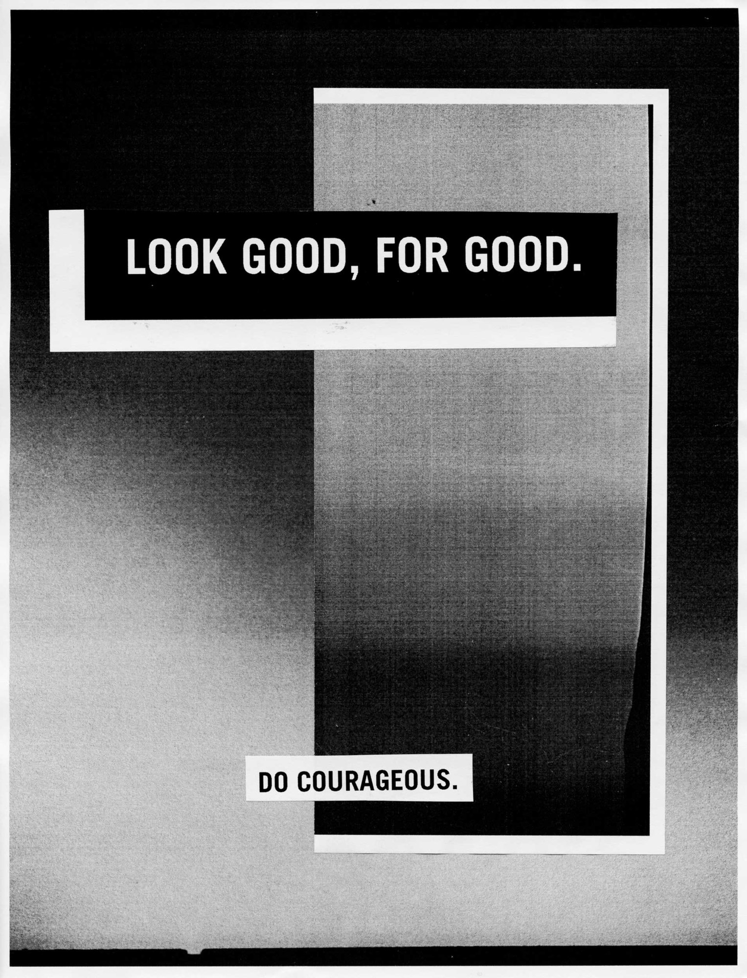
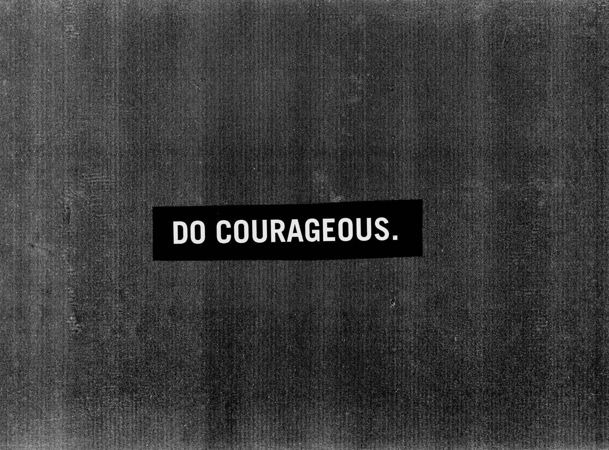
Do Courageous
In which the copier does the art direction.
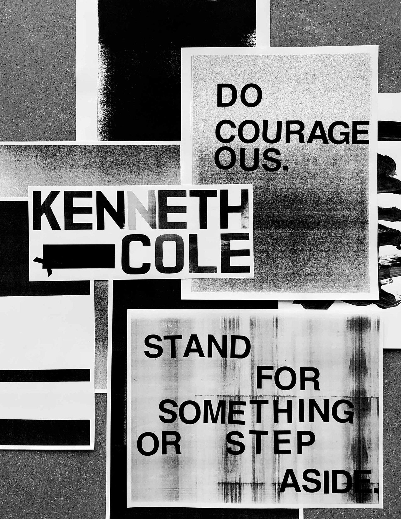
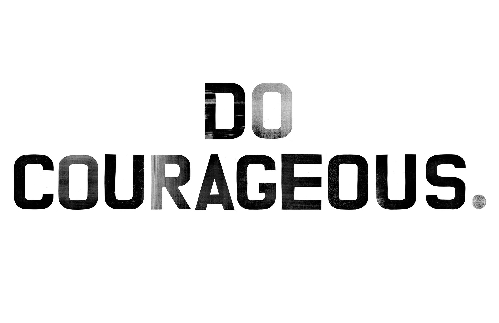
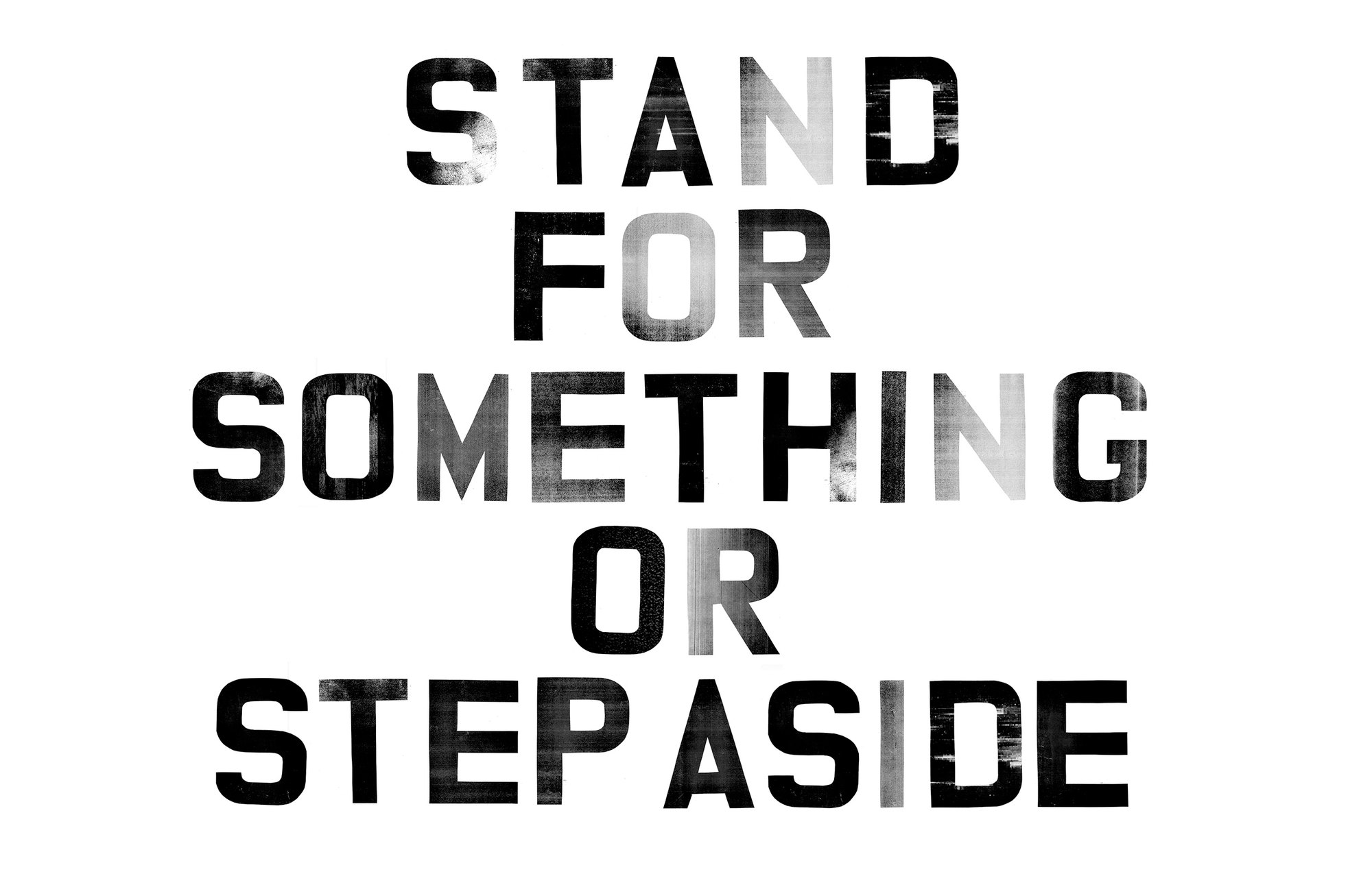
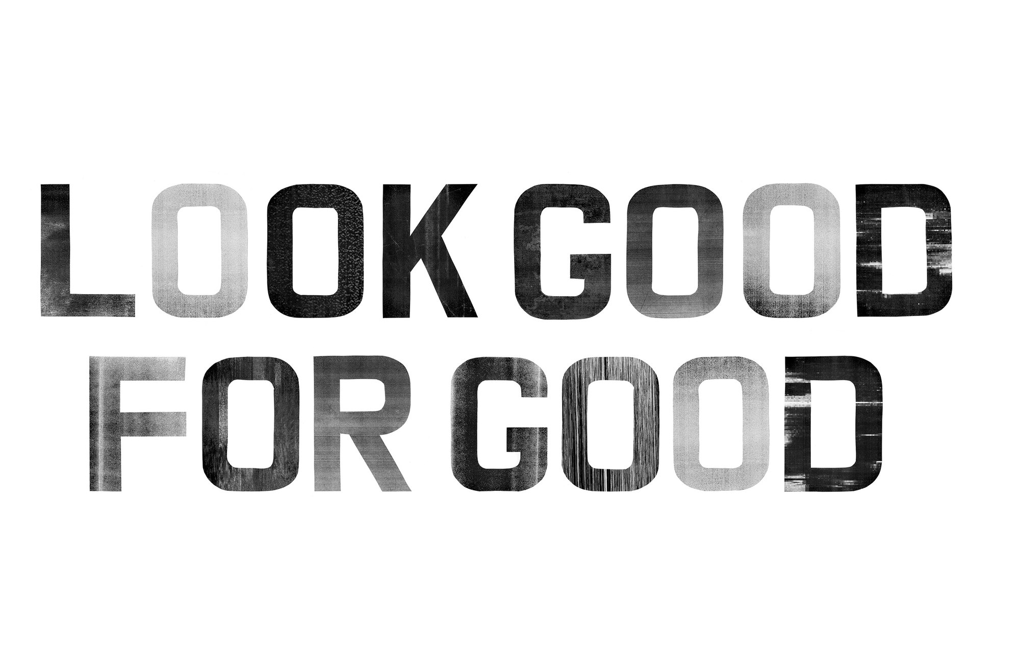
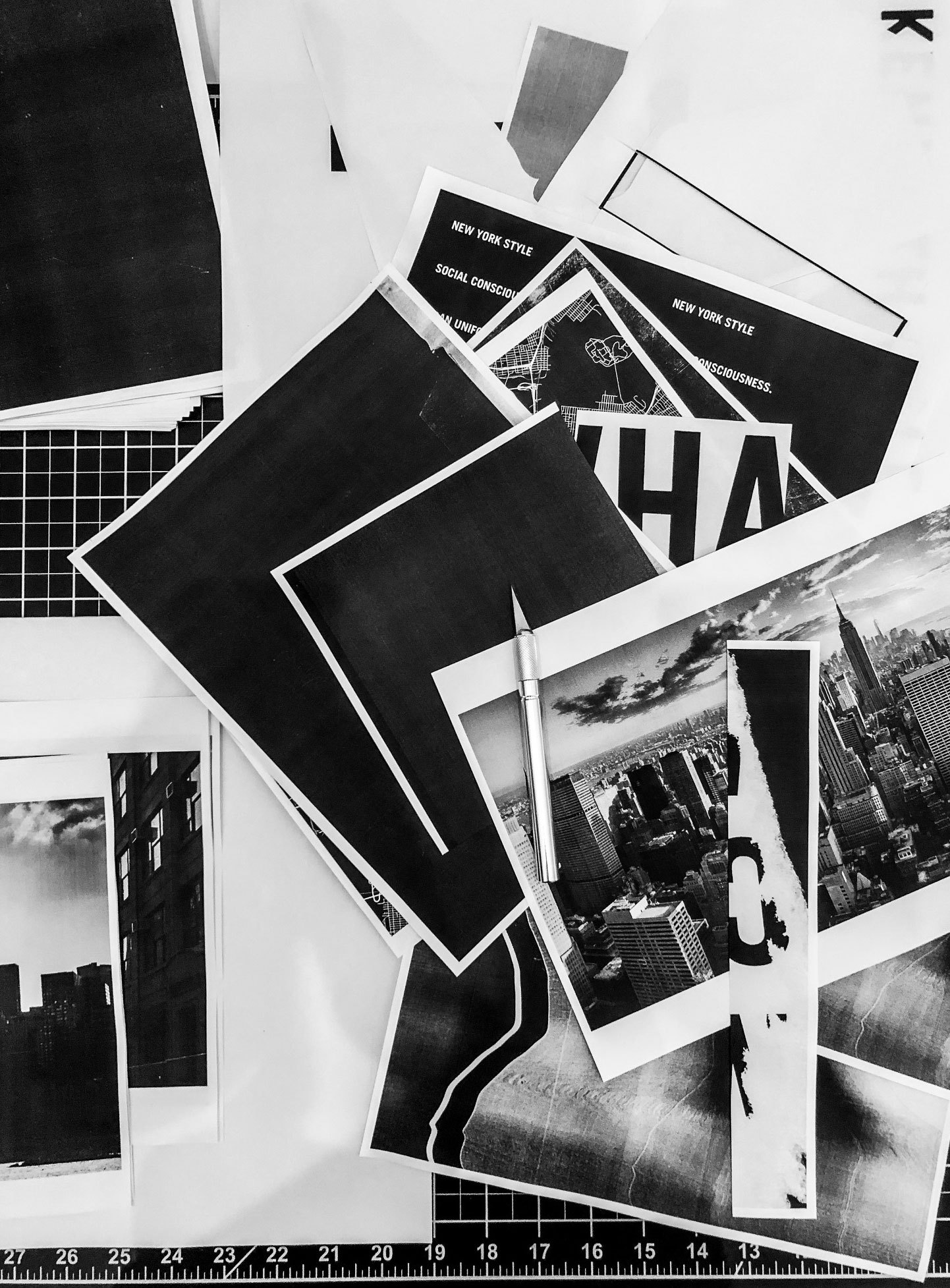
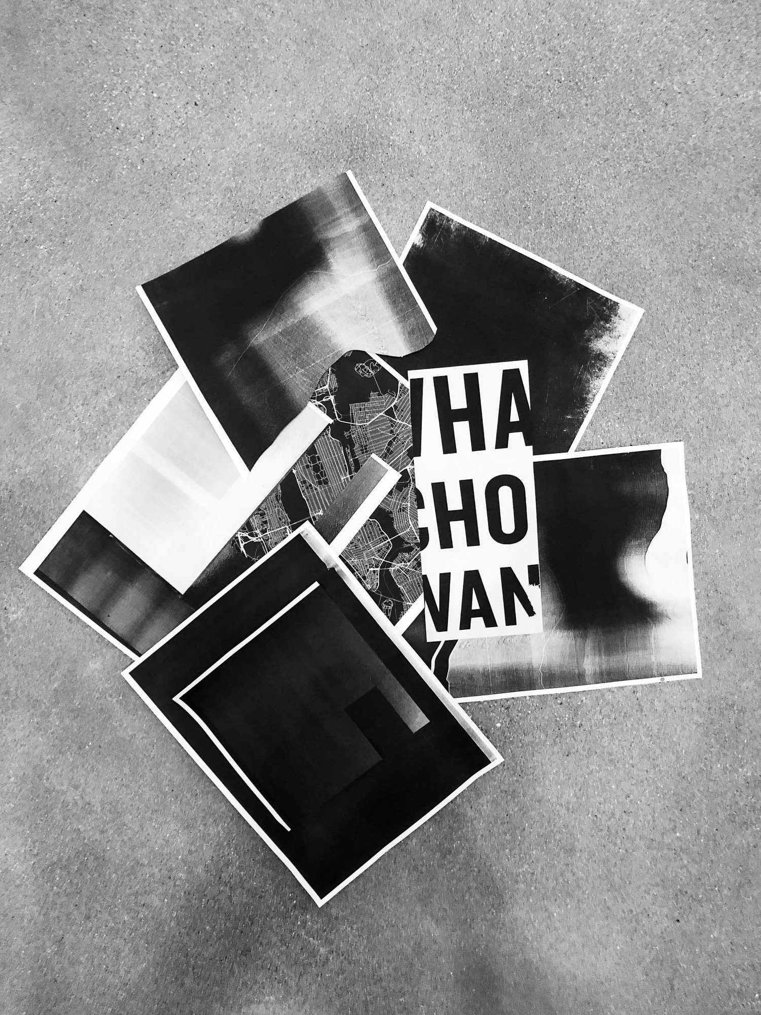
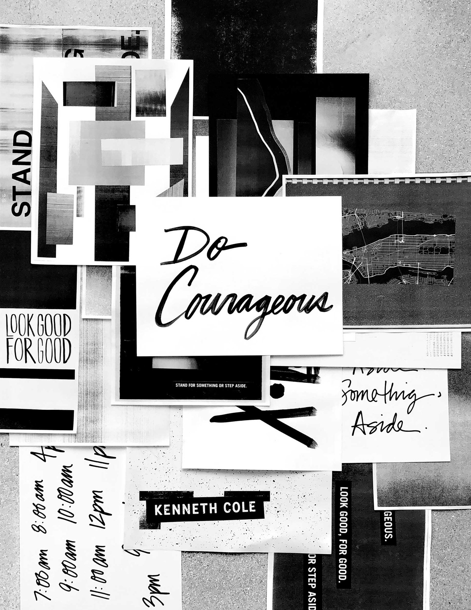
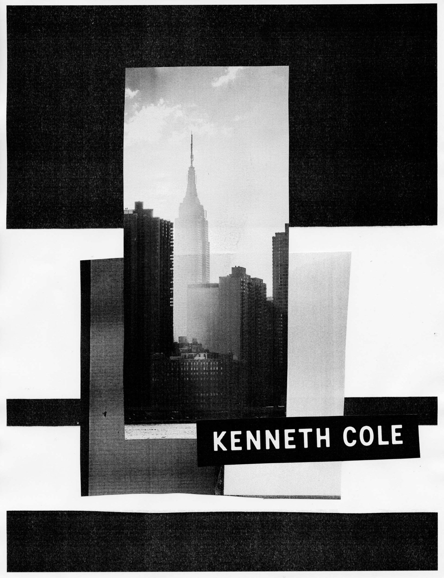
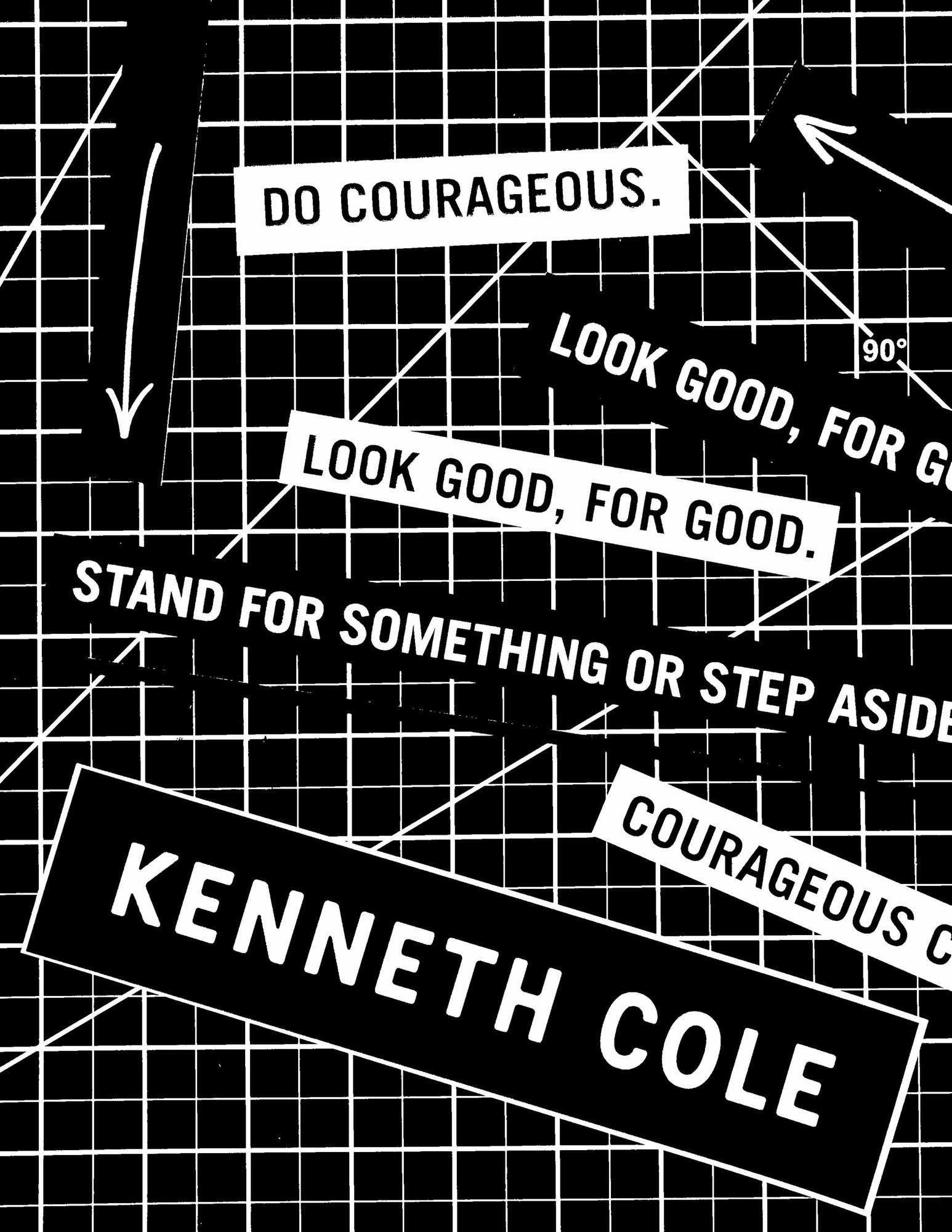
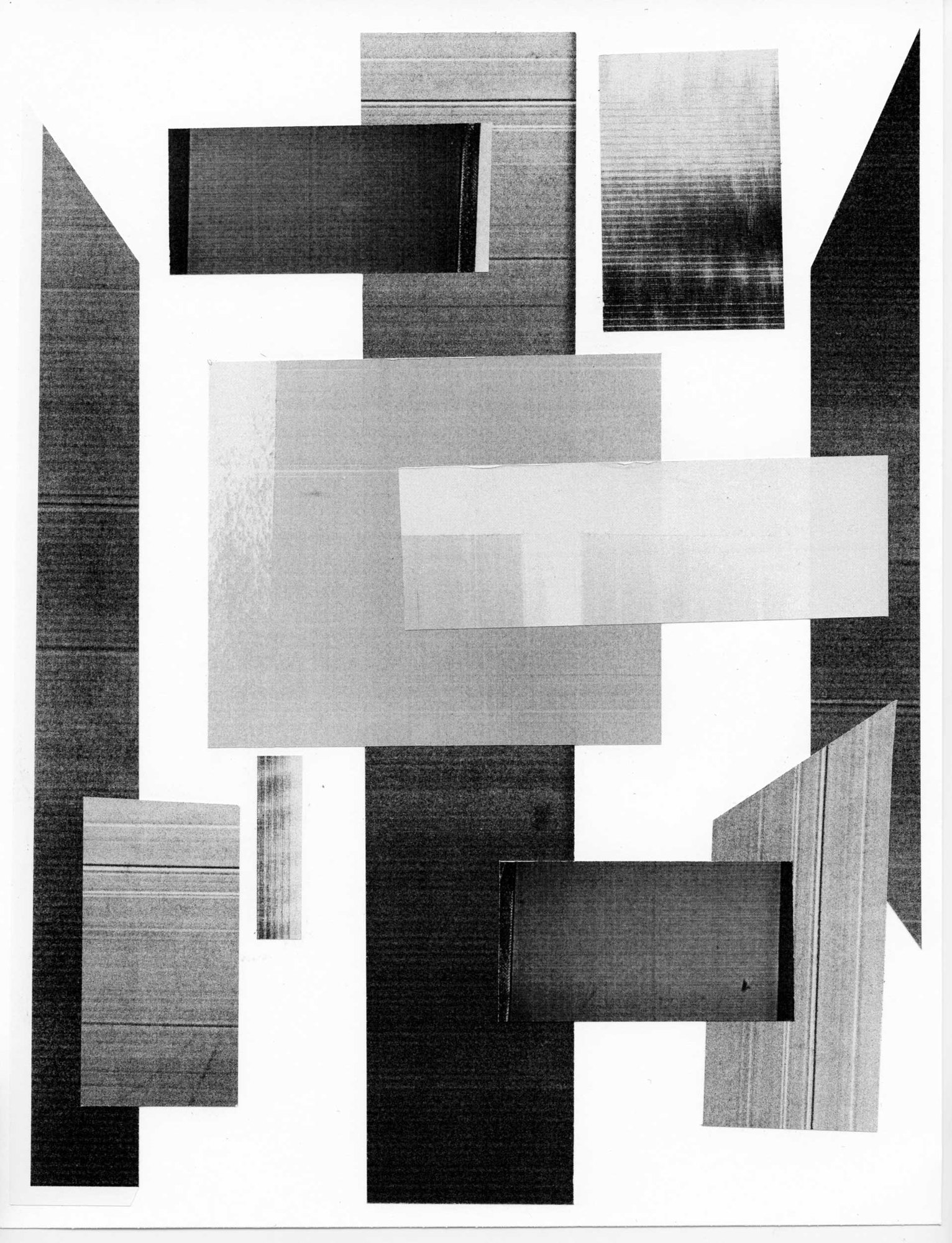
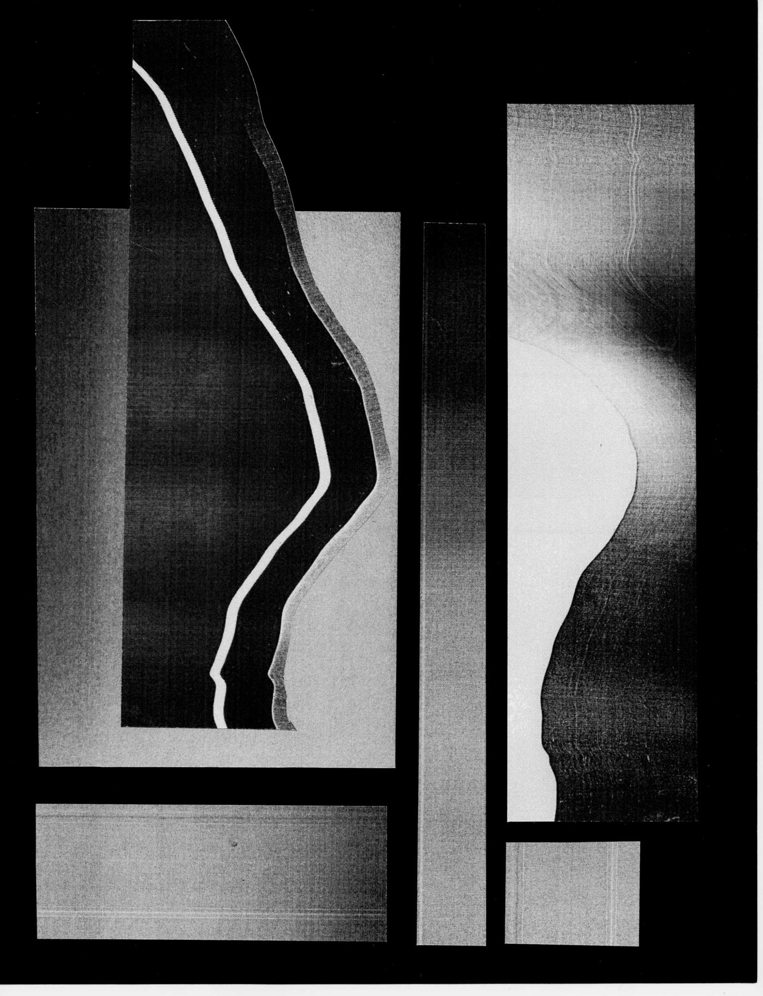
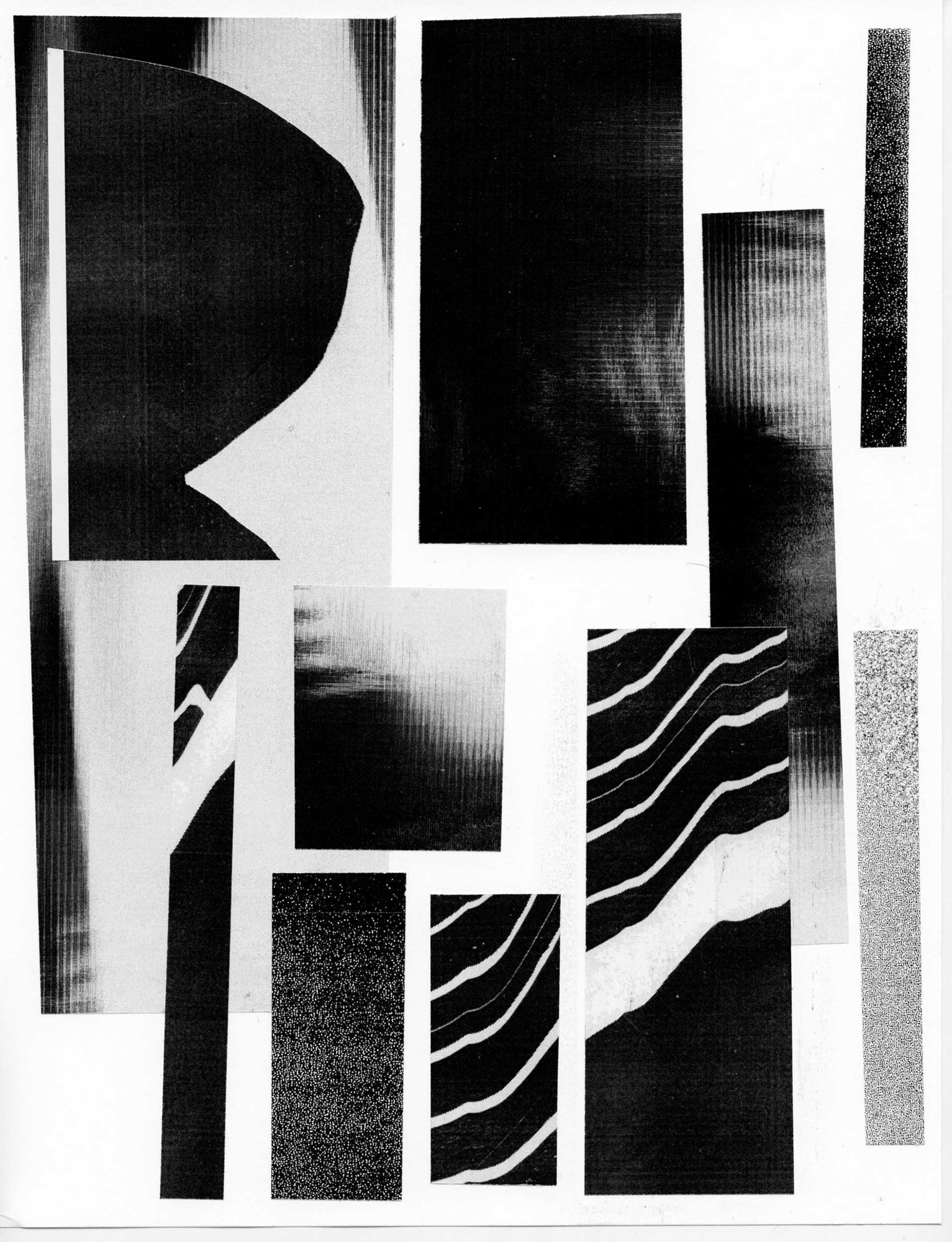
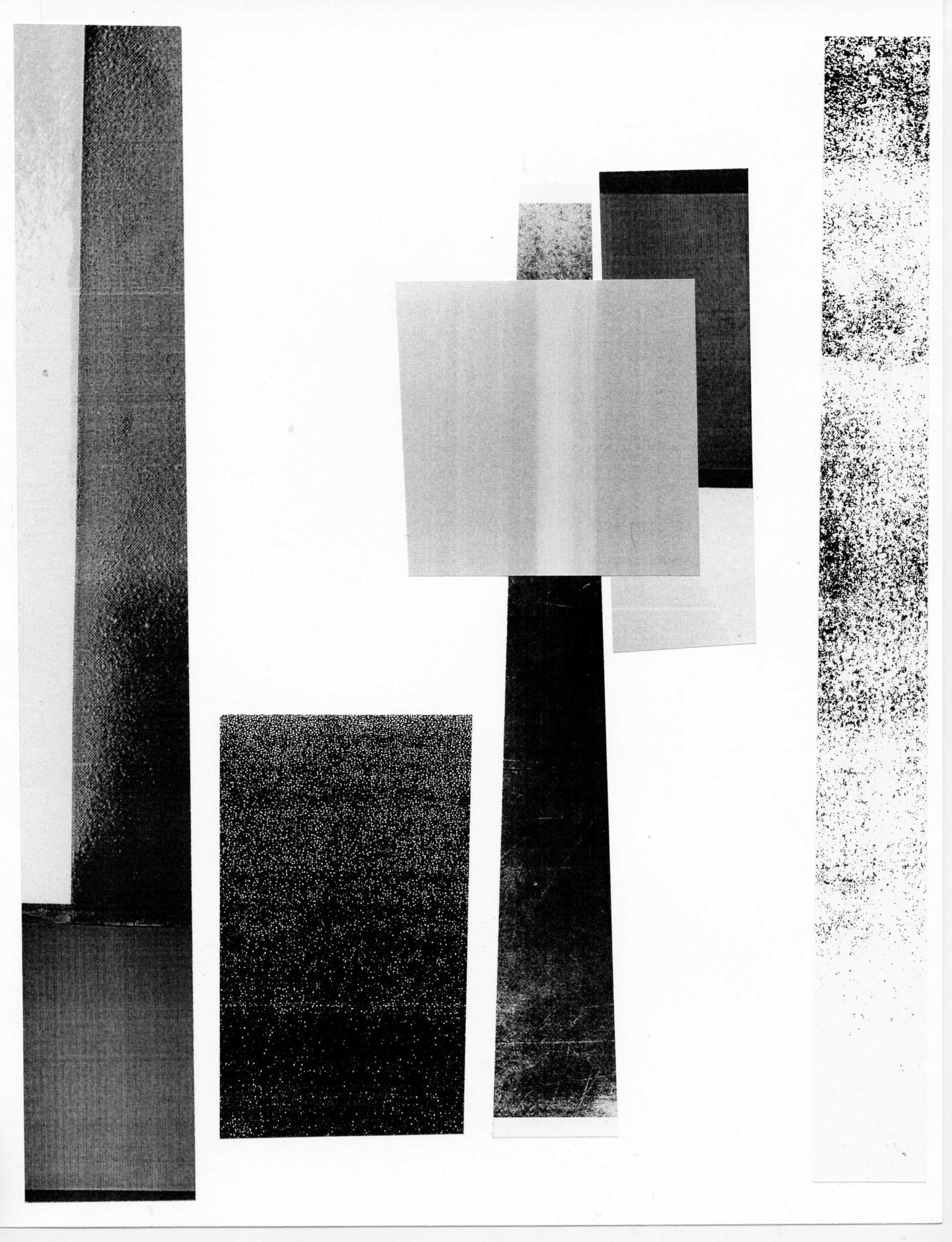
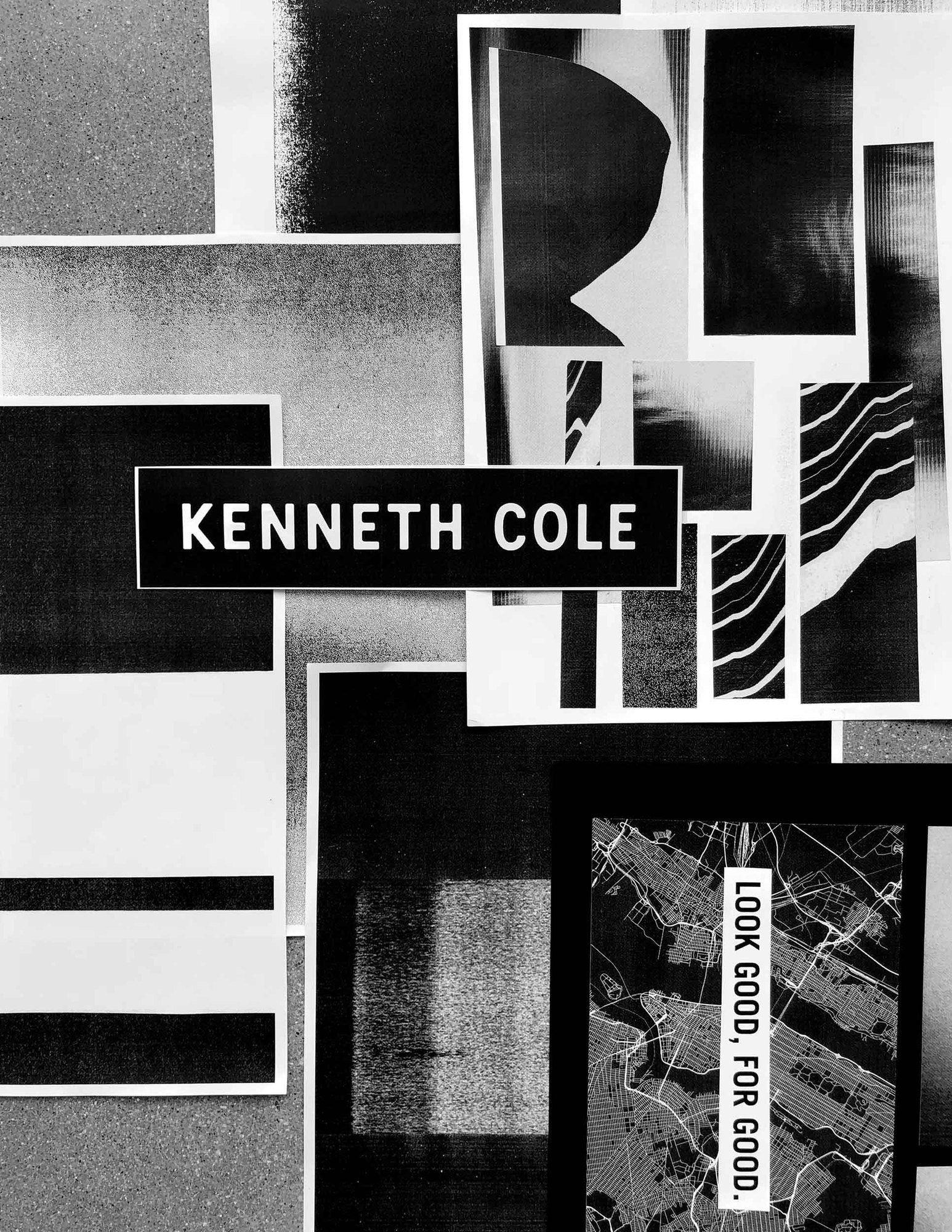
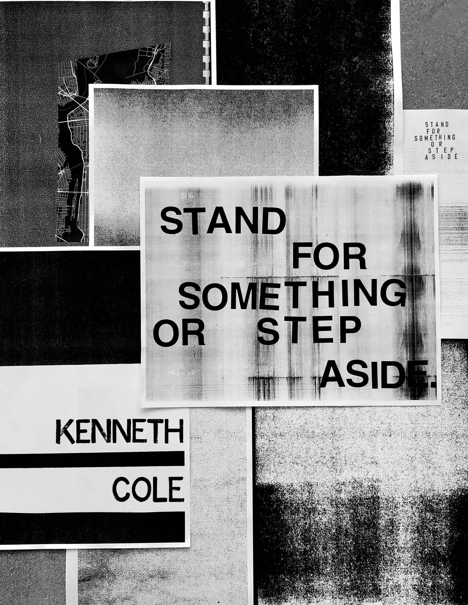
I made all of these by hand on an old xerox machine. I painted the lines in ink, both the block letters and the brush script: Do Courageous, Look good, for good and Stand for something or step aside, ran them through the copier, cut them up and copied them again until the grain took over, then laid the sheets out together as one wall.
Homepages and email
In which the voice goes online.
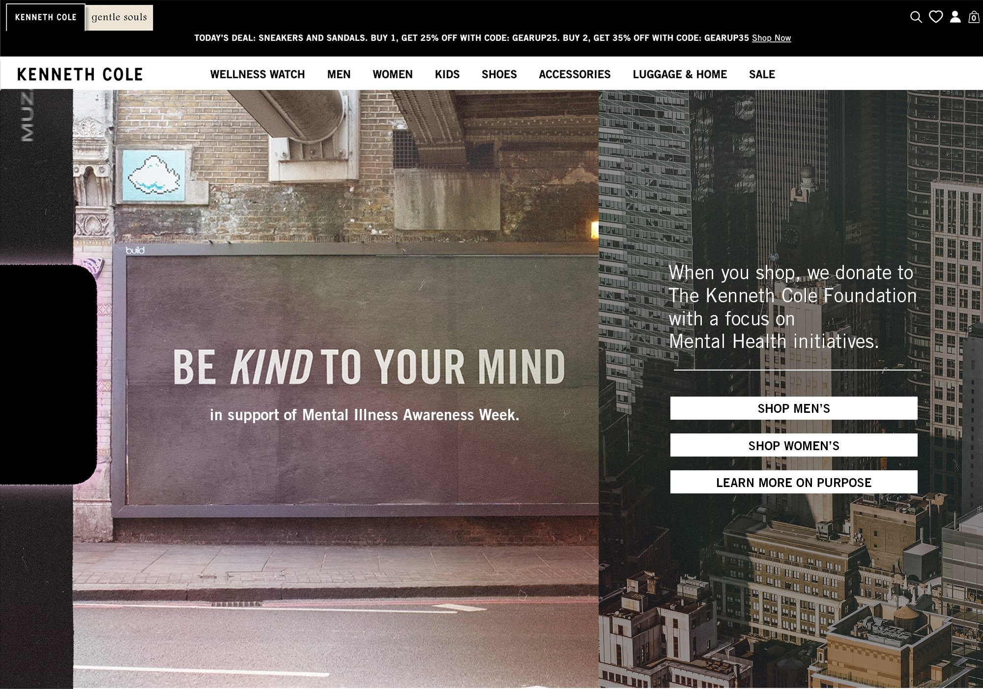
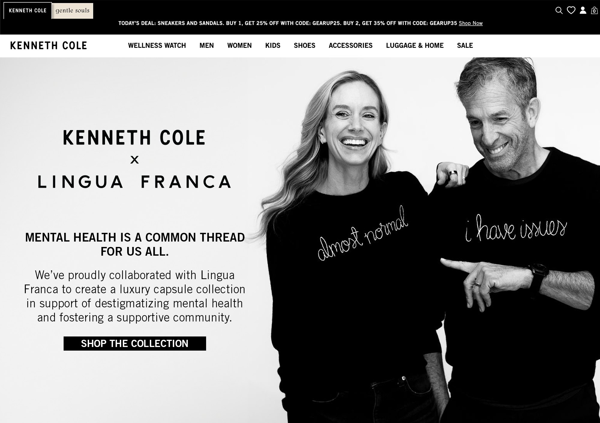
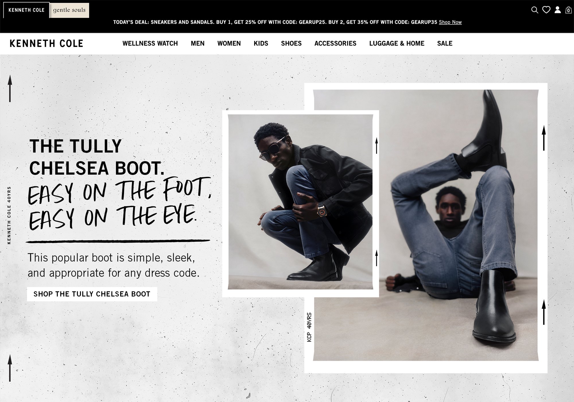
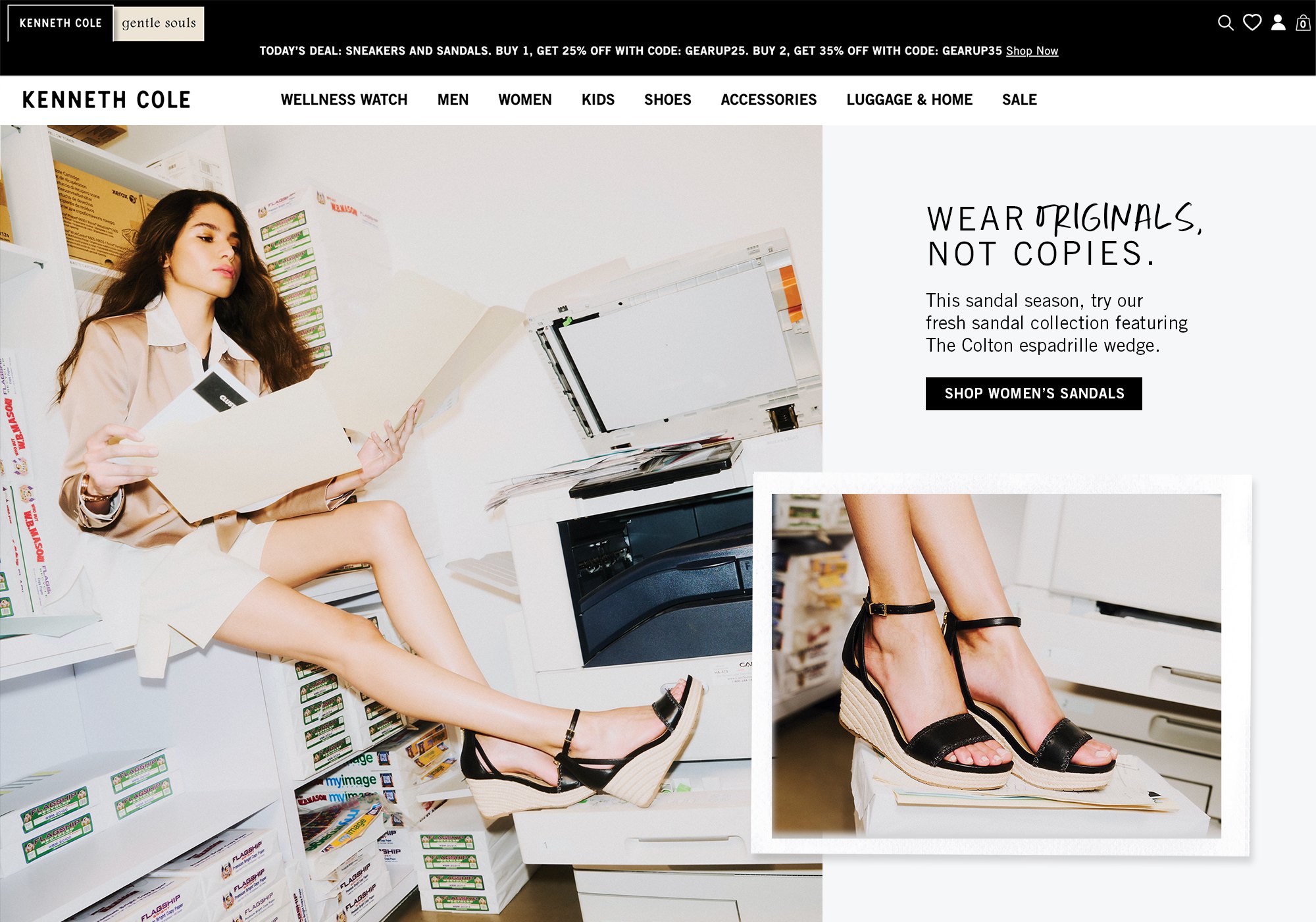
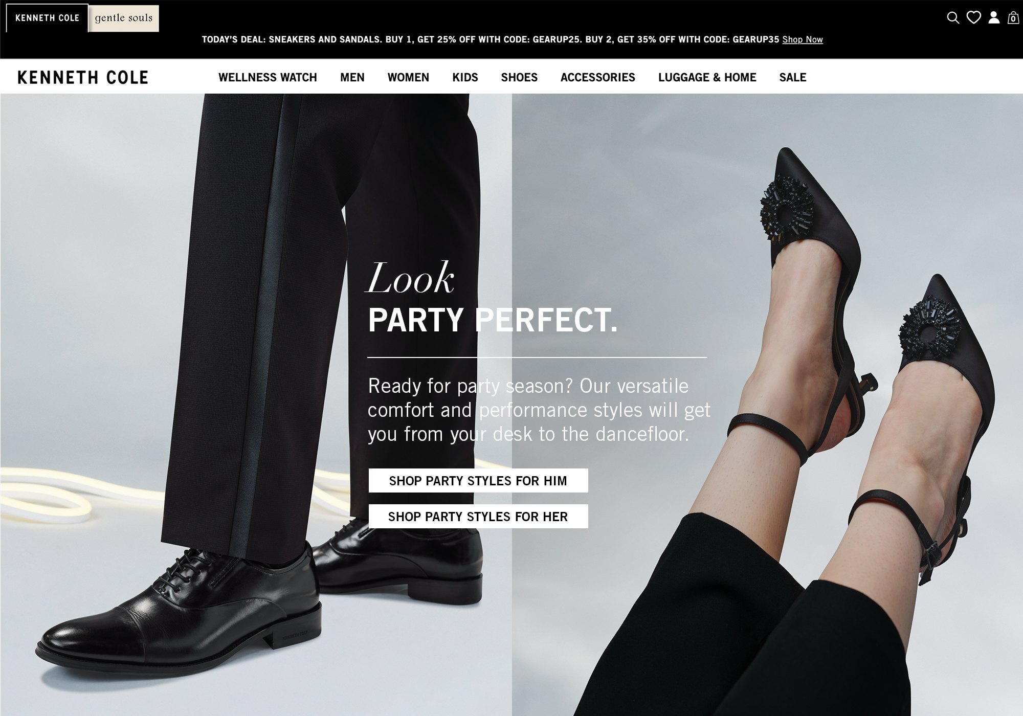
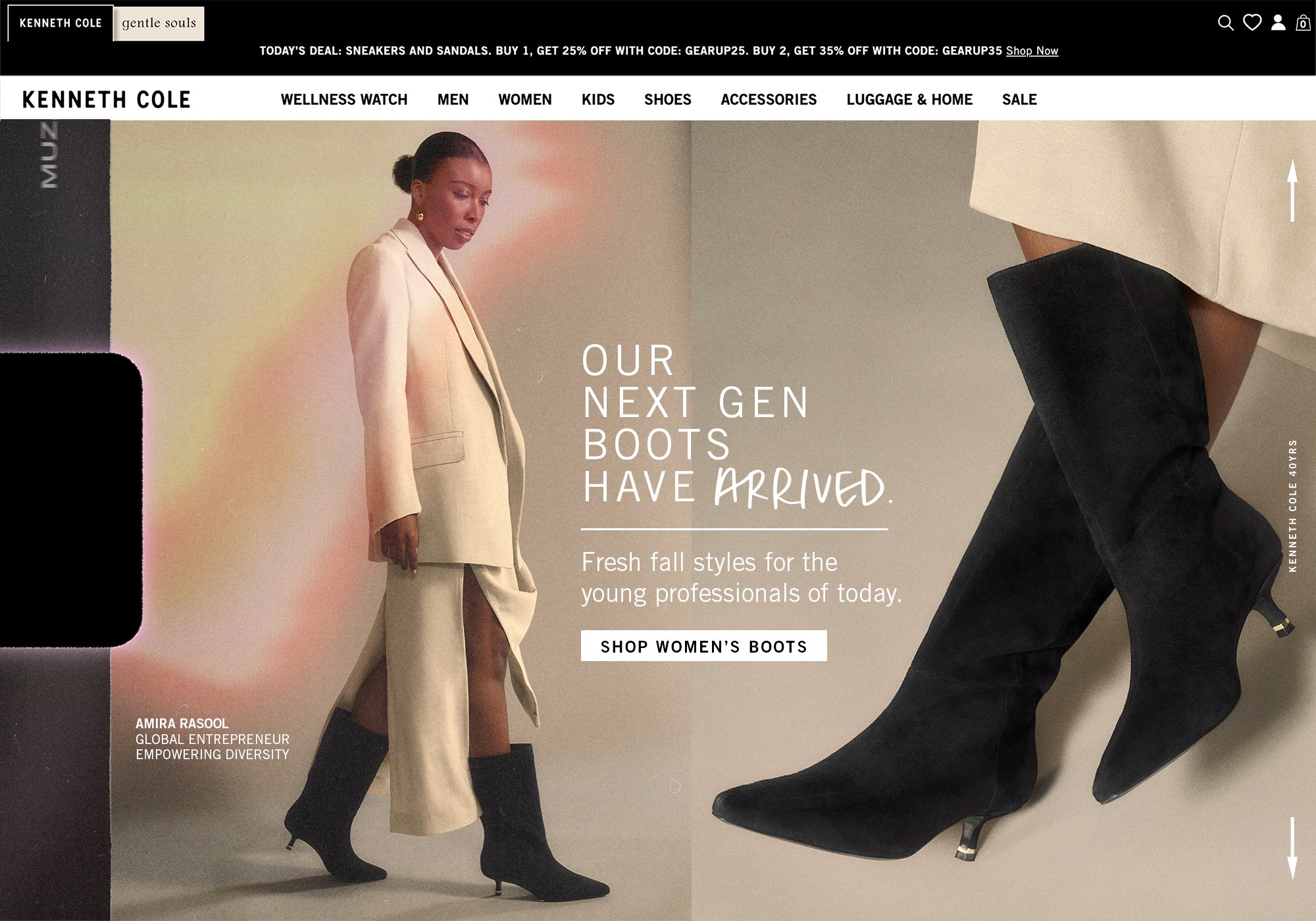
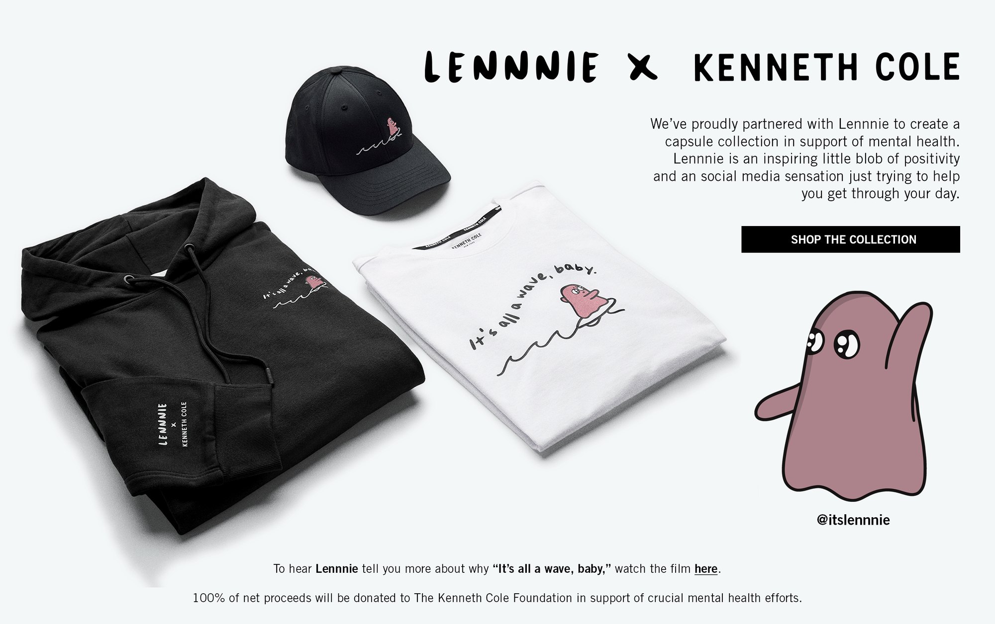
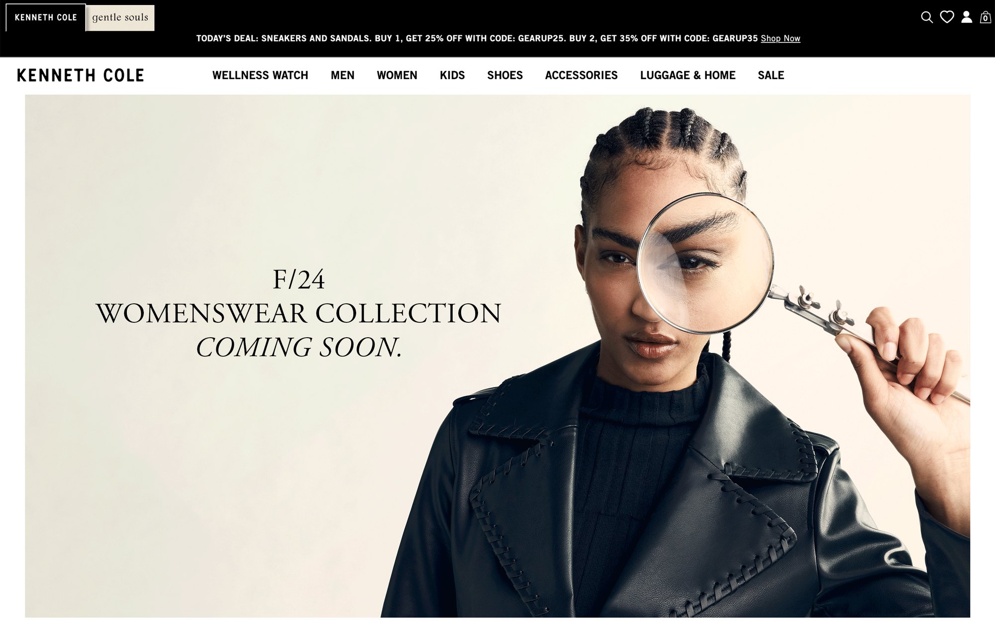
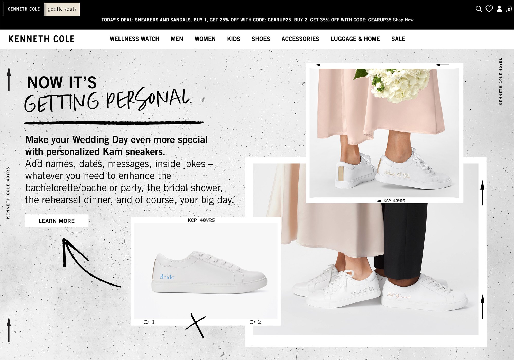
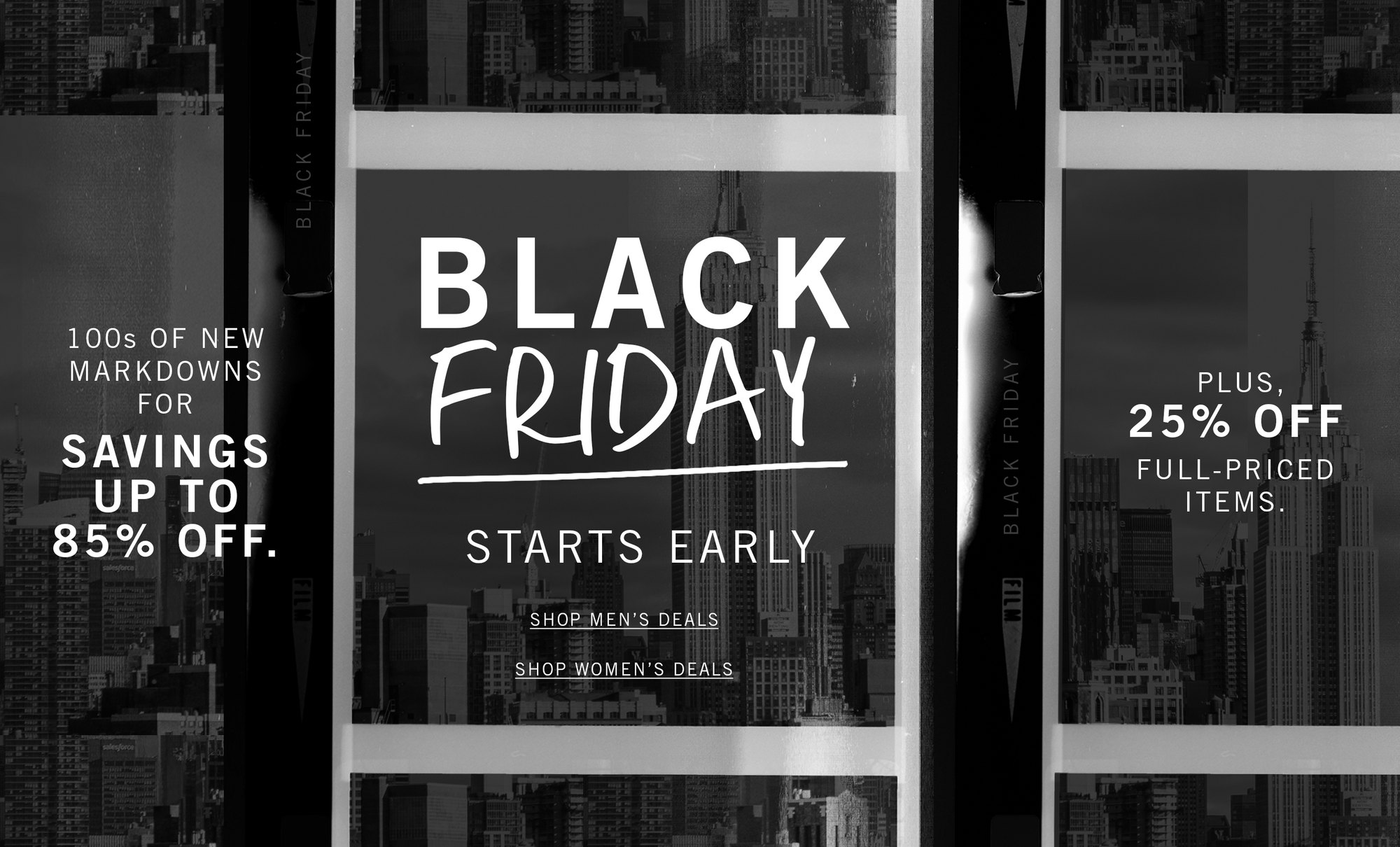
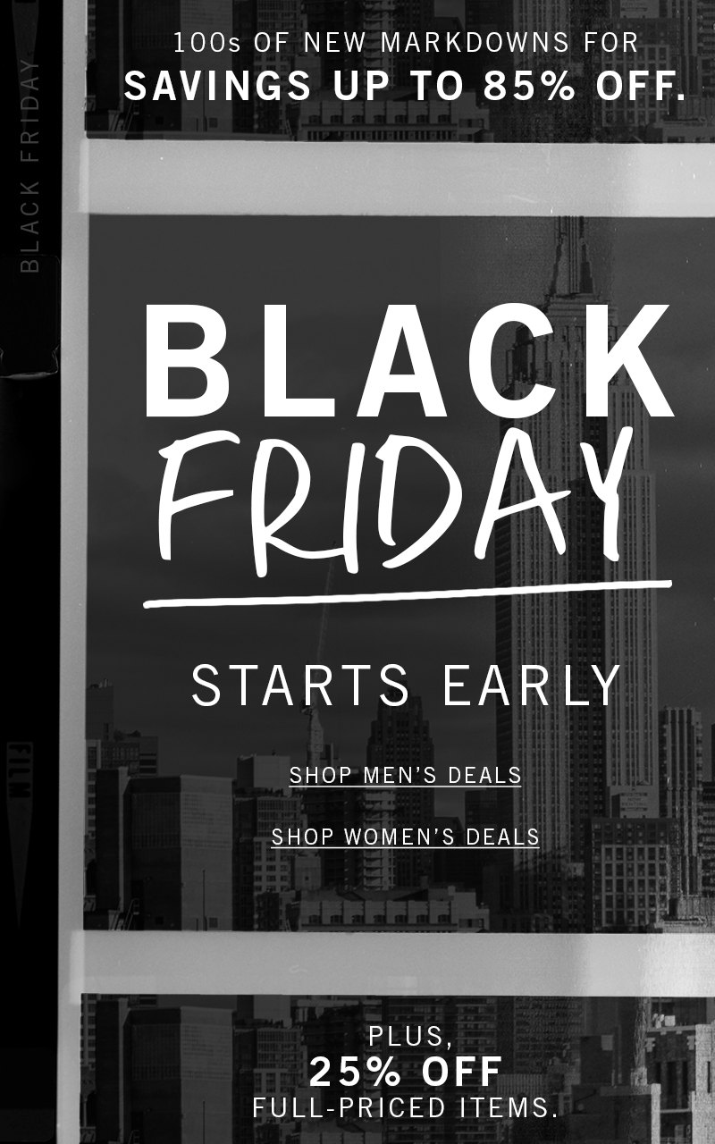
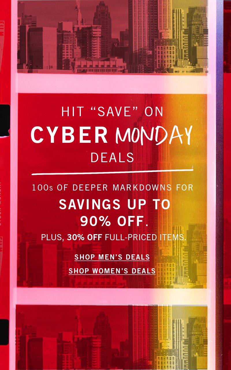
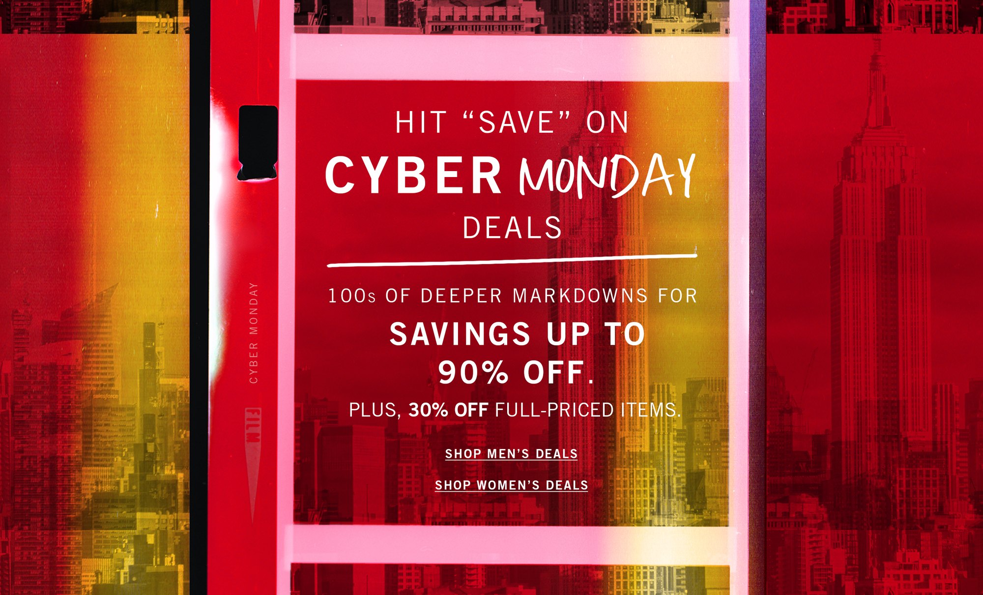
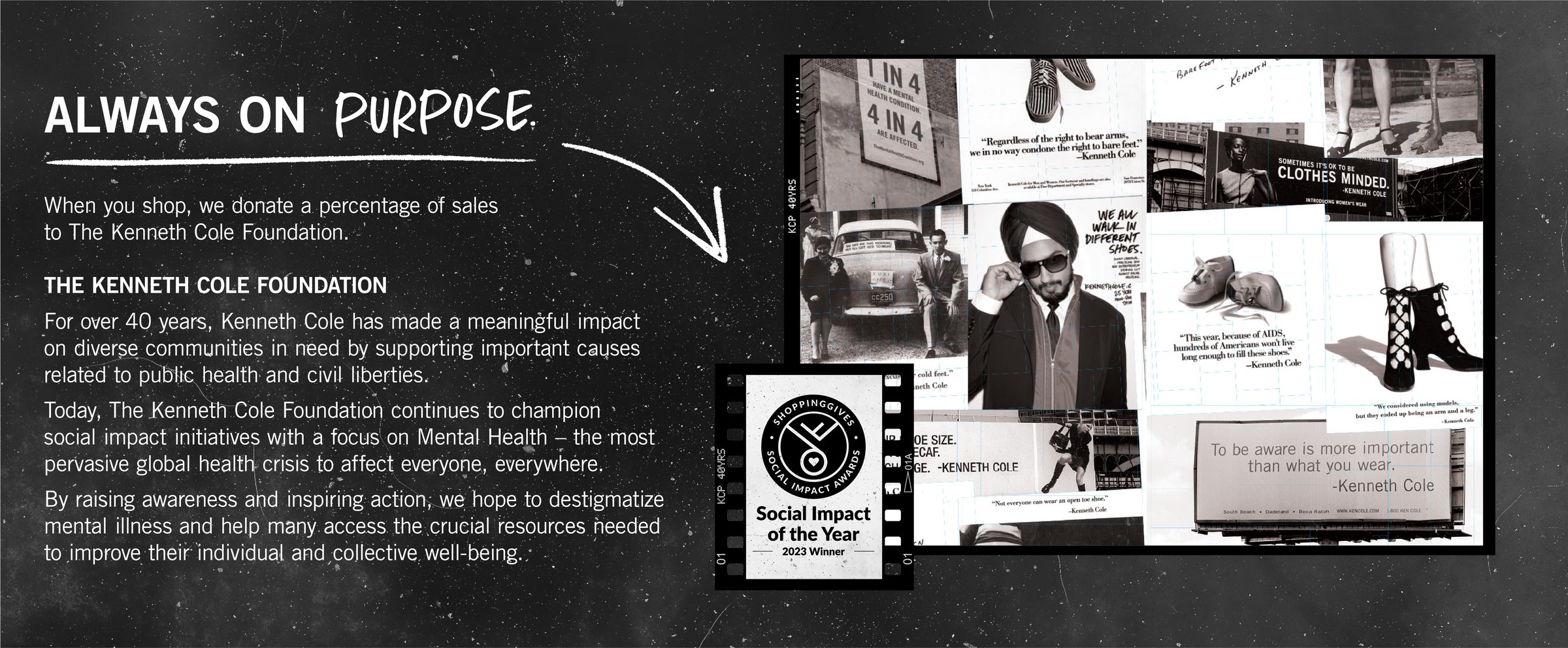
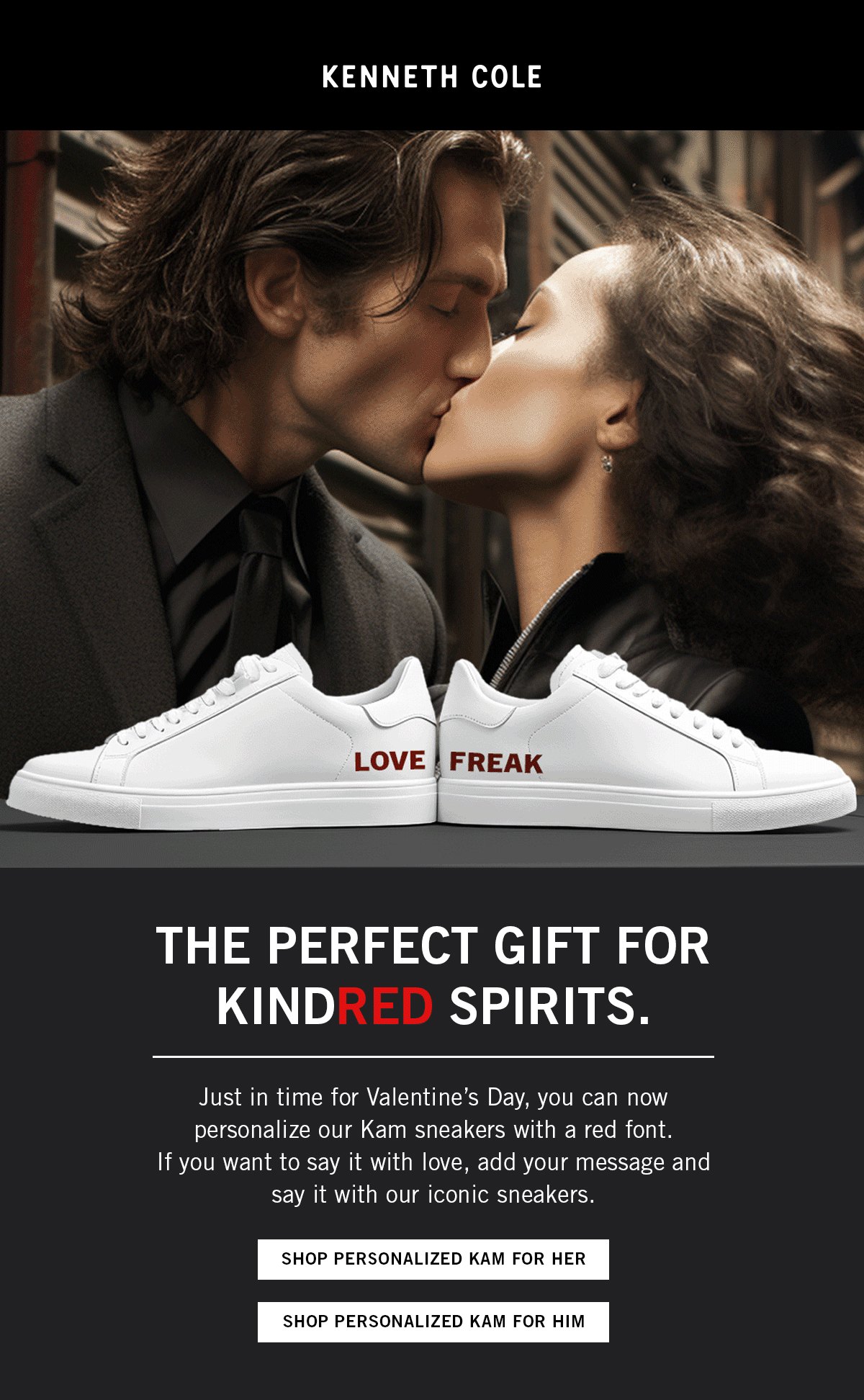
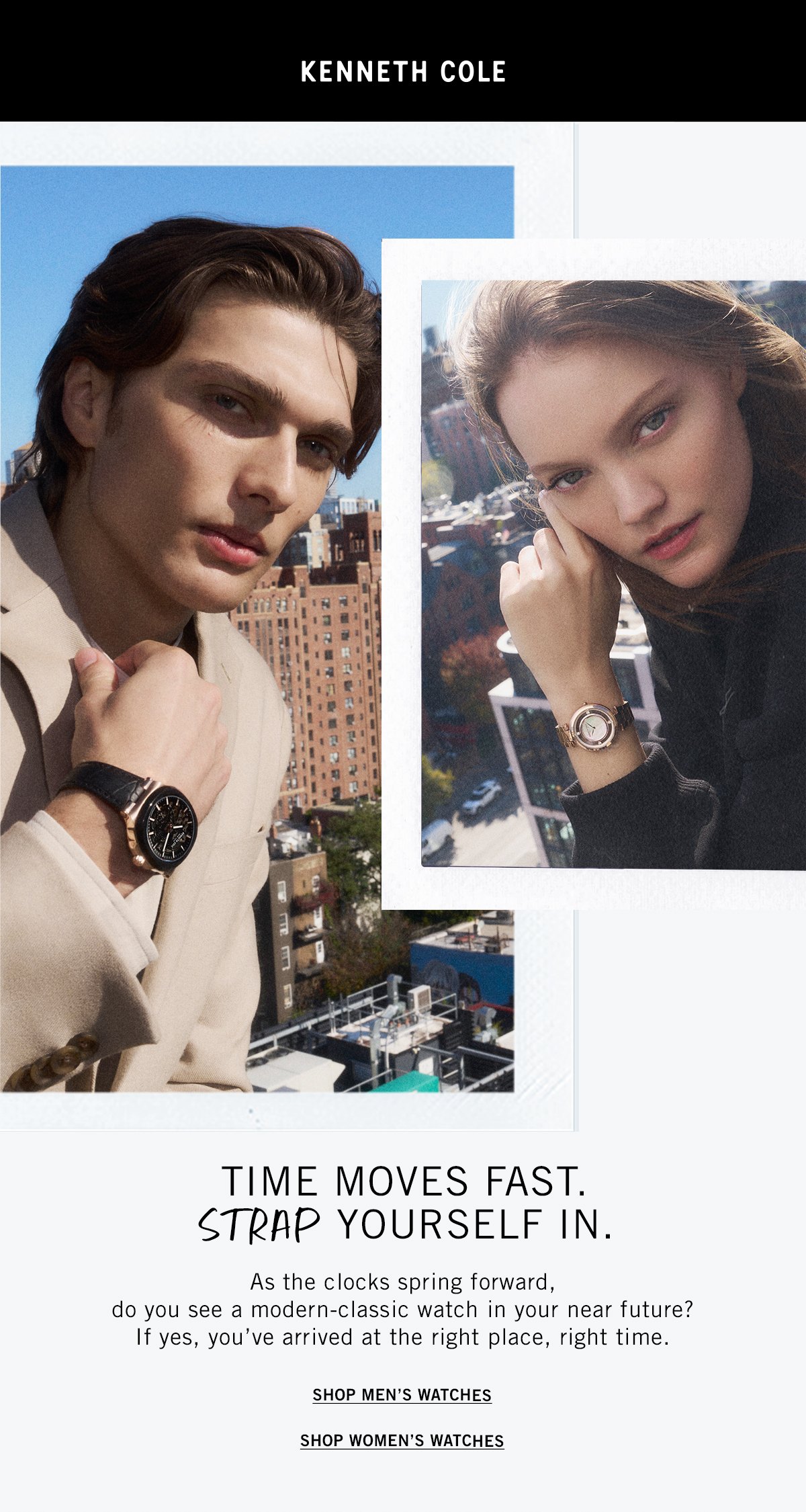
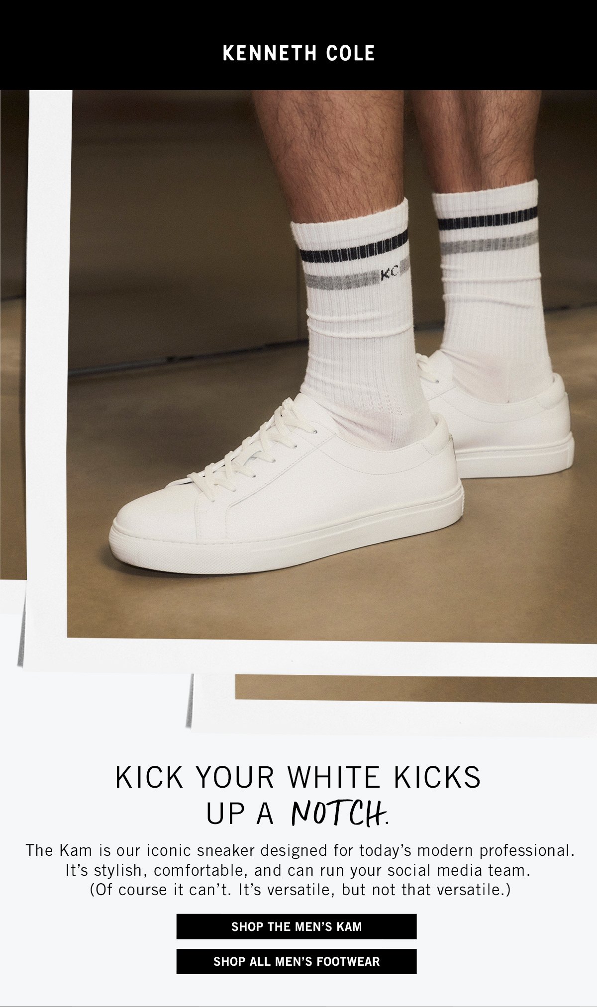
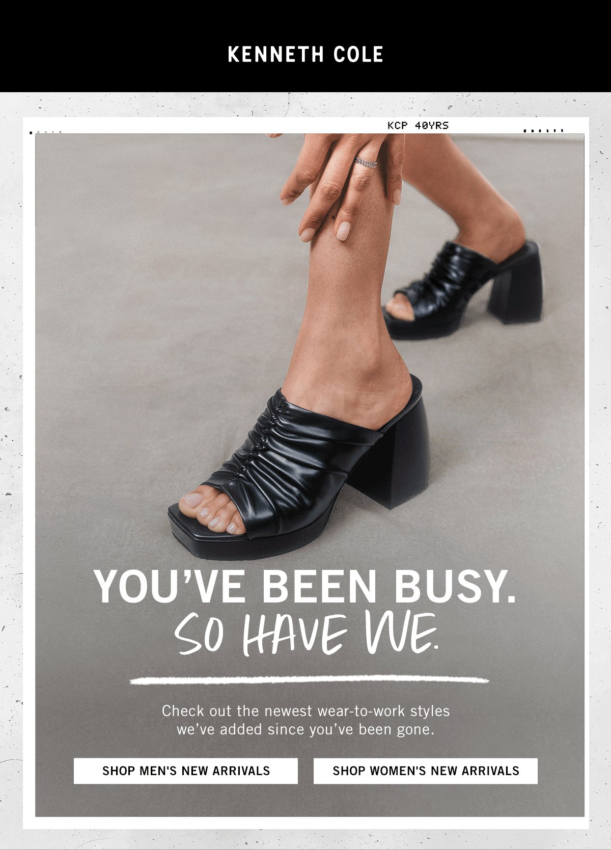
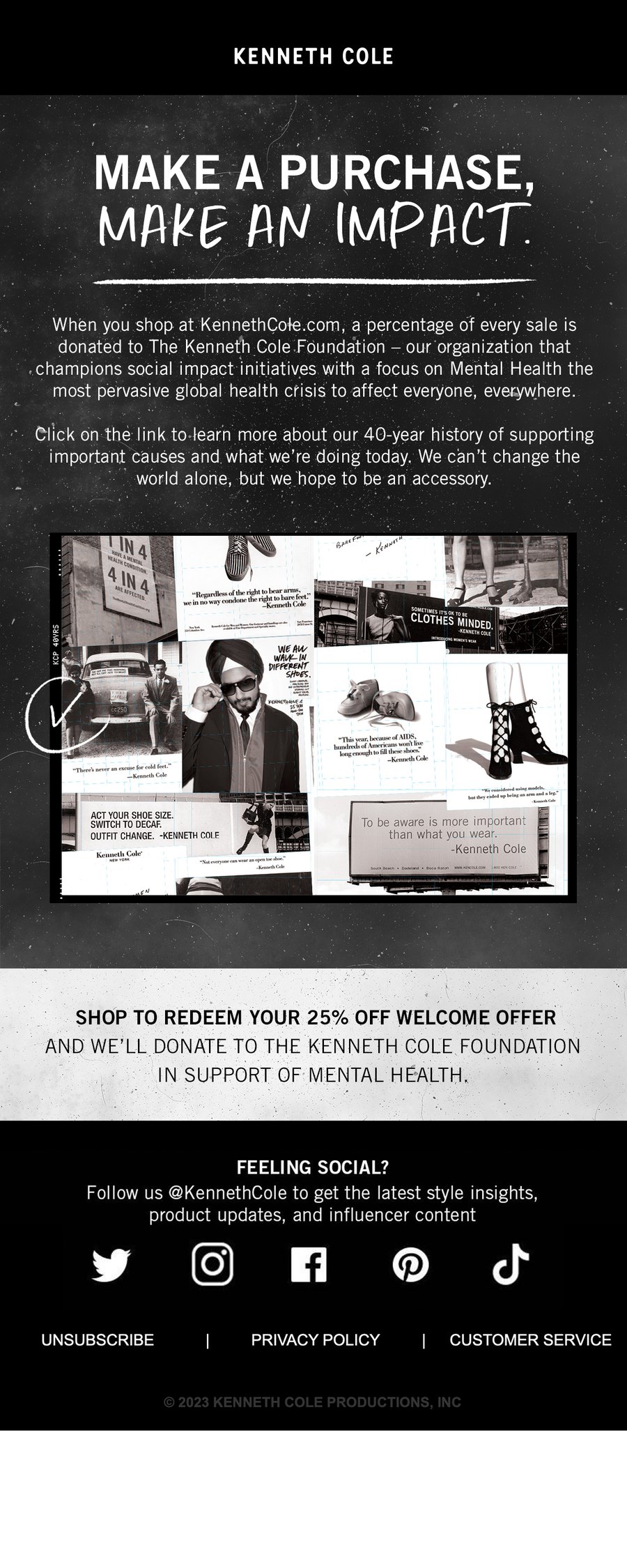
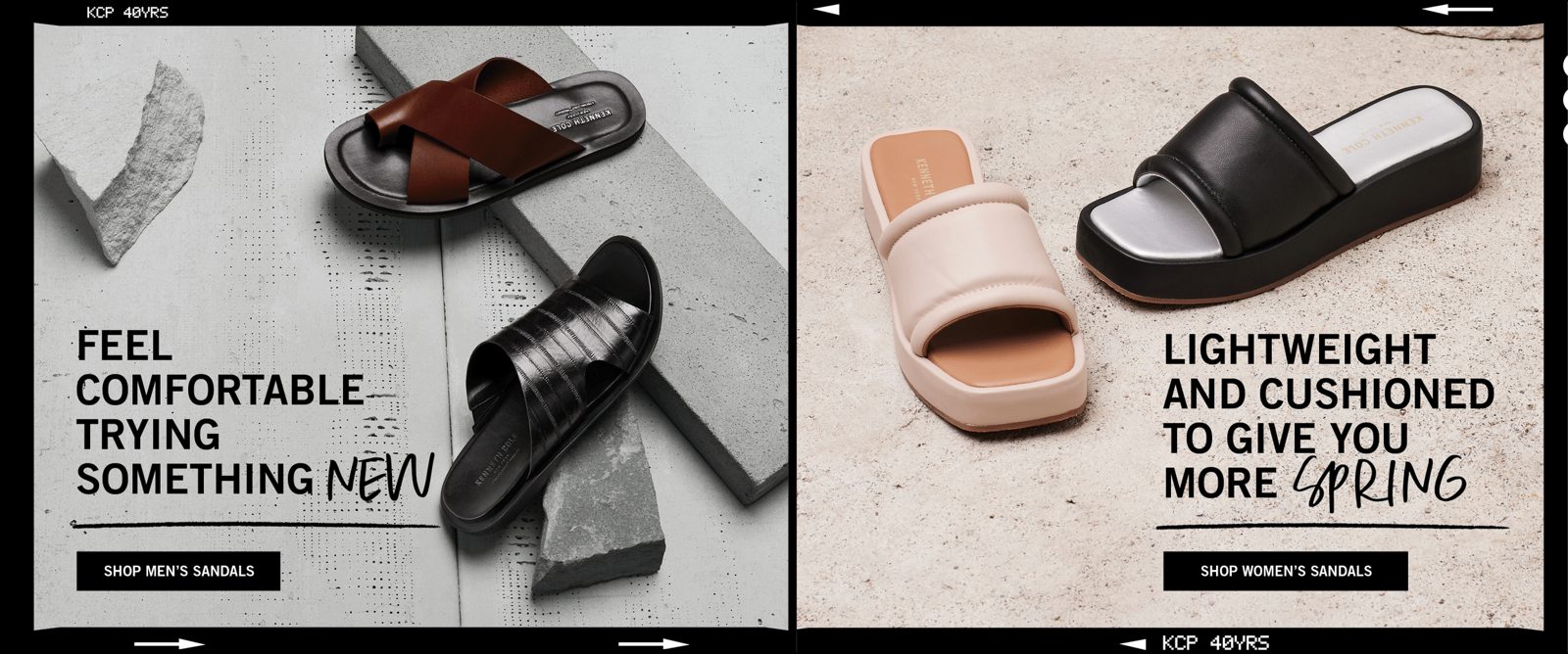
I designed the Kenneth Cole homepages, along with emails, landing pages and banners. The same hand and the same voice, from Black Friday to Pride, on the desktop and on the phone.