← All workCase studyAnimist / 2017

Animist

A skincare identity built from seven letters and ten steps.
Animist2017
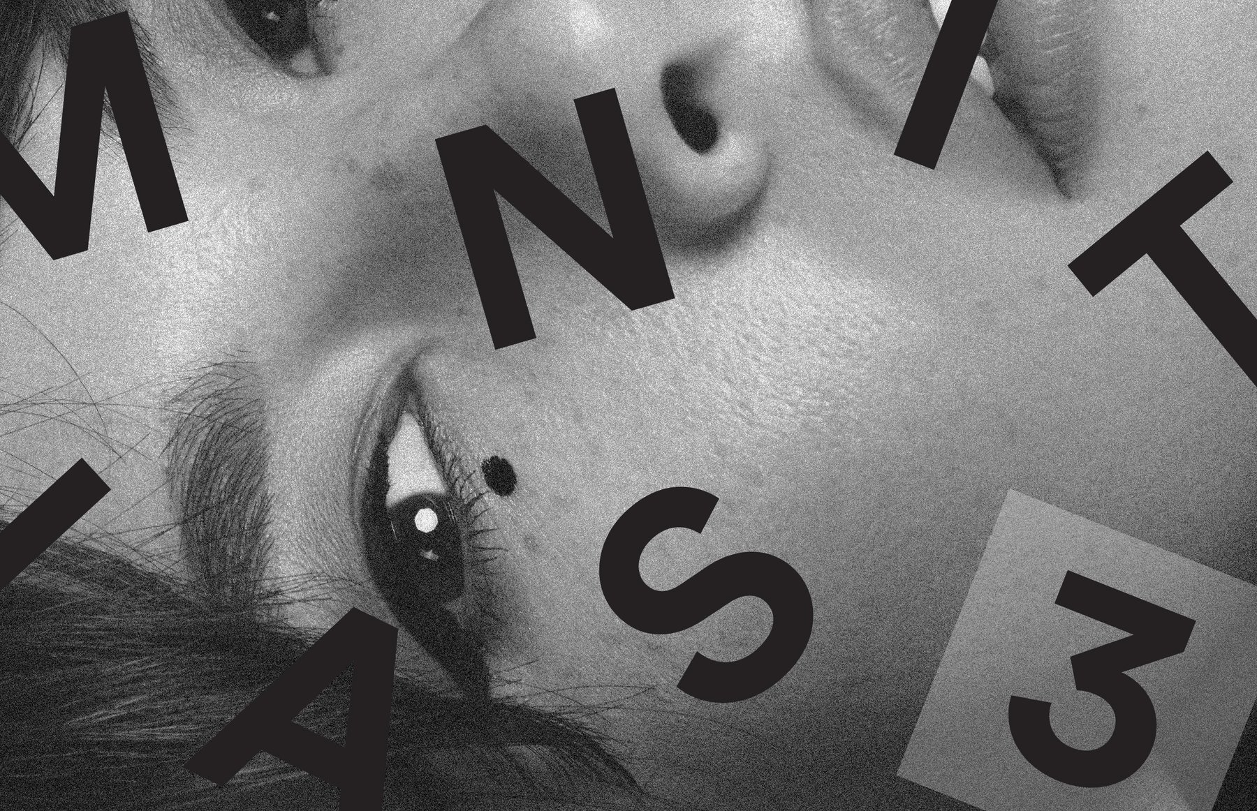
Animist campaign: a black-and-white close-up of a face crossed by the letters of the name and the number 3
The briefAnimist

A more direct approach to skincare, rooted in the steps of Korean skincare.

Story→ Ten steps
Identity→ Letters and numbers
Packaging→ Tubes and jars
Launch→ Campaign and social

From the Animist identity guide, October 2017. We are Animist. We are one.

I built the identity for Animist, a skincare brand that takes its cue from the cleansing steps of Korean skincare and wanted a more direct approach: a simple formula of pure ingredients, cruelty free, gluten free and naturally derived. The identity guide, dated October 2017, sets out a spaced wordmark, a brush signature and the marquee, a grid of the letters of ANIMIST with a number for each step, set in Gotham, mostly in black and white with Pantone 2716 U periwinkle. The same system then carries onto the packaging, the social icons and the launch faces.

ClientAnimist
Year2017
ScopeIdentity, brand guide, stationery, social media, packaging, campaign
TypeGotham Book, Gotham Light, Adobe Garamond Pro
ColorPantone 2716 U, Pantone Cool Gray 4 U, Pantone Neutral Black, white, rose gold
Part IStory

Ten steps

In which skincare gets simpler.

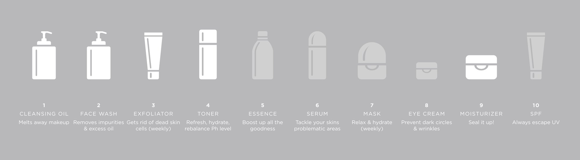
Animist takes its name from animism, from the Latin anima: breath, spirit, life. The brand story takes its cue from the cleansing steps of Korean skincare, ten of them, from cleansing oil to SPF. The voice is clear and uncomplicated, informed and considered.
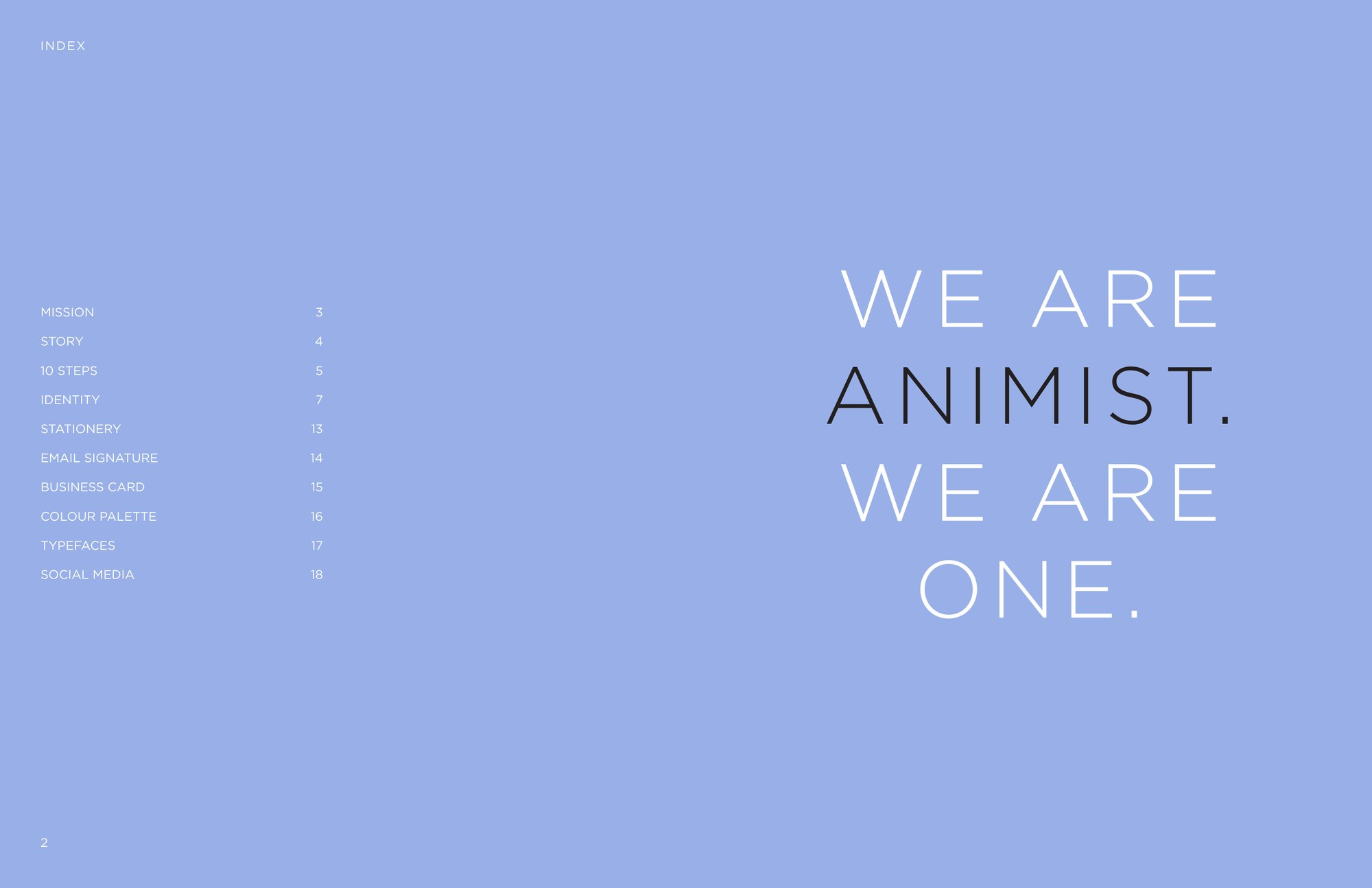
Identity guide index on periwinkle: We are Animist. We are one.
The identity guide, October 2017
The art of life is complicated enough. The art of taking care of your skin doesn’t have to be.
The Animist mission
Ten white skincare icons on gray, numbered 1 to 10, from cleansing oil to SPF
Ten steps of Korean skincare
Part IIIdentity

Letters and numbers

In which the name becomes a grid.

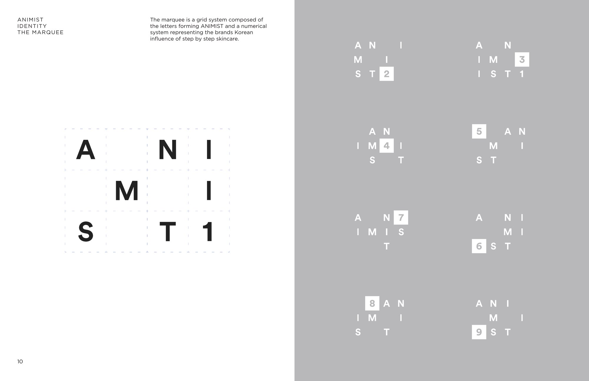
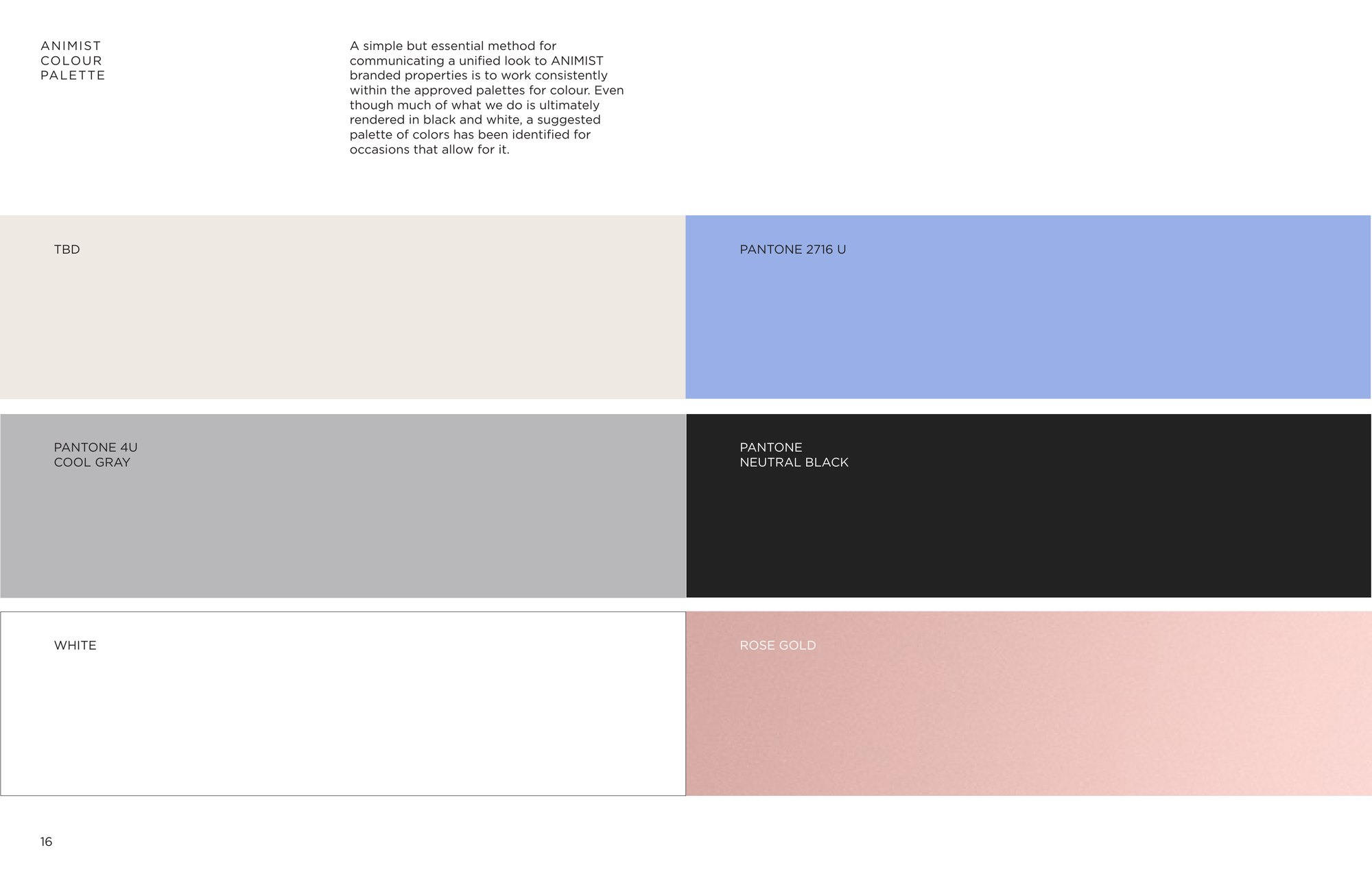
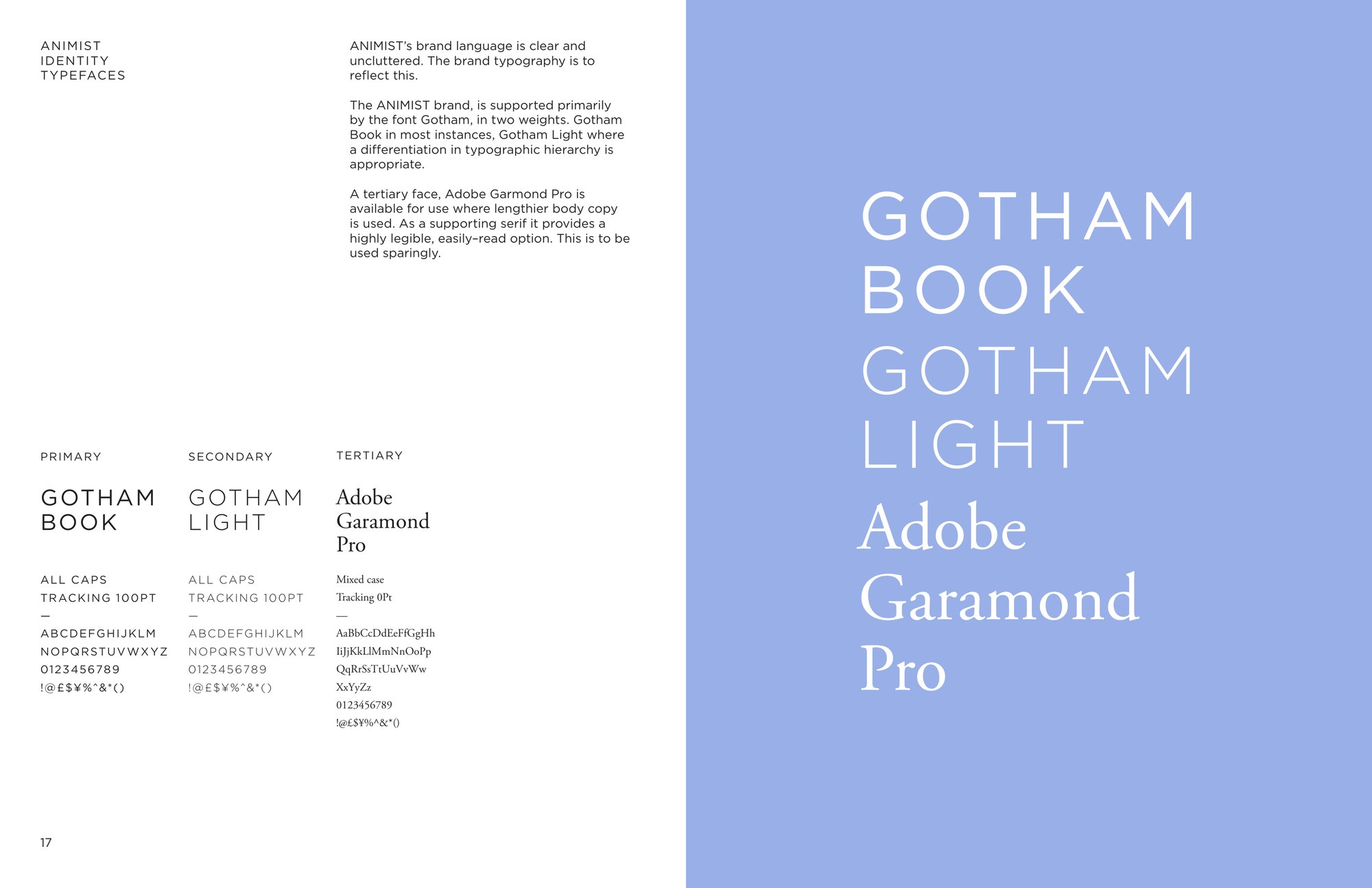
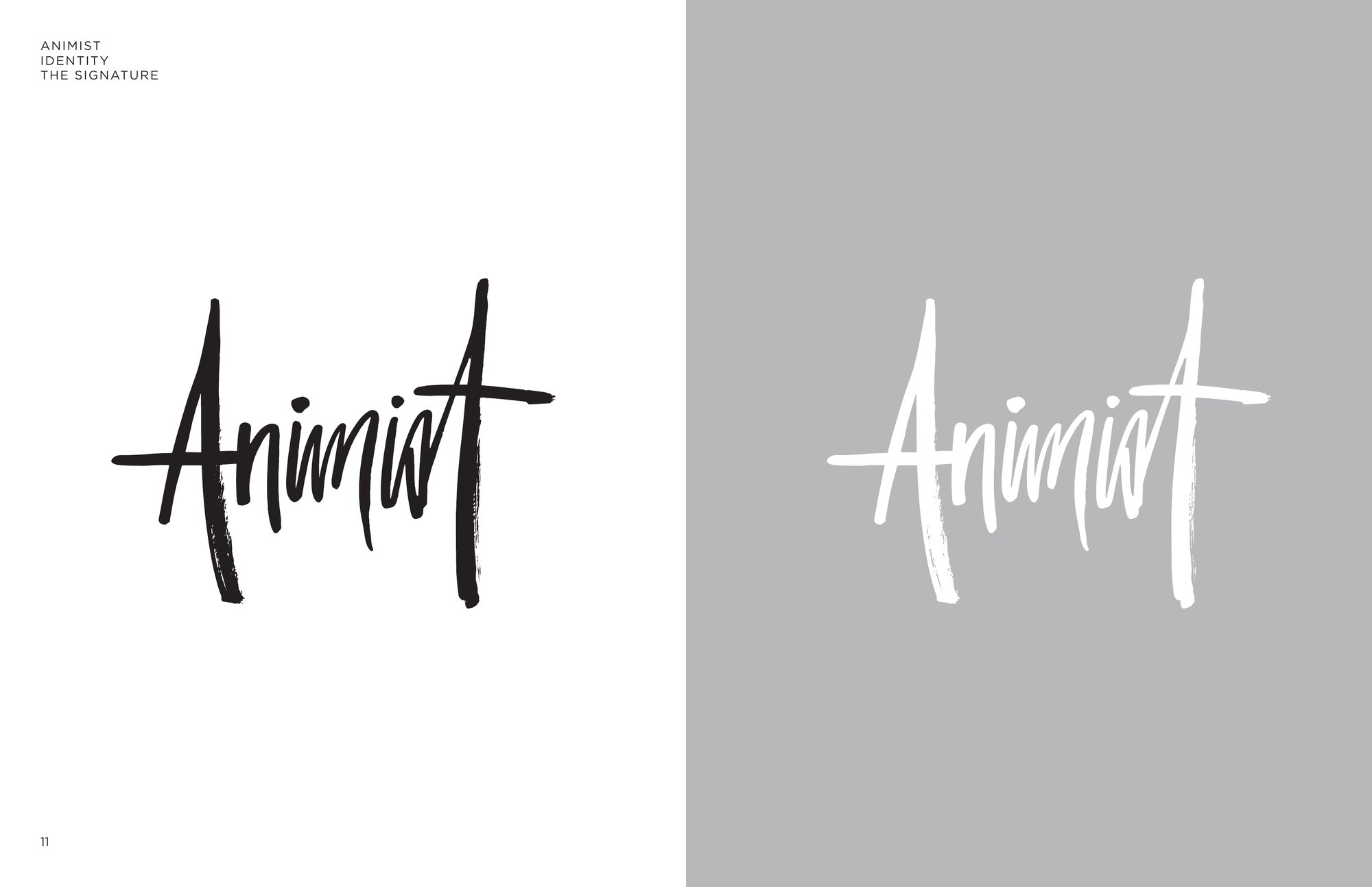
A wide, spaced wordmark, always given equal space on every side, and a brush signature beside it. Then the marquee: a grid of the letters of ANIMIST with a number dropped in for each step, the brand’s nod to step by step Korean skincare. Gotham Book and Gotham Light, all caps, with Adobe Garamond Pro for longer copy. Mostly black and white, with a palette of Pantone 2716 U periwinkle, Cool Gray 4 U, Neutral Black, white and rose gold.
The Animist wordmark in black on white and in white on gray
The logo
The Animist signature, a brush script, in black on white and in white on gray
The signature
The marquee: the letters of Animist on a grid with the number 1, and eight variations numbered 2 to 9 on gray
The marquee
The letters of Animist cut up and collaged in black on white
Logo collage
Identity guide color palette: cream, Pantone 2716 U, Pantone Cool Gray 4 U, Pantone Neutral Black, white and rose gold
Color
Identity guide typefaces: Gotham Book, Gotham Light and Adobe Garamond Pro
Typefaces
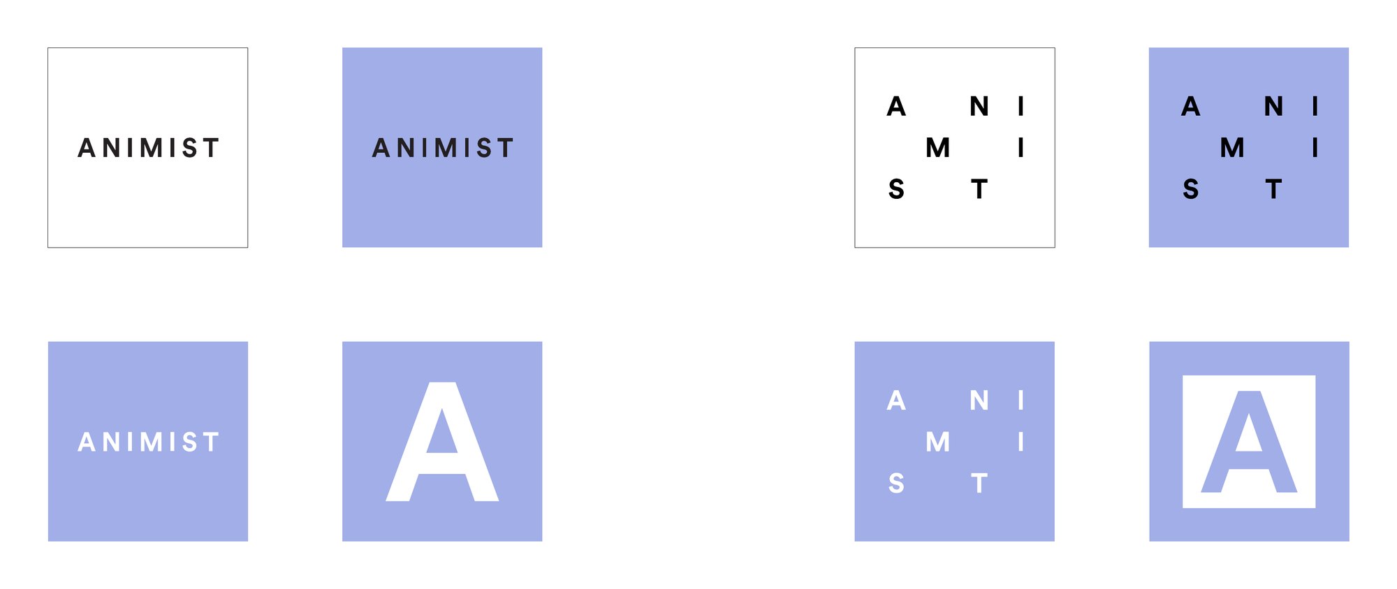
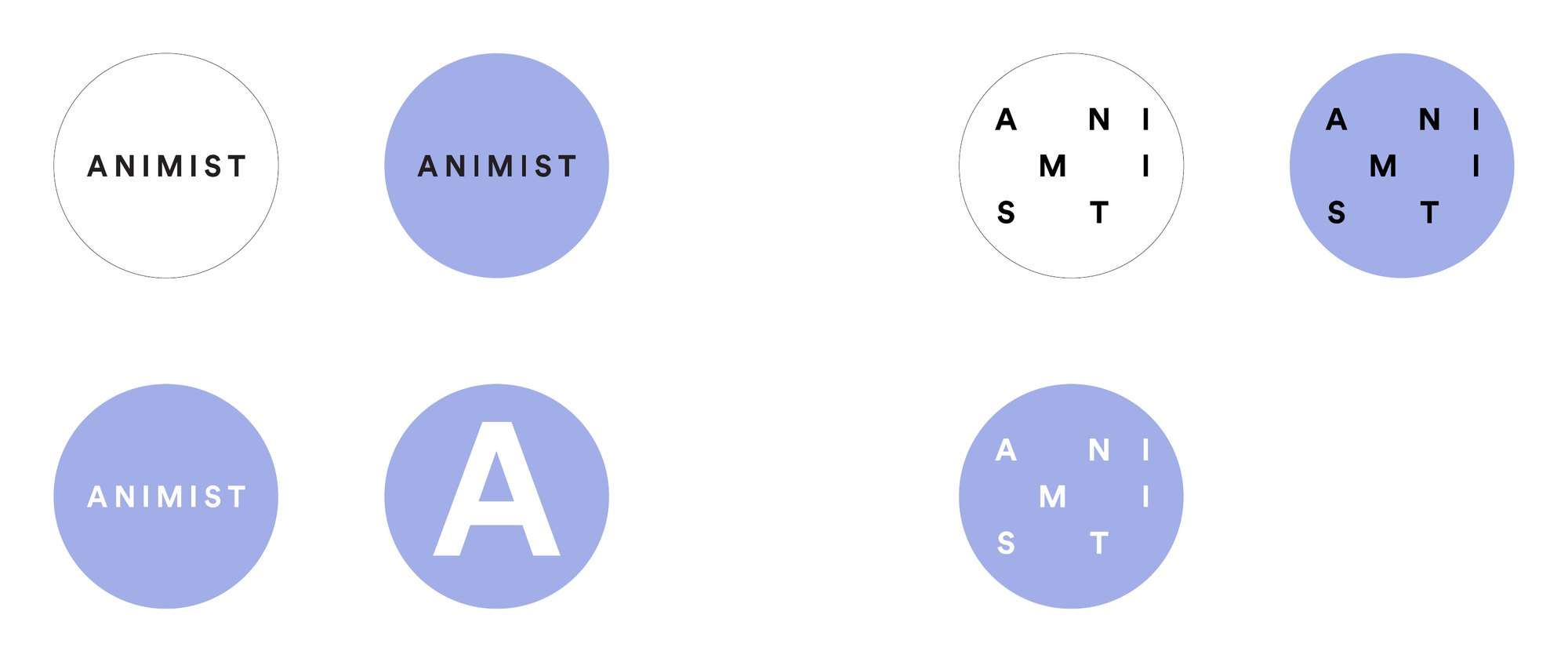
Square social icons in white and periwinkle: the wordmark, the marquee and the A
Round social icons in white and periwinkle: the wordmark, the marquee and the A
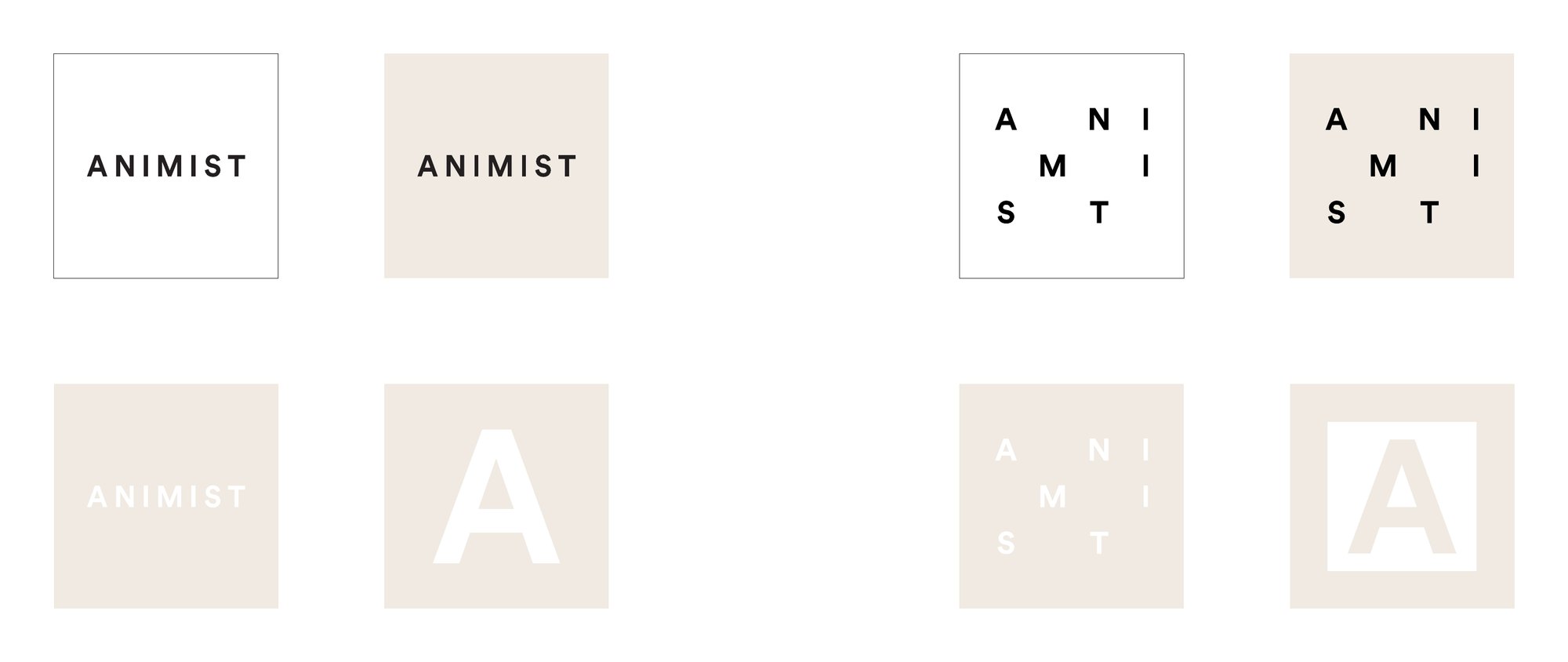
Square social icons in white and cream: the wordmark, the marquee and the A
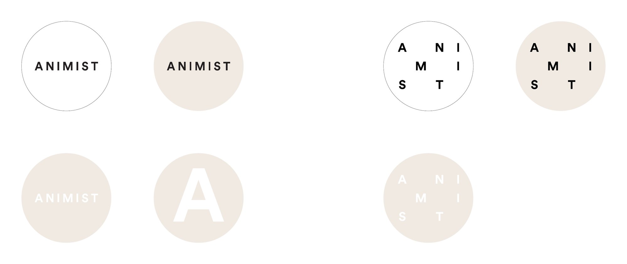
Round social icons in white and cream: the wordmark, the marquee and the A
Social media icons, from the identity guide4 images, swipe →
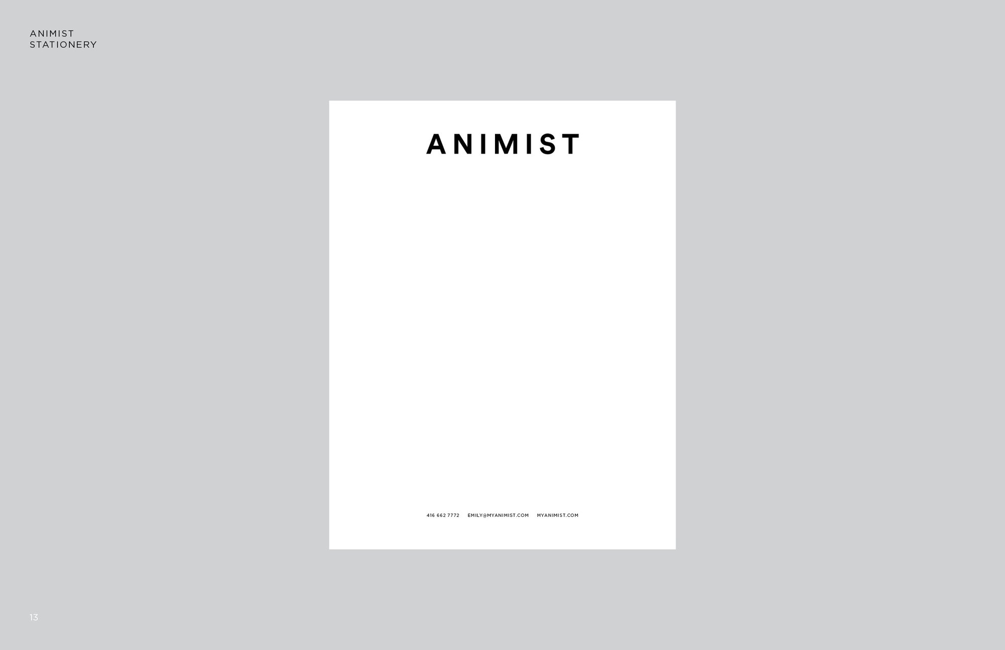
Identity guide page: the Animist letterhead, the spaced wordmark at the head of a white sheet on gray
Letterhead
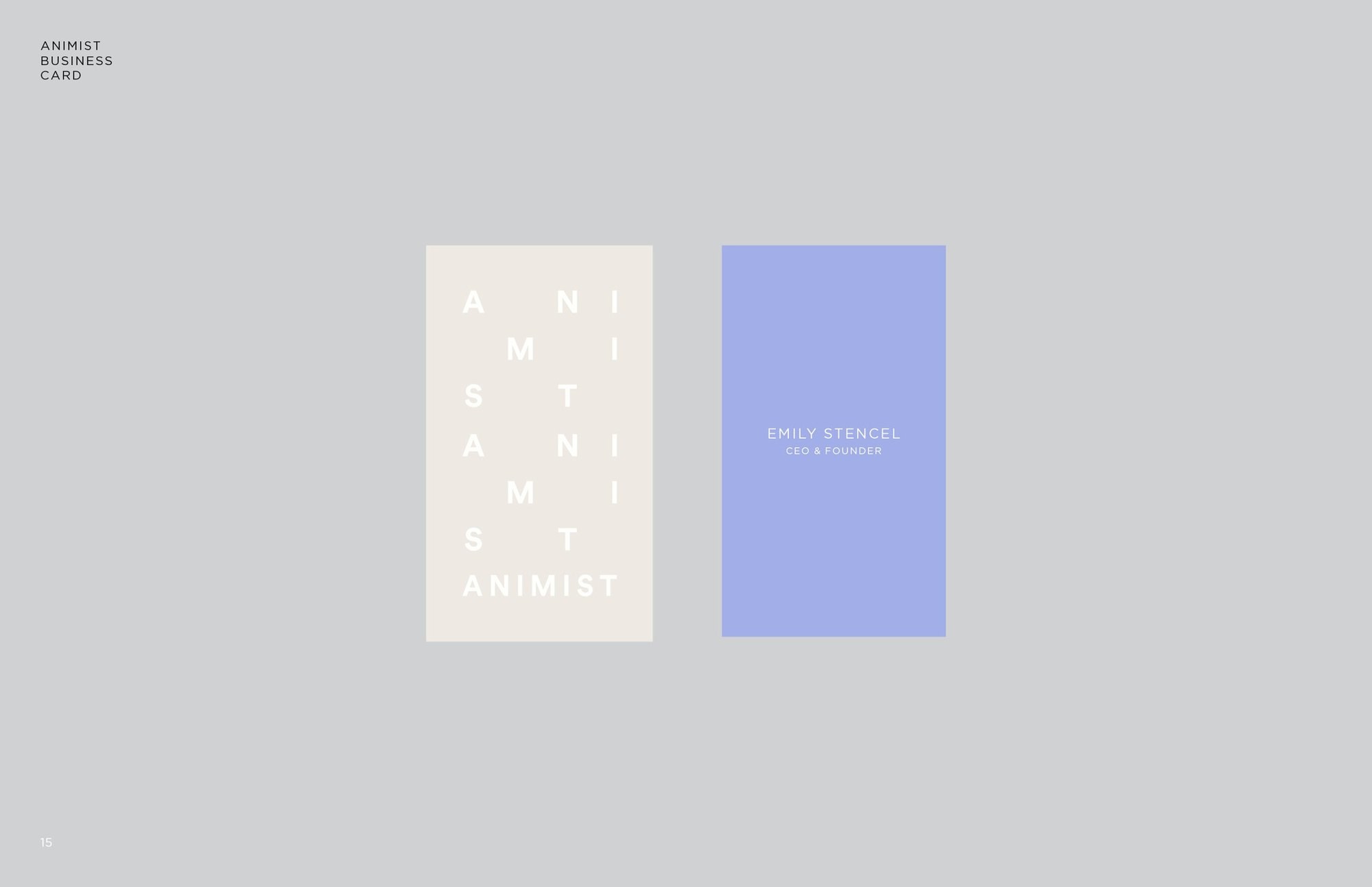
Identity guide page: two business cards, the letters of Animist stepped down a cream card and a periwinkle back with the founder’s name
Business cards
Part IIIPackaging

Tubes and jars

In which the stack goes on the pack.

White tubes and jars that fade into periwinkle, each one carrying the stacked mark and its number.

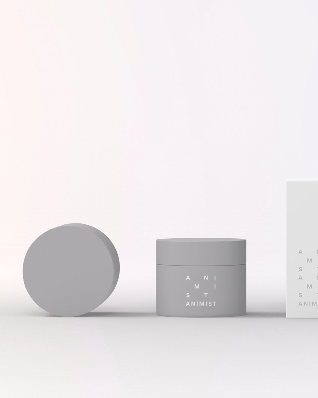
Animist tubes and jars in white and periwinkle on black
The range
Animist jars in gray and white with the stacked mark
Jars
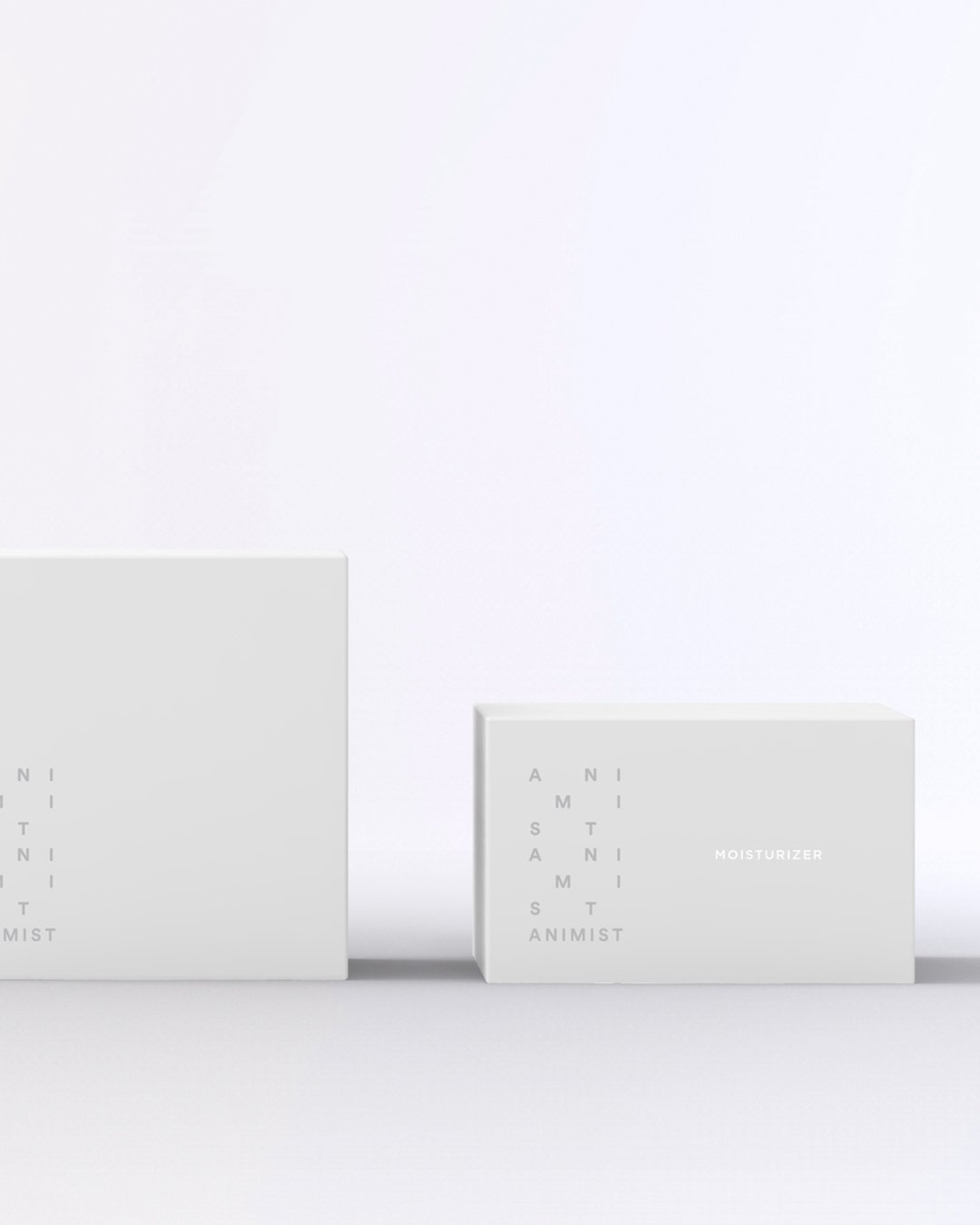
Animist boxes in white with the stacked mark
Boxes
Part IVLaunch

Campaign and social

In which the letters cross the face.

Faces in black and white or periwinkle, with the letters of the marquee moving across the skin and a step number on each. Then the same system on the site.

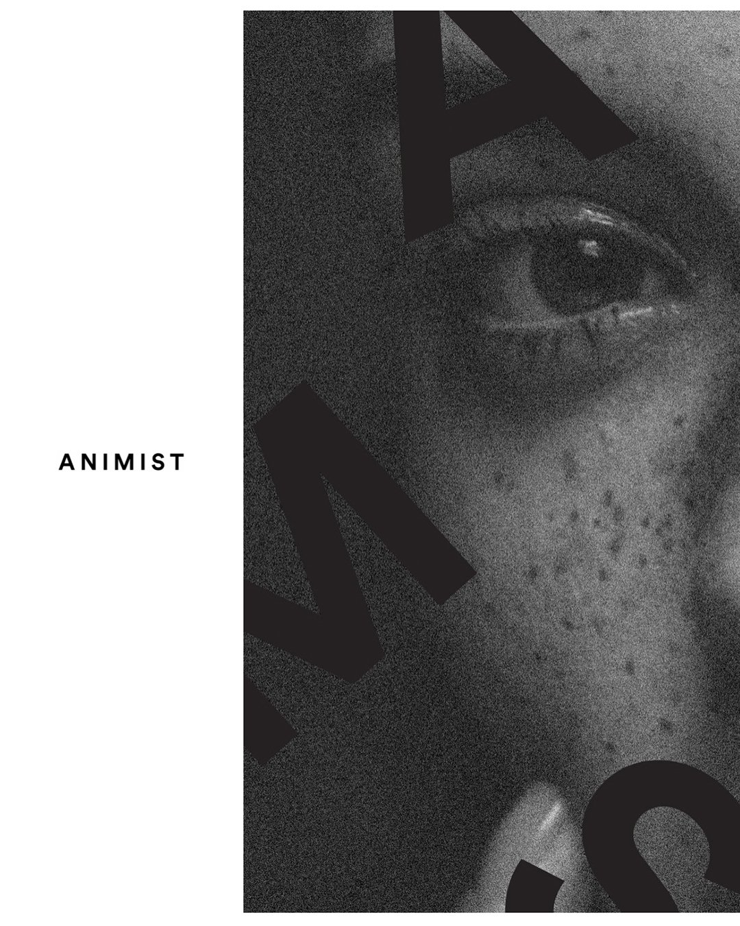
Campaign: a face in periwinkle crossed by the letters of Animist and the number 1Campaign: a black-and-white close-up crossed by the letters of Animist and the number 3
Campaign: a face in profile in black and white with Animist in the margin
The faces
The site, in motion.
Next project2022
Function of BeautyView →